BRADA IS A GRAPHIC DESIGN STUDIO SPECIALIZED IN BRANDING. IF YOU WANT TO CONTACT US PLEASE FEEL FREE TO SEND US AN EMAIL TO INFO@BRADA.CO OR CHECK OUR CONTACT SECTION.
BRADA IS A GRAPHIC DESIGN STUDIO SPECIALIZED IN BRANDING. IF YOU WANT TO CONTACT US PLEASE FEEL FREE TO SEND US AN EMAIL TO INFO@BRADA.CO OR CHECK OUR CONTACT SECTION.
BRADA IS A GRAPHIC DESIGN STUDIO SPECIALIZED IN BRANDING. IF YOU WANT TO CONTACT US PLEASE FEEL FREE TO SEND US AN EMAIL TO INFO@BRADA.CO OR CHECK OUR CONTACT SECTION.
BRADA IS A GRAPHIC DESIGN STUDIO SPECIALIZED IN BRANDING. IF YOU WANT TO CONTACT US PLEASE FEEL FREE TO SEND US AN EMAIL TO INFO@BRADA.CO OR CHECK OUR CONTACT SECTION.
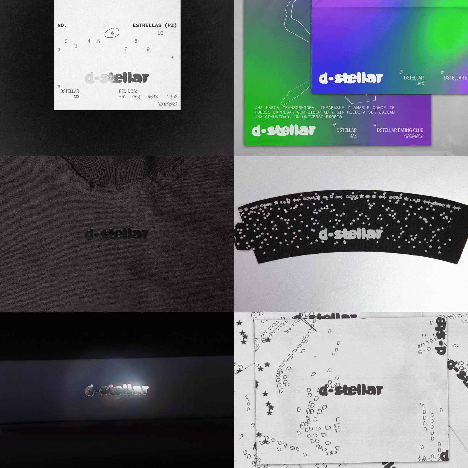
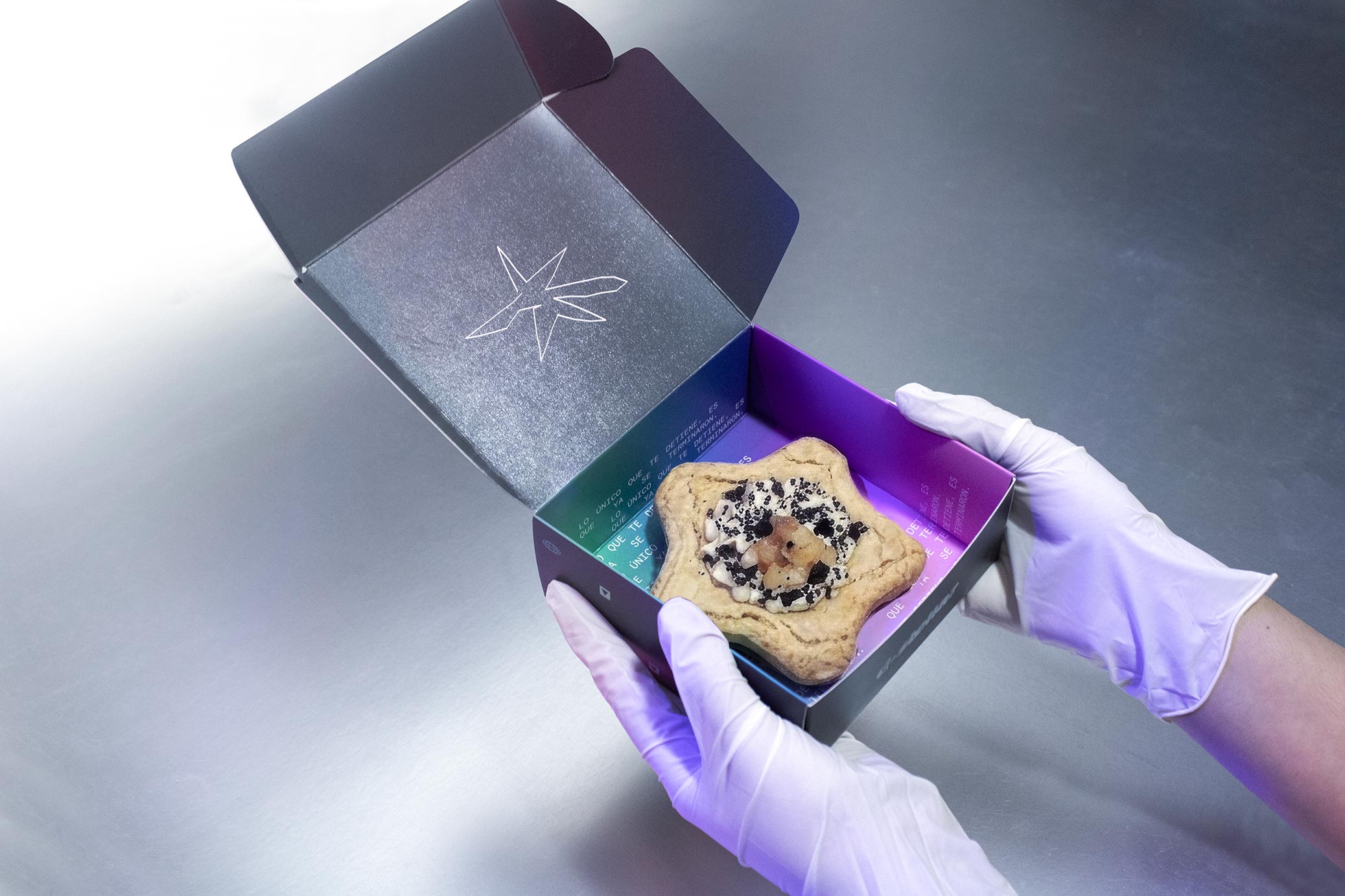
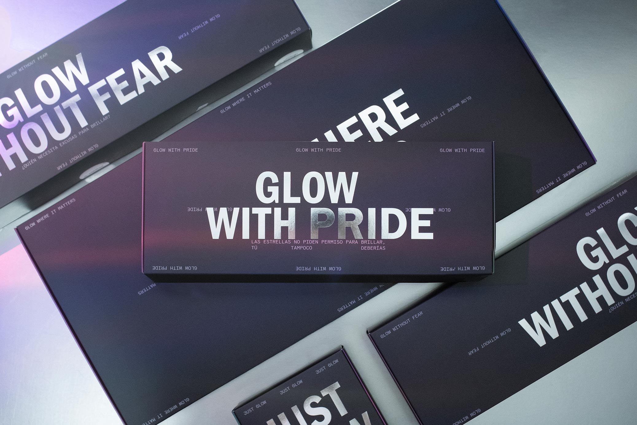
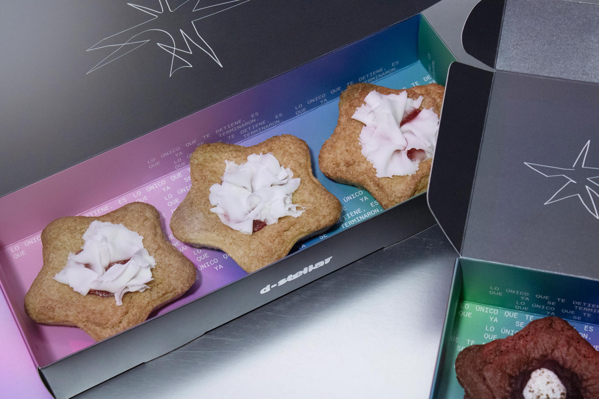
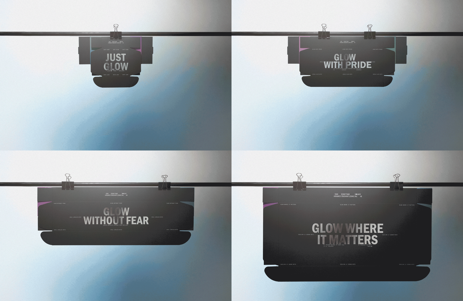
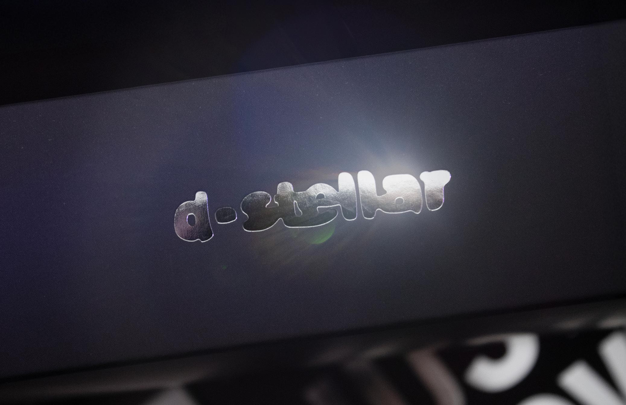
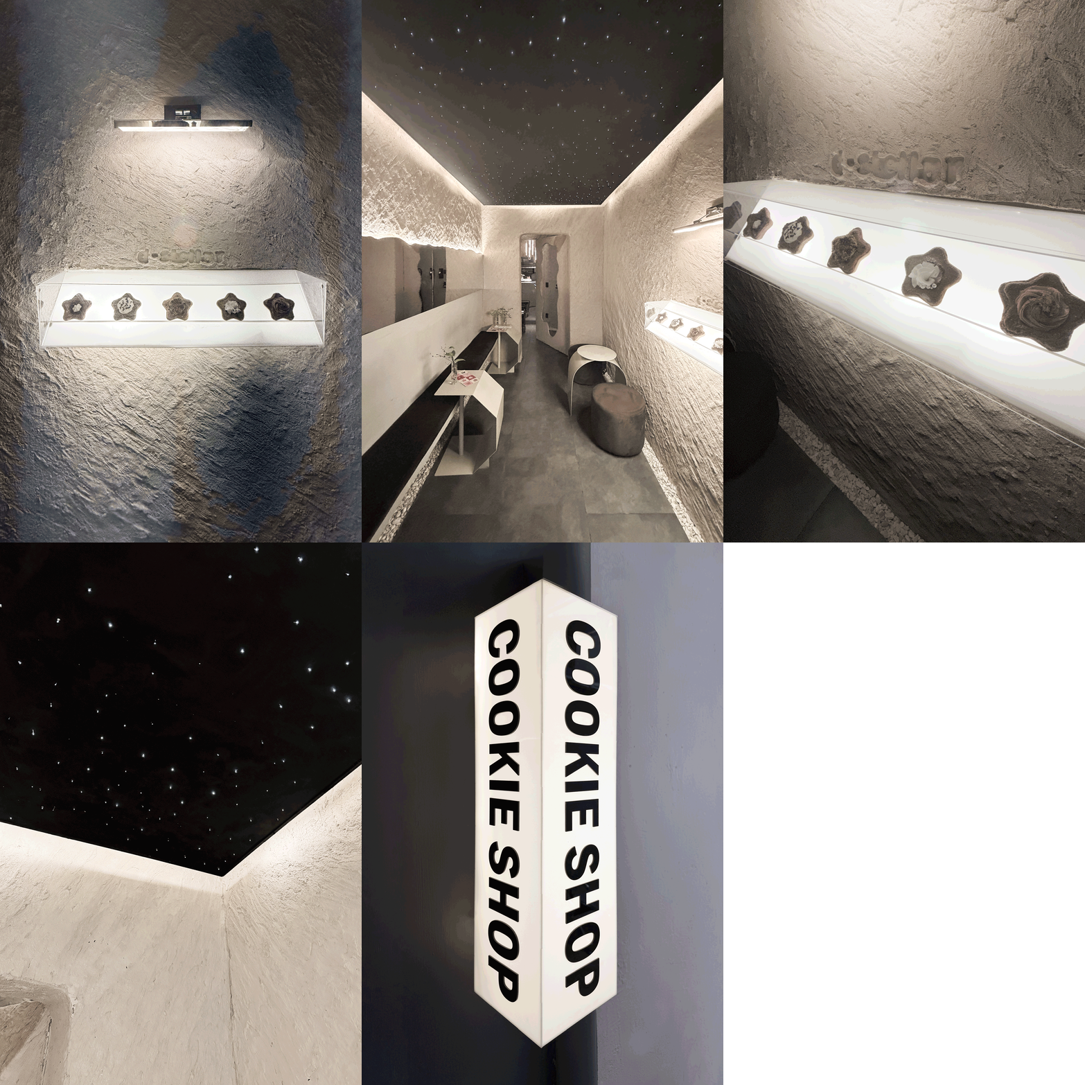
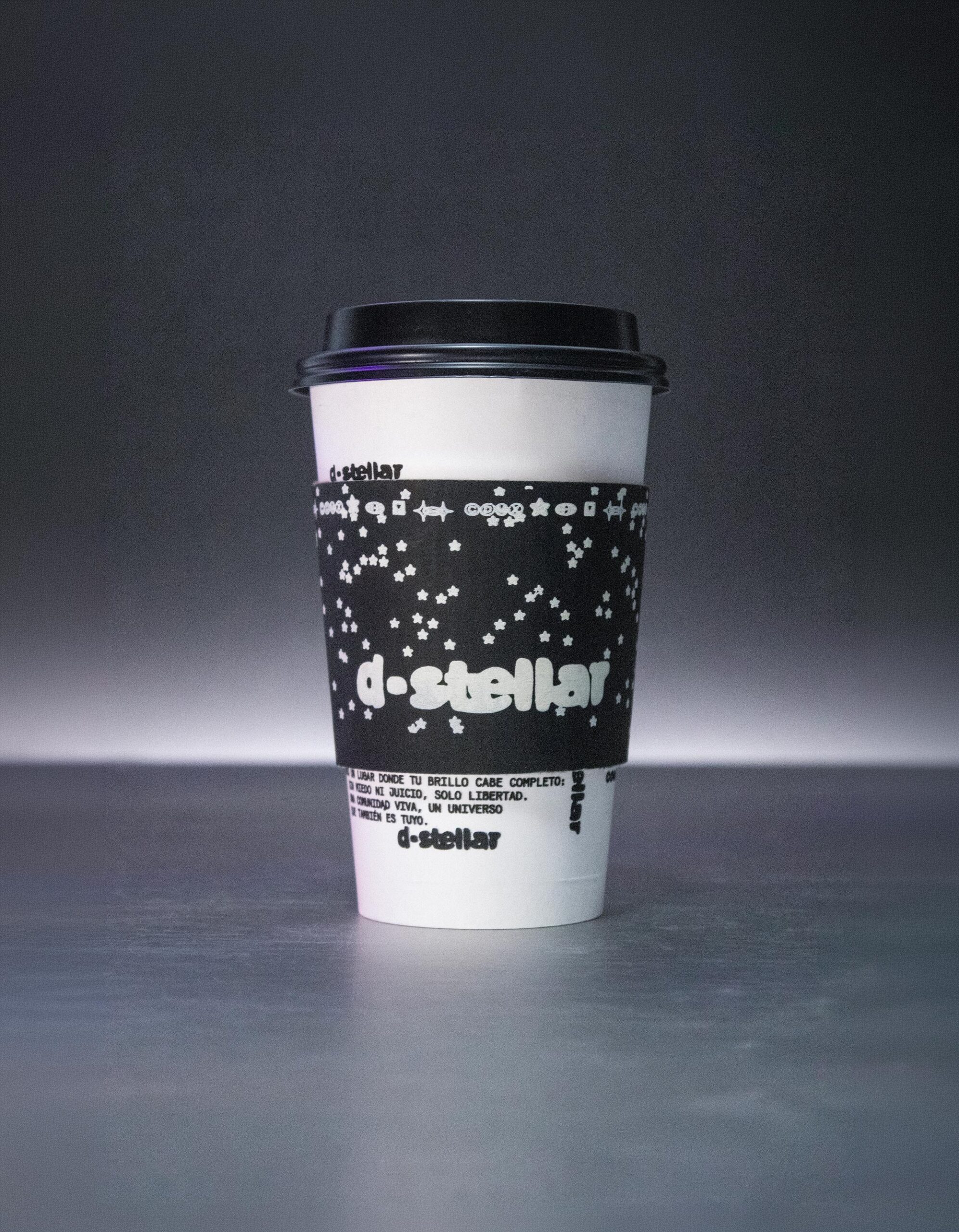
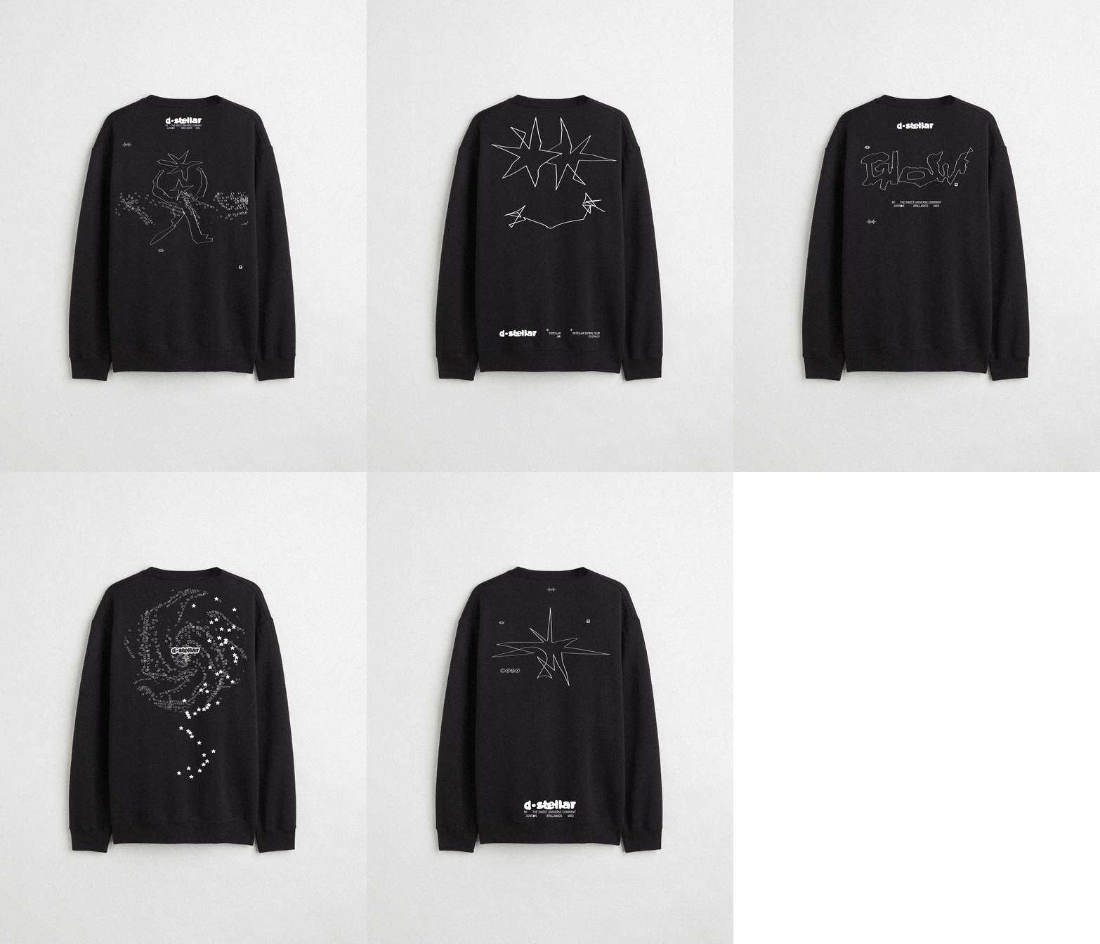
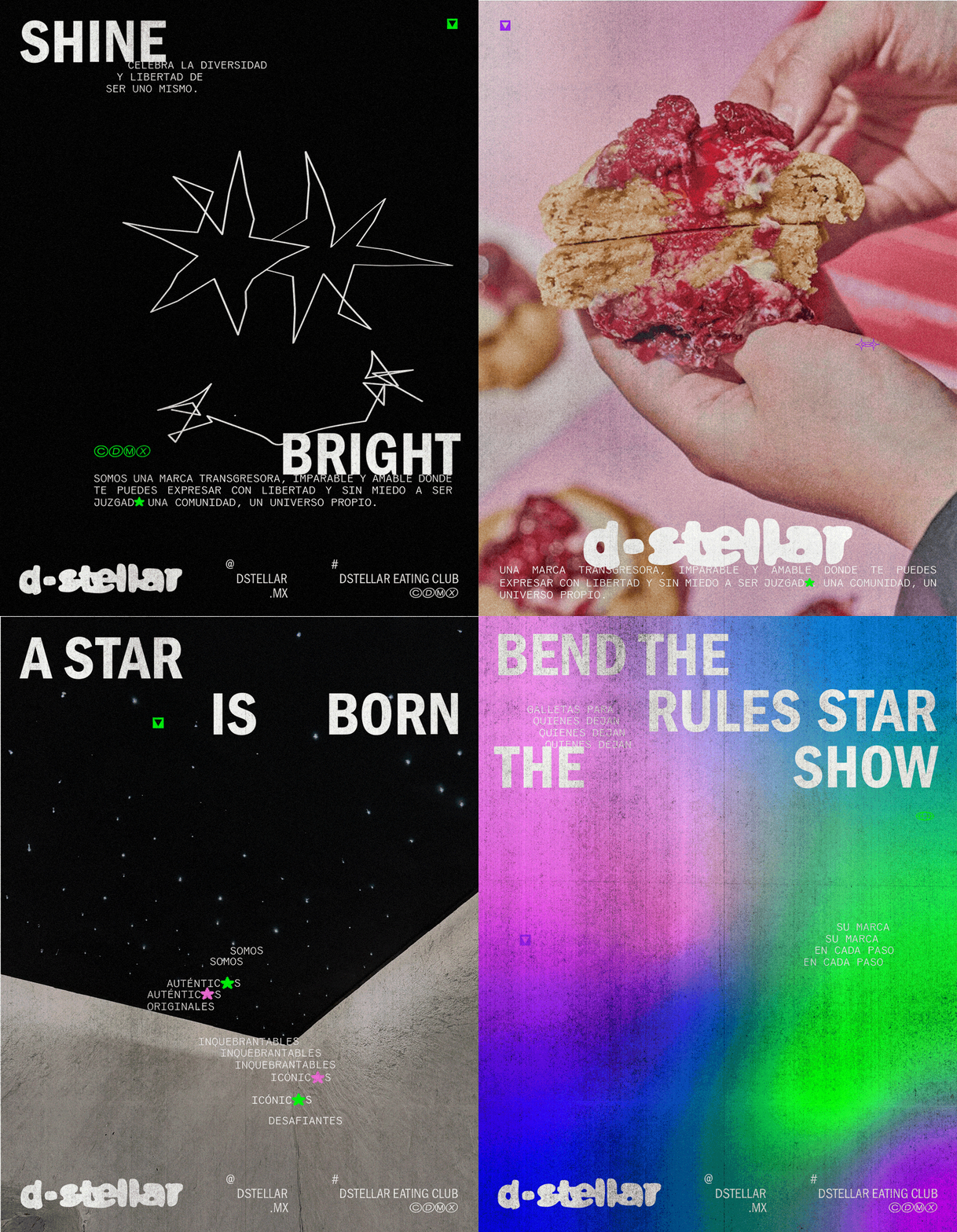
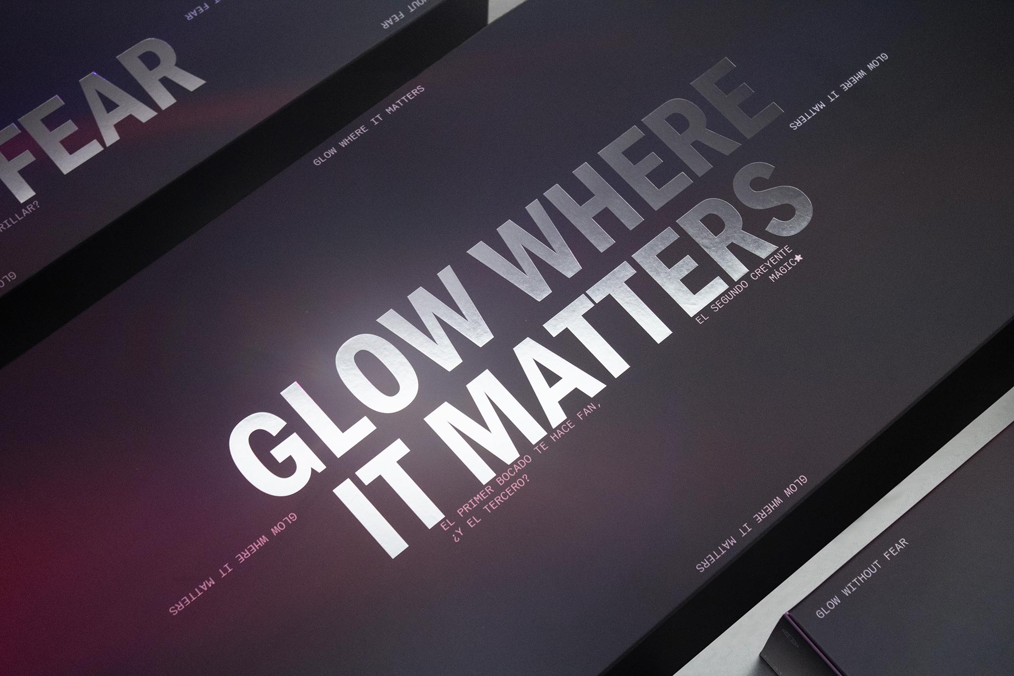
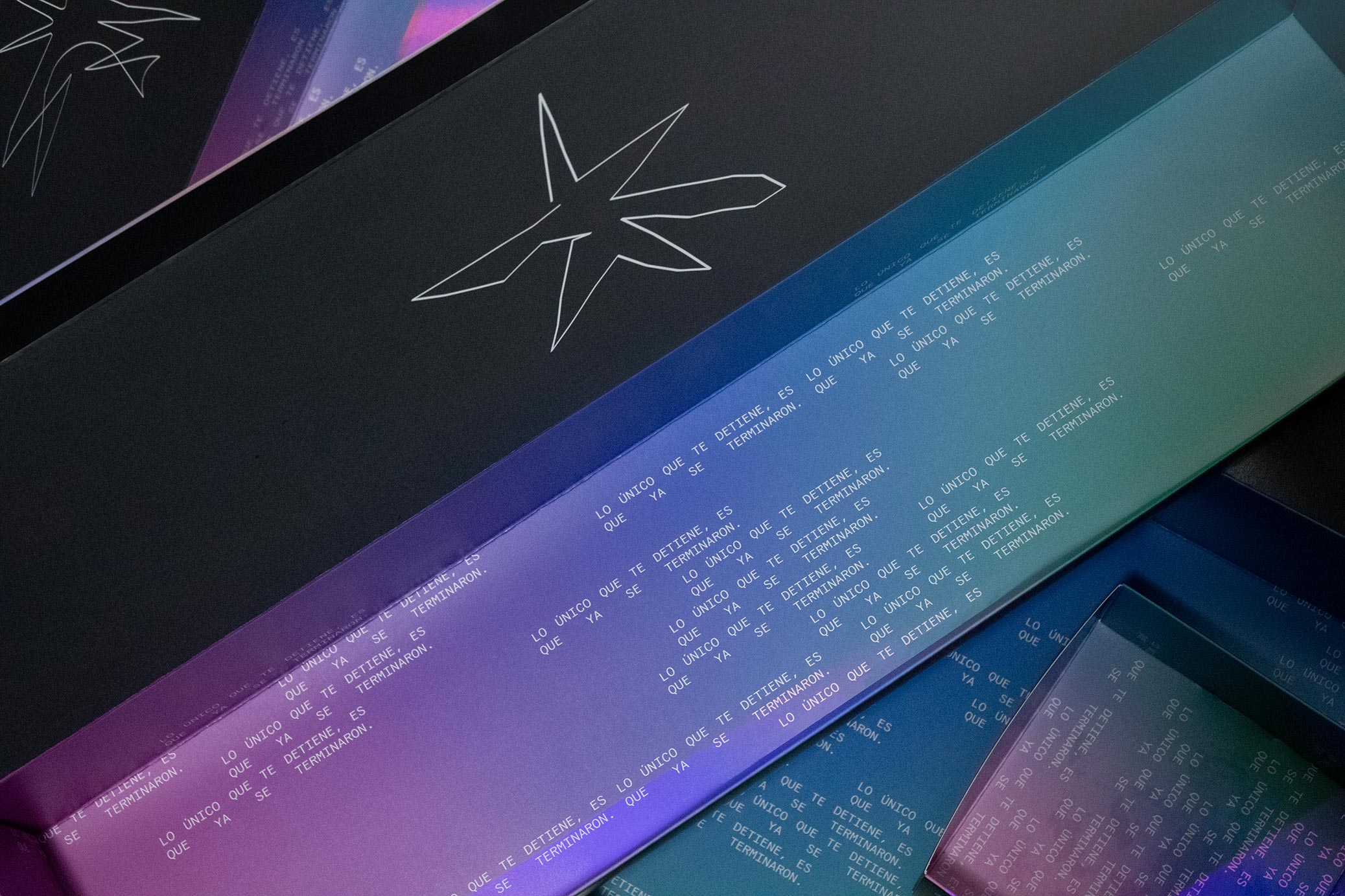
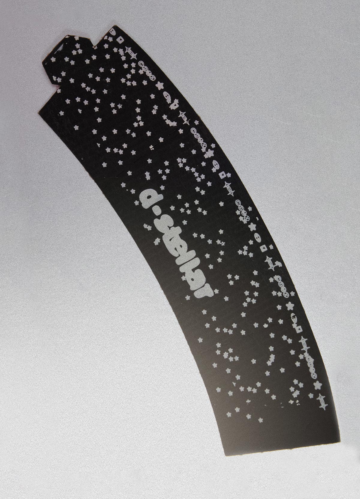
D-stellar is a cookie brand where the product is just the excuse. The real offer is a safe, judgment-free space to belong. The concept is built entirely around the life cycle of a star: nebulae, birth, expansion, collapse, light. That cosmic logic runs through everything, from a color palette drawn from nebula gases and cosmic microwave radiation, to a silver, reflective finish that echoes the metallic surfaces of spacecraft and satellites.
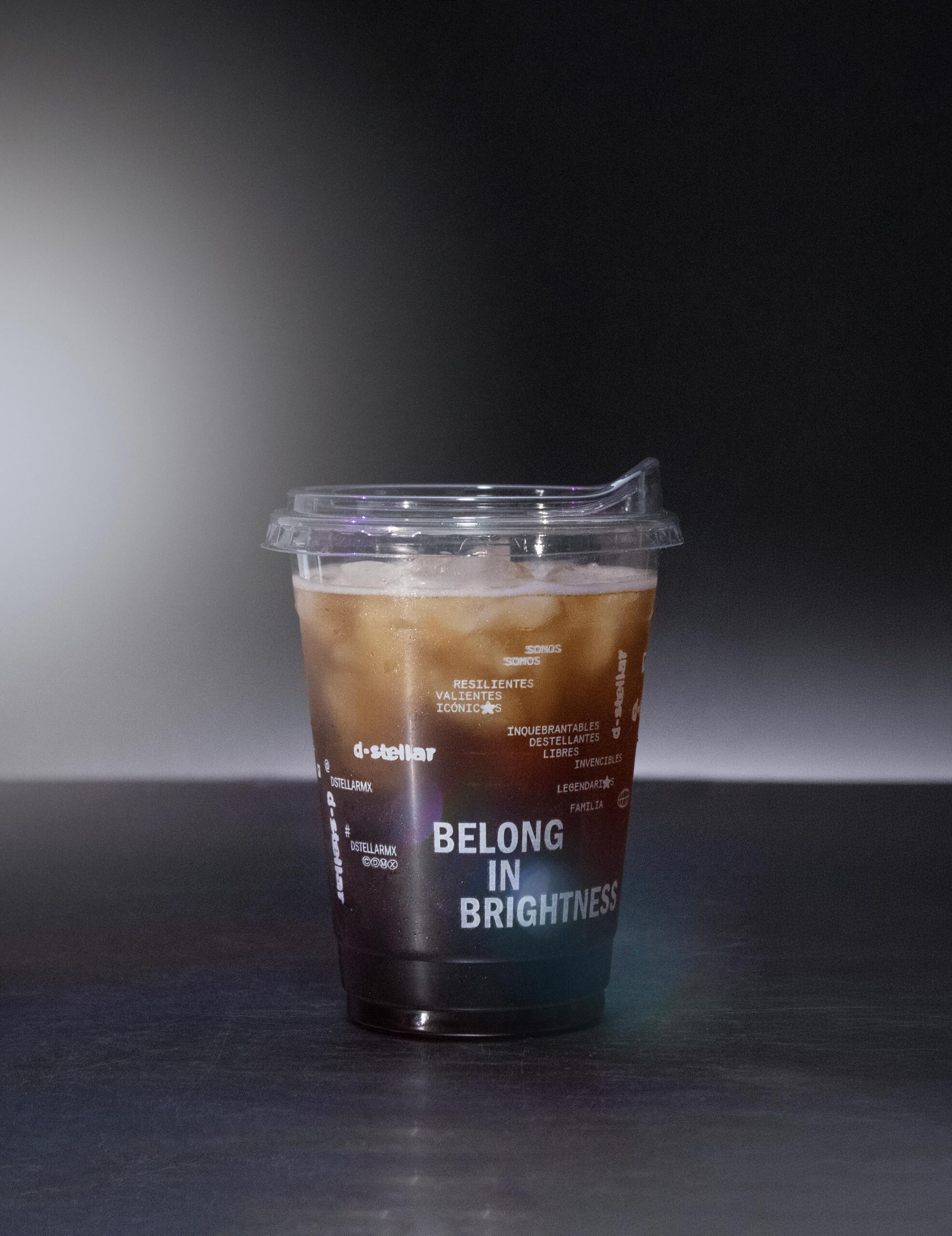
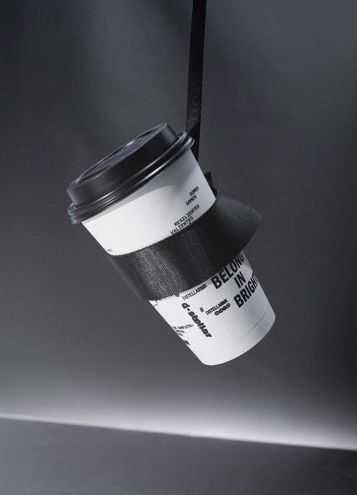
The identity leans disruptive on purpose. Typography behaves like a constellation, letters spaced out, gravitating toward each other, echoing that same sense of expansion. The logo follows the same logic: characters that stretch and pull apart, as if the universe itself were still expanding.
At its core, D-stellar speaks for people who’ve rarely had a place to shine. Bold, inclusive, unapologetically itself. A brand, and a community, with its own gravity.