BRADA IS A GRAPHIC DESIGN STUDIO SPECIALIZED IN BRANDING. IF YOU WANT TO CONTACT US PLEASE FEEL FREE TO SEND US AN EMAIL TO INFO@BRADA.CO OR CHECK OUR CONTACT SECTION.
BRADA IS A GRAPHIC DESIGN STUDIO SPECIALIZED IN BRANDING. IF YOU WANT TO CONTACT US PLEASE FEEL FREE TO SEND US AN EMAIL TO INFO@BRADA.CO OR CHECK OUR CONTACT SECTION.
BRADA IS A GRAPHIC DESIGN STUDIO SPECIALIZED IN BRANDING. IF YOU WANT TO CONTACT US PLEASE FEEL FREE TO SEND US AN EMAIL TO INFO@BRADA.CO OR CHECK OUR CONTACT SECTION.
BRADA IS A GRAPHIC DESIGN STUDIO SPECIALIZED IN BRANDING. IF YOU WANT TO CONTACT US PLEASE FEEL FREE TO SEND US AN EMAIL TO INFO@BRADA.CO OR CHECK OUR CONTACT SECTION.
A brand without limits that crosses the borders of different disciplines and products. A mix between classic and contemporary. Between conservative and bold.
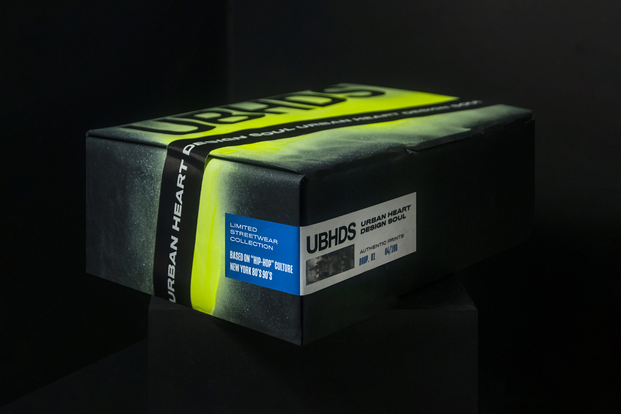
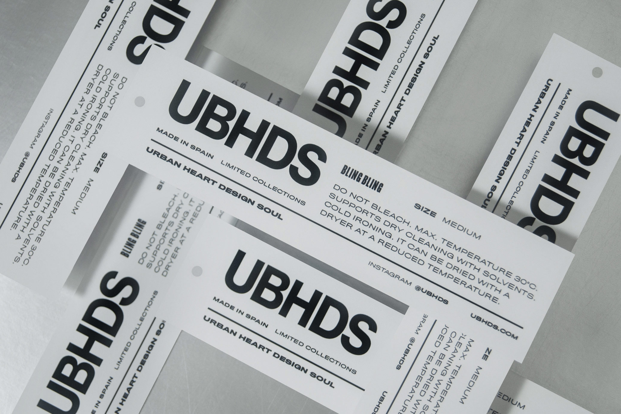
Urban Heart Design Soul is a streetwear label reflecting a sense of unique and extravagant style with limited collections inspired in 80’s hip hop culture.
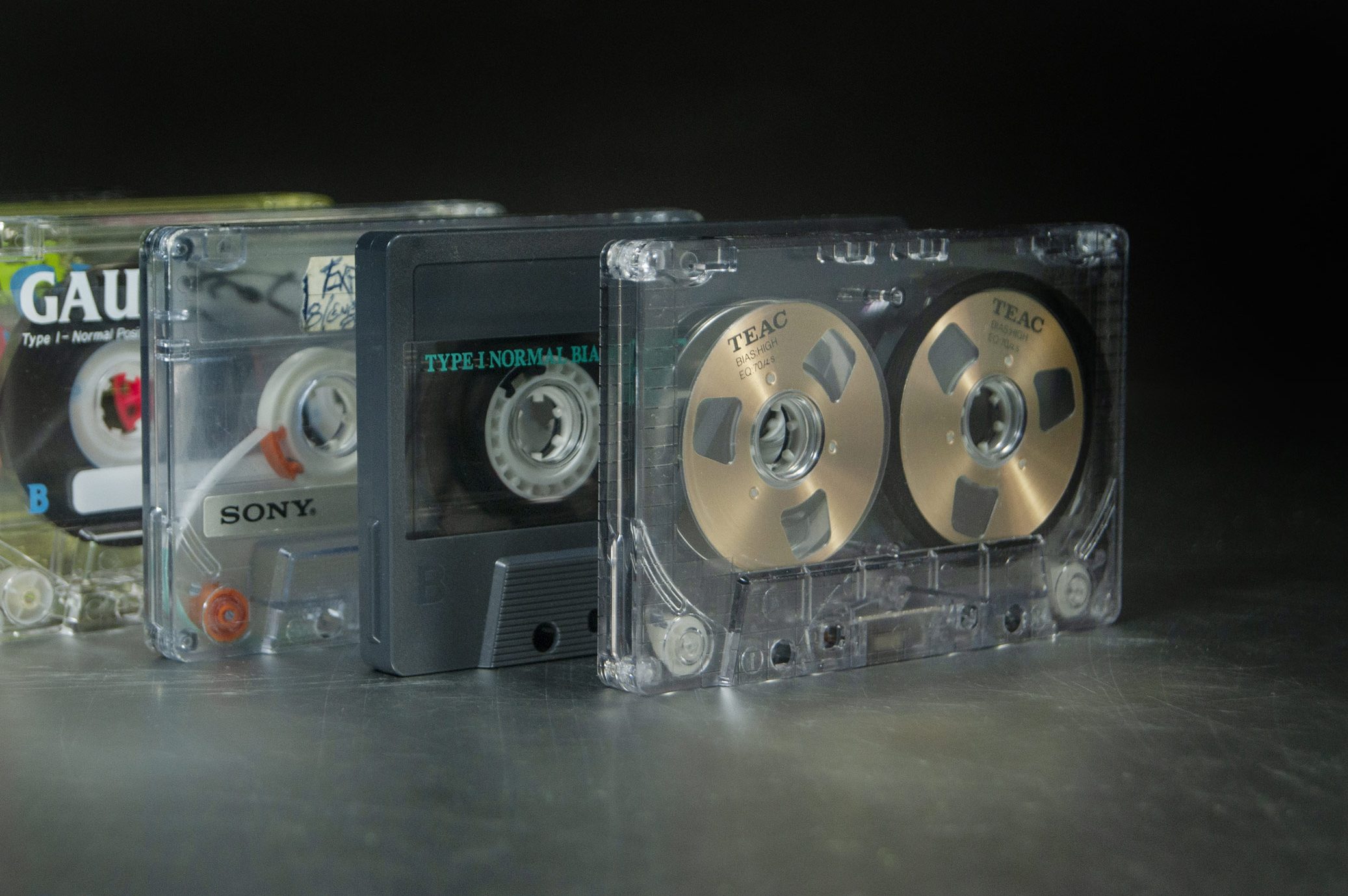
The logo and the compositions allude to the cassette boxes of the time (RUN DMC was the main reference), while the graphic elements recreates the context where the culture lived, such as graffiti and cassettes, complemented with extravagant colors and bright details with the use of foil.
T-shirt illustrations: Ana Cuna for UBHDS. Photos where t-shirts appear are just for illustrative purposes and are property of UBHDS.
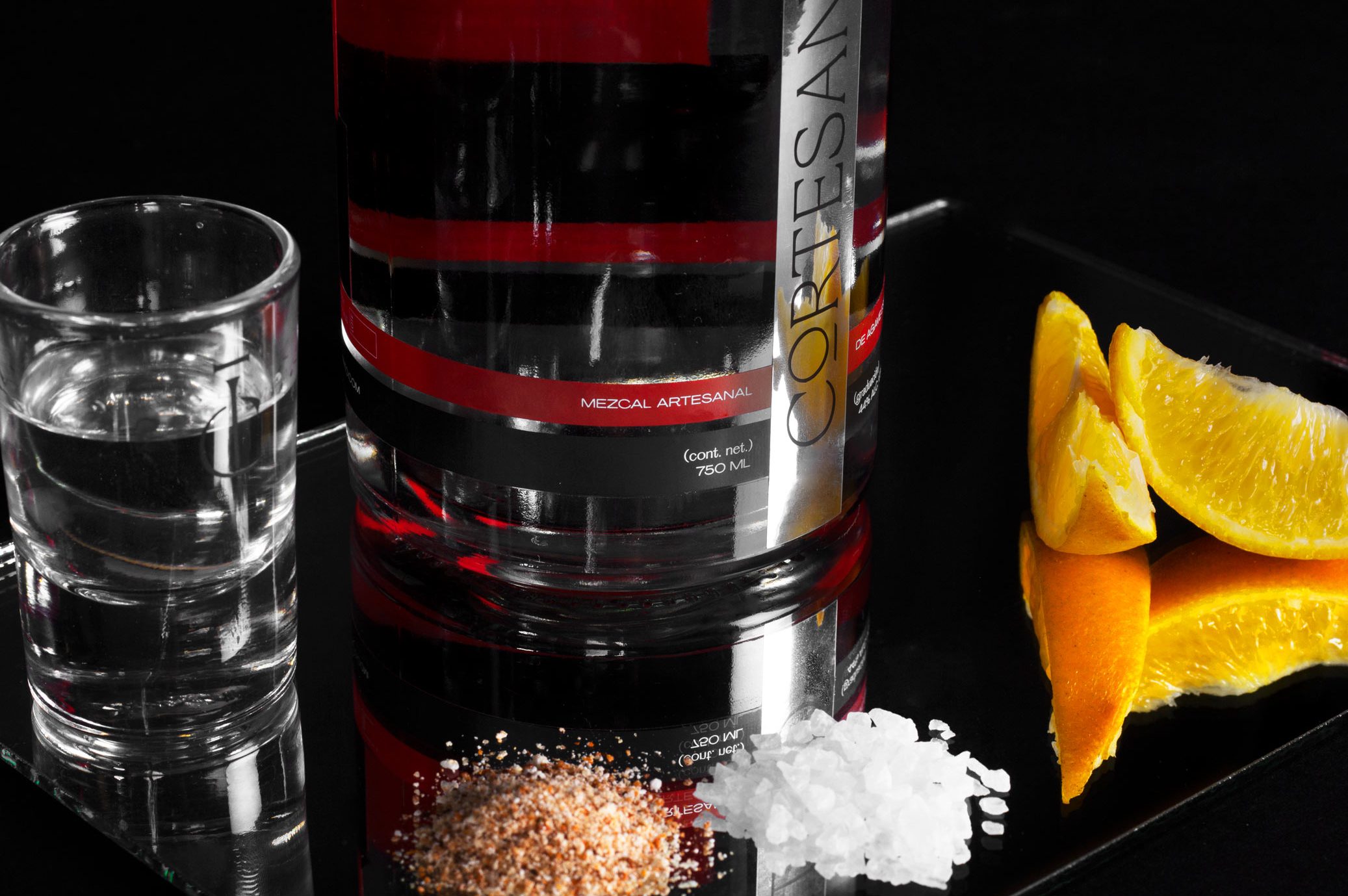
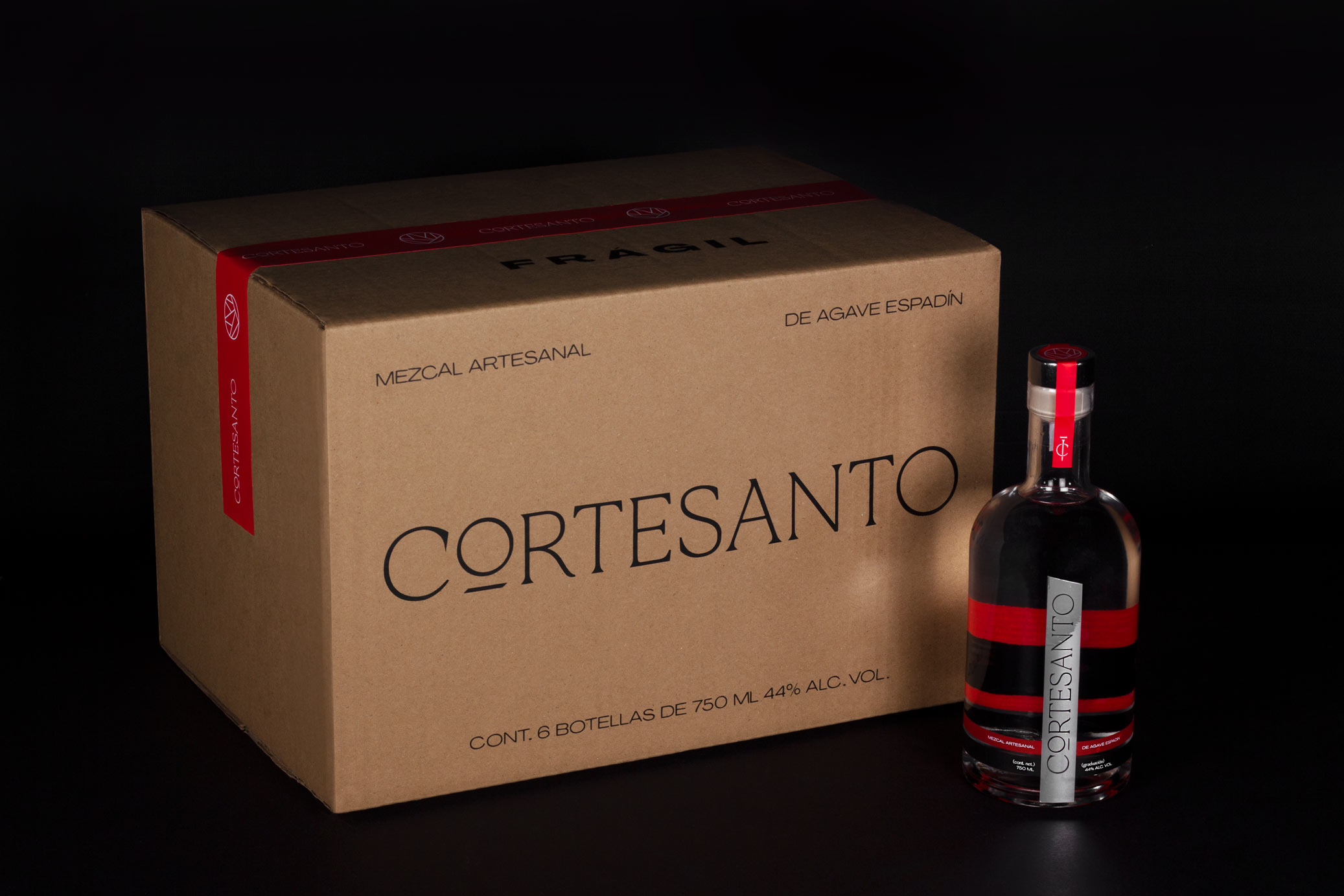
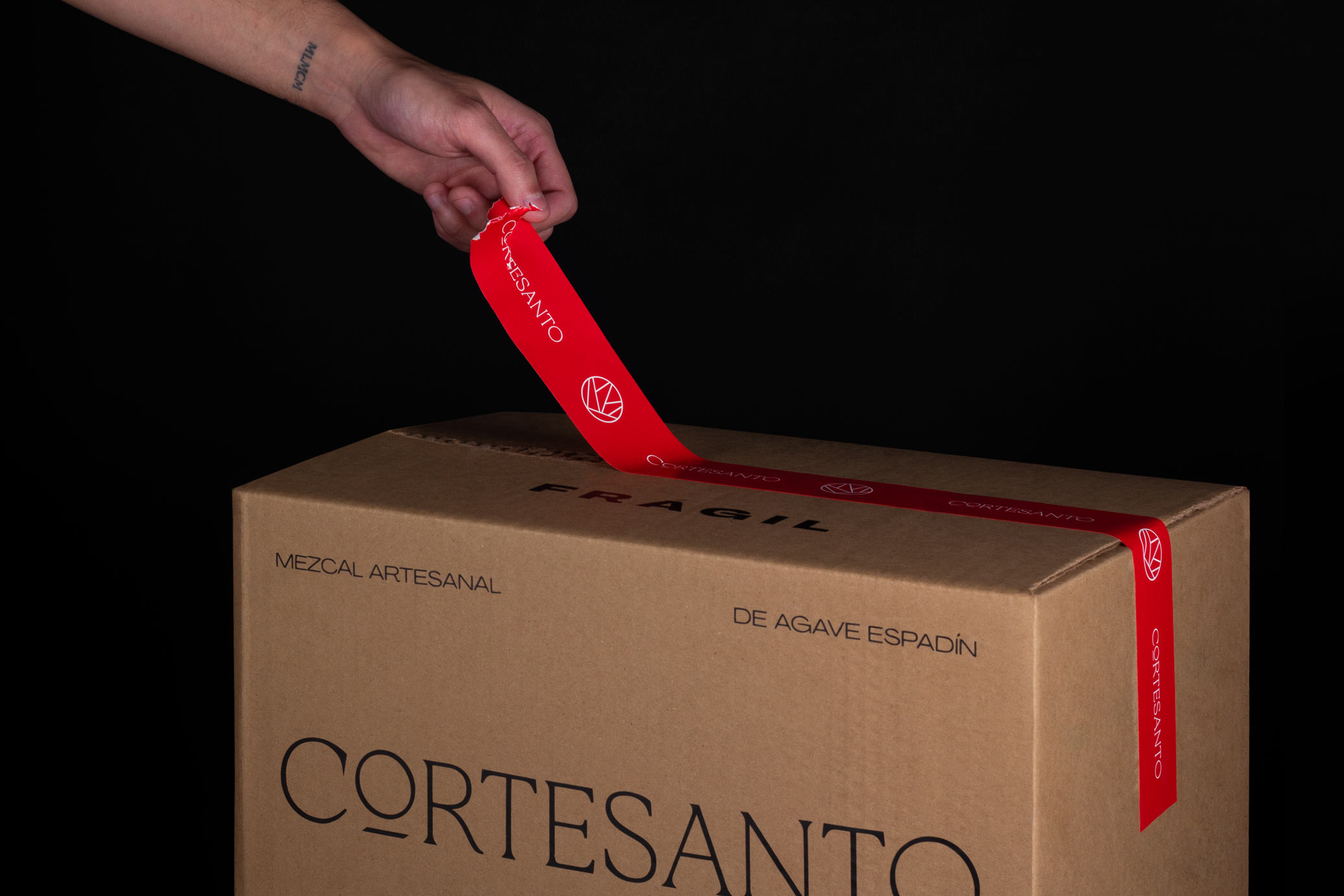
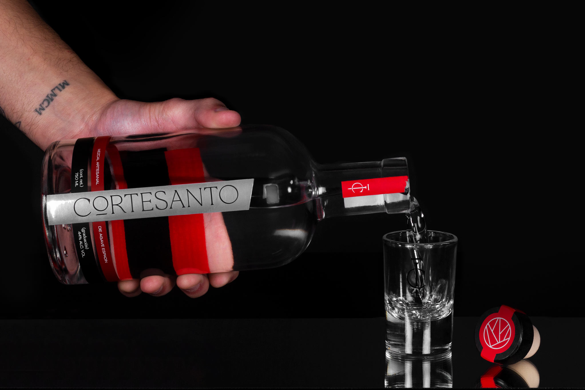
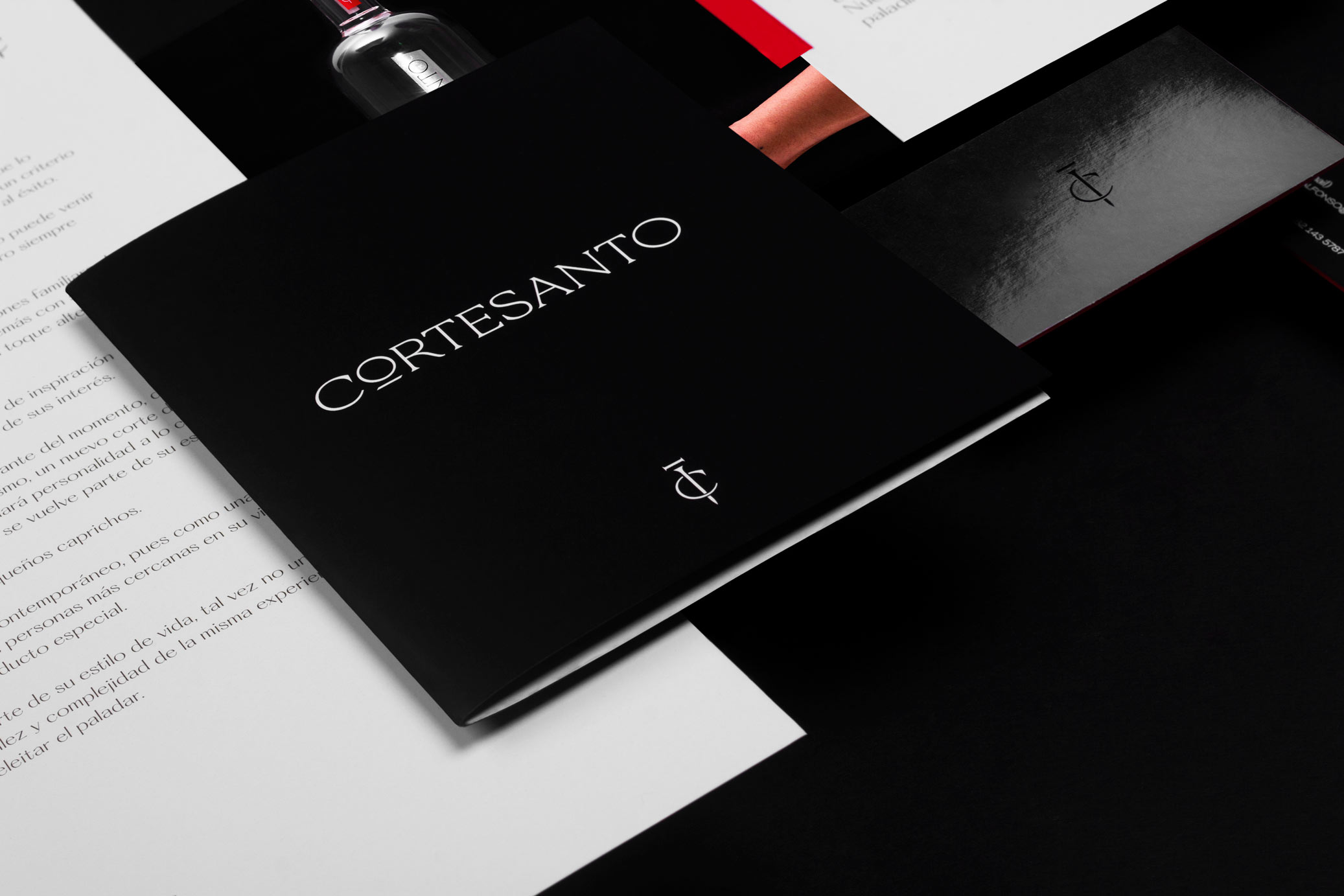
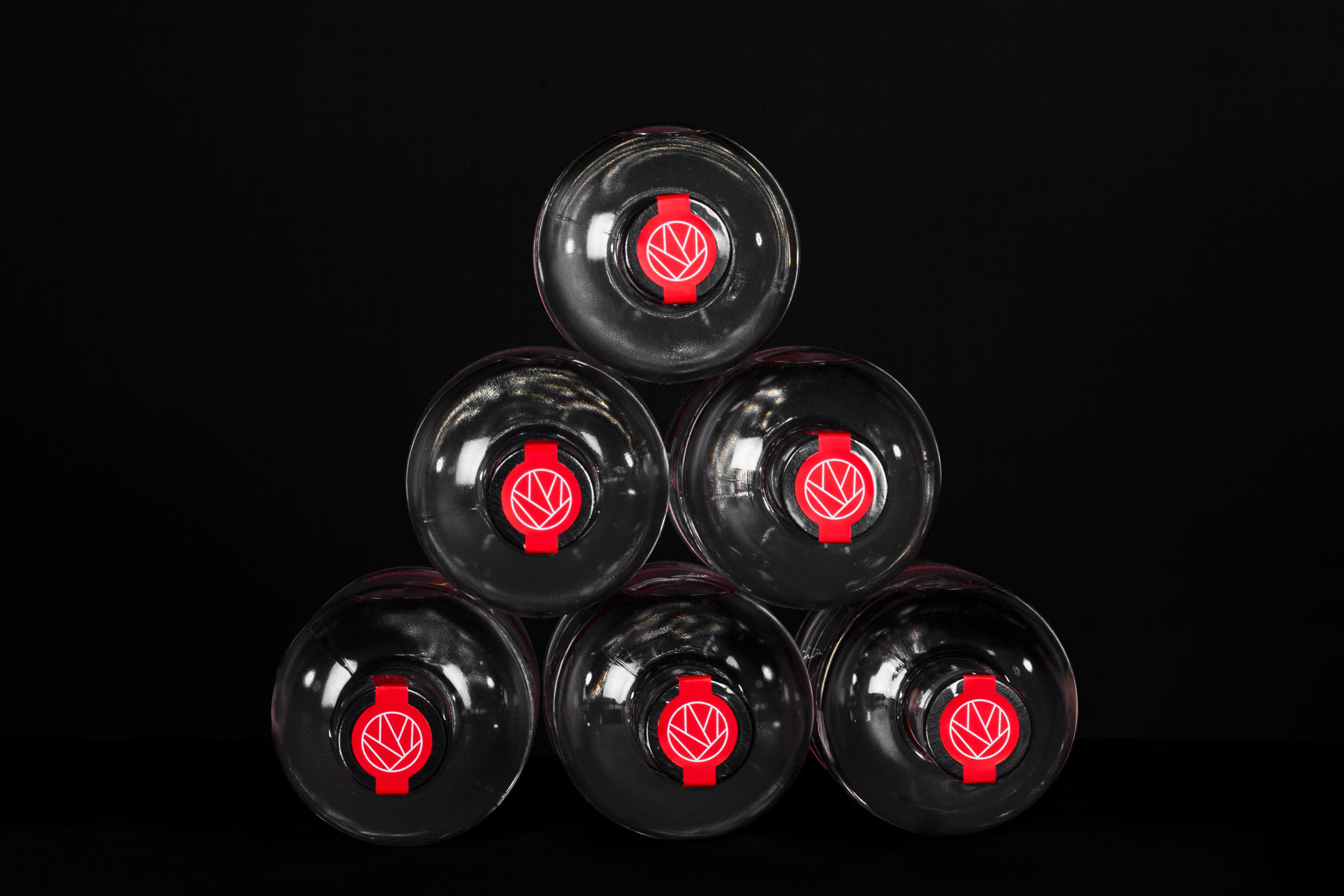
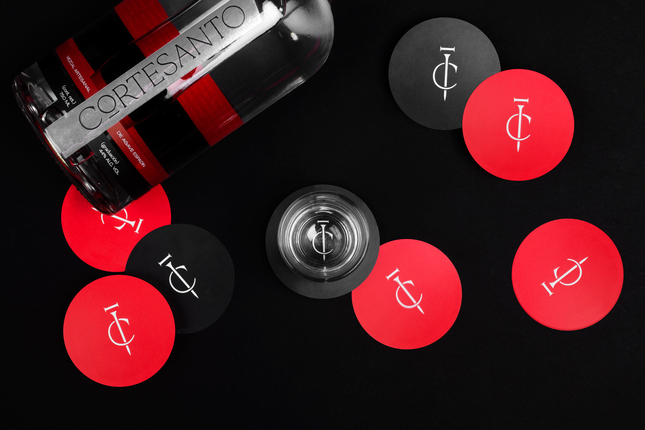
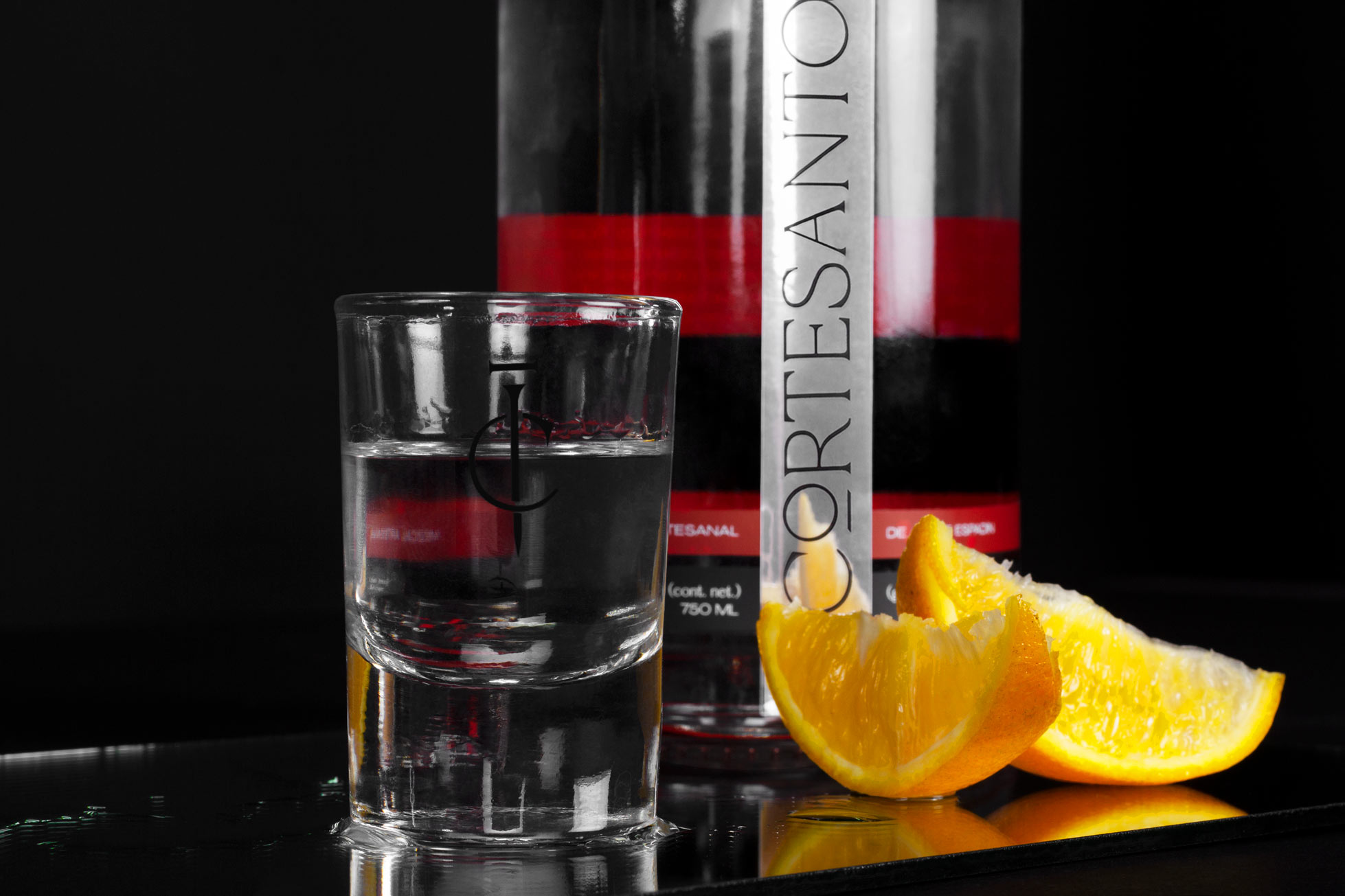
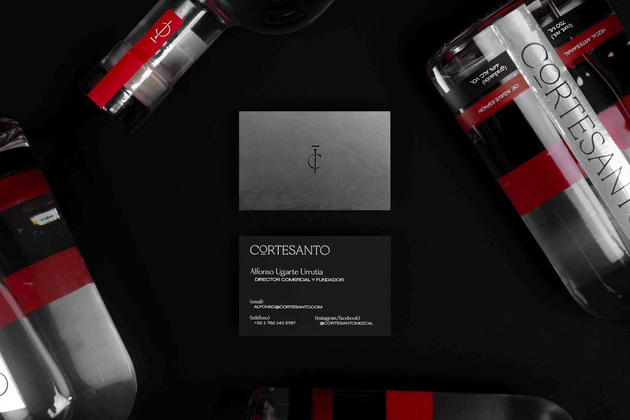
Cortesanto is a premium artisanal mezcal from agave espadín produced in Oaxaca, Mexico. The concept dates back to several centuries ago with the idea of knights and swords. The name comes from the union of the words “Corte” (cut) and “Santo” (holy), because the cut of agave is a key part of the mezcal production process, a drink that was considered holy / sacred by ancient pre-hispanic peoples.
The brand represents the modern knight; the hard-working, dreamer and brave man. For this reason, the graphic was created from the figure of the paladin: that knight distinguished in the war by his brave and noble achievements.
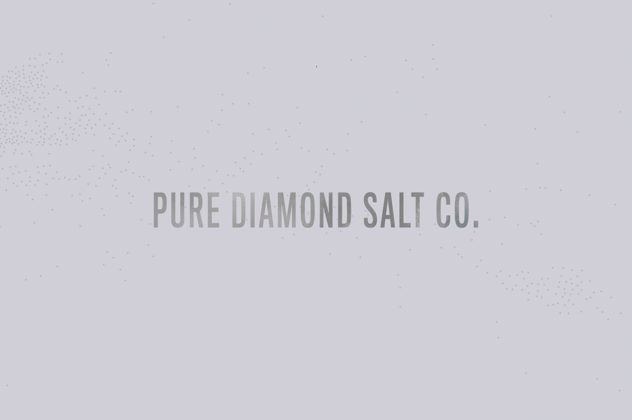
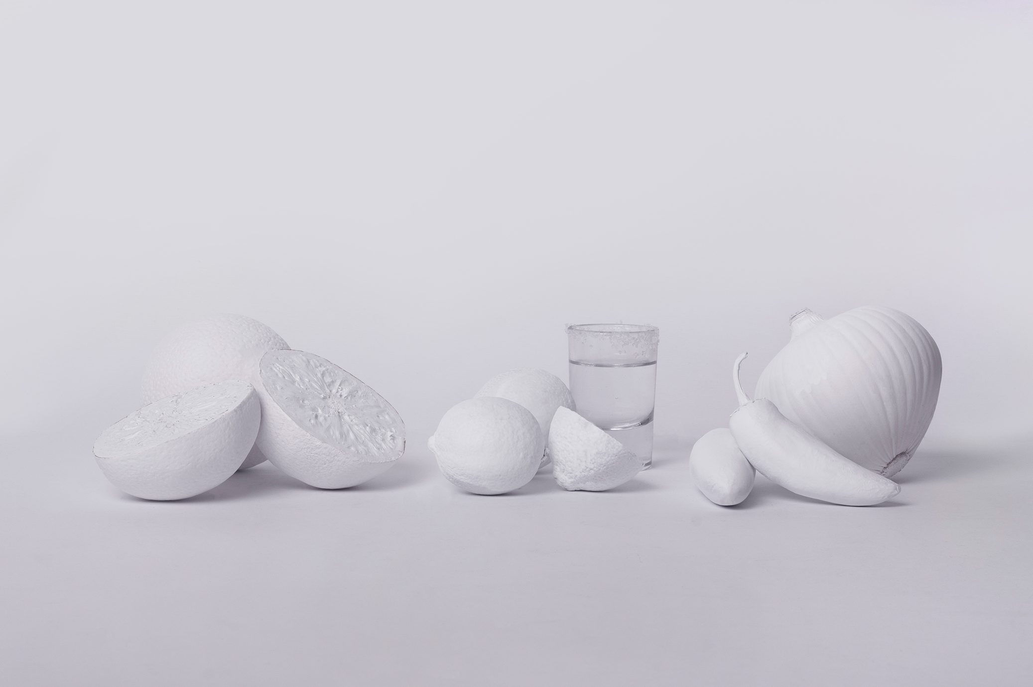
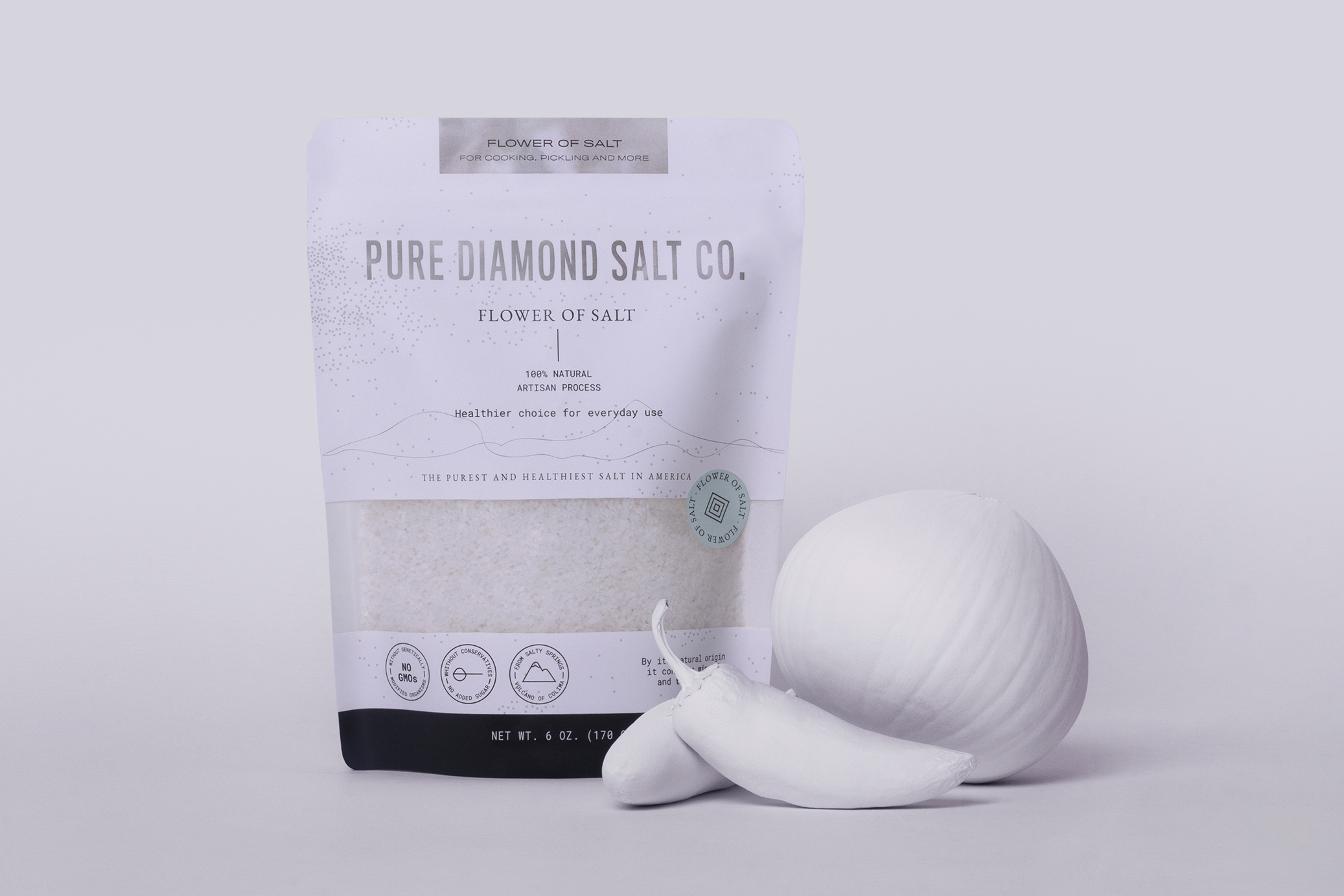
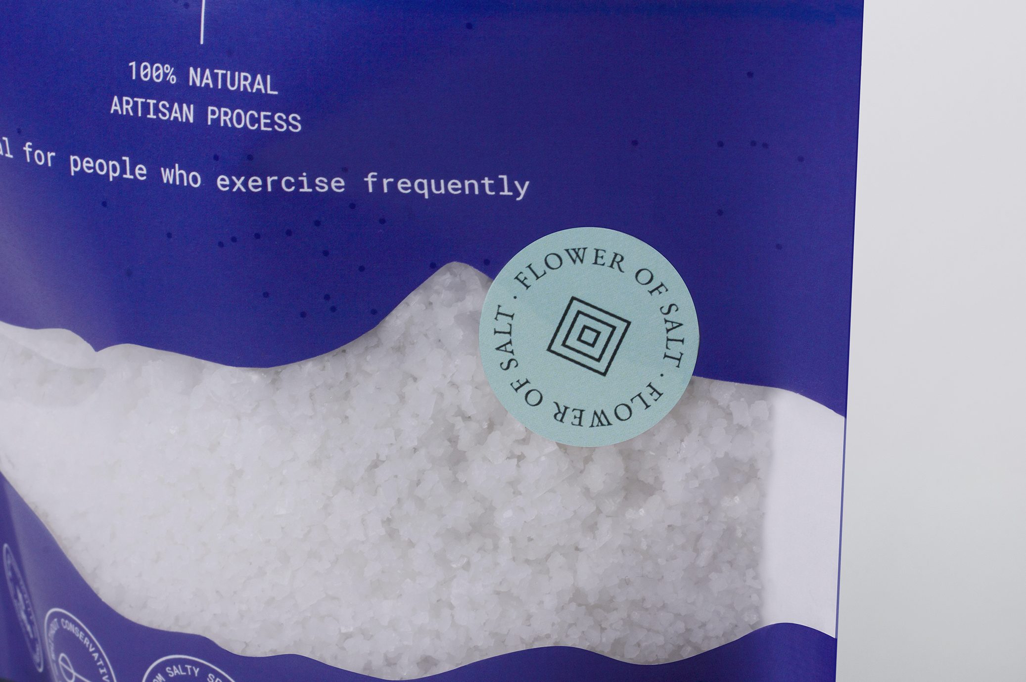
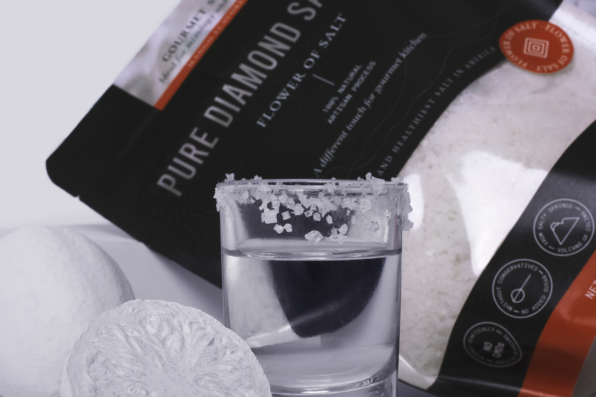
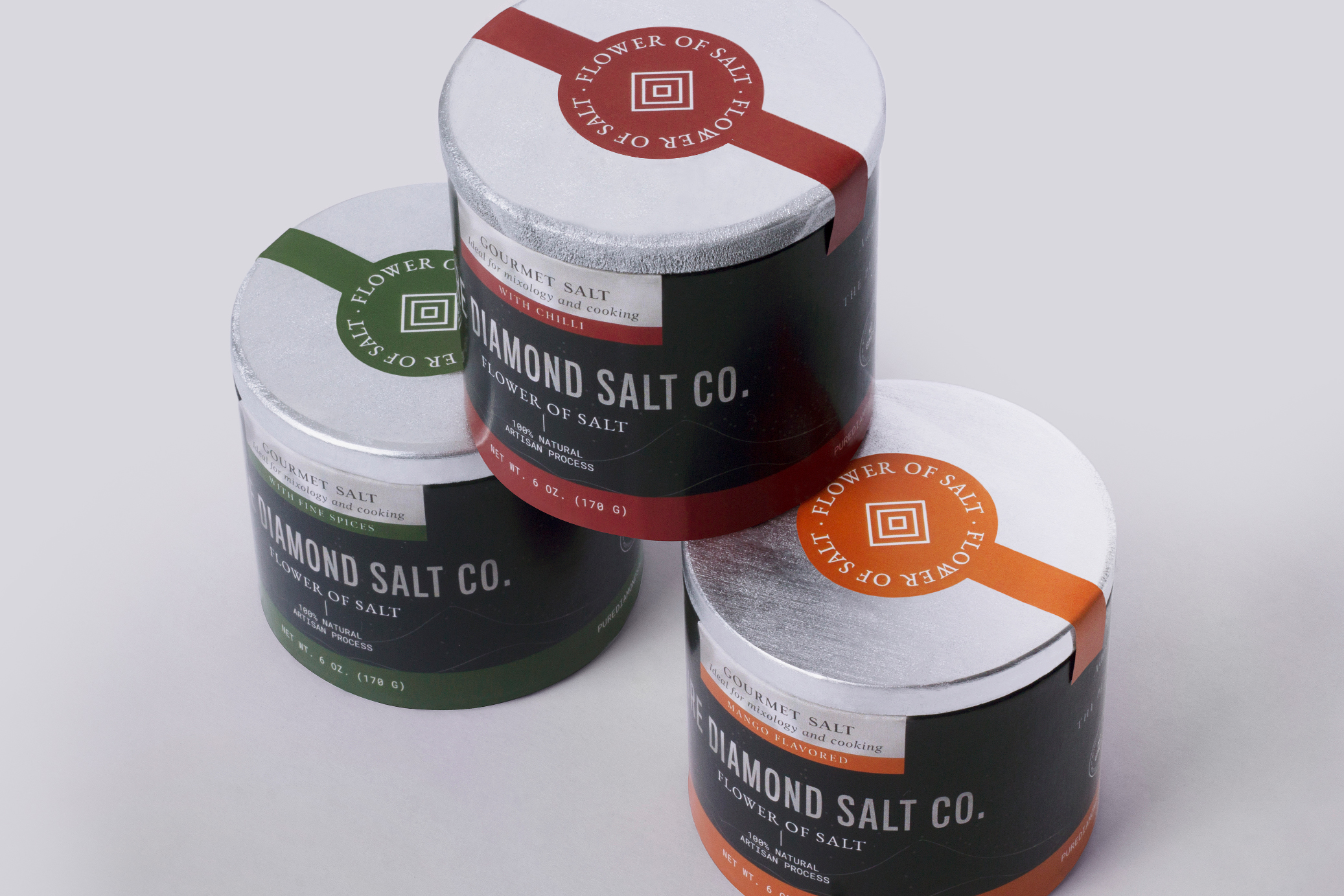
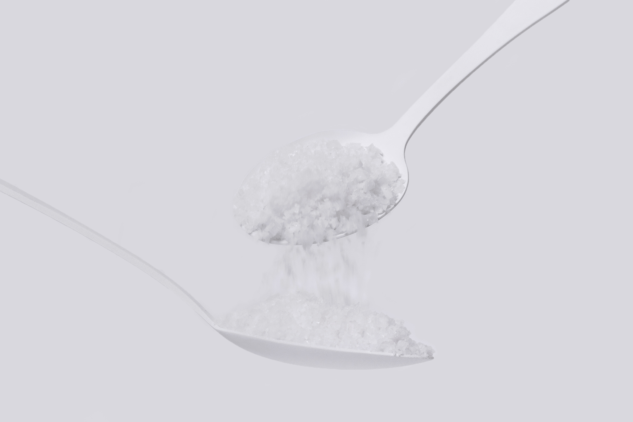
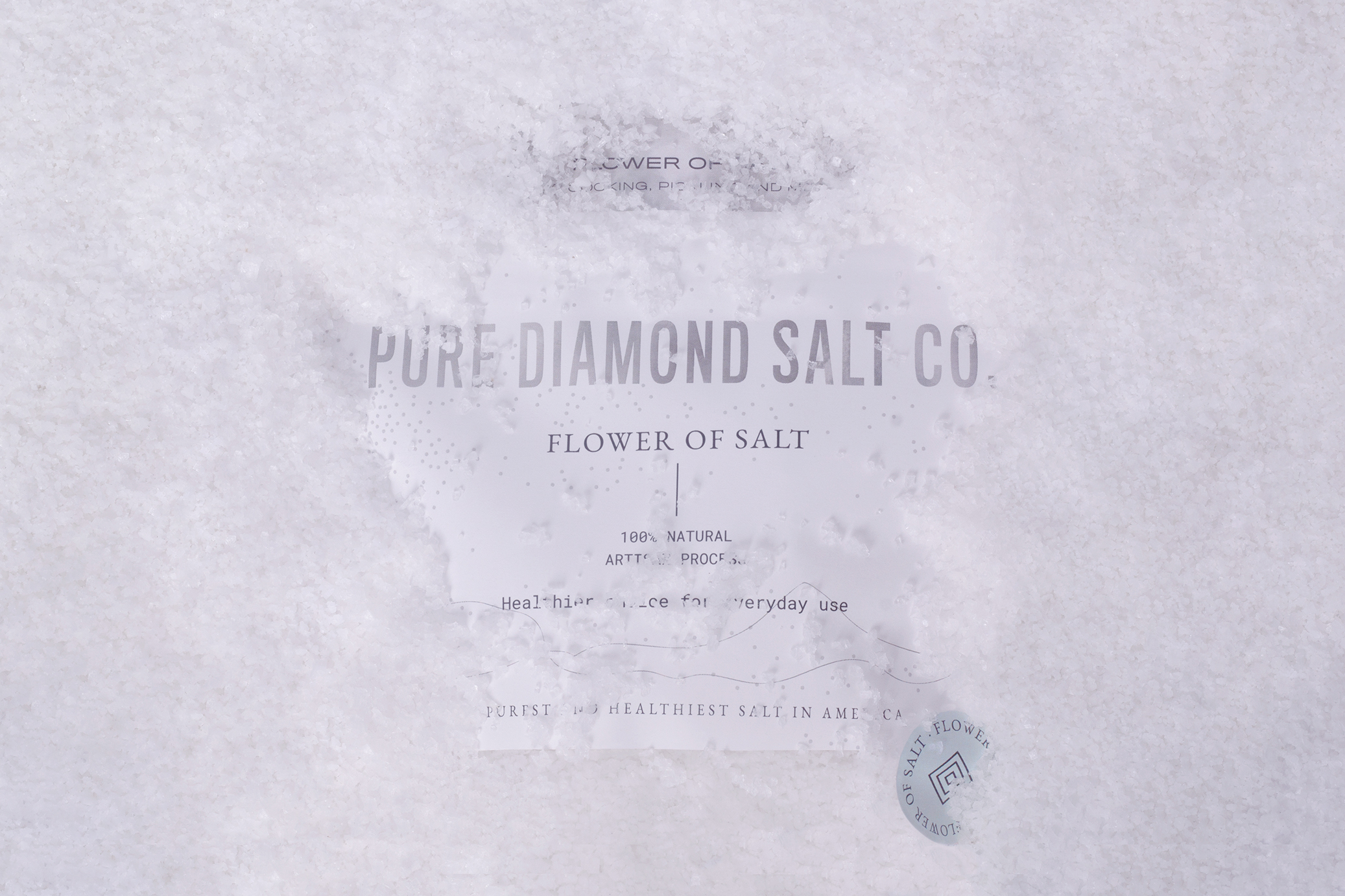
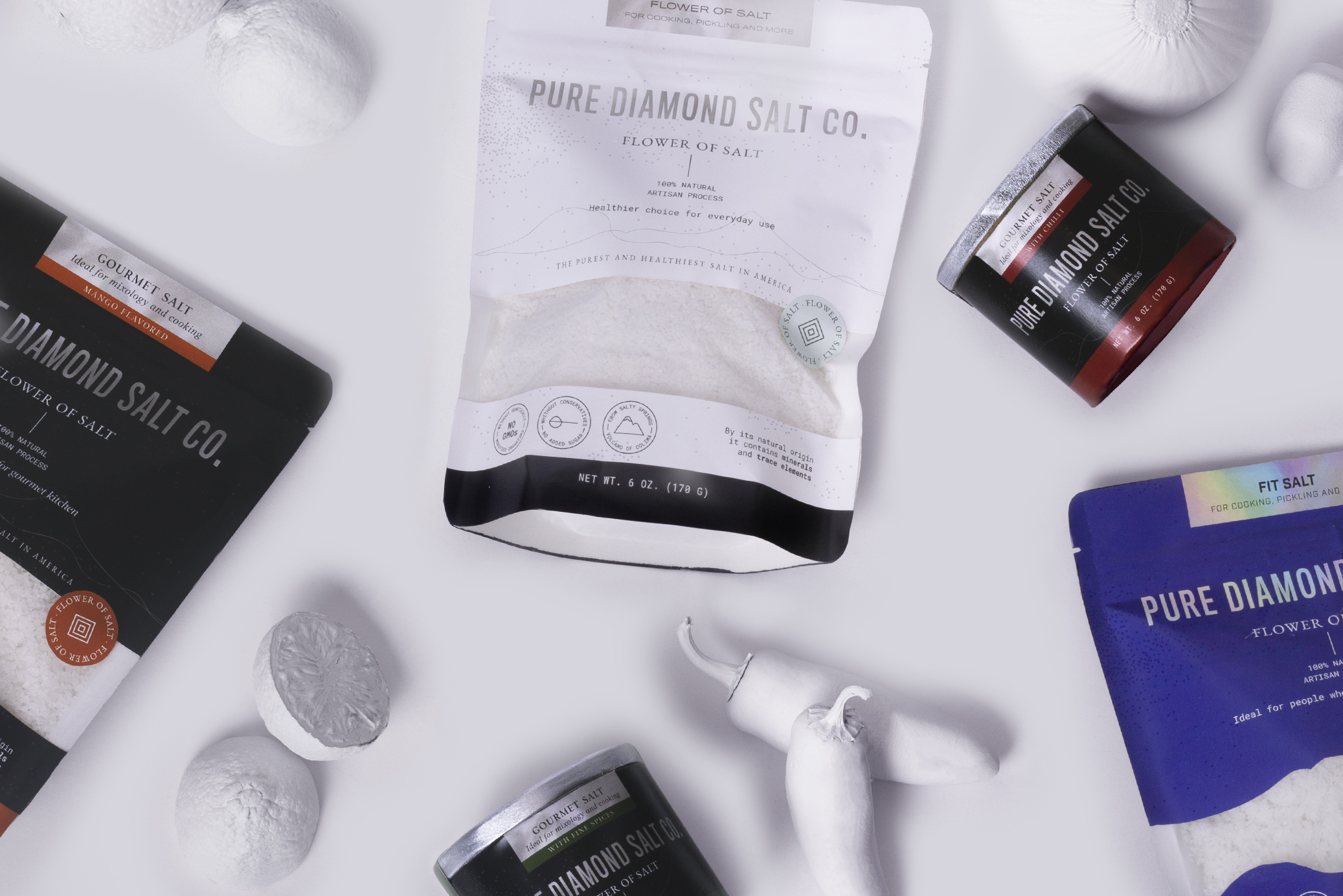
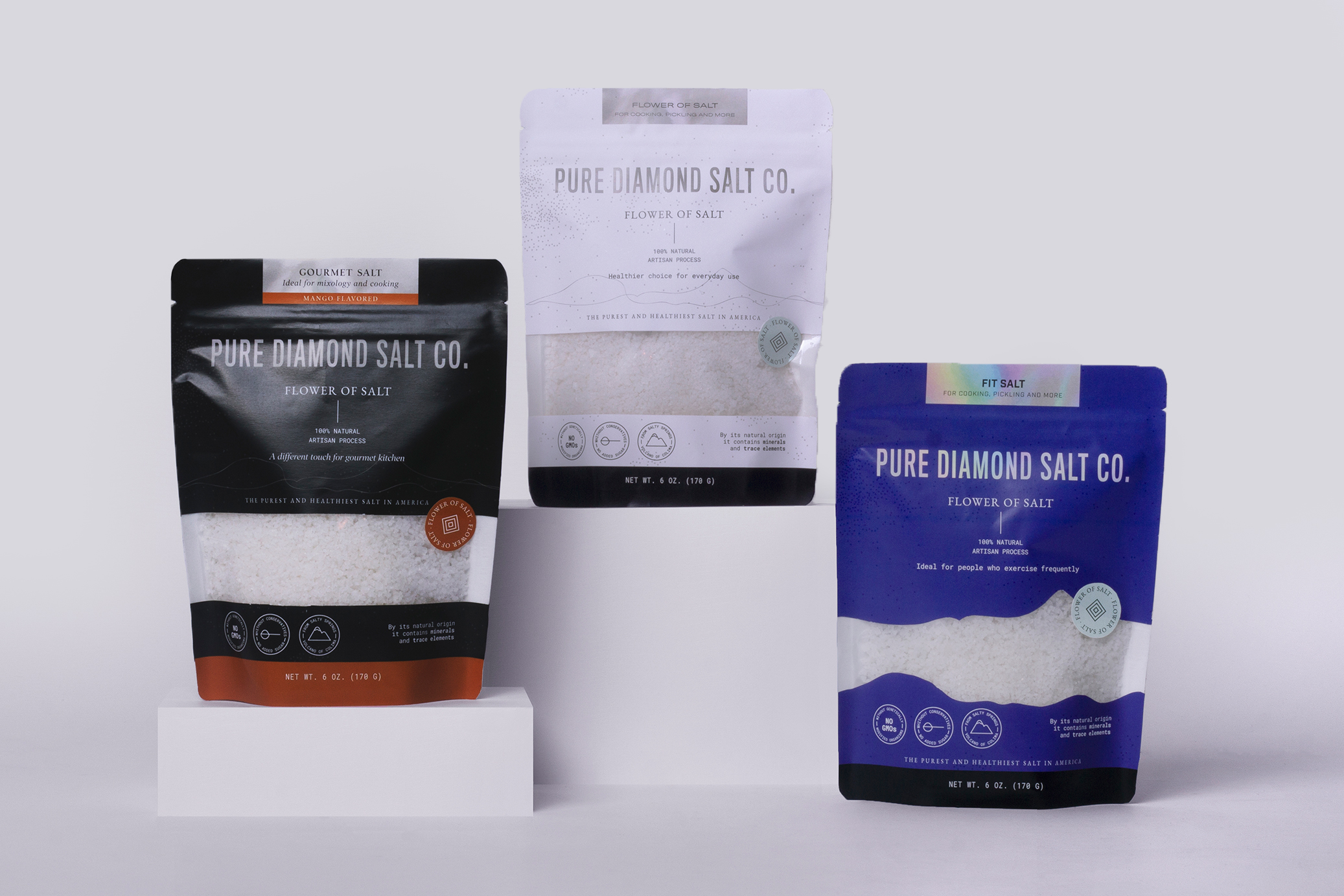
Pure Diamond Salt Co is a flower of salt brand. The product is harvested by hand in Mexico and distributed in the United States. It seeks to highlight the health benefits that this type of salt grants.
Our work started with naming, using purity as the main brand attribute, which is transmitted throughout the graphic line of branding and packaging.
Lines and dots represent traditional craftsmanship of the process of collecting salt, while the colors refer to the purity and brightness reflected by the sun when make contact with the salt mountains.
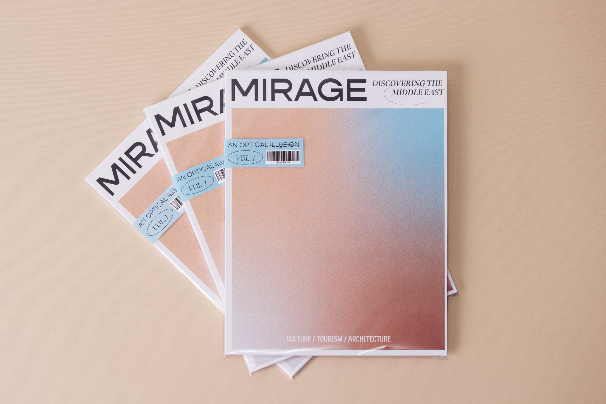
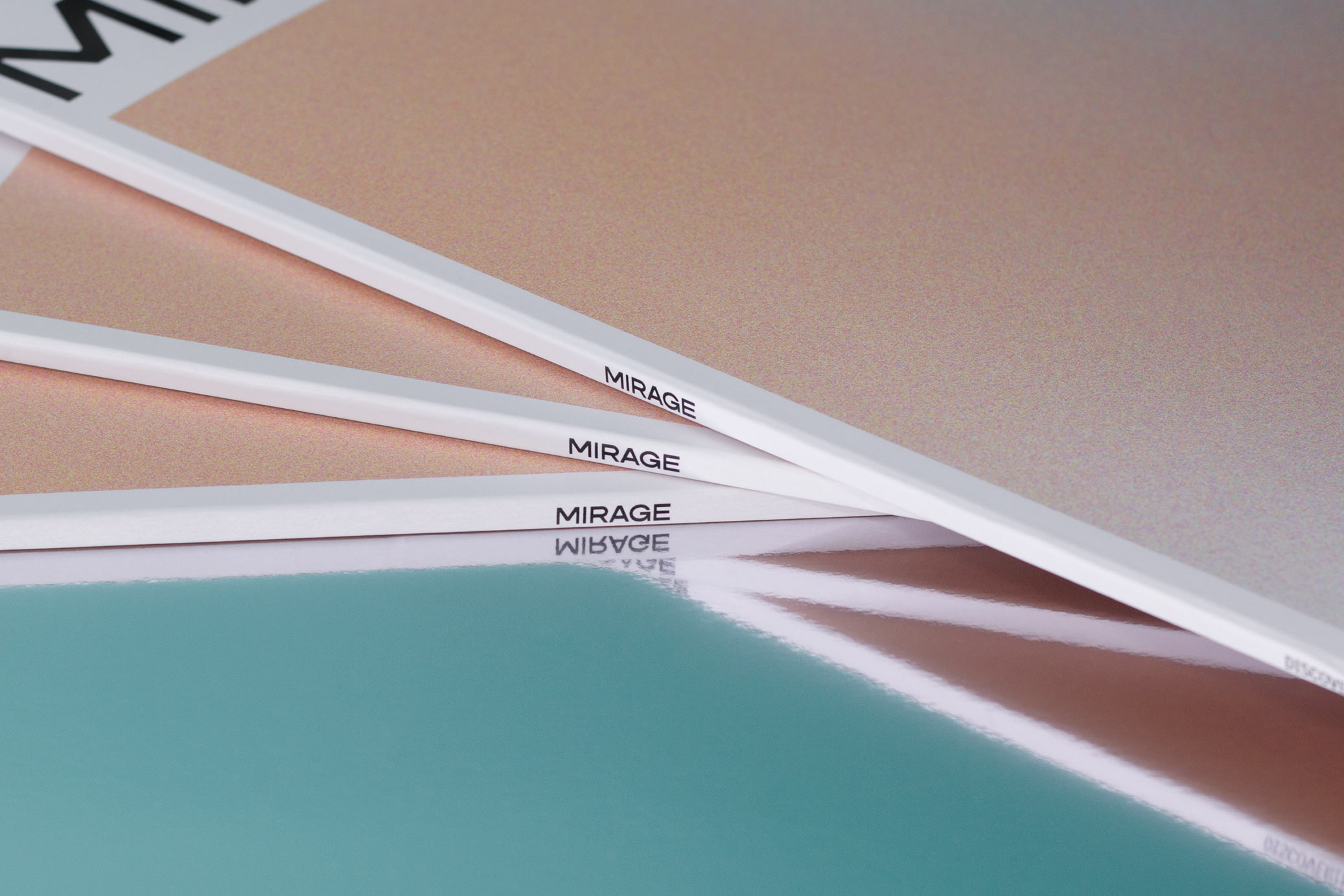
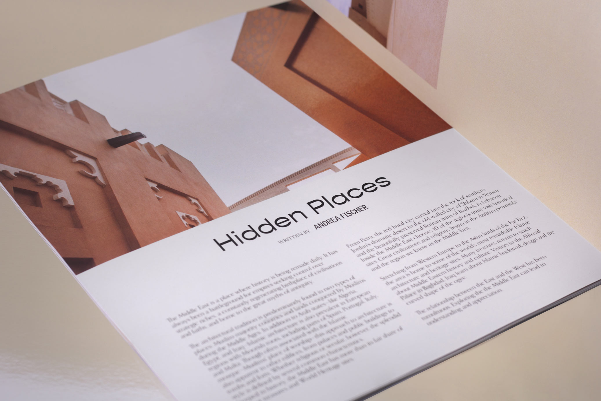
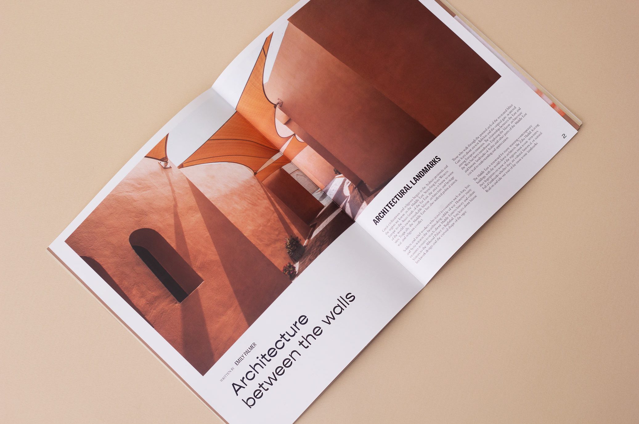
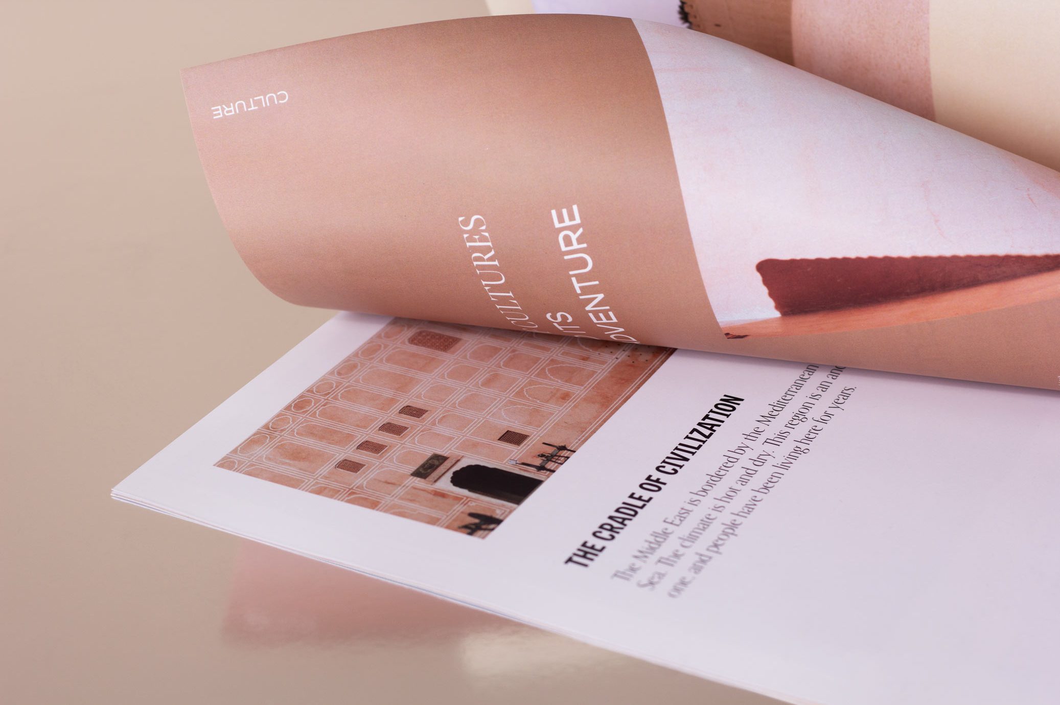
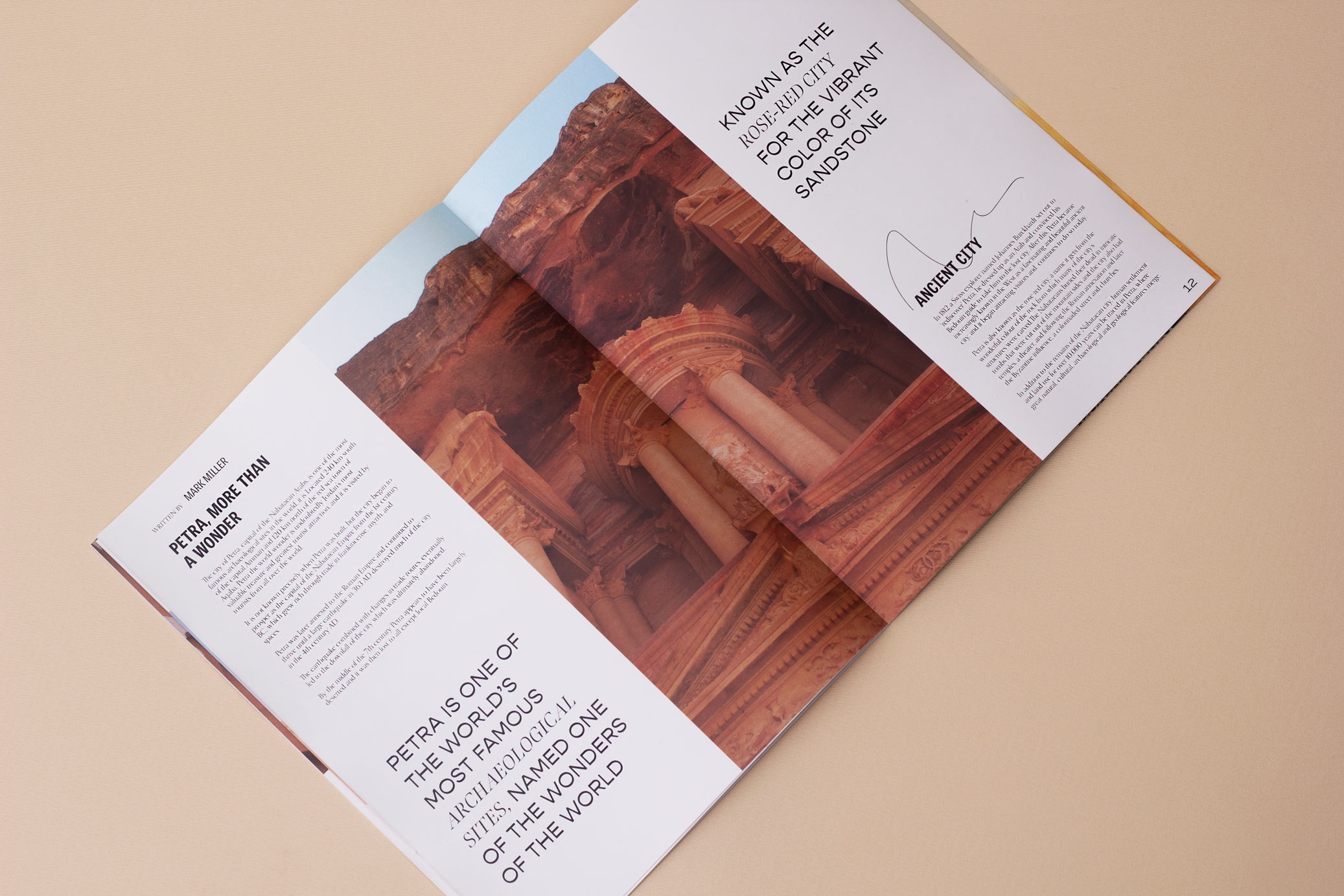
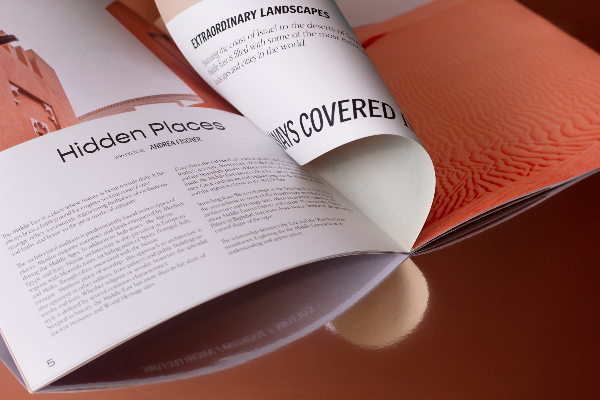
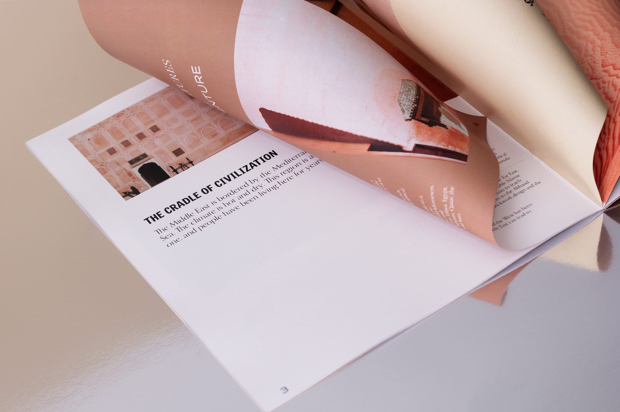
Mirage is a travel and tourism experiences magazine in the Middle East, with documentary, photographic and informative contents about the places of interest in the area.
For this project we develop branding and editorial design, proposing a contemporary and globalized idea of this geographical area, moving away from the stereotypical idea to which it is commonly associated.
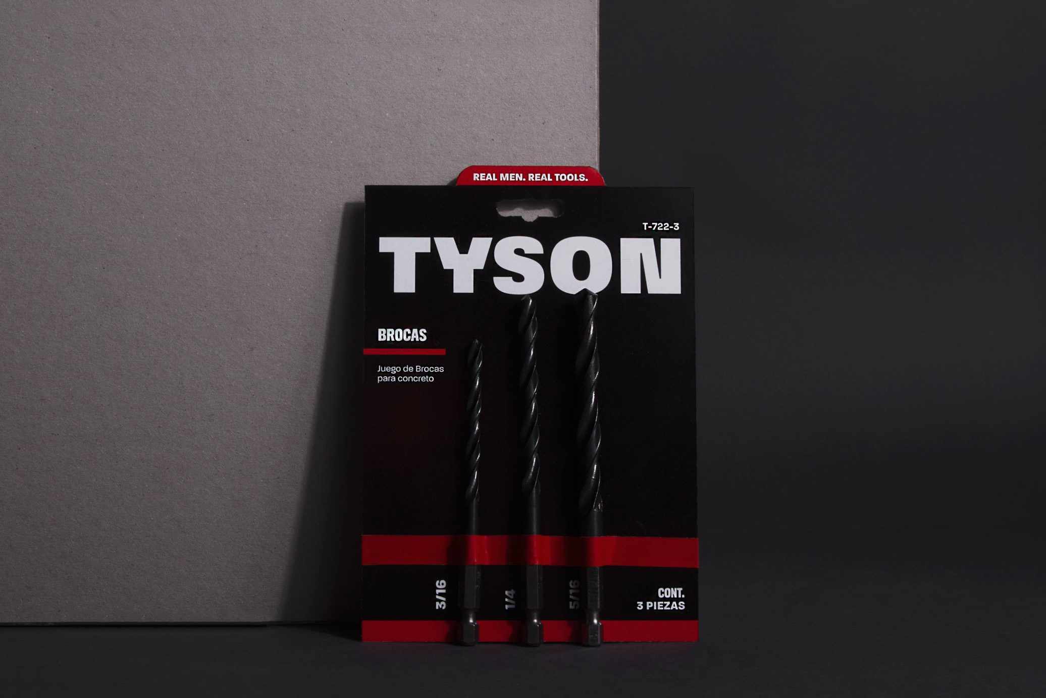
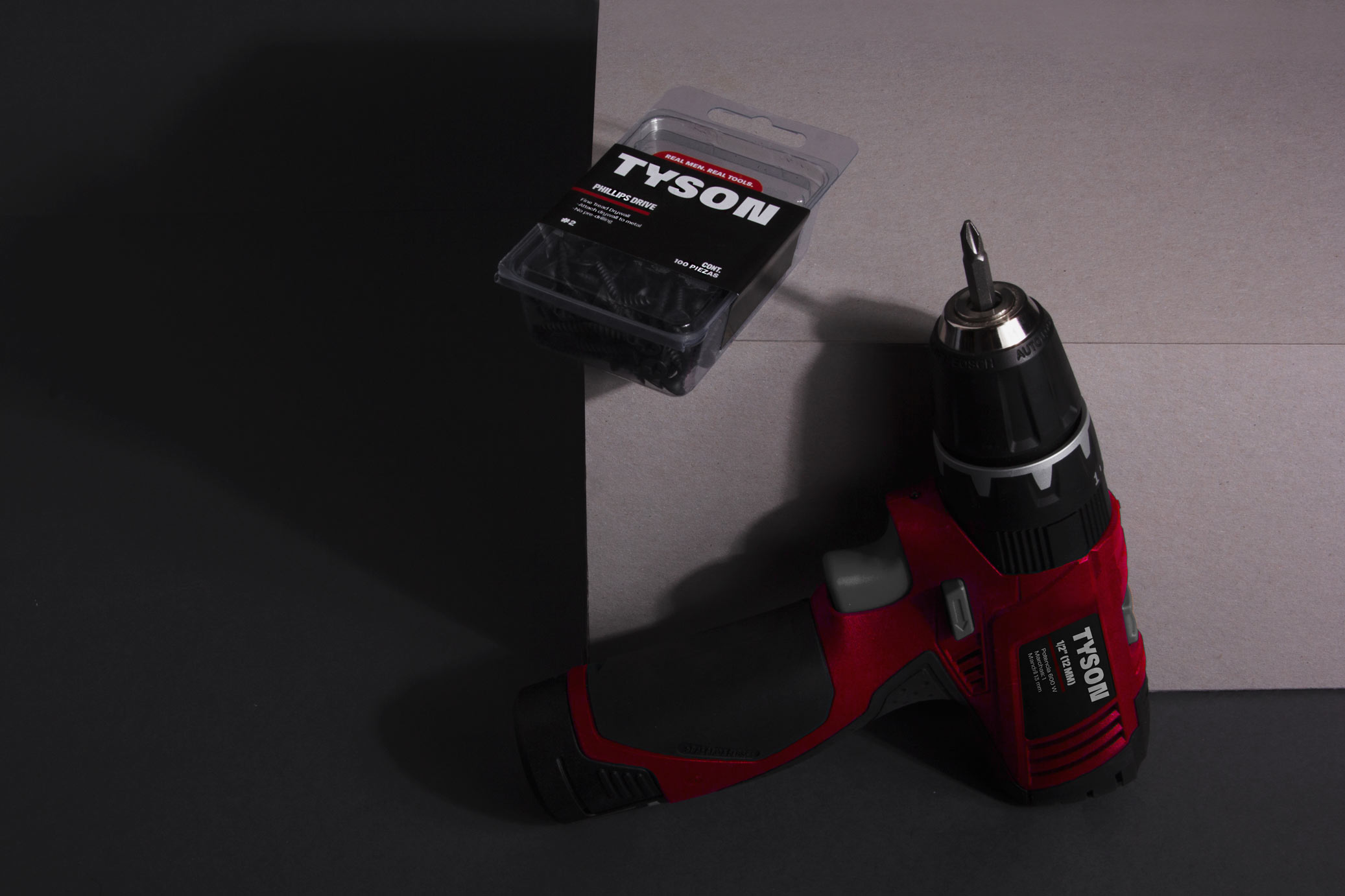
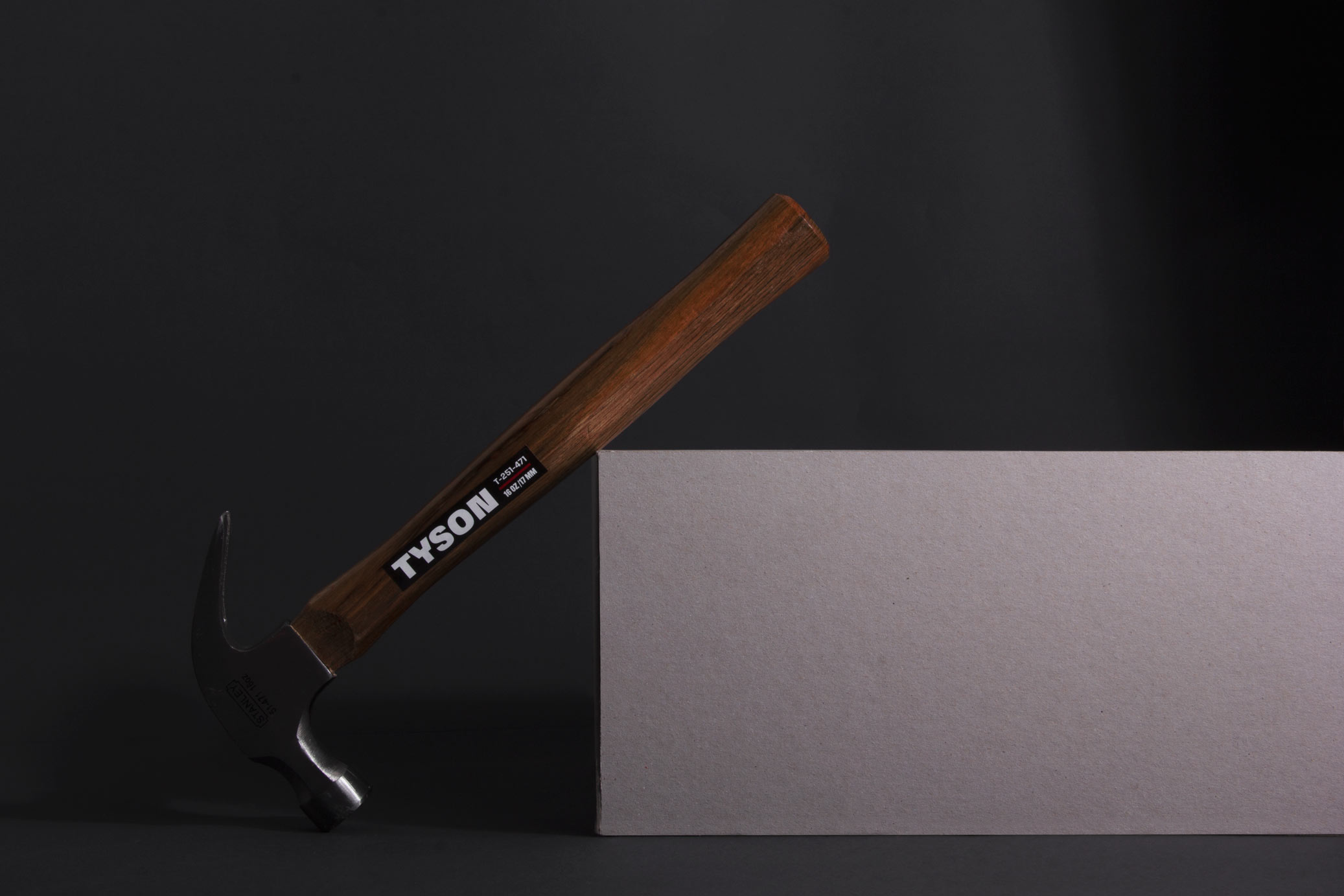
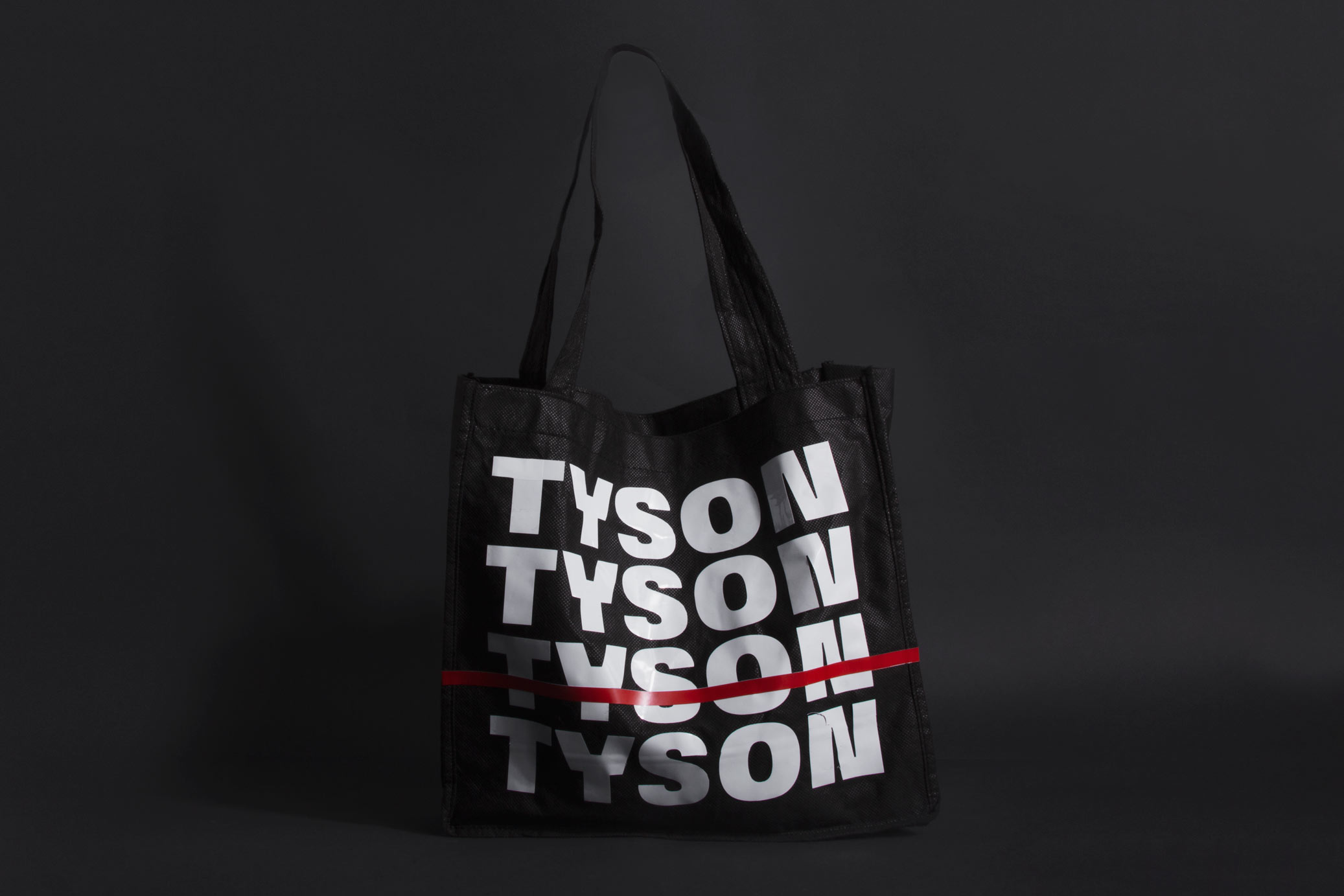
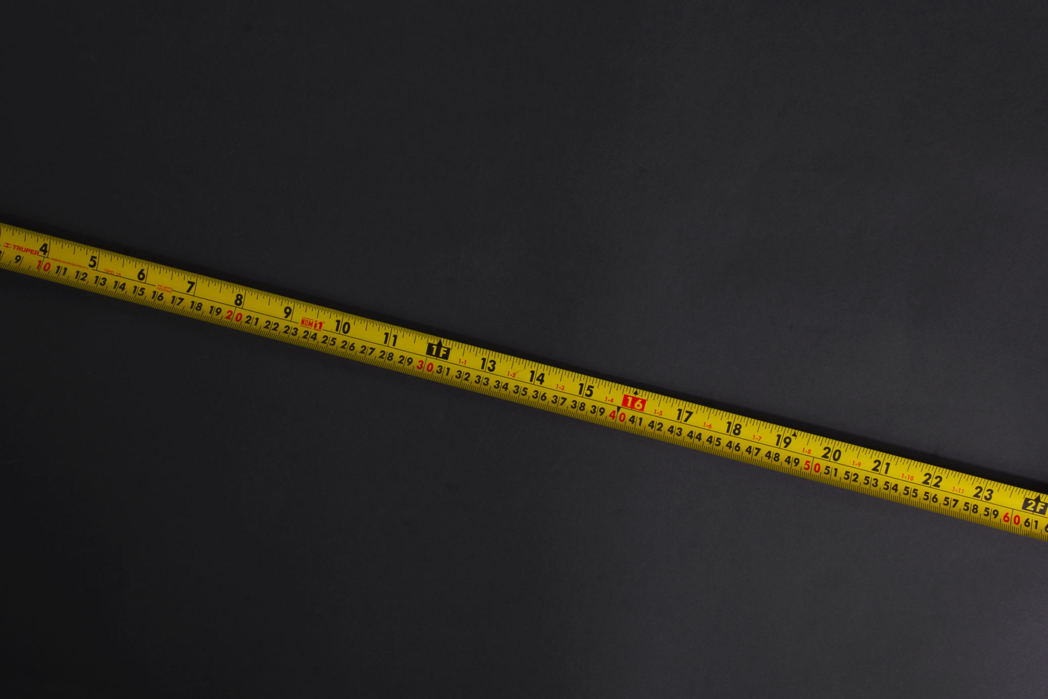
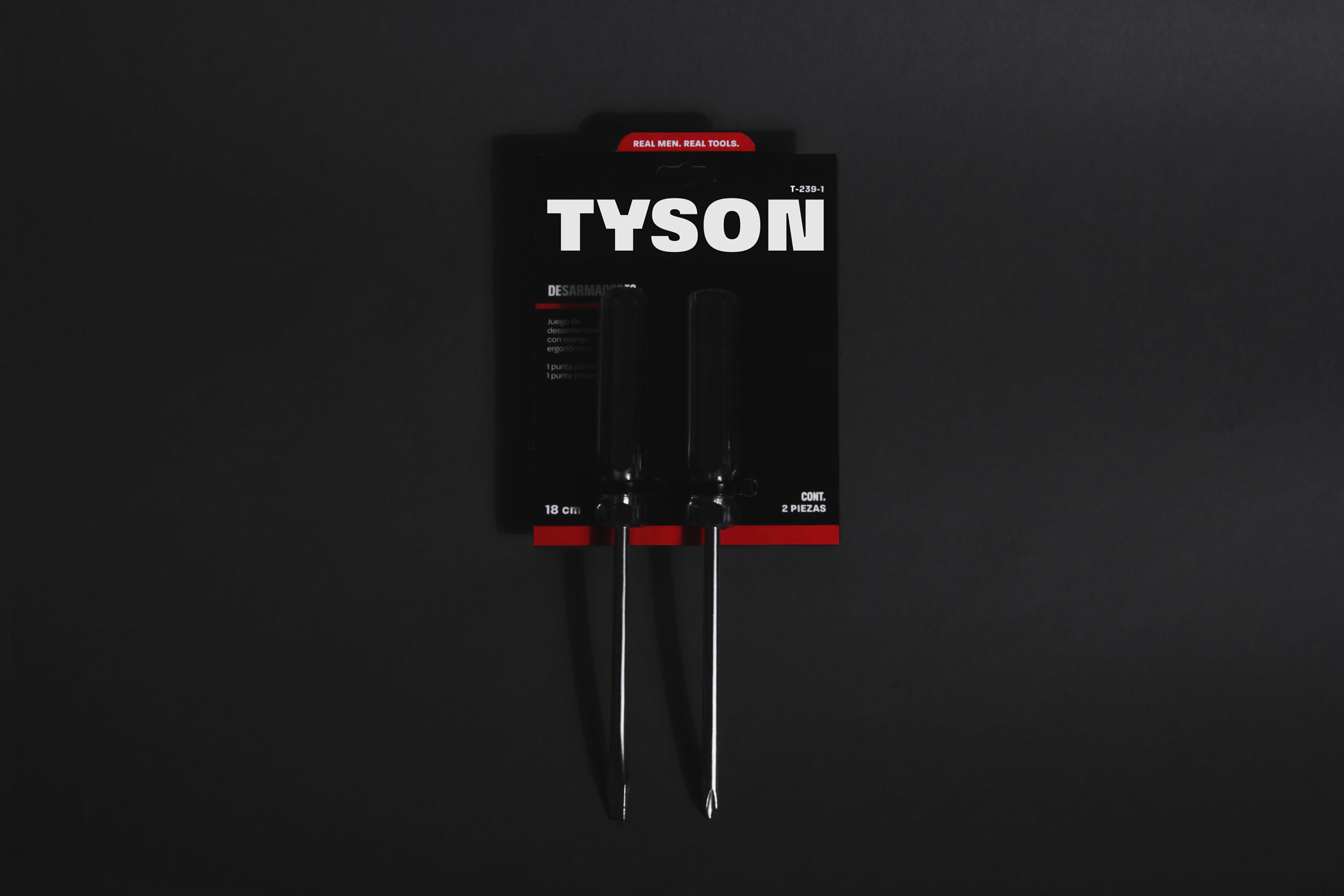
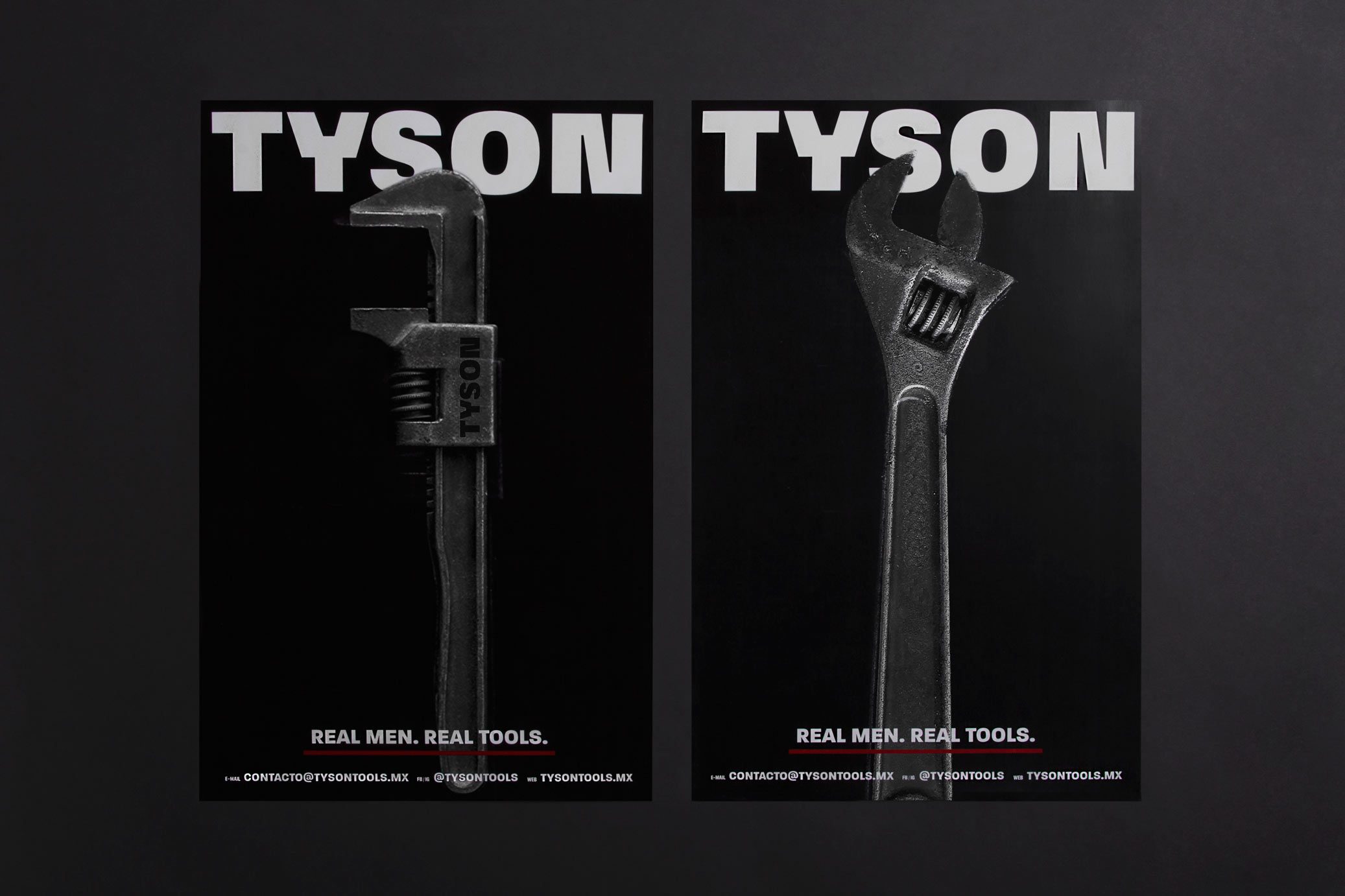
Tyson is a Mexican tools brand. The main communication attribute is the strength and resistance of the tools. This idea mixed with the brand’s name led us to propose a graphic line that refers to the box: black backgrounds, red lines as detail of the ring, big photos of the product and layout inspired by retro box posters.
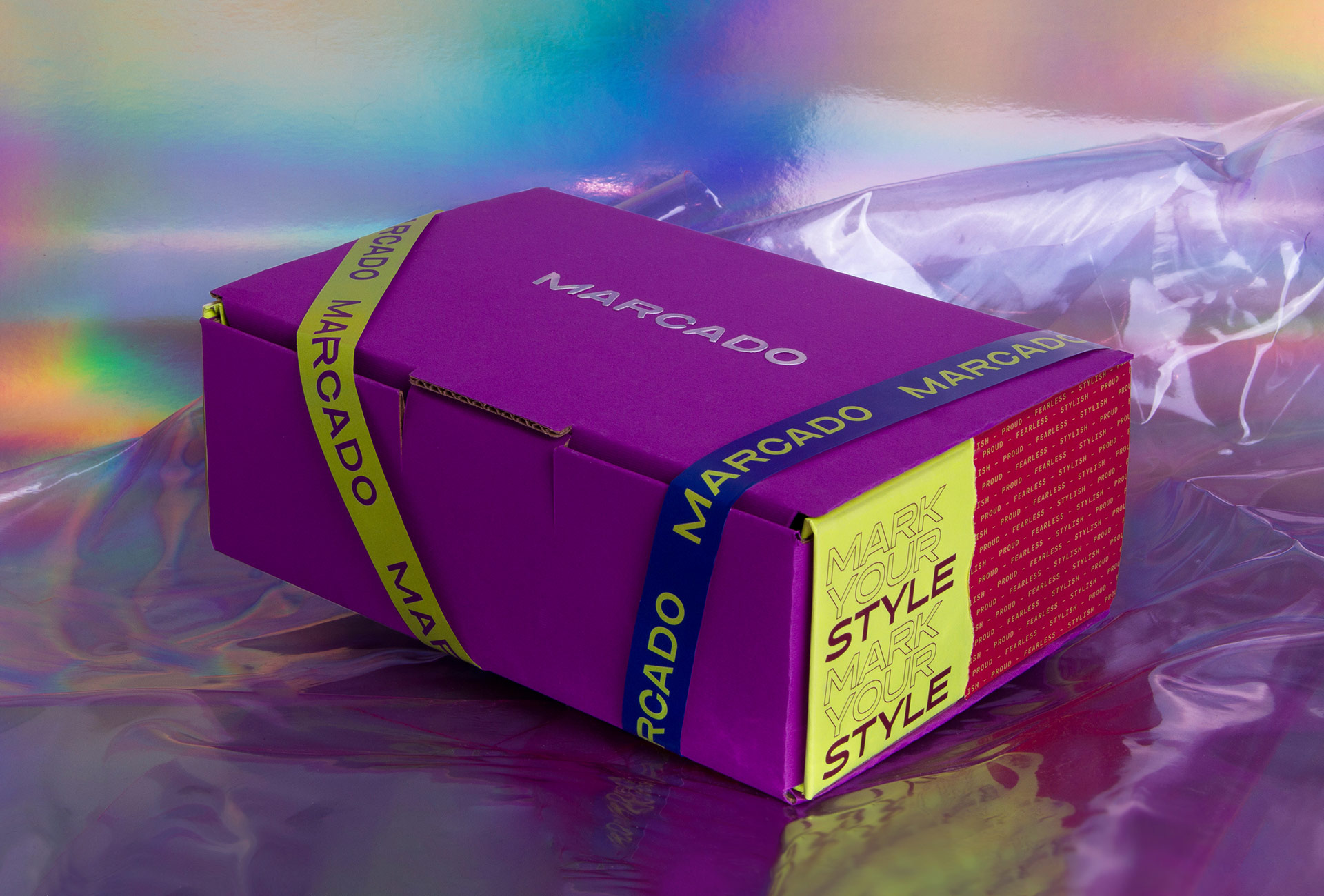
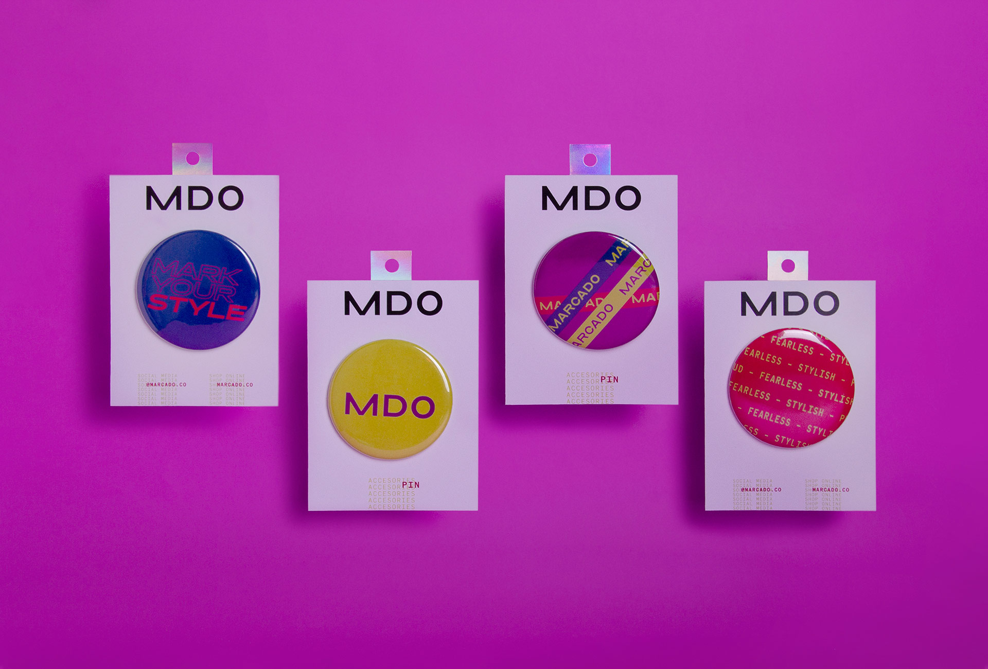
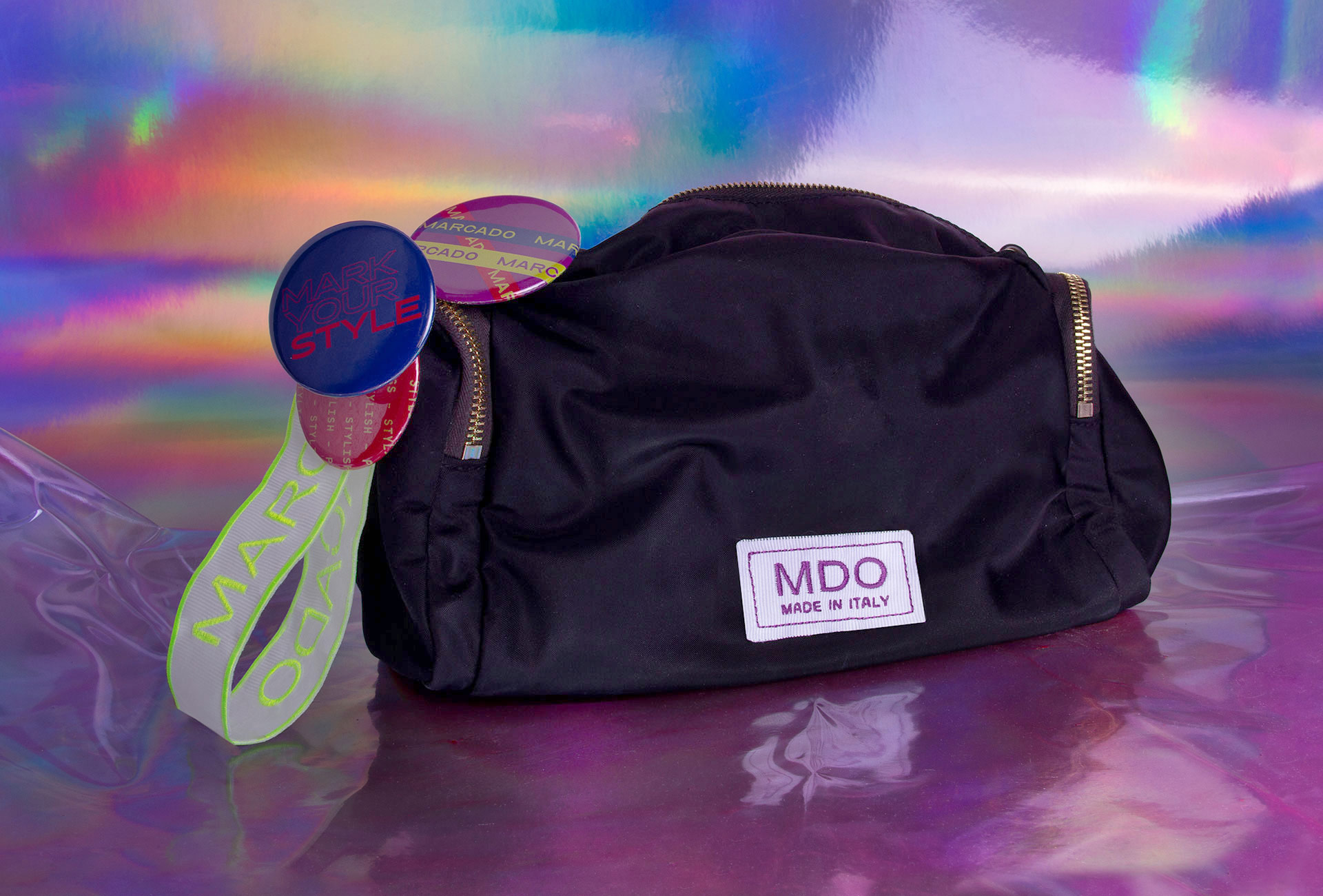
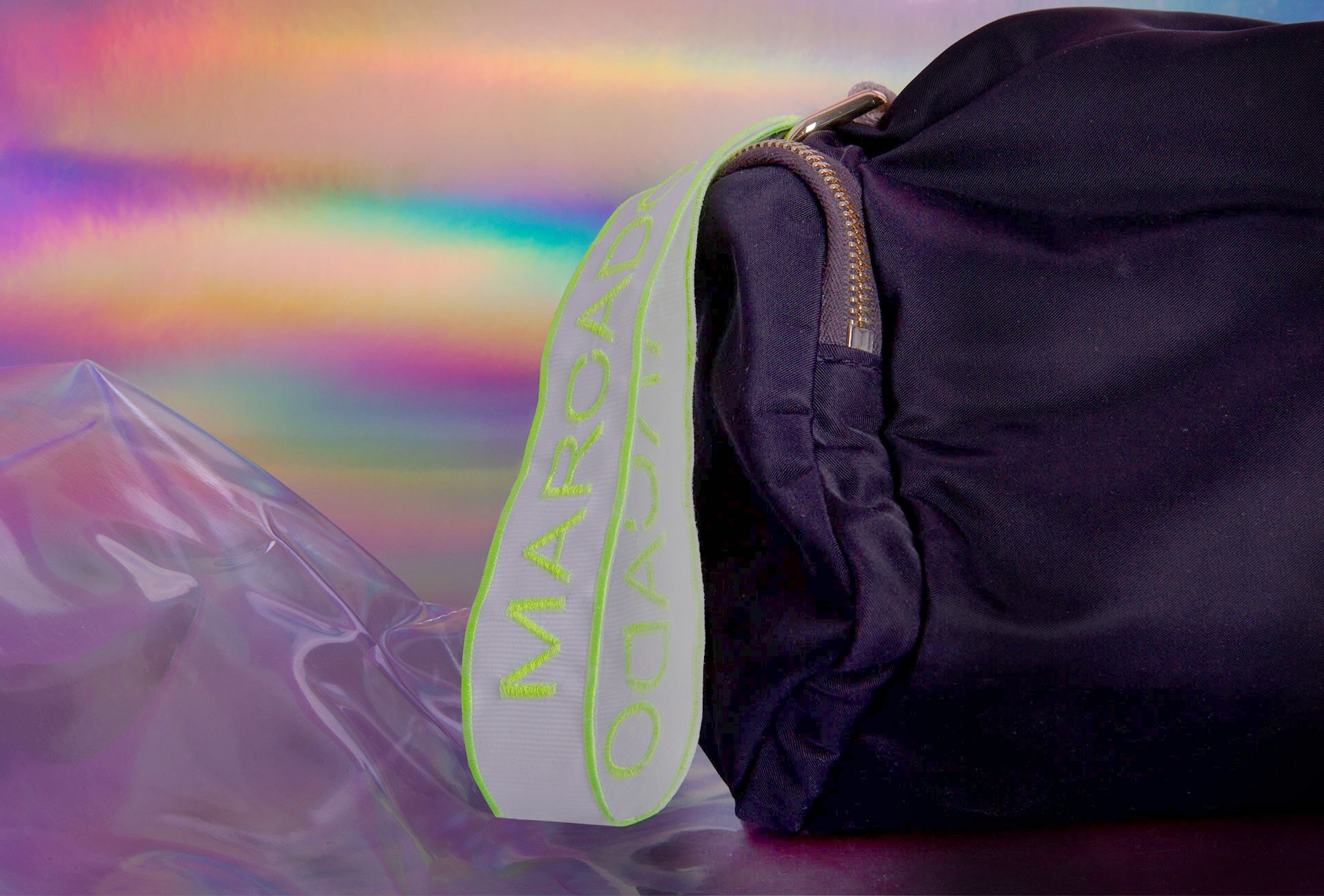
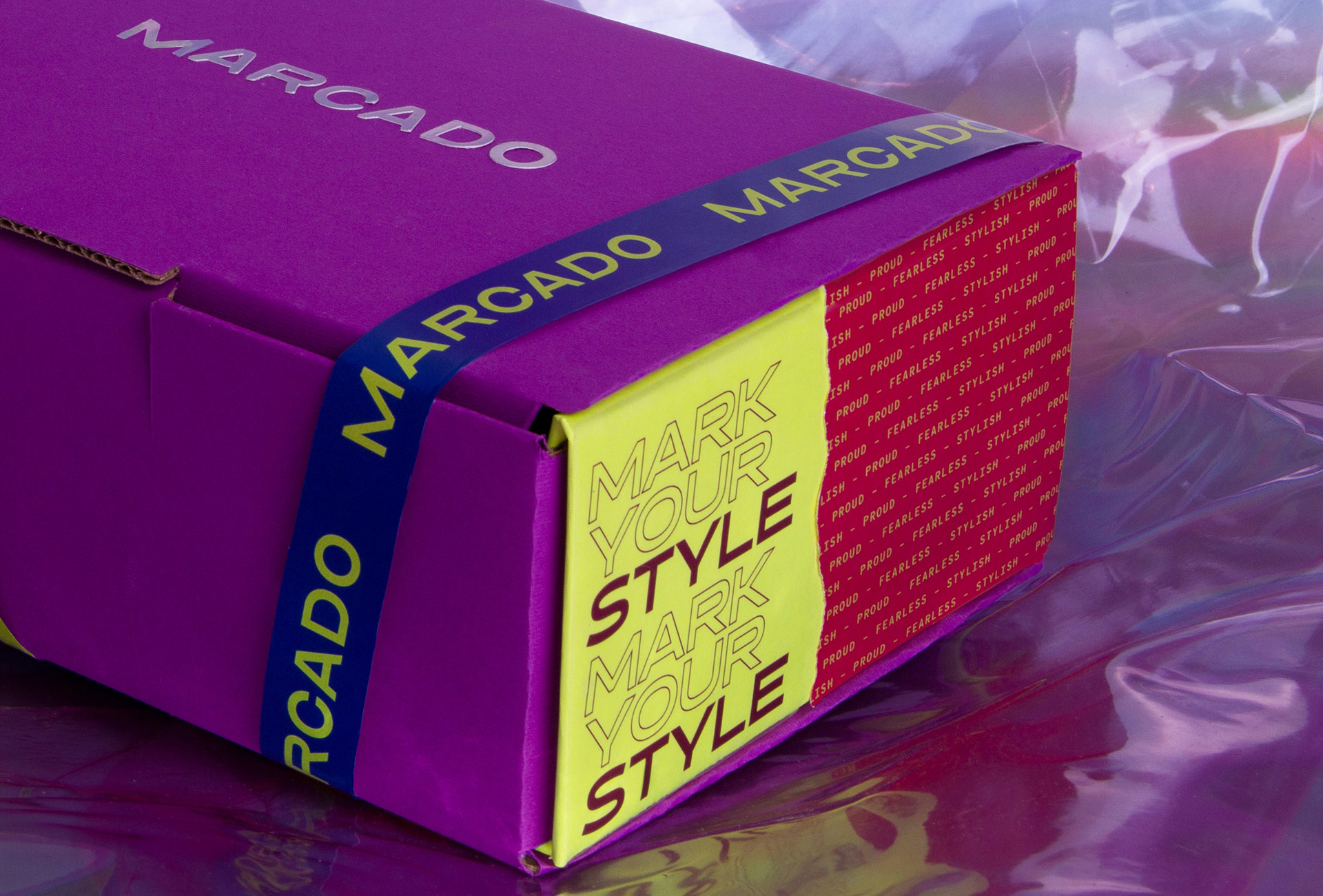
Marcado is an accessories brand with 80’s vibes. They design and produce straps and pins that allows people to customize their bags and accessories.
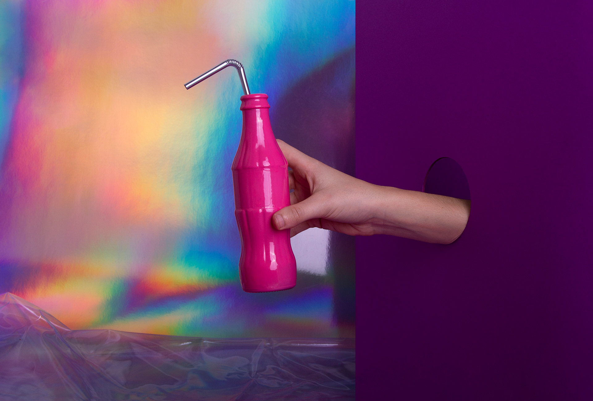
The concept starts with the name Marcado (marked), because that’s exactly the purpose of the brand: to mark your accessories with your own style. The color palette came from visual references from 80’s fashion, with an eccentric mixture of materials and colors. Typographic selection contrasts with the retro vibes, and gives to Marcado a fashion brand look.
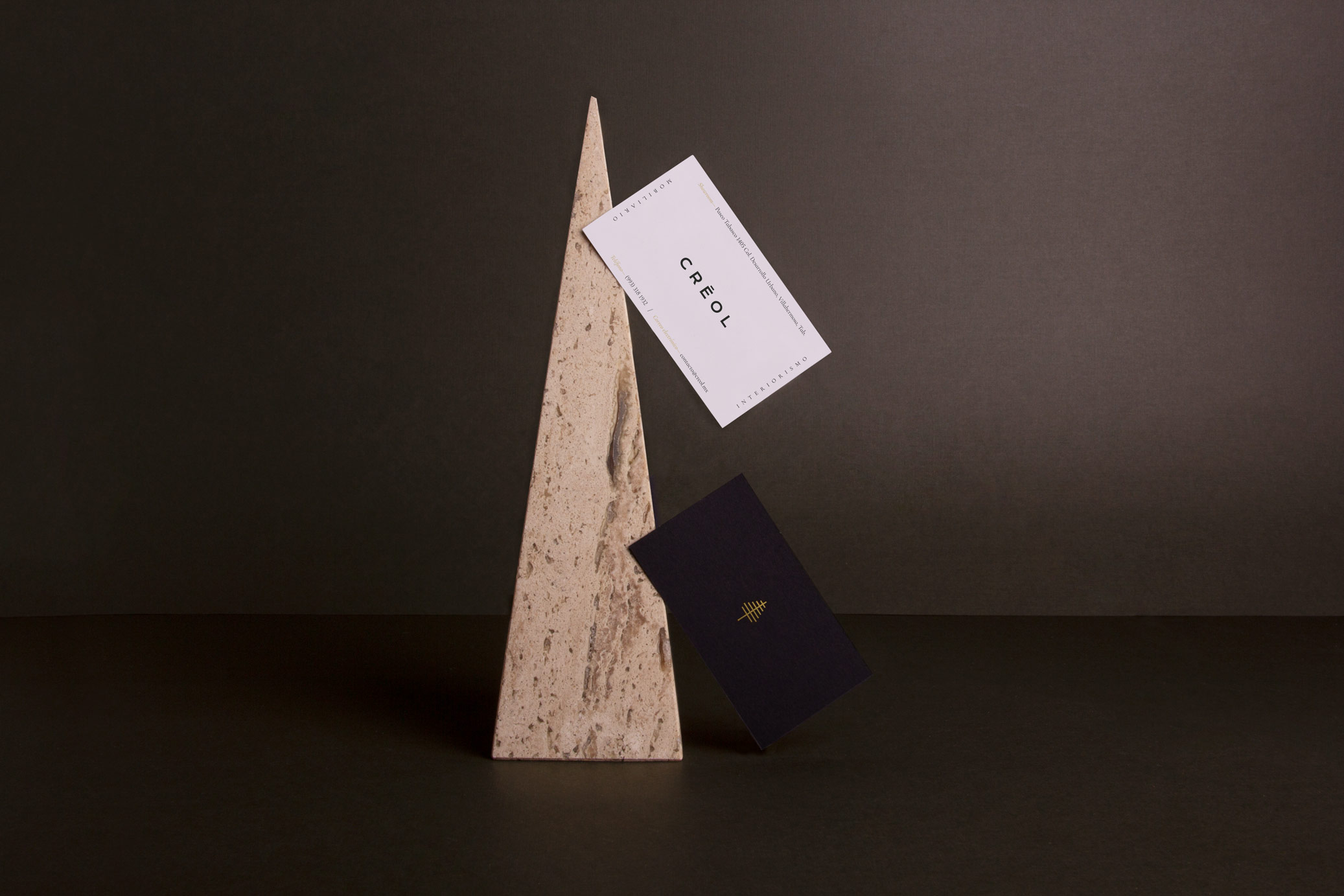
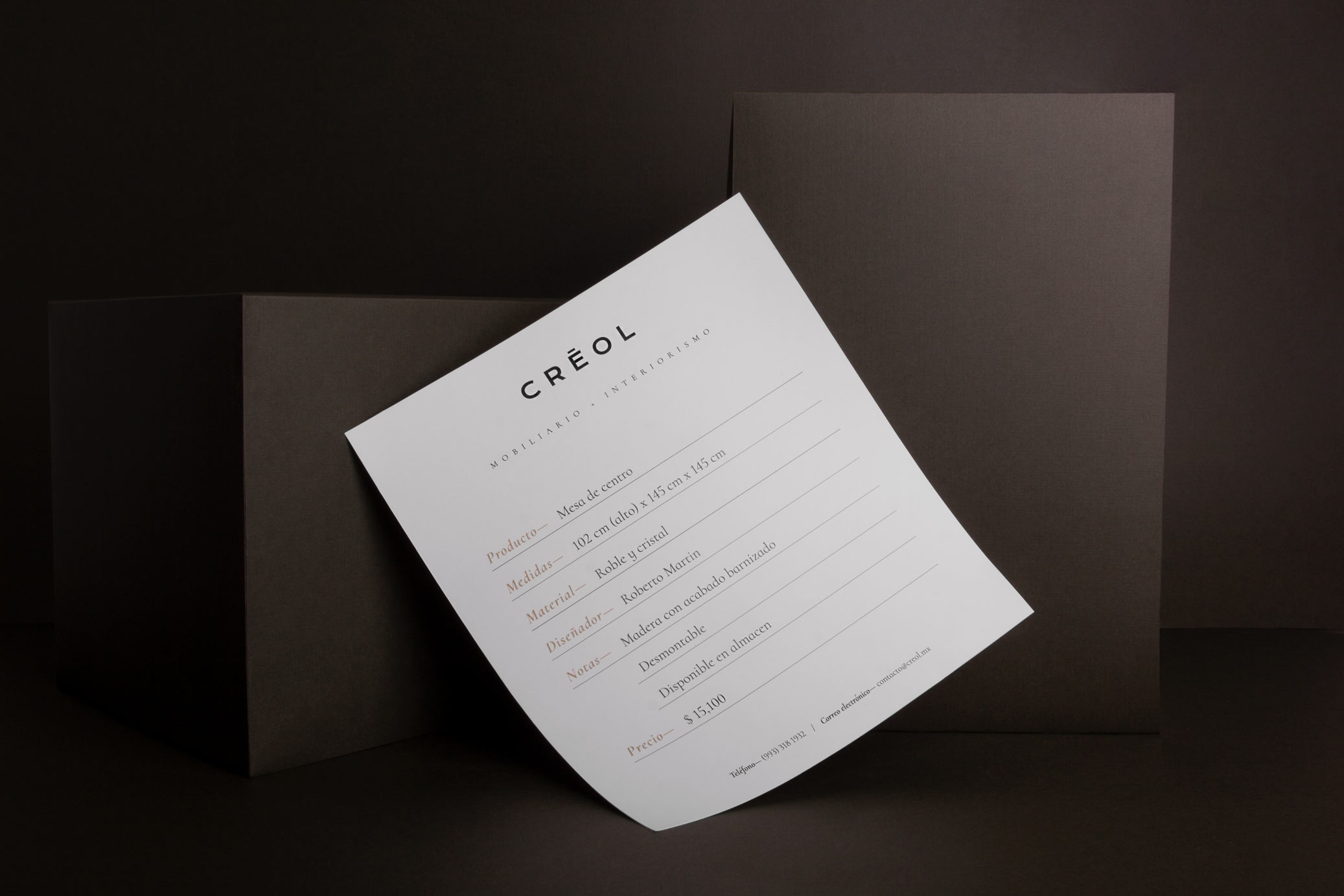
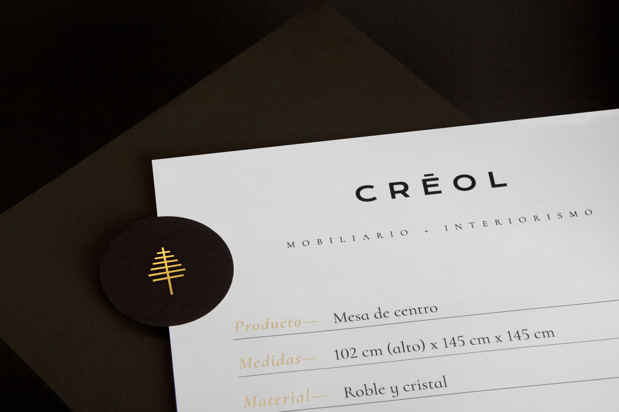
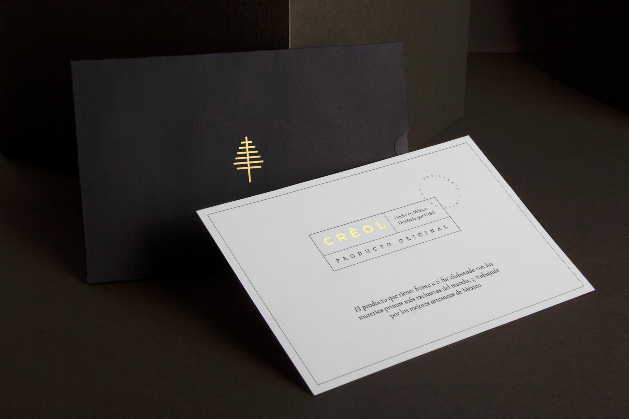
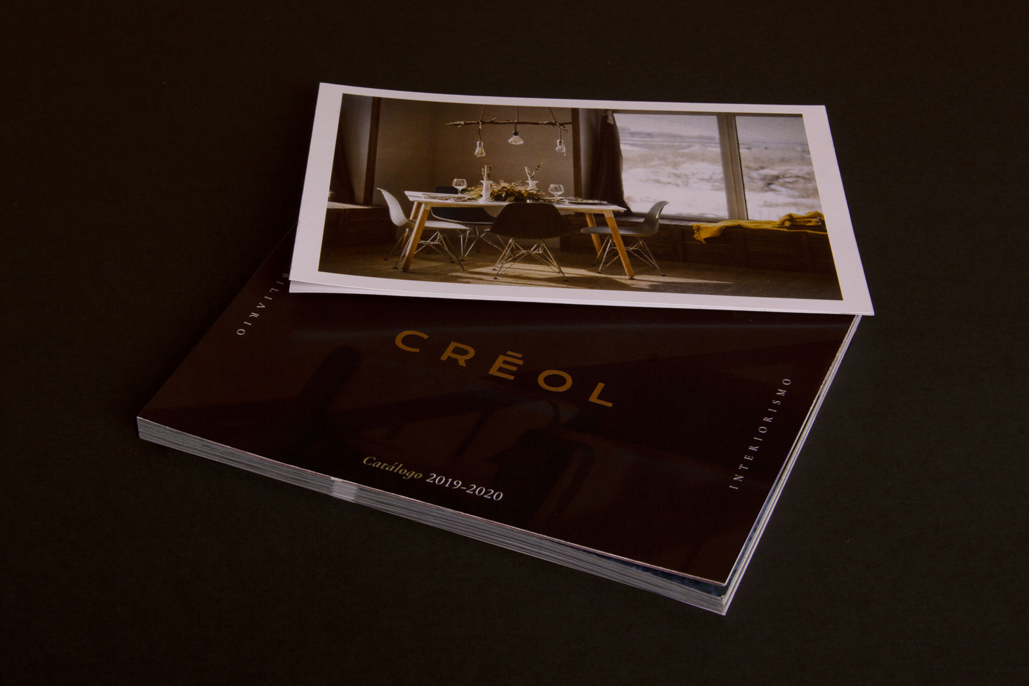
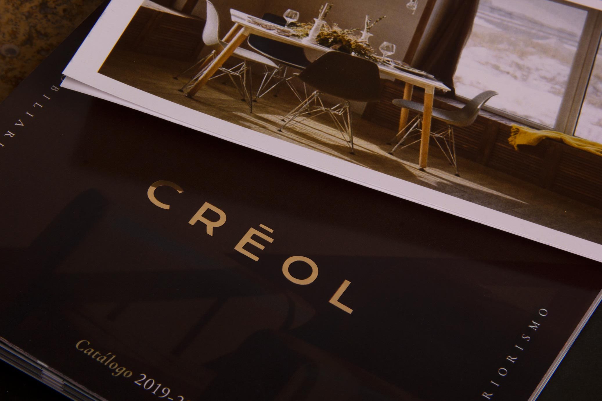
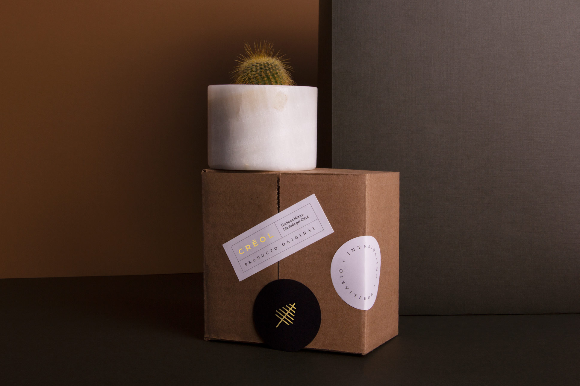
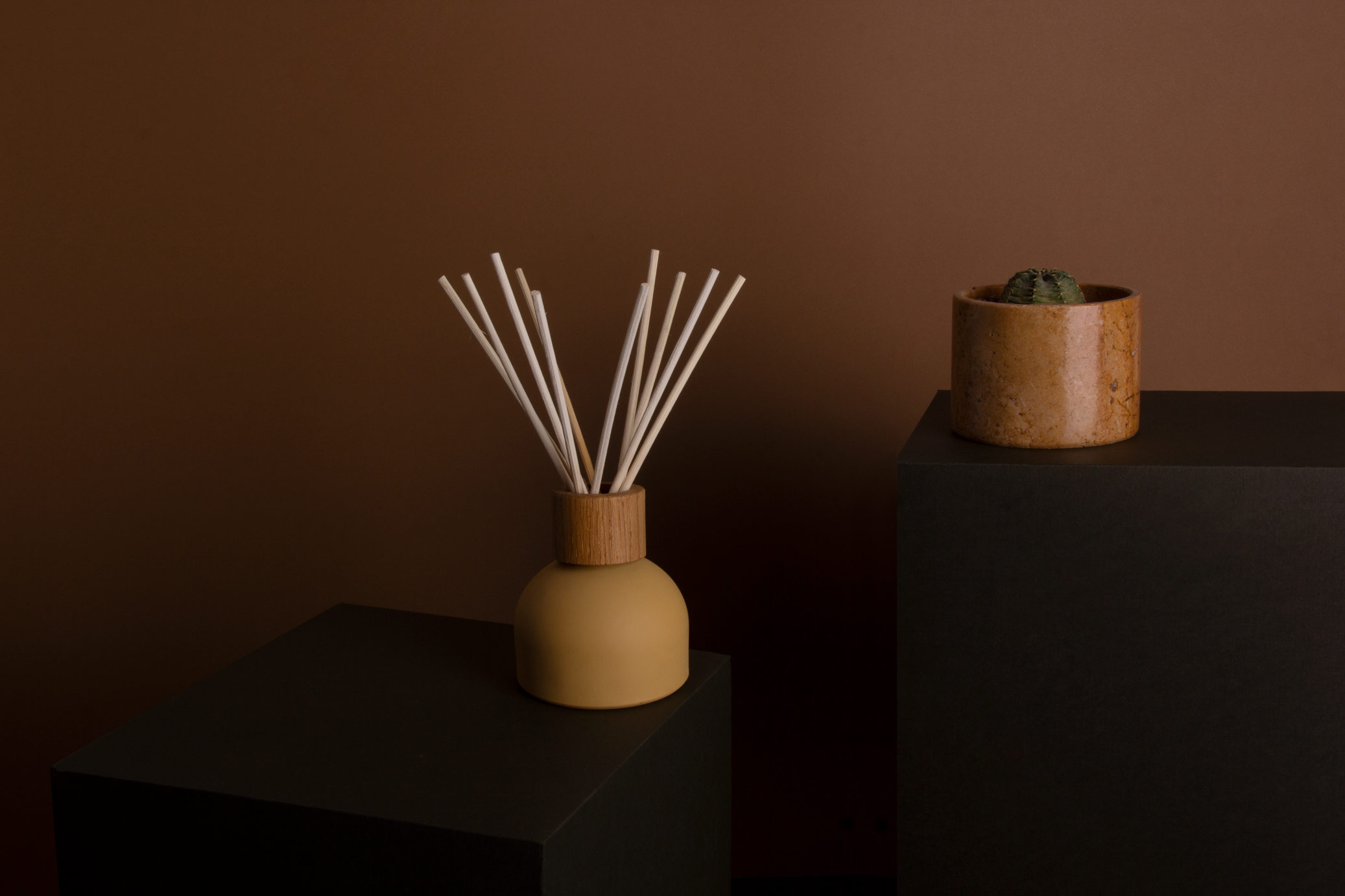
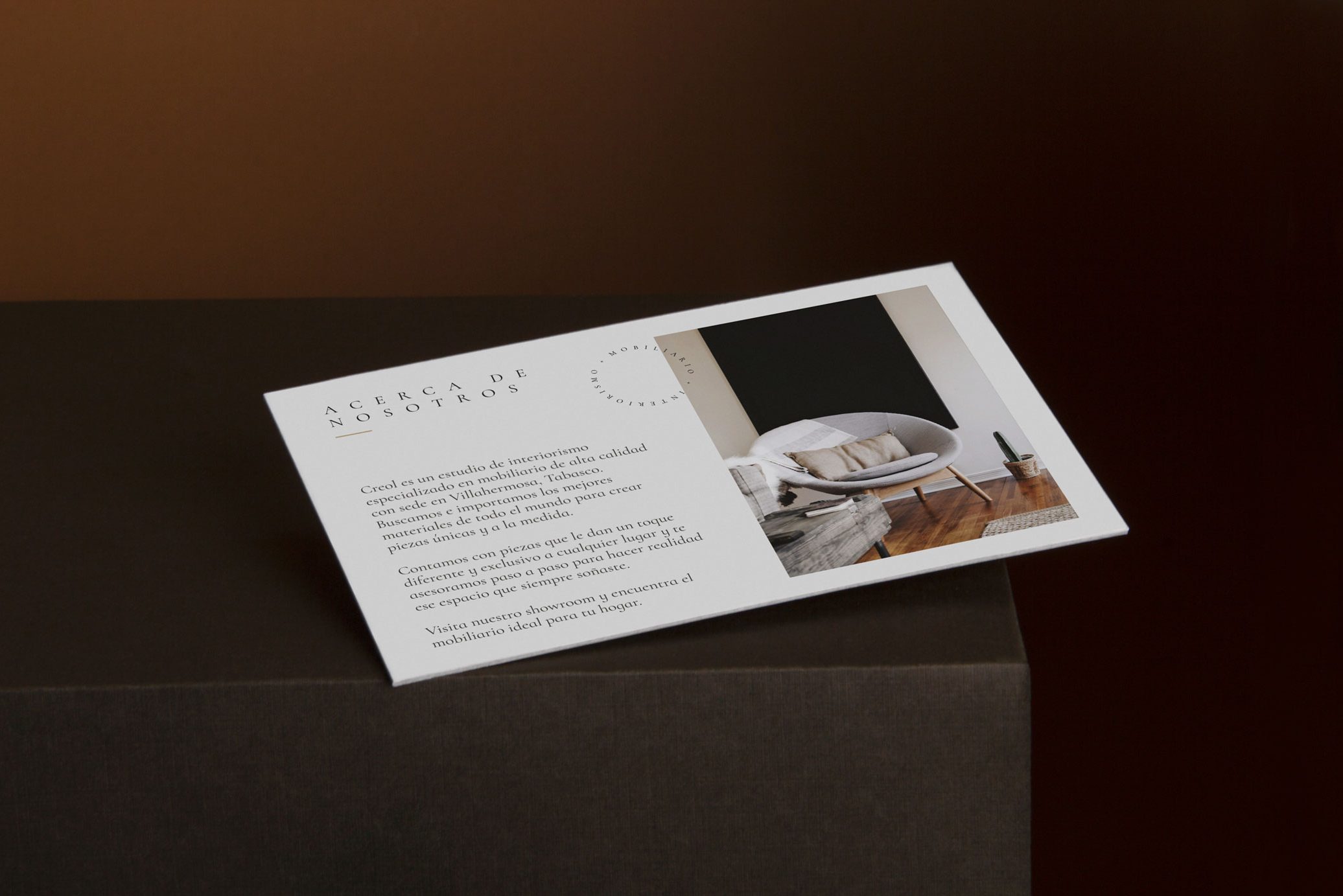
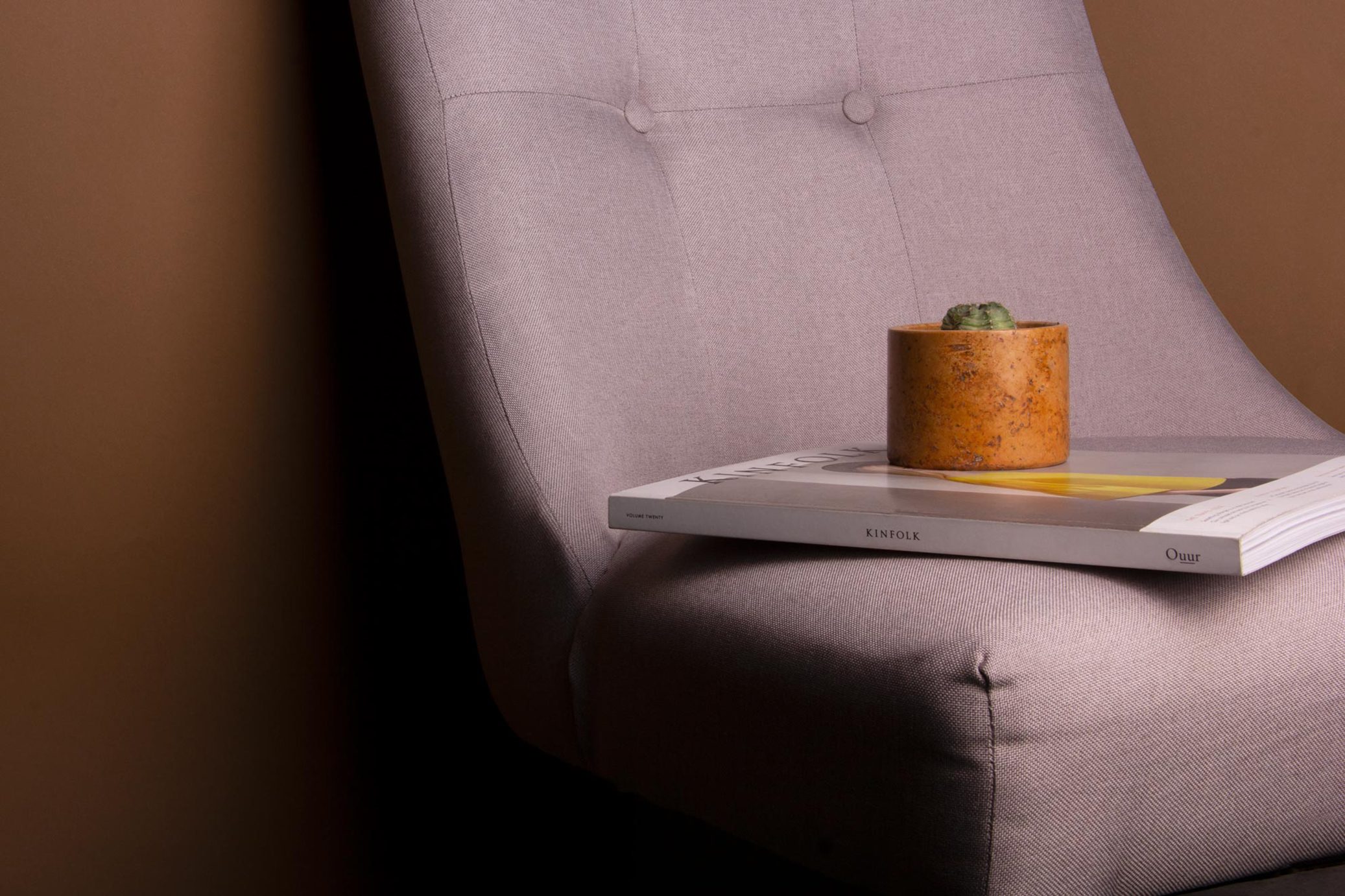
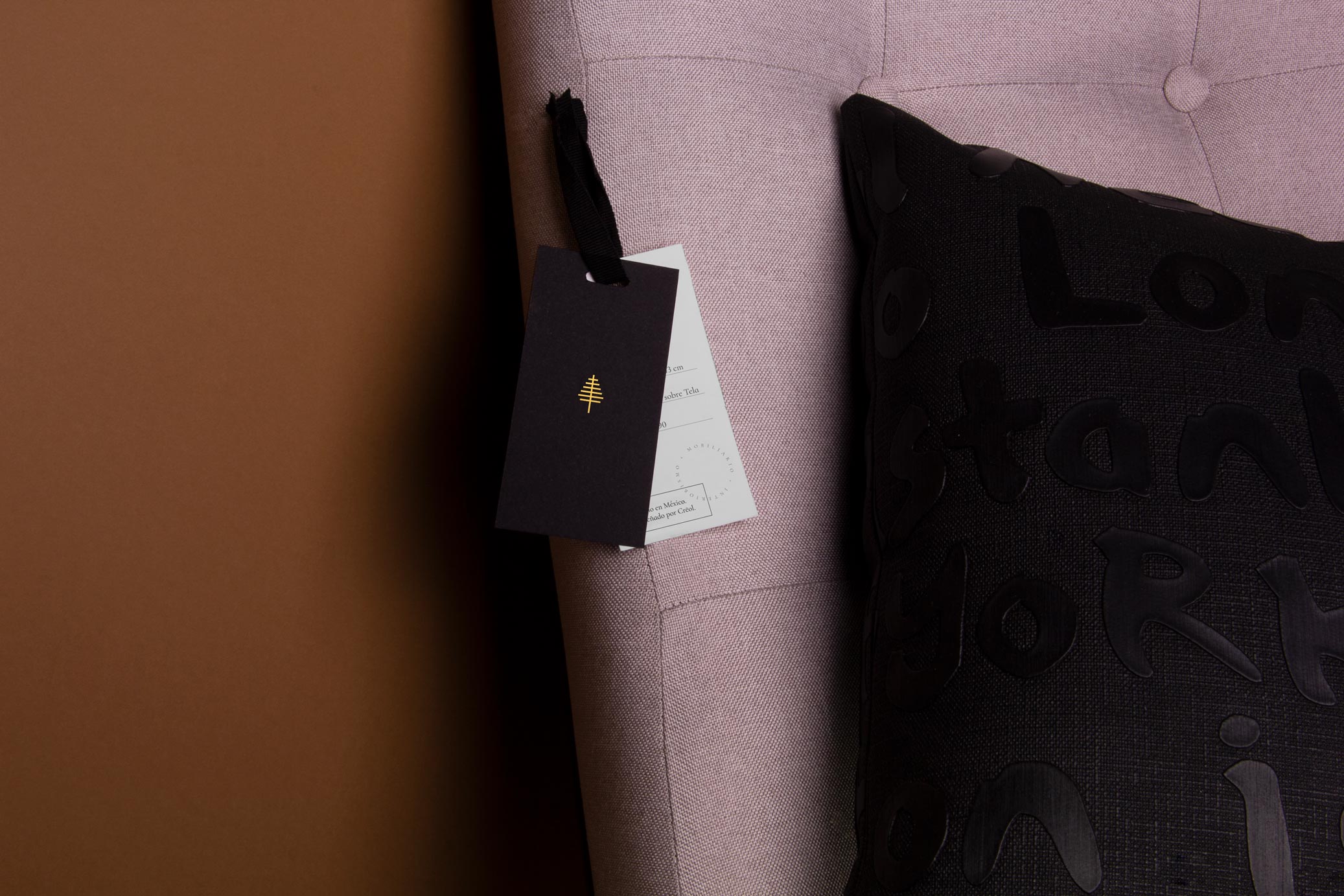
Creol is a workshop focused on interior design, luxury furniture and high-end decoration pieces made with exclusive materials from different parts of the world, by Mexican hands.
The name refers to the mixture and diversity of each material’s origin, so the final product is a combination of different regions and cultures around the world. The sobriety of black and white materials in combination with gold details gives to the brand a luxury and exclusive look.
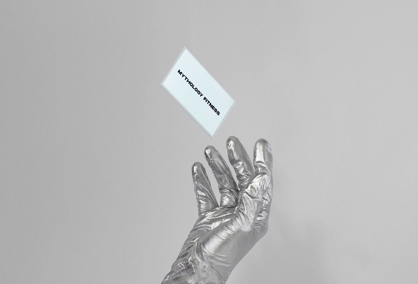
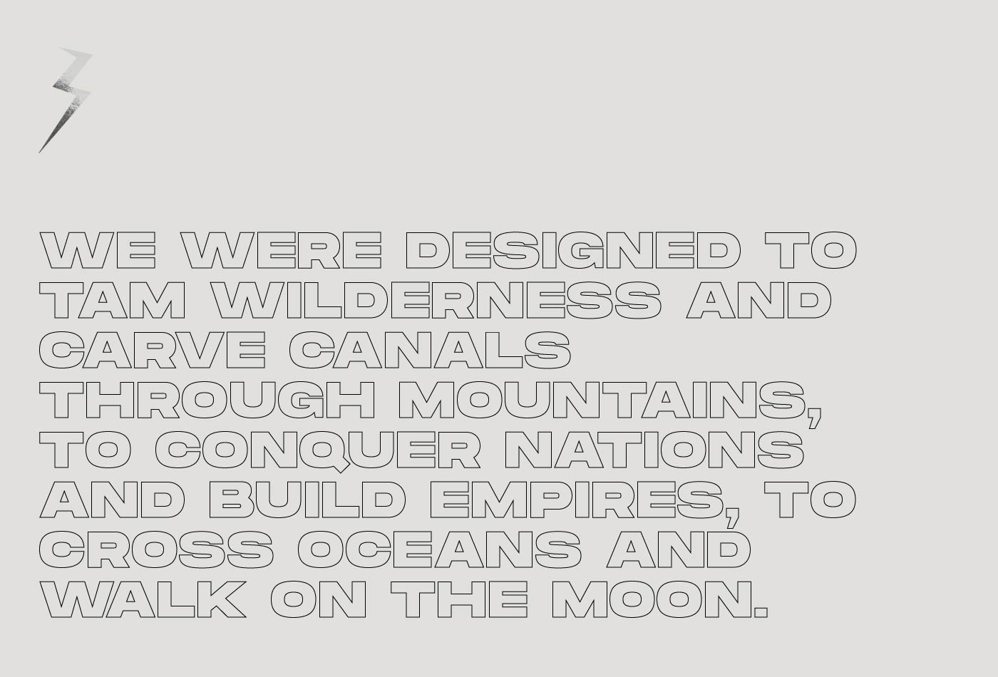
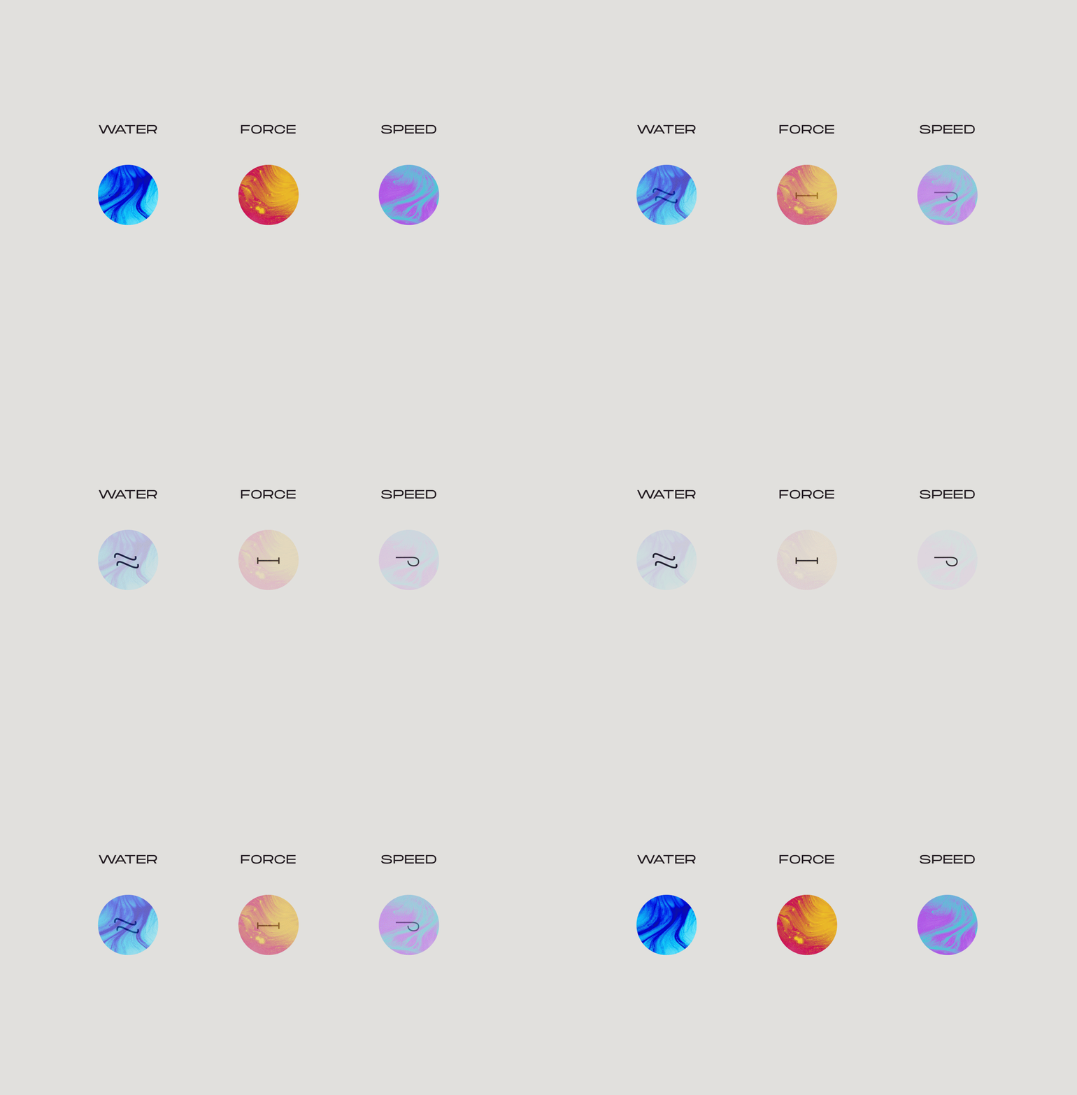
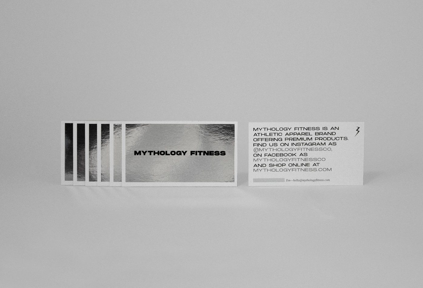
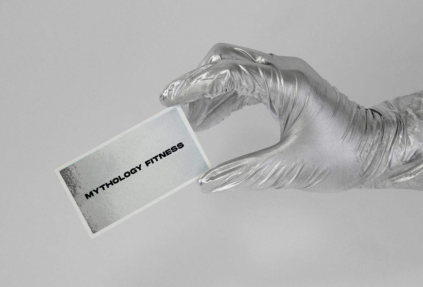
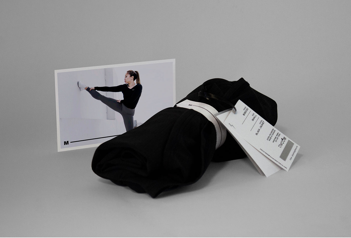
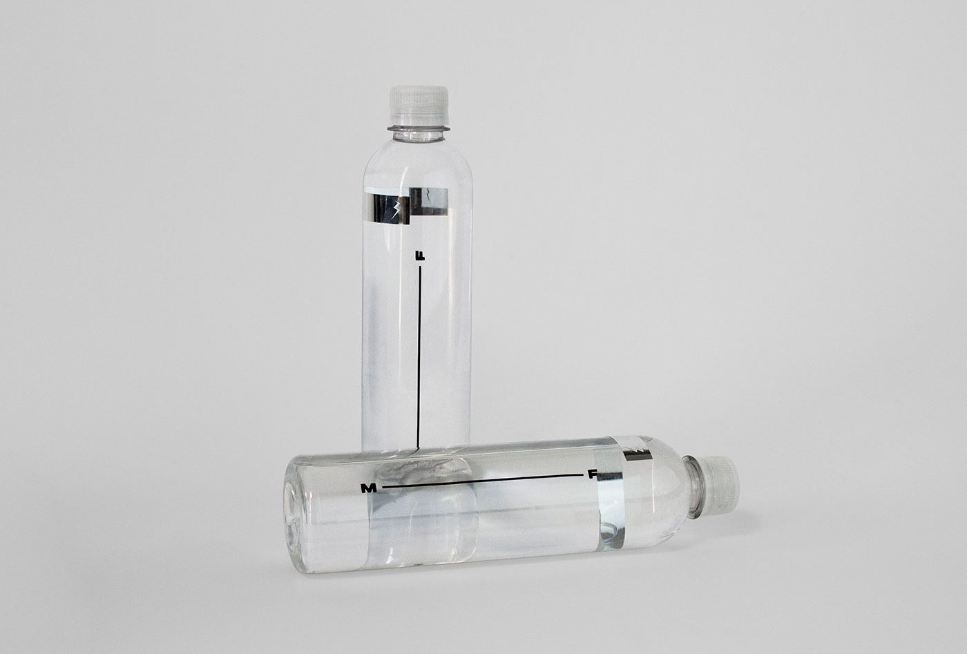
Mythology Fitness is an emerging sportswear brand based in Vancouver, Canada. The main statement is remember us that the man was made in the image and likeness of the Gods, and the difference between the present and what he wants to achieve is in the determination of each one. For this reason, the brand has so much inspiration in Greek mythology: from the monochromatic color palette and the lightning isotype, to the selection of emblematic characters for each of the clothing lines, as well are complemented by abstract symbols inspired in the graphic style of some characters of the Greek alphabet.
All brand’s applications have at least one detail on silver foil, so the person that carries it can be reflected in it, creating an analogy with the idea that the human being was made in the image and likeness of the Gods.
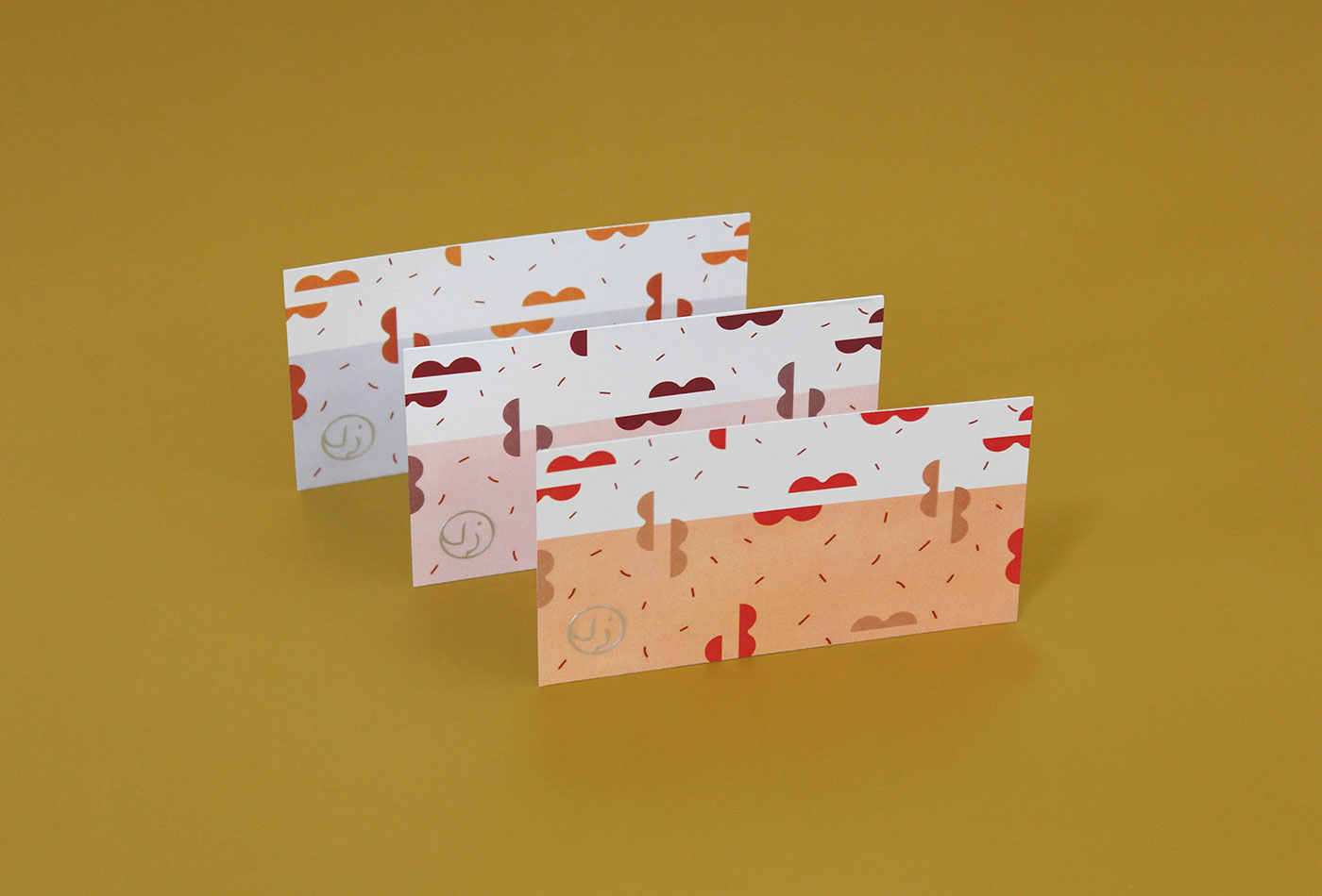
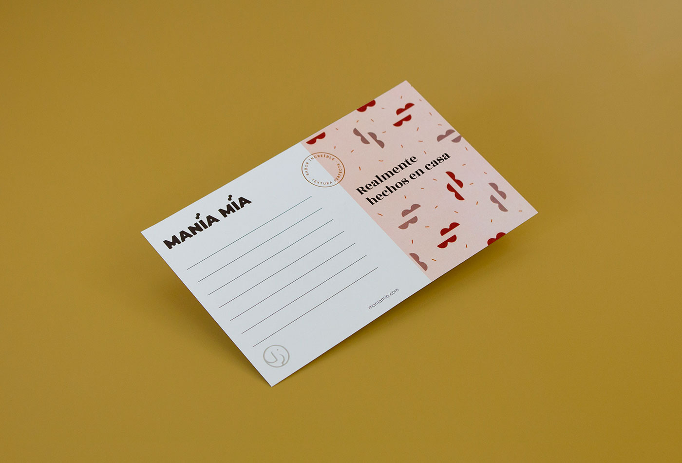
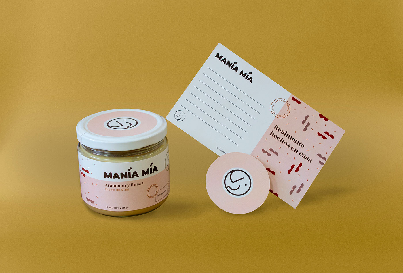
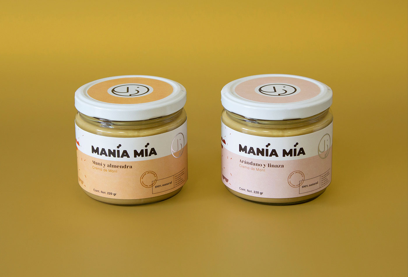
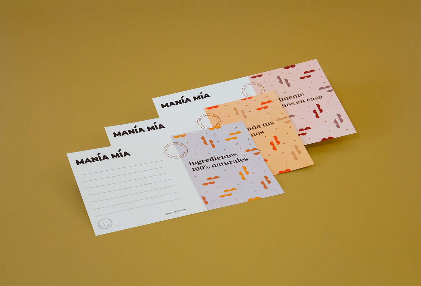
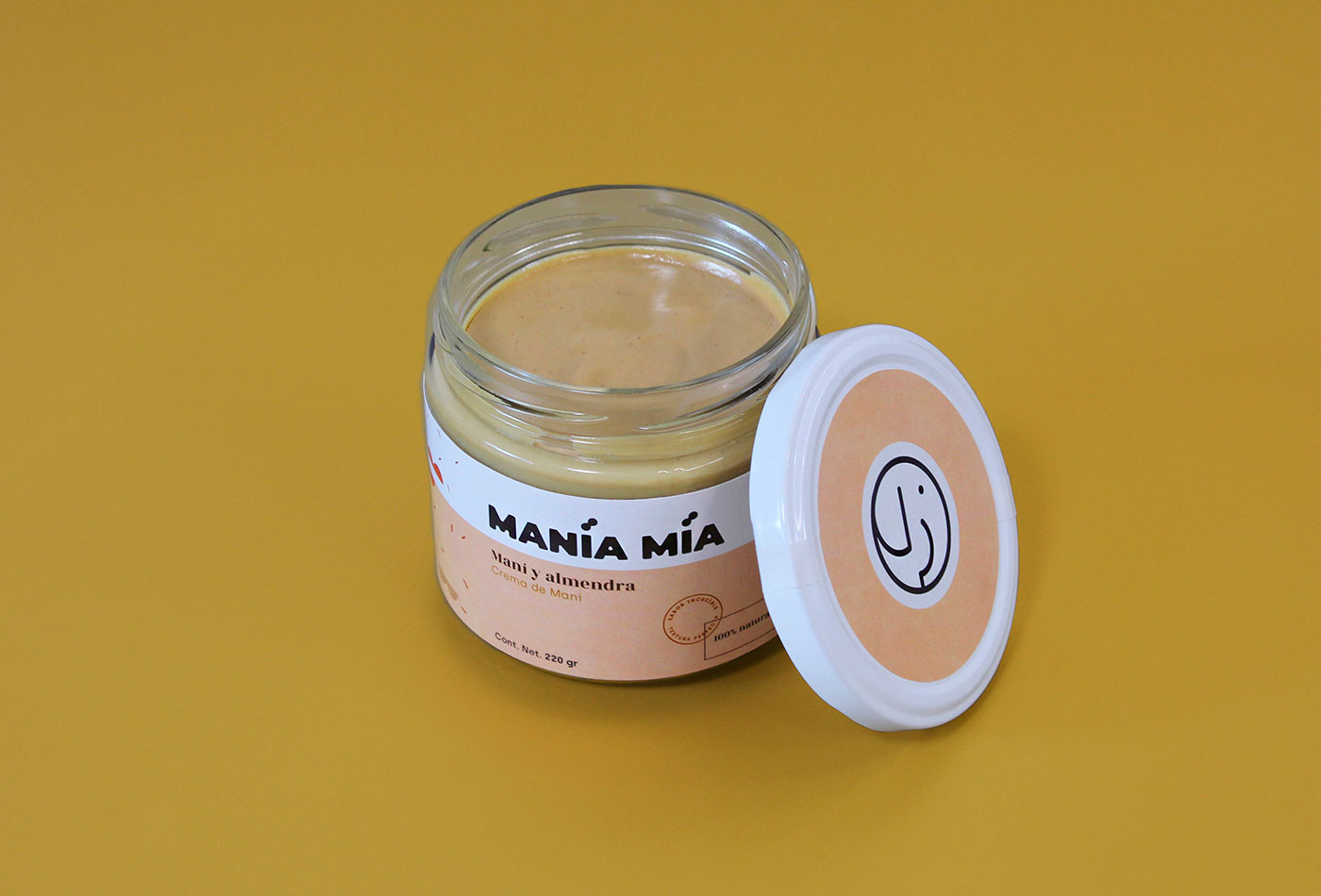
Manía Mía is a company based in Mexico that manufactures 100% natural peanut butter. The requirement was to create a brand that reflects quality with a homemade and fun touch, and that could also be adapted to the packaging and reproduced in different flavors of the product.
For the logo we create a bold typeface with curved edges. The isotype is an abstraction of an elephant, created as a seal for easy reproduction and identification. This is complemented with monospaced / serif typographies, creating a contrast between modern and classic. Finally, a pattern was created from the basic form of peanuts to add a fun touch to the brand.