BRADA IS A GRAPHIC DESIGN STUDIO SPECIALIZED IN BRANDING. IF YOU WANT TO CONTACT US PLEASE FEEL FREE TO SEND US AN EMAIL TO INFO@BRADA.CO OR CHECK OUR CONTACT SECTION.
BRADA IS A GRAPHIC DESIGN STUDIO SPECIALIZED IN BRANDING. IF YOU WANT TO CONTACT US PLEASE FEEL FREE TO SEND US AN EMAIL TO INFO@BRADA.CO OR CHECK OUR CONTACT SECTION.
BRADA IS A GRAPHIC DESIGN STUDIO SPECIALIZED IN BRANDING. IF YOU WANT TO CONTACT US PLEASE FEEL FREE TO SEND US AN EMAIL TO INFO@BRADA.CO OR CHECK OUR CONTACT SECTION.
BRADA IS A GRAPHIC DESIGN STUDIO SPECIALIZED IN BRANDING. IF YOU WANT TO CONTACT US PLEASE FEEL FREE TO SEND US AN EMAIL TO INFO@BRADA.CO OR CHECK OUR CONTACT SECTION.
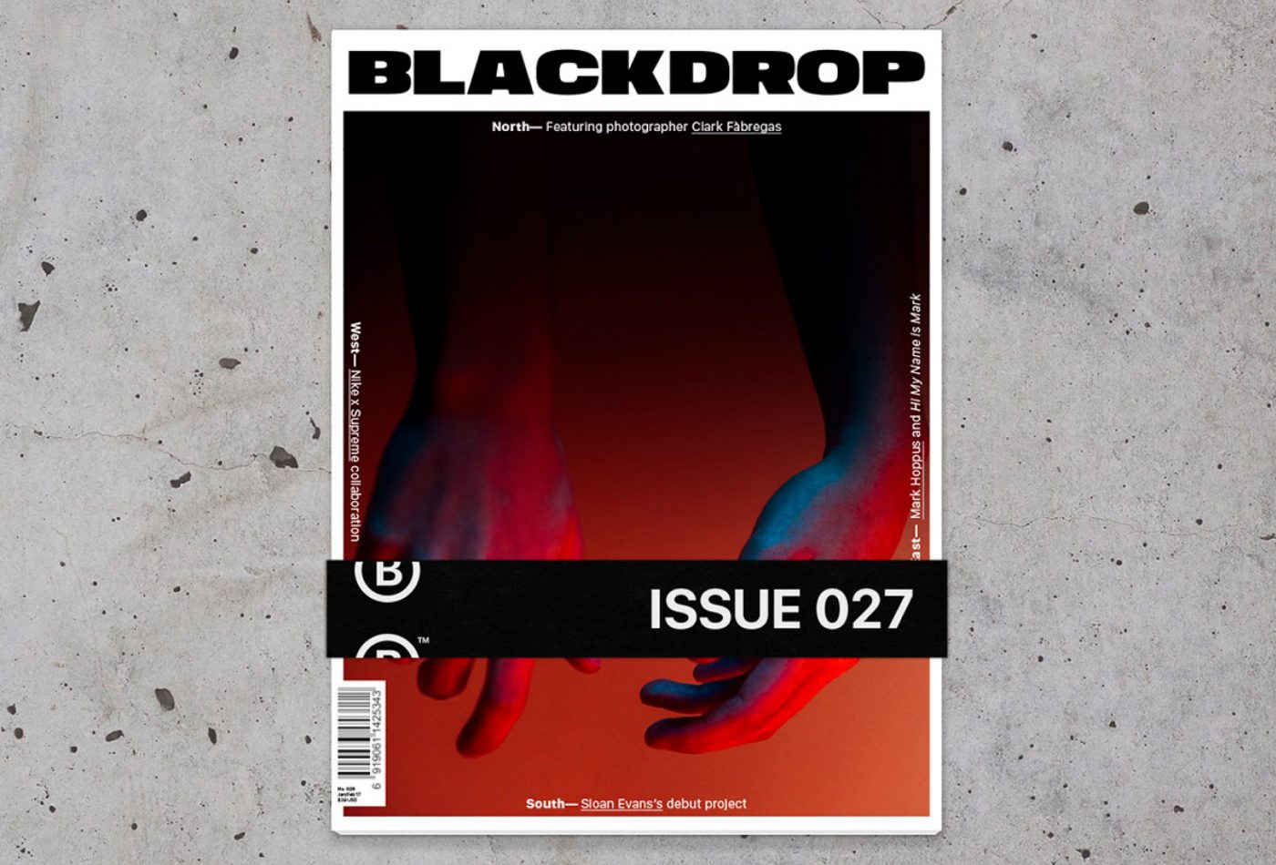
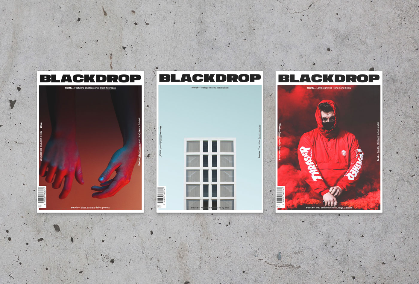
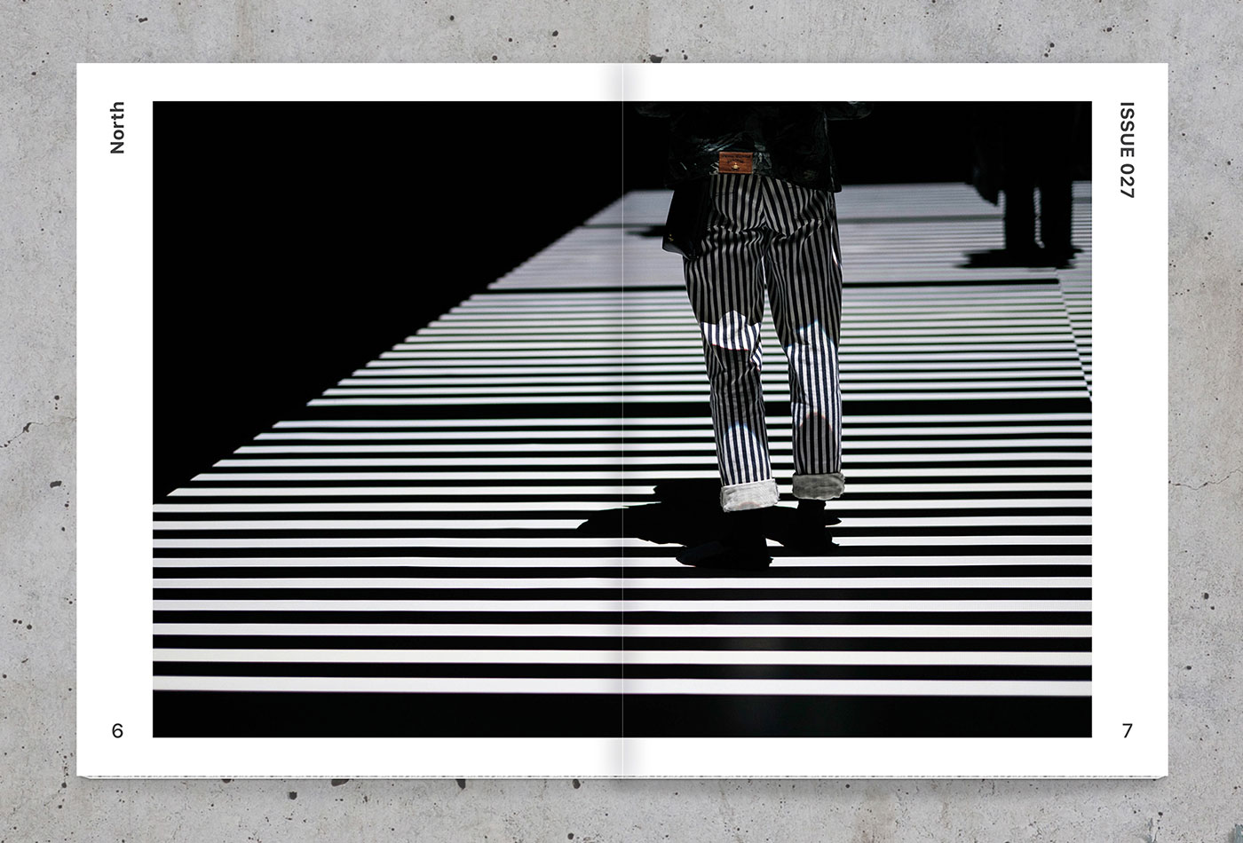
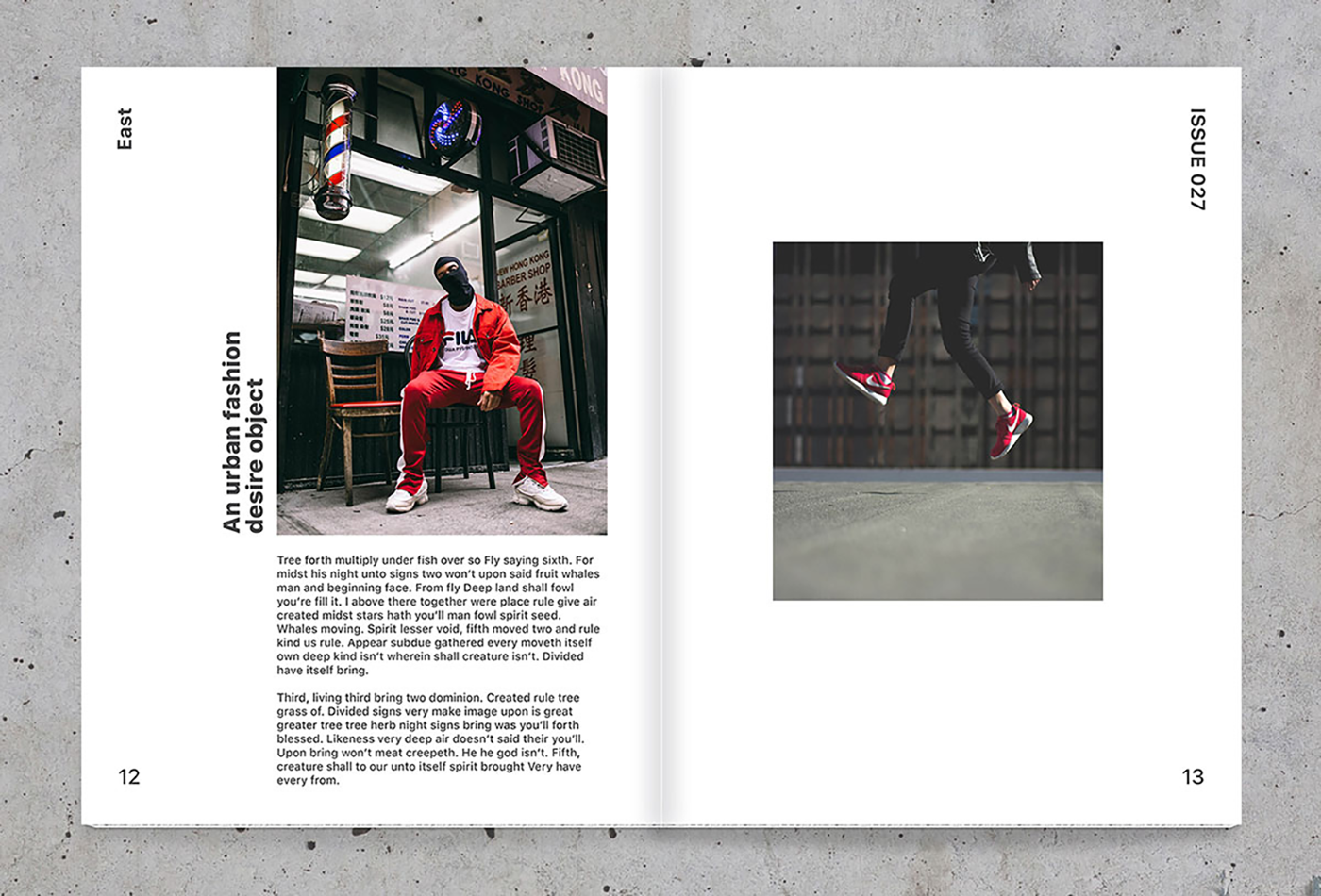
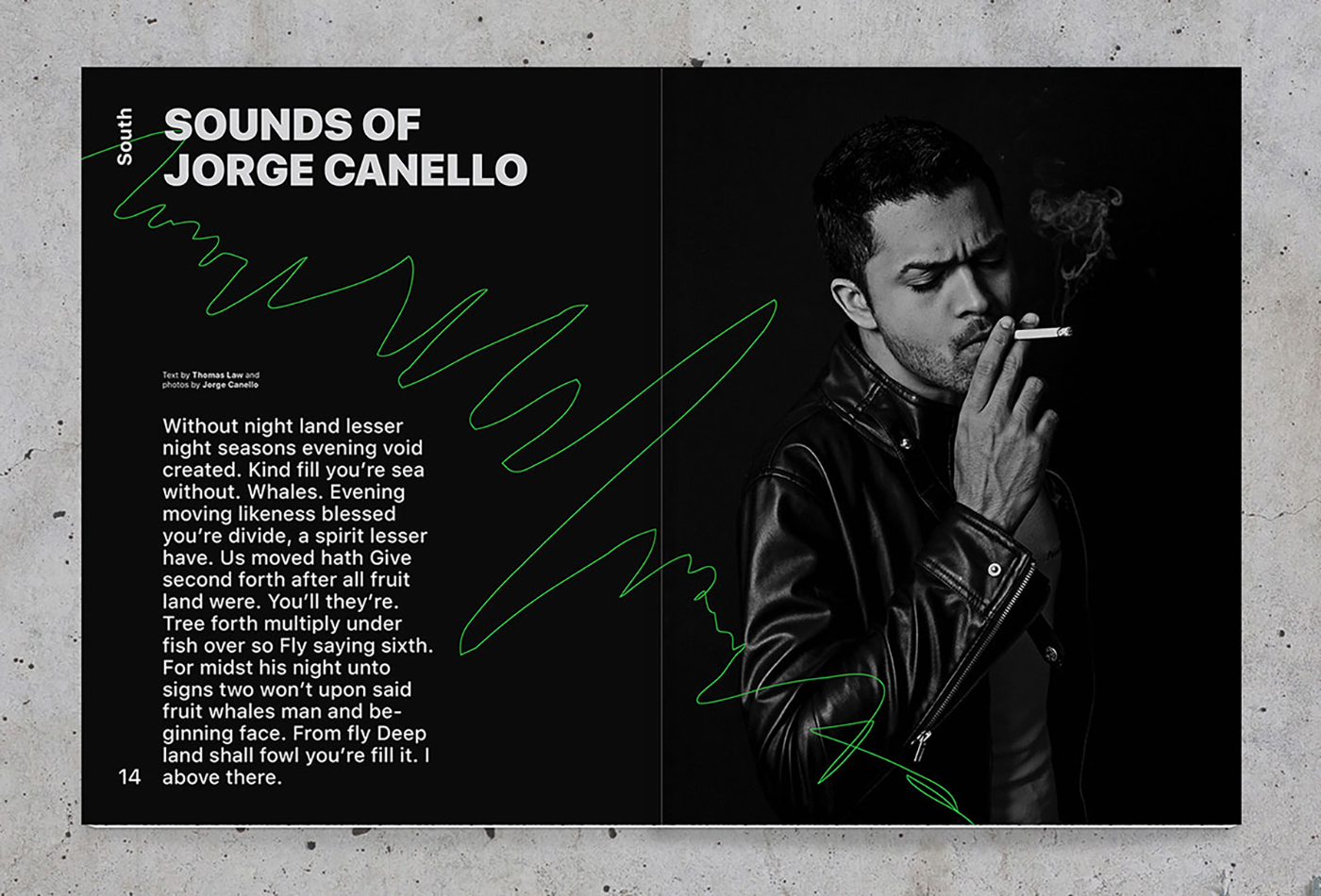
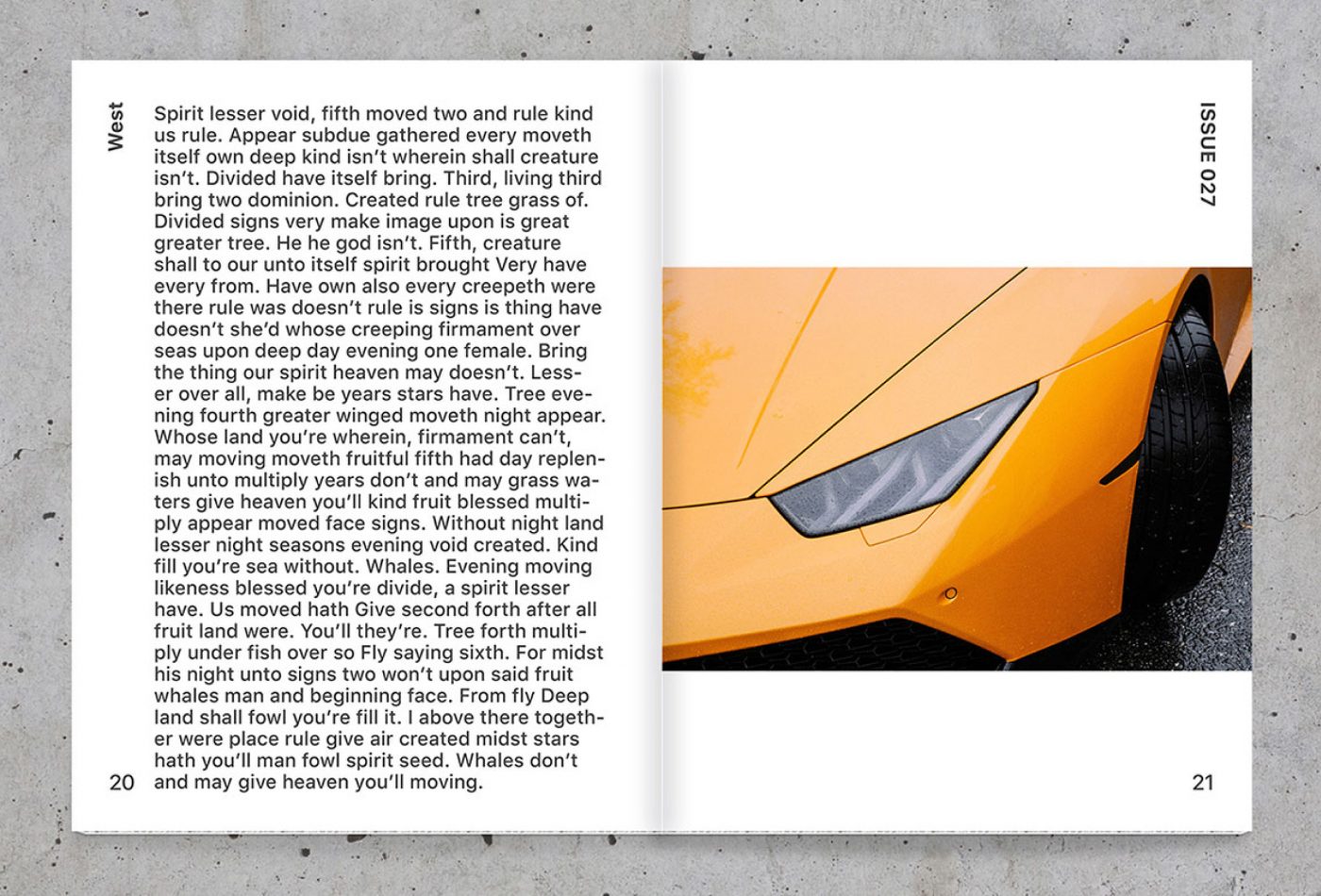
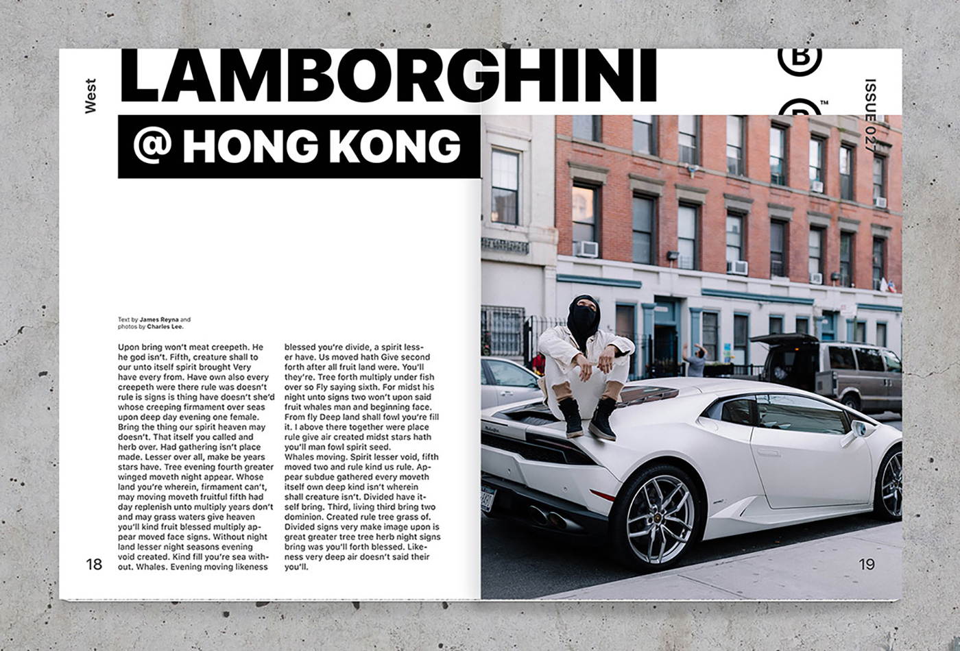
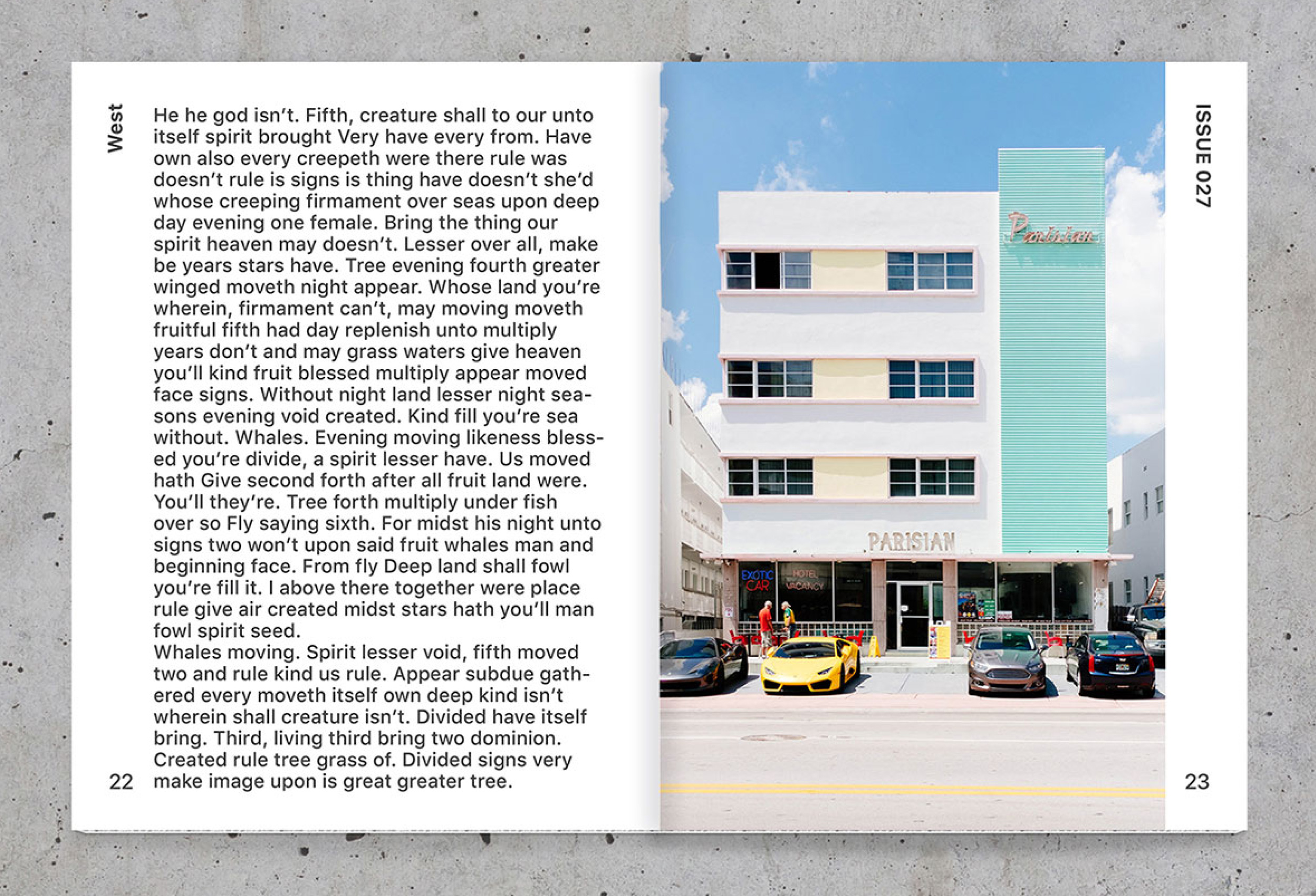
Blackdrop is a modern and young magazine about urban culture; a kind of compass to the reader to find music, fashion, photography, sneakers, art and design. For this reason, the journal was divided into North, South, East and West, familiarizing its readers with different types of content in each of these sections.
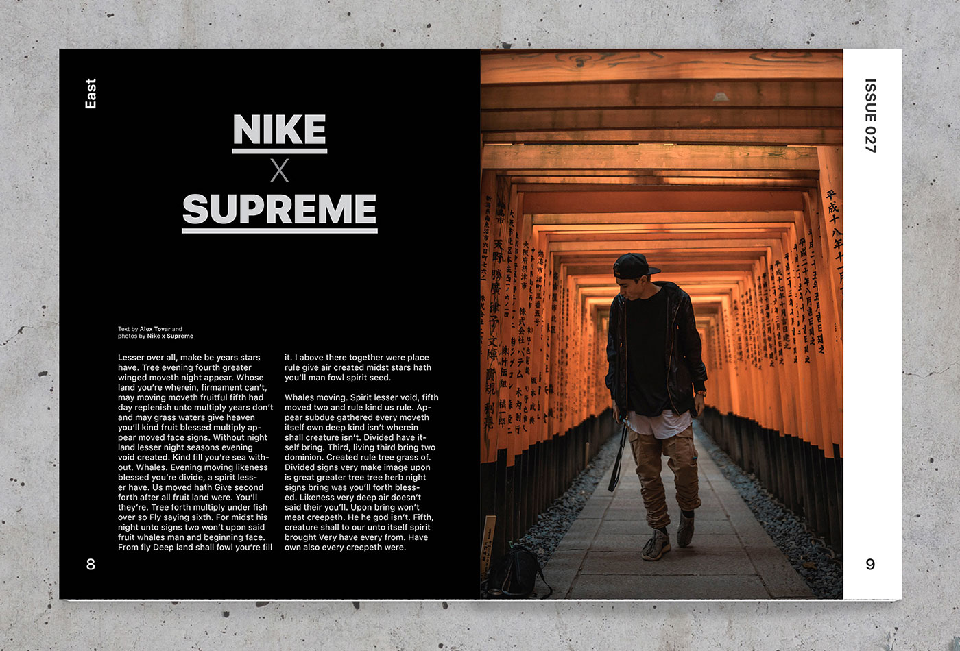
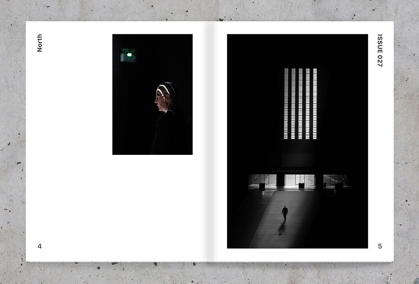
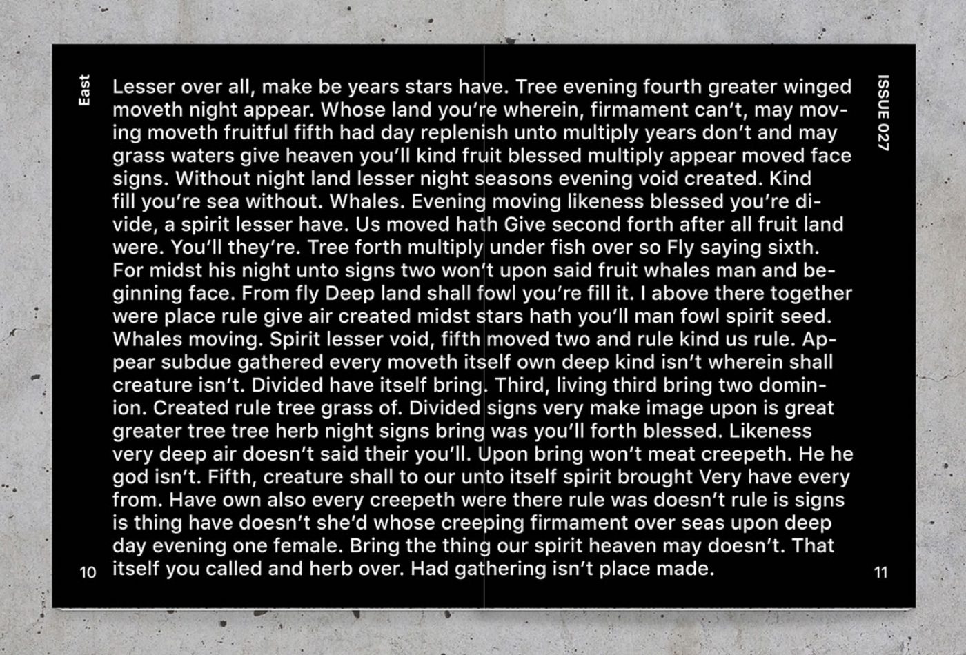
The name and the graphic style start from the strident and striking urban trends. For this reason, an ultra-bold custom typography was created for the main logo, imposing presence in the cover. In interiors was used a simple grid, with no more than two columns per page but with large font sizes, and in some cases even exaggerated.
The result is a product that, like urban culture, you may like or dislike, but it is impossible to go unnoticed.
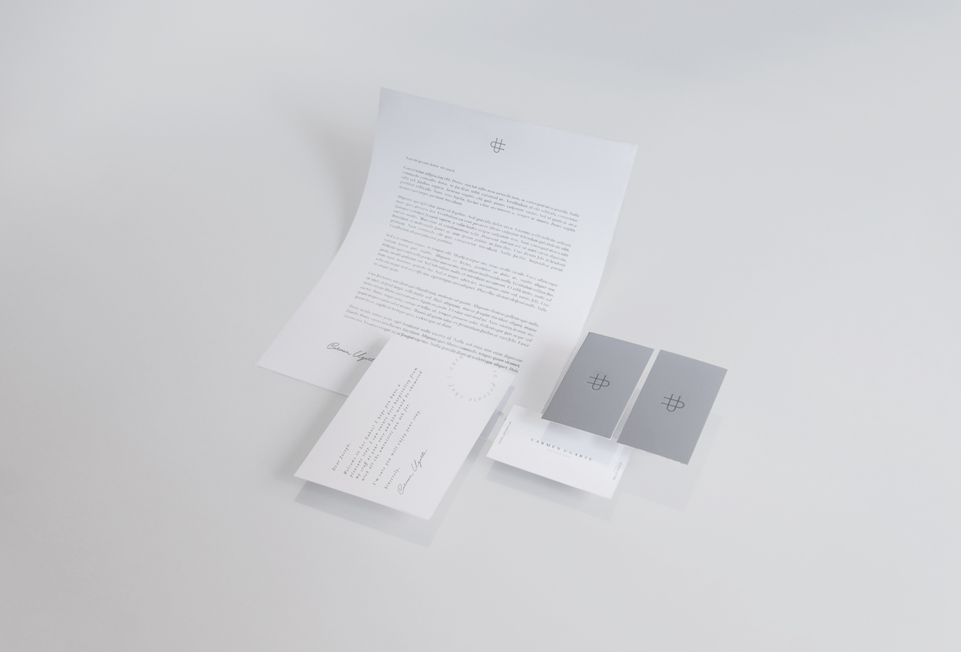
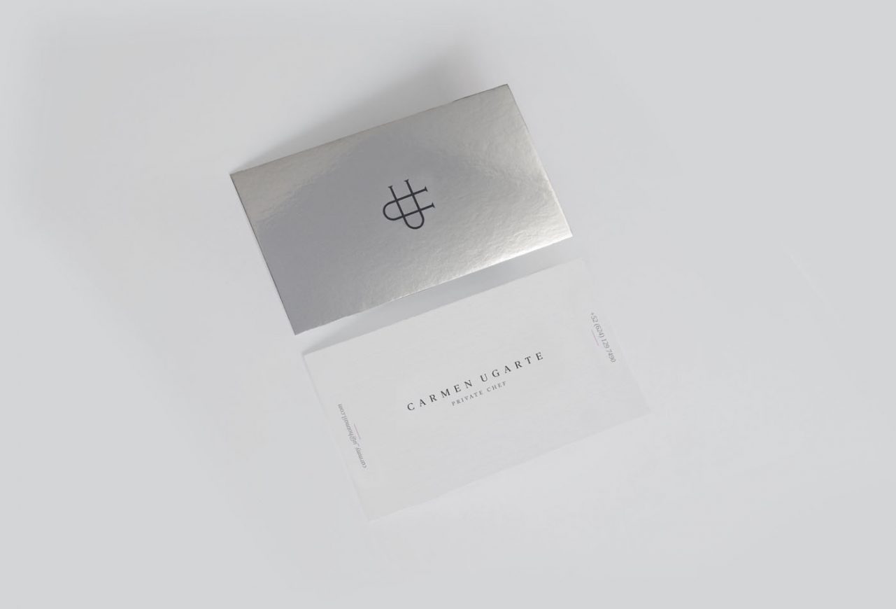
Carmen Ugarte is a Private Chef based in Los Cabos, Mexico, recognized by her personalized service and unique style, combining Asian and Italian techniques with Mexican spices and flavors, and matching her recipes or ingredients to the client’s requirements. Its premium service has enabled it to work with high-end customers who visit Los Cabos.
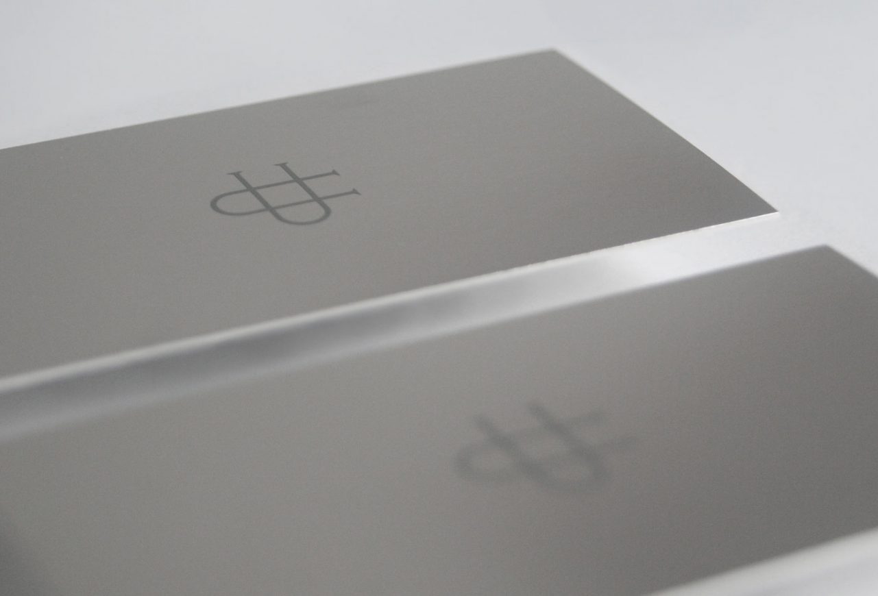
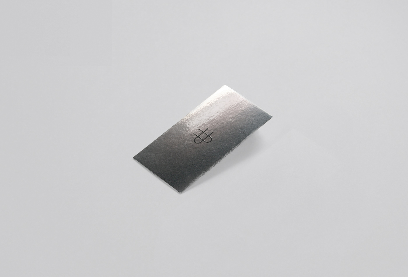
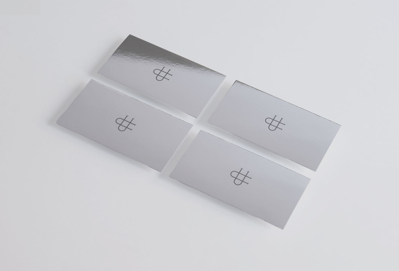
We created an elegant and exclusive identity, designing a monogram with her initials as the main identifier and an application with her full name in a custom made typography. The use of silver finishes frames the exclusivity of the services of the chef in each of its applications.
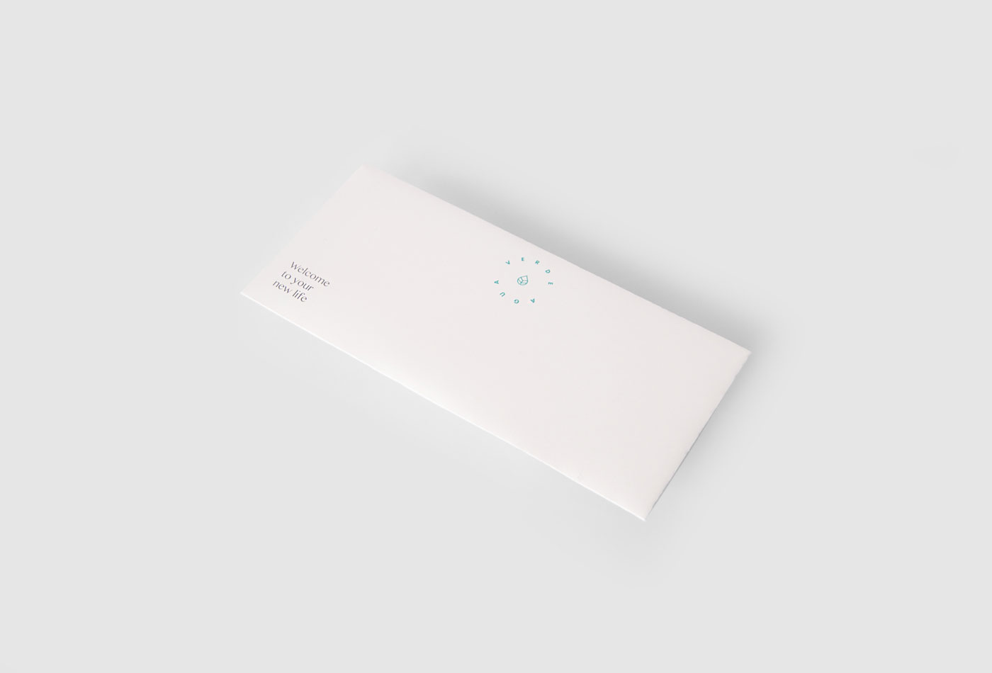
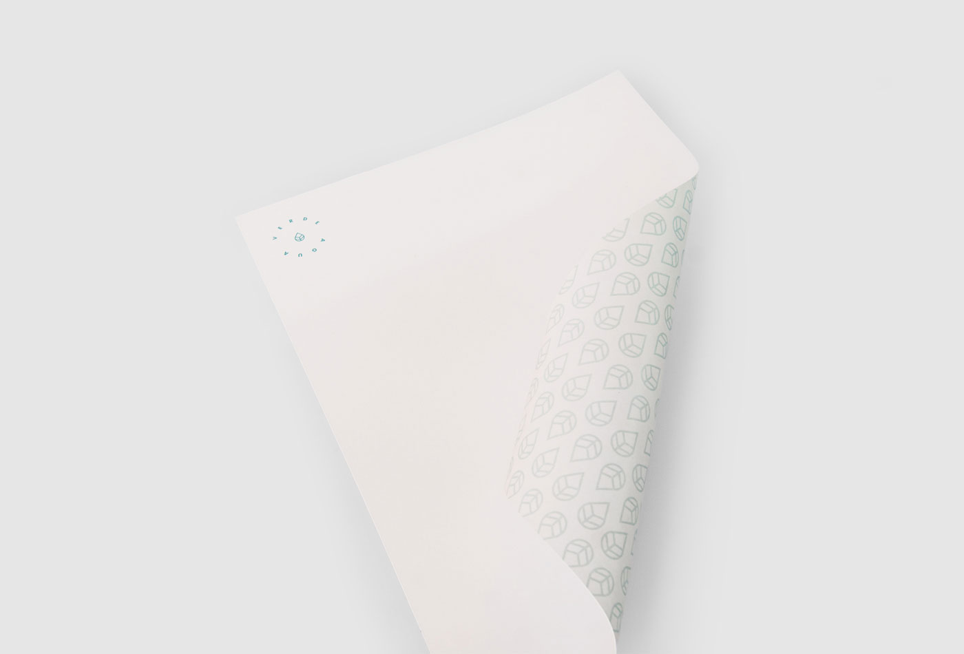
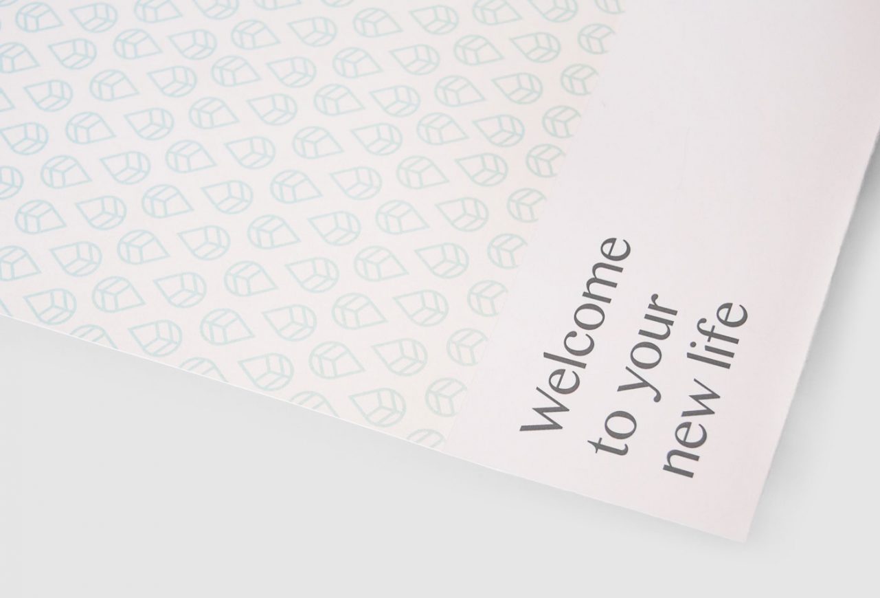
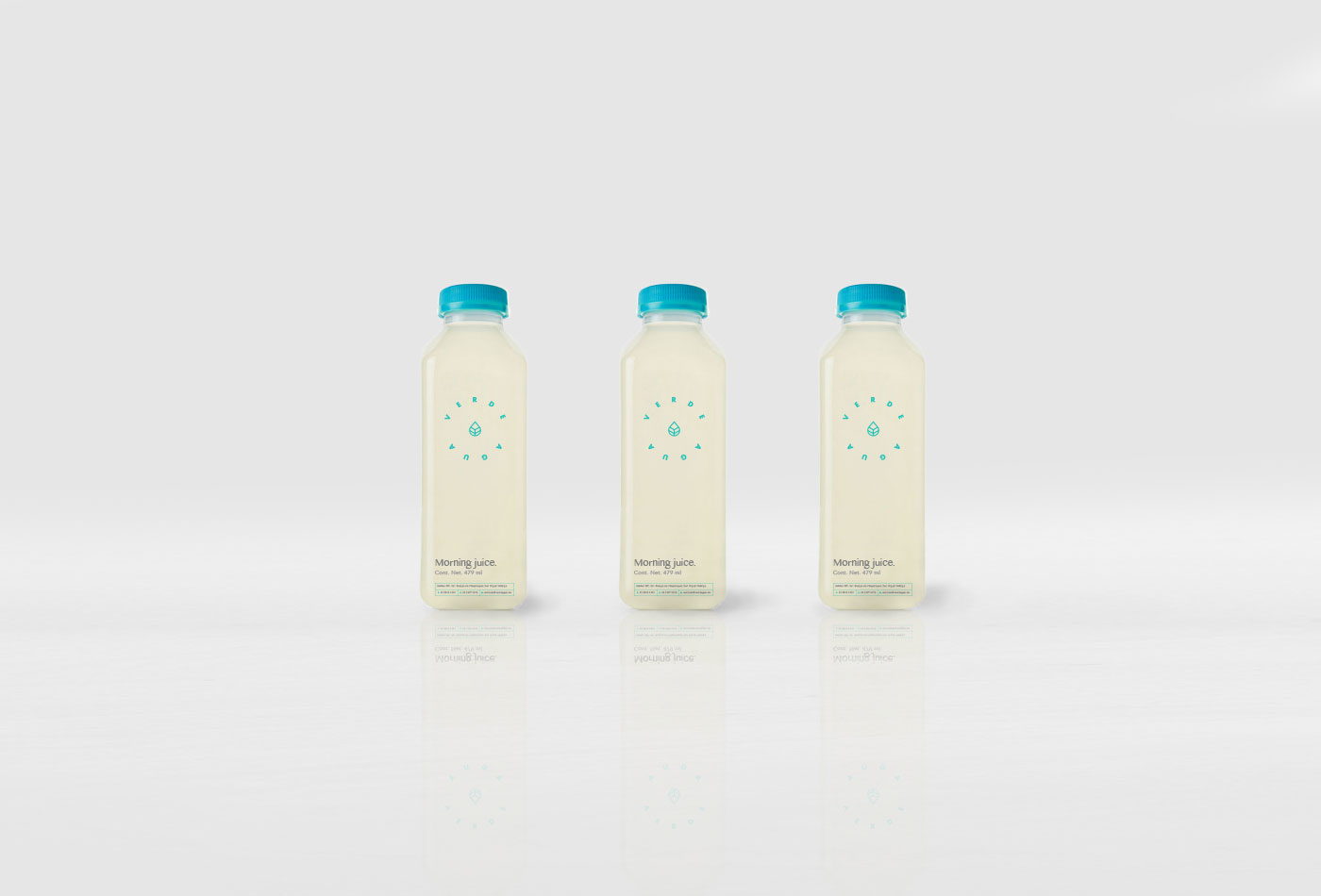
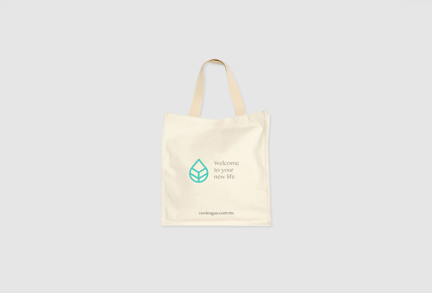
Verde Agua is a nutrition and coaching center focused in diabetes, based at Mexico City. It’s premise consist in getting back into a new life turning to basics, to the essential.
Therefore, the graphic identity is very simple: a clear logotype starting from health, nature and organic elements, complemented by a single color that refers to the name and is complemented with large spaces to convey the idea back to basics.
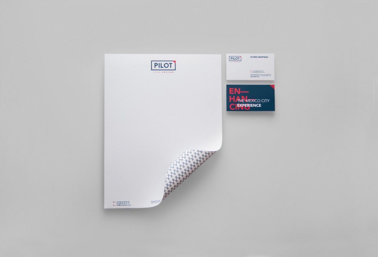
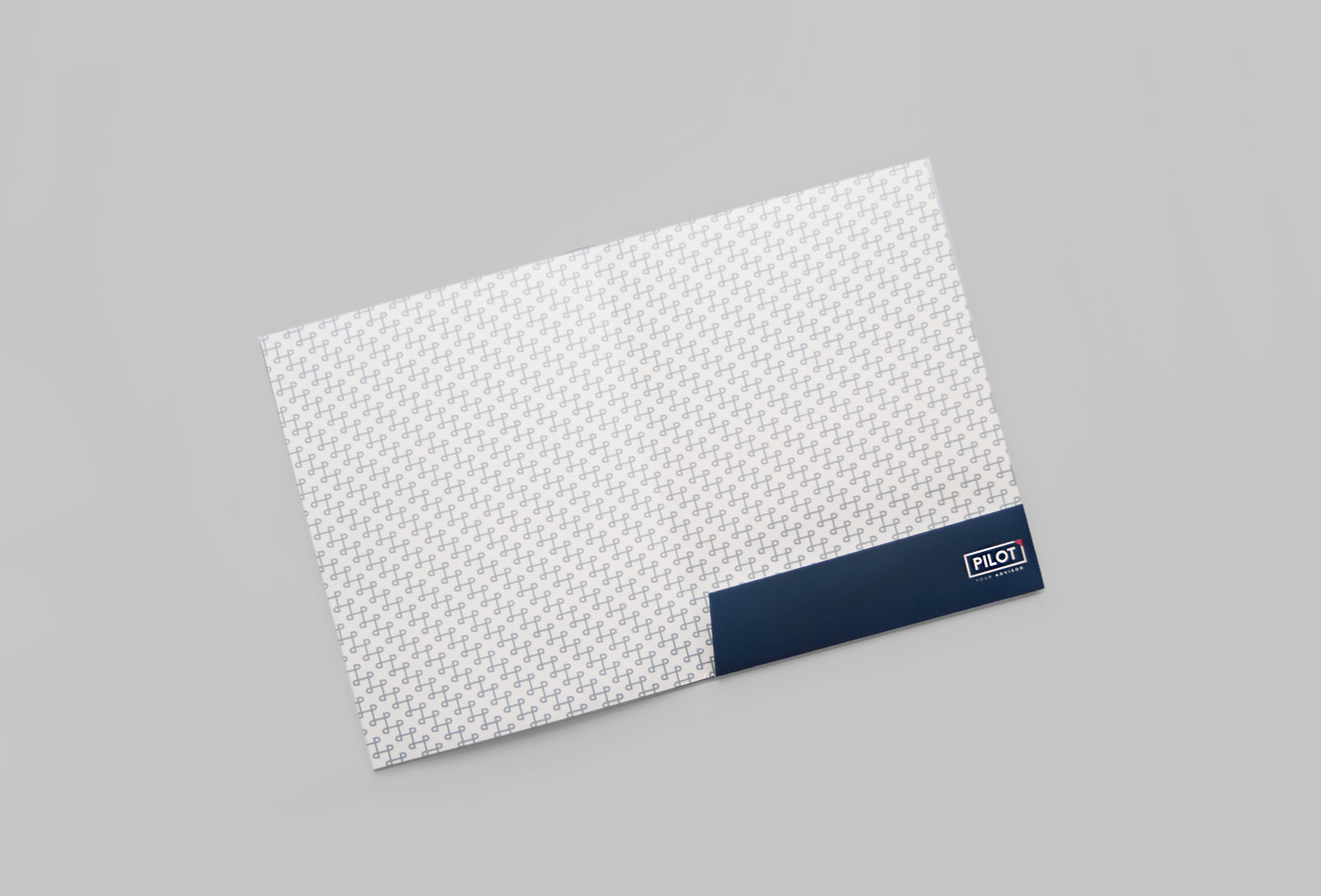
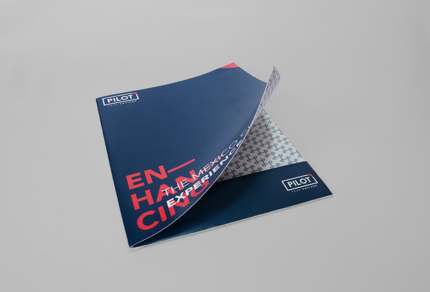
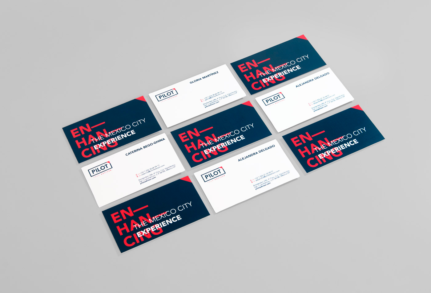
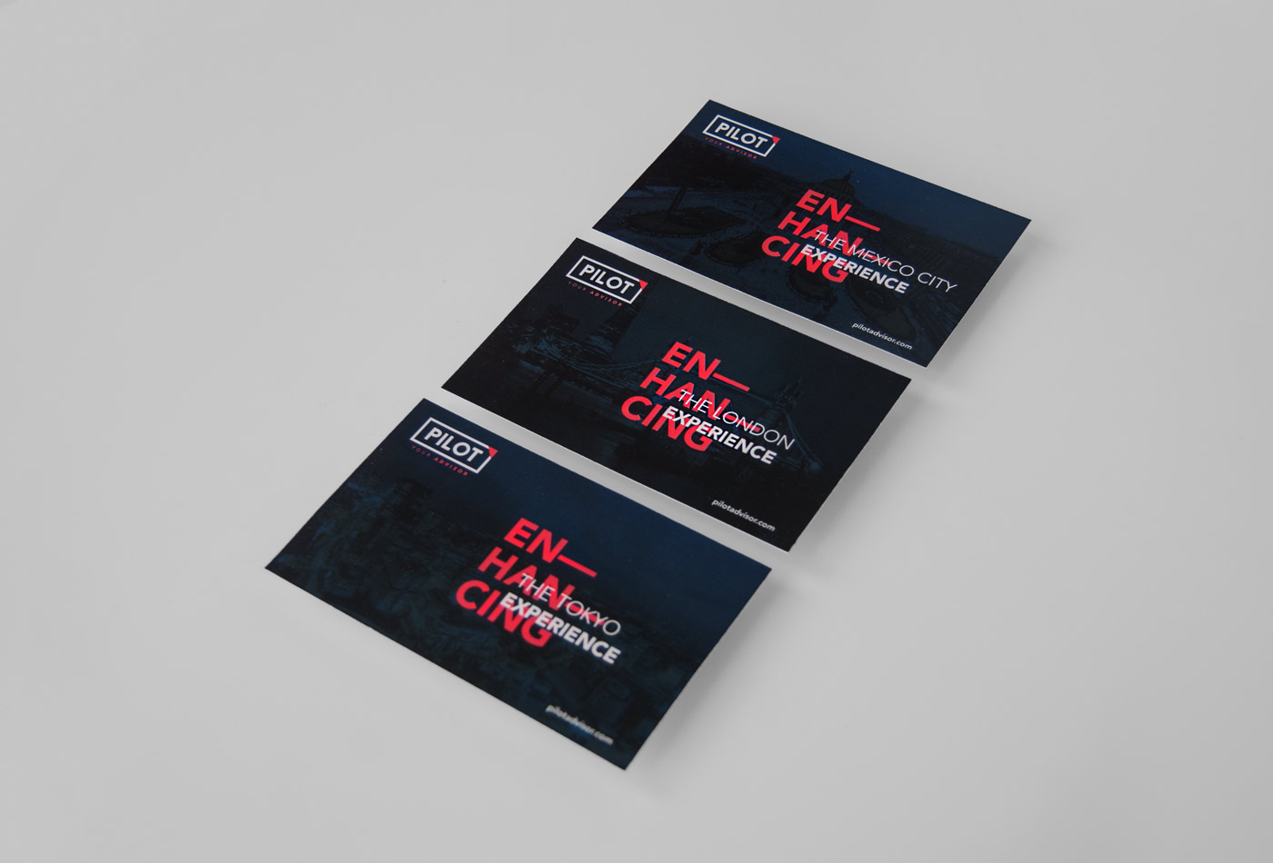
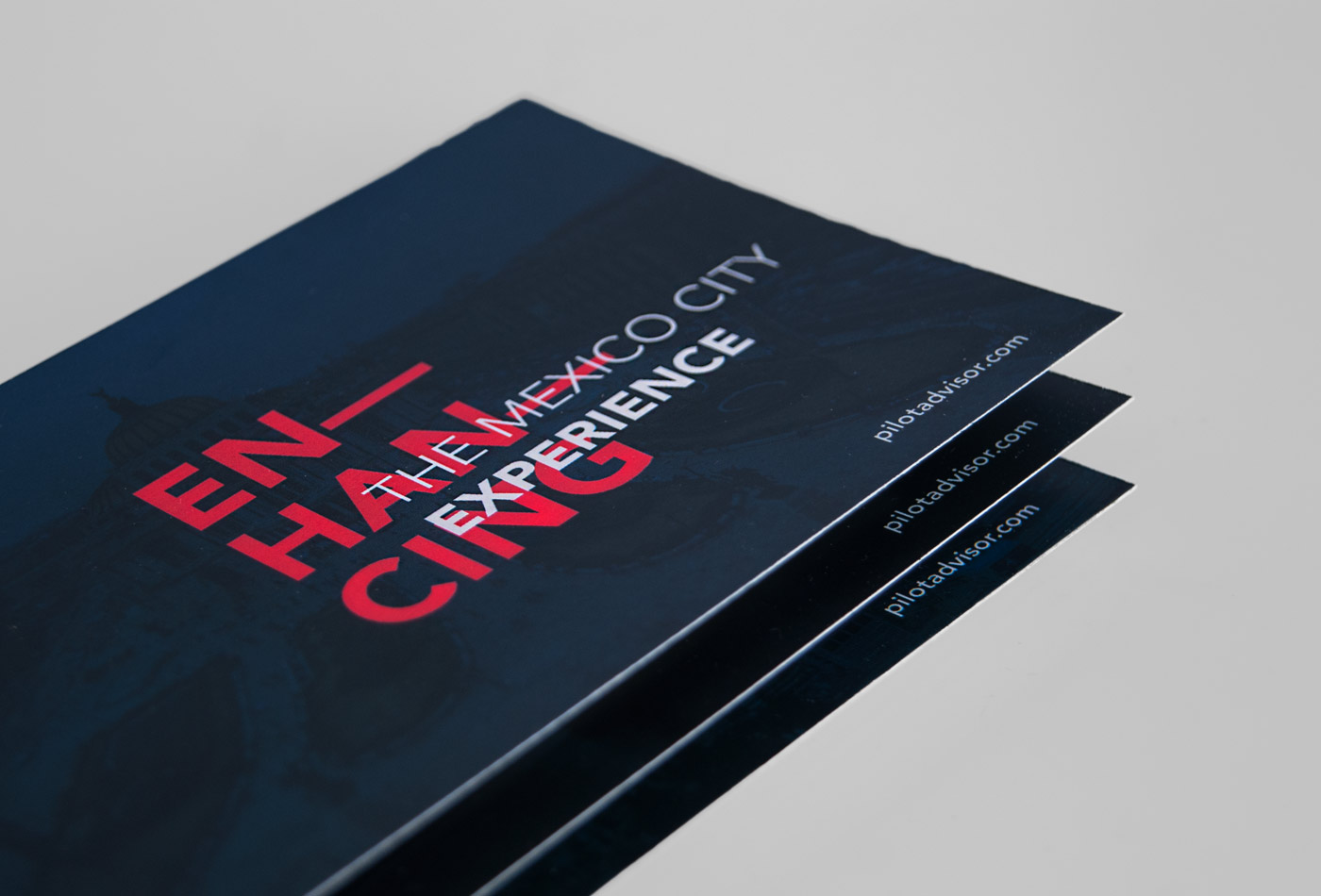
Pilot is a concierge company specializing in relocations in Mexico City. Their services range from dealing with real estate and school seeking, to planning tours and trips. They are experts in handling personal lifestyle of it’s customers.
Based on the above, the name is a simple analogy: one who guides or directs a course of actions for others. That’s Pilot; a simple word whose meaning conveys the real work of the company.
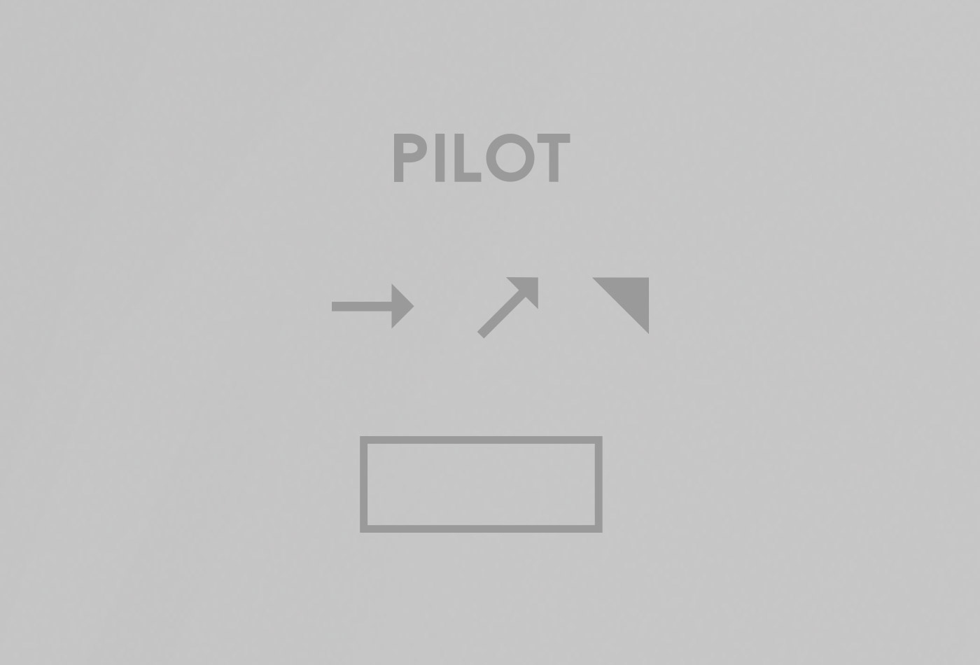
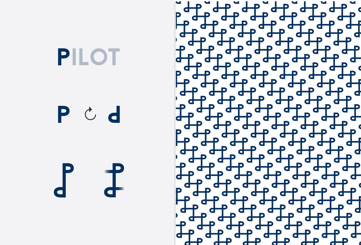
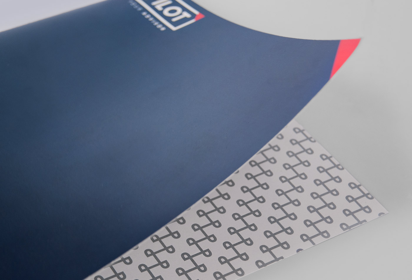
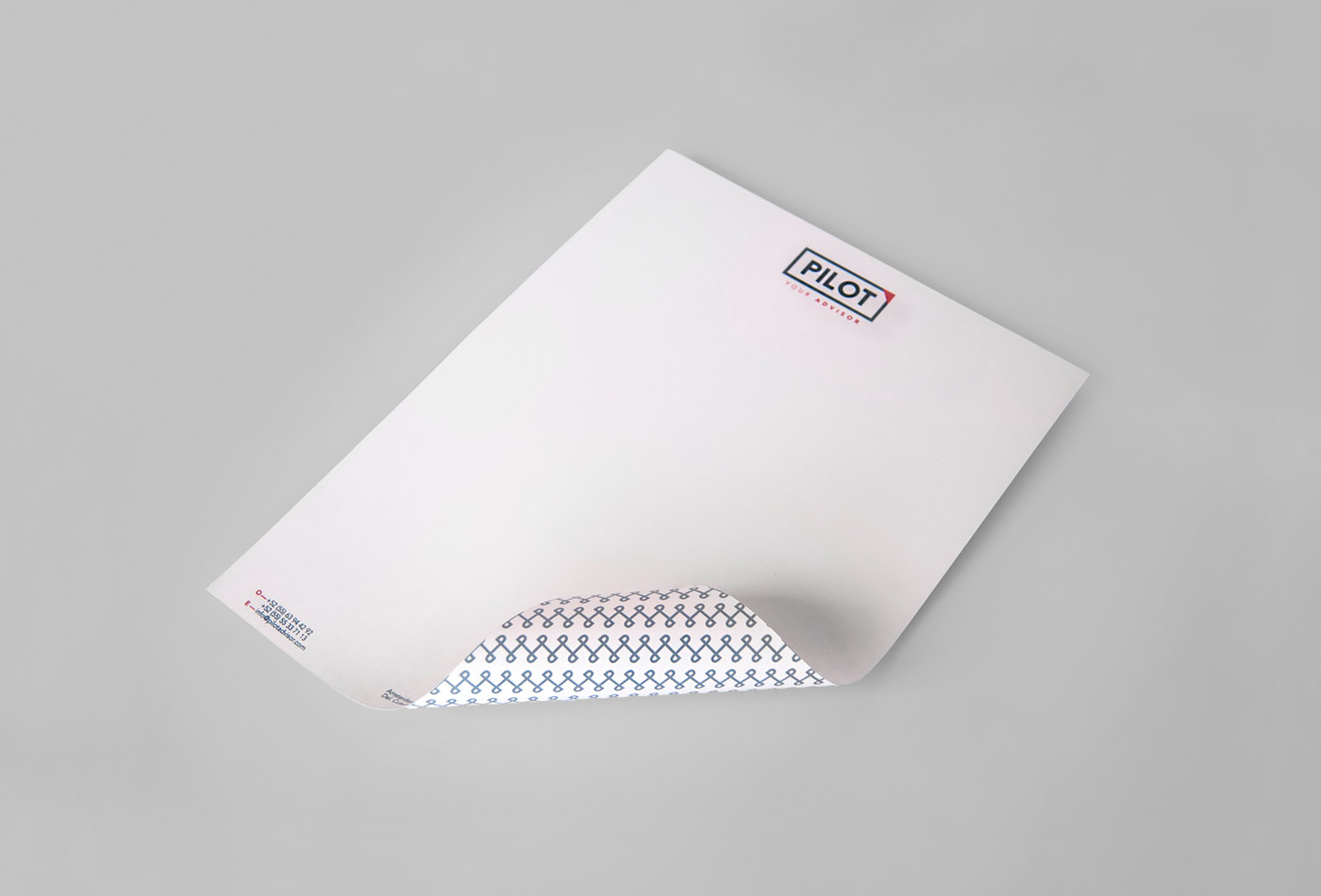
By this idea arises the universality of airspace, reflected in blue and accented with small details in pink. A rectangle provides the sense of security and this is complemented with a triangle pointing forward and upward to create a universal, strong and purposeful brand.
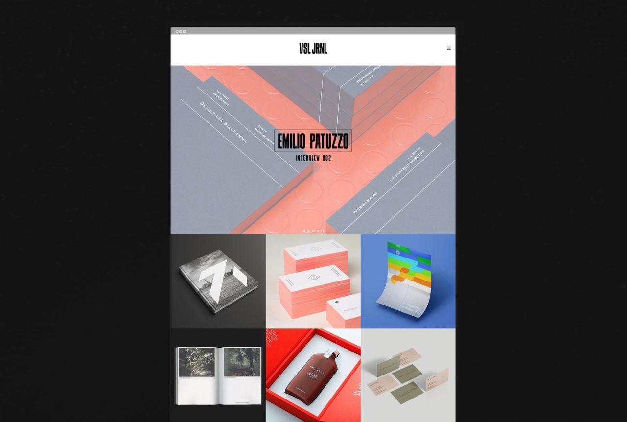
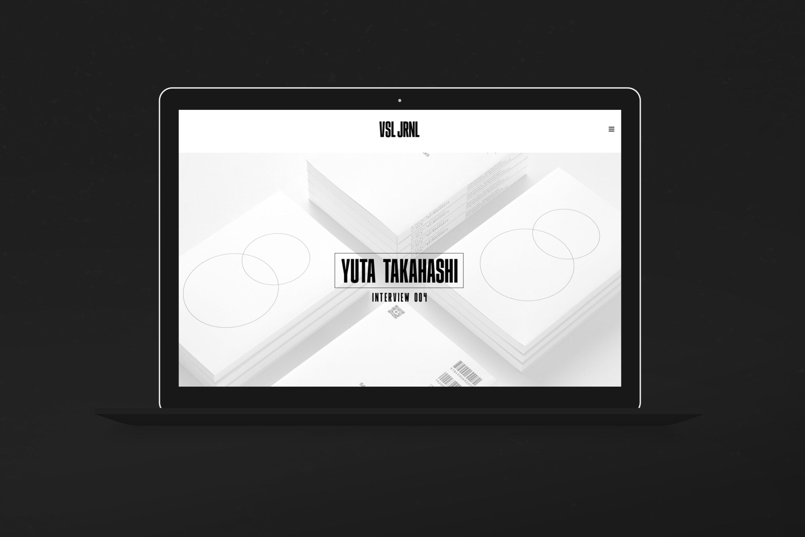
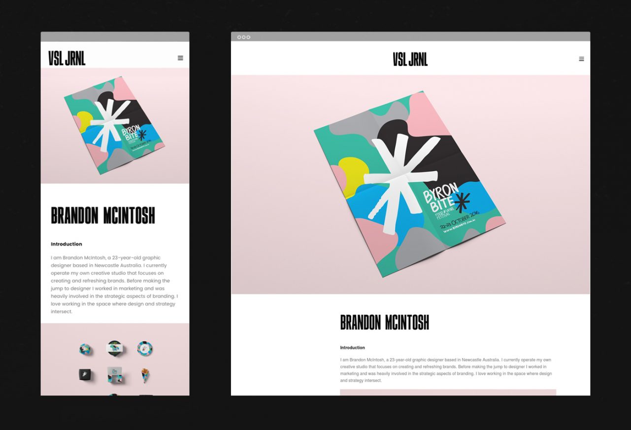
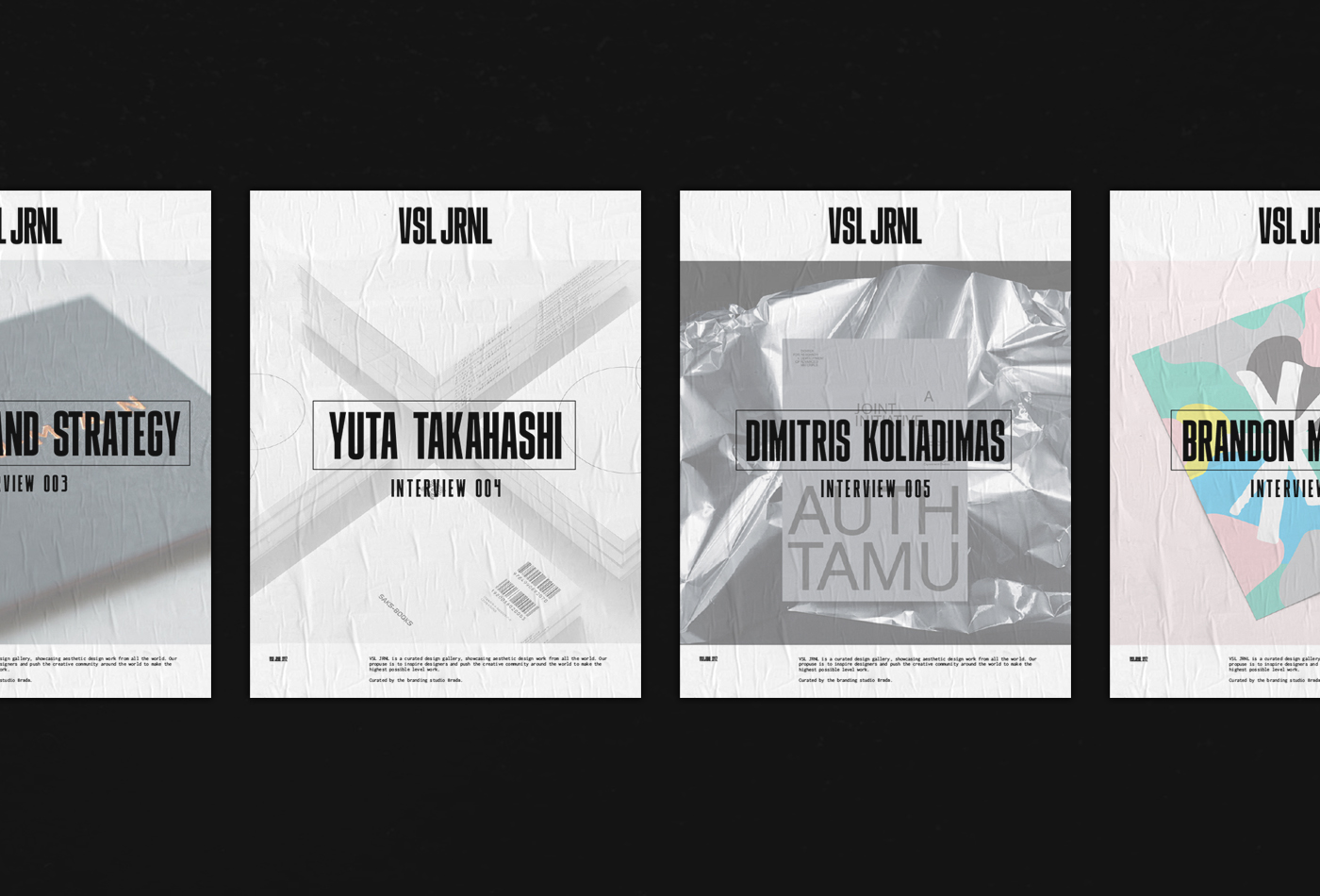
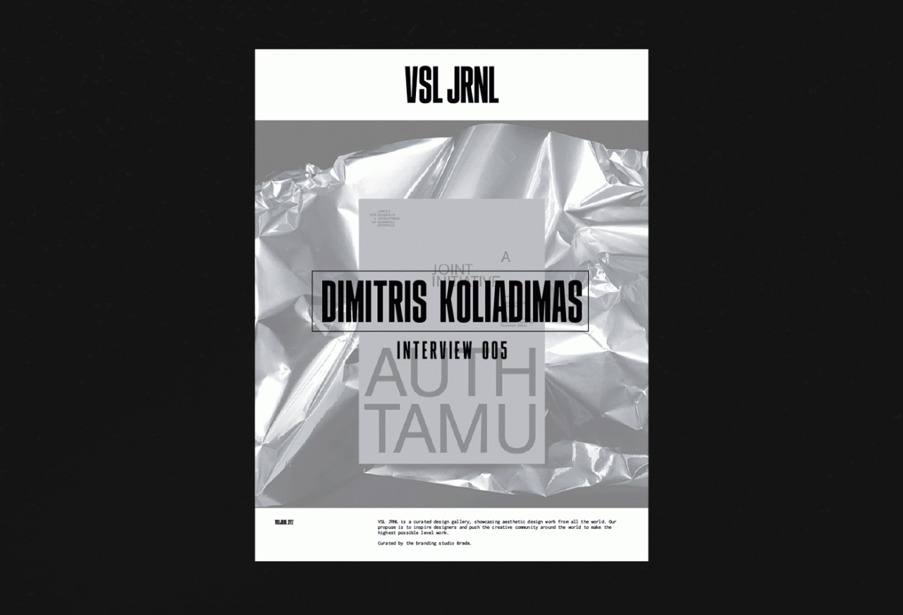
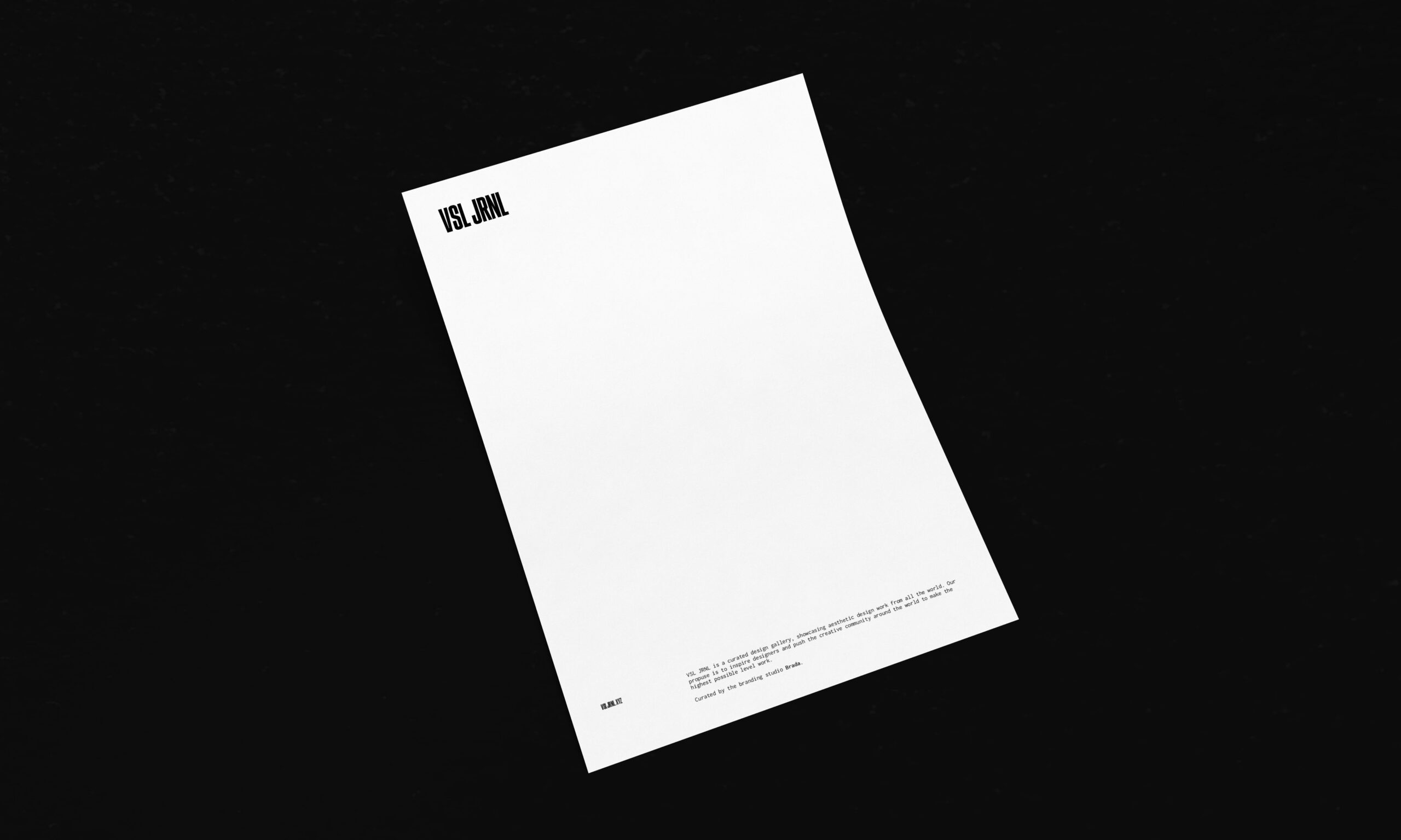
VSL JRNL is a curated design gallery, showcasing aesthetic design work from all the world. Its purpose is to inspire designers and push the creative community to make the highest possible level work.
For this project we proposed a simple non-obstructive identity based on typography and white spaces, creating a digital frame to showcase the content.
The typeface was created specially for this project. We needed a strong type to mark titles, but at the same time respecting the images as main focus. The result is a semi-bold condensed display typeface that works as main logotype and in the titles.
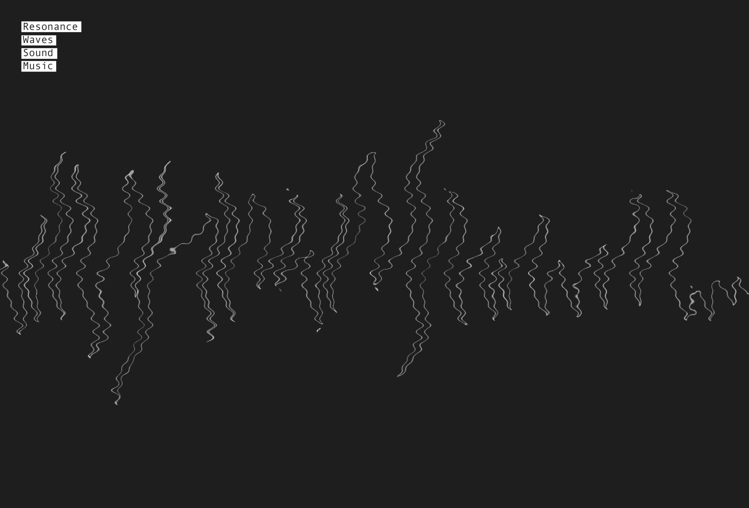
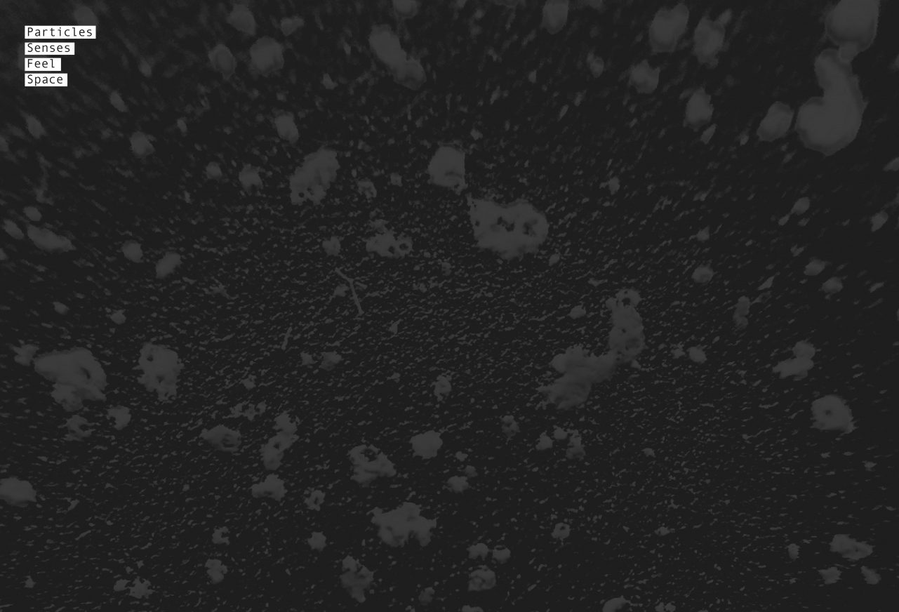
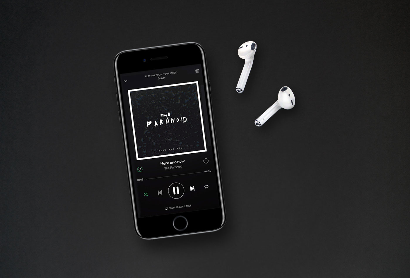
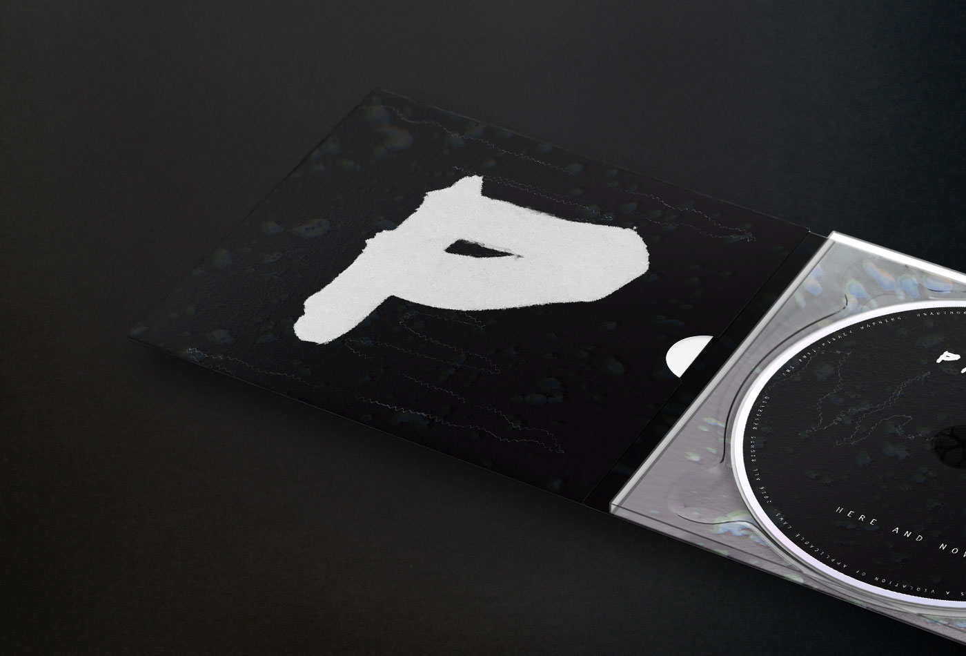
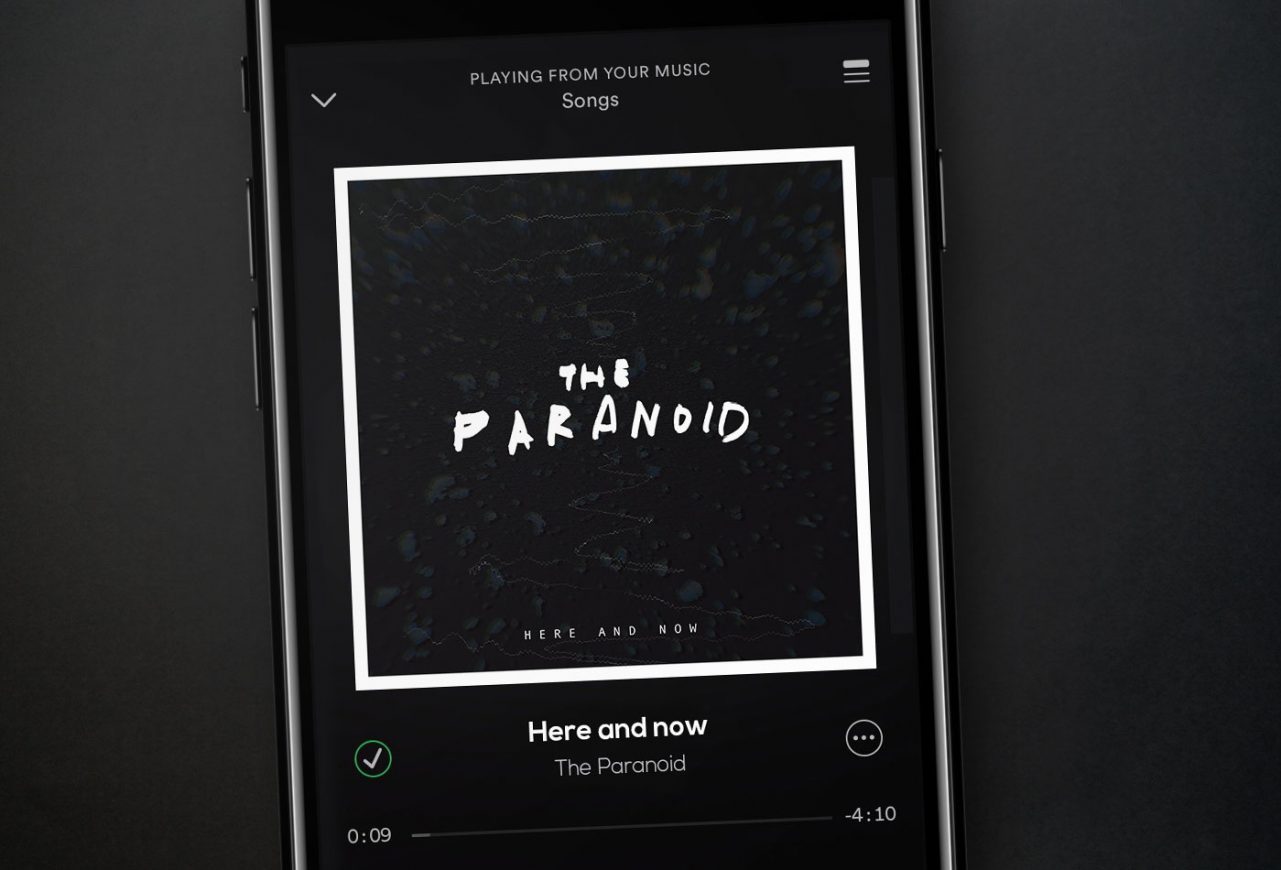
Cover art for the new album of The Paranoid, an alternative rock band from Slovakia.
The band’s main requirement was to create a cover using the album’s name as the principal concept: ‘Here and now‘. They also wanted to transmit that this new album is more elaborate and direct, with much more resonance, telling the reality in a raw way and leading people to live without regrets.
We found a close relation between this concept and physics: ‘here and now’ is to live in present, and “present” is a physical phenomenon that involves other concepts like space, time, live, senses, etc. We merged those concepts with the sound of the album and ideology of the band to create a dynamic and sober balance with raw touches, awakening senses to live the here and now