BRADA IS A GRAPHIC DESIGN STUDIO SPECIALIZED IN BRANDING. IF YOU WANT TO CONTACT US PLEASE FEEL FREE TO SEND US AN EMAIL TO INFO@BRADA.CO OR CHECK OUR CONTACT SECTION.
BRADA IS A GRAPHIC DESIGN STUDIO SPECIALIZED IN BRANDING. IF YOU WANT TO CONTACT US PLEASE FEEL FREE TO SEND US AN EMAIL TO INFO@BRADA.CO OR CHECK OUR CONTACT SECTION.
BRADA IS A GRAPHIC DESIGN STUDIO SPECIALIZED IN BRANDING. IF YOU WANT TO CONTACT US PLEASE FEEL FREE TO SEND US AN EMAIL TO INFO@BRADA.CO OR CHECK OUR CONTACT SECTION.
BRADA IS A GRAPHIC DESIGN STUDIO SPECIALIZED IN BRANDING. IF YOU WANT TO CONTACT US PLEASE FEEL FREE TO SEND US AN EMAIL TO INFO@BRADA.CO OR CHECK OUR CONTACT SECTION.
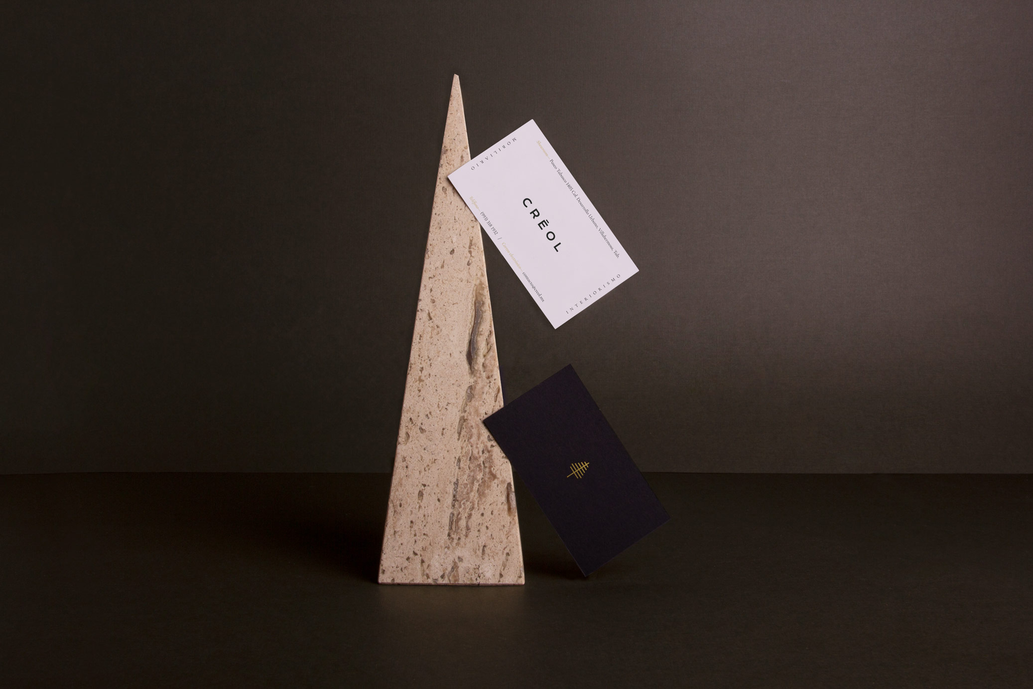
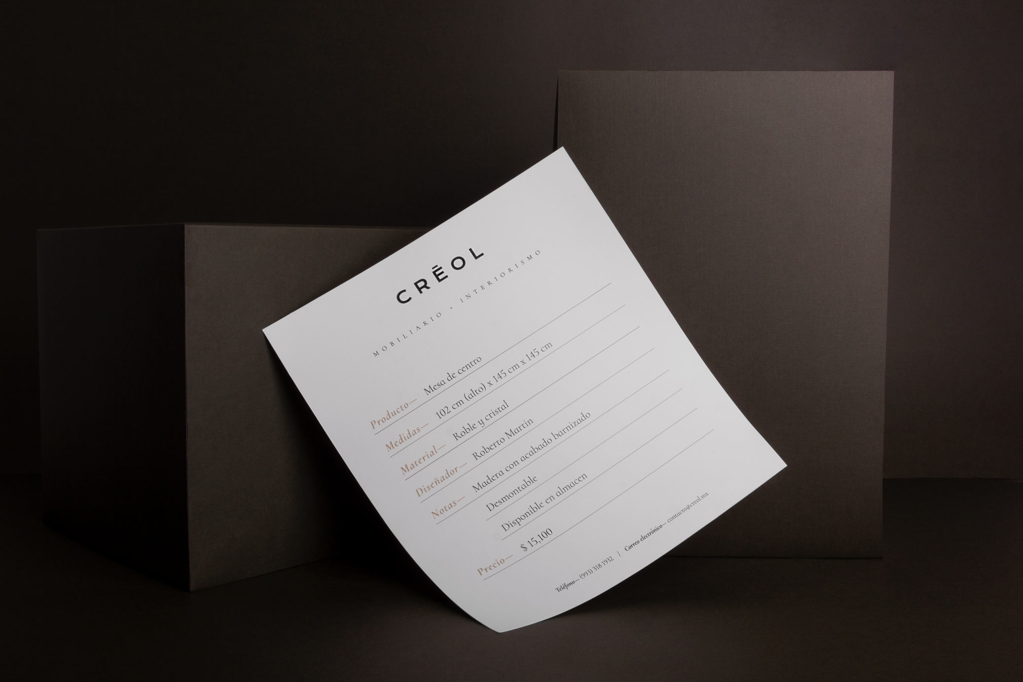
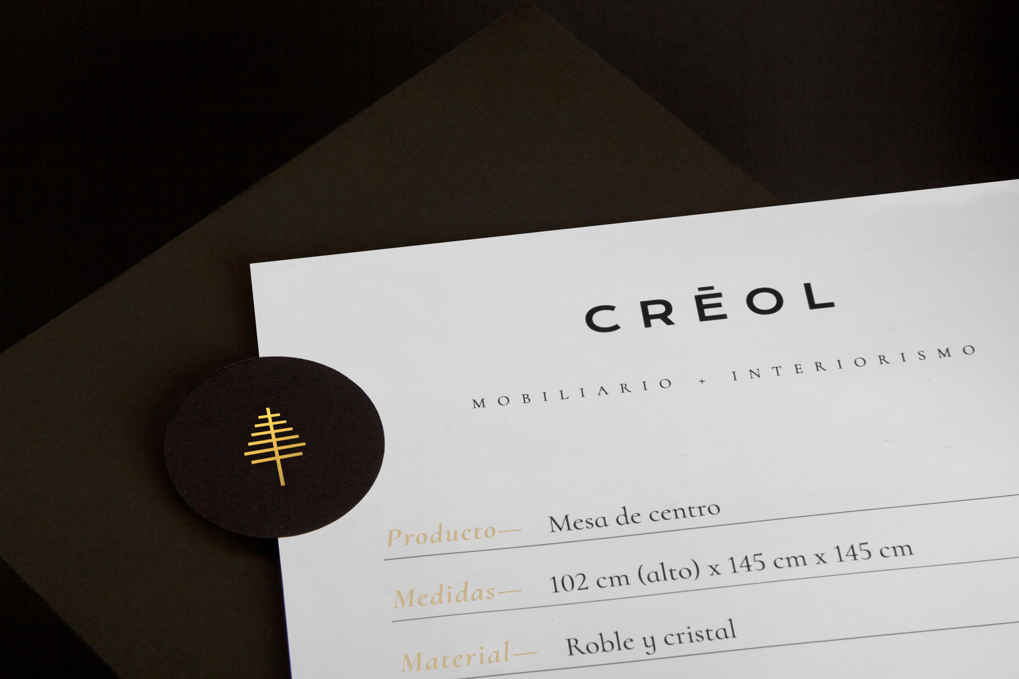
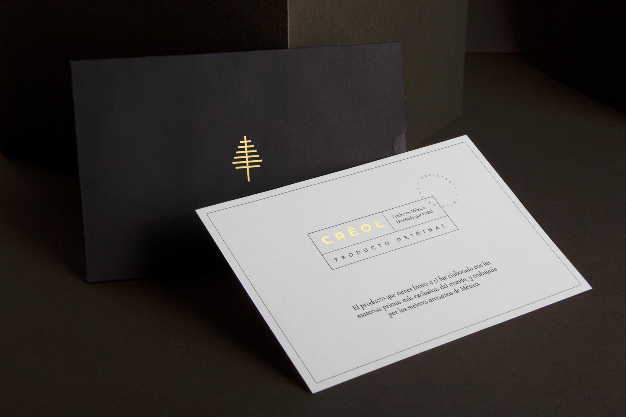
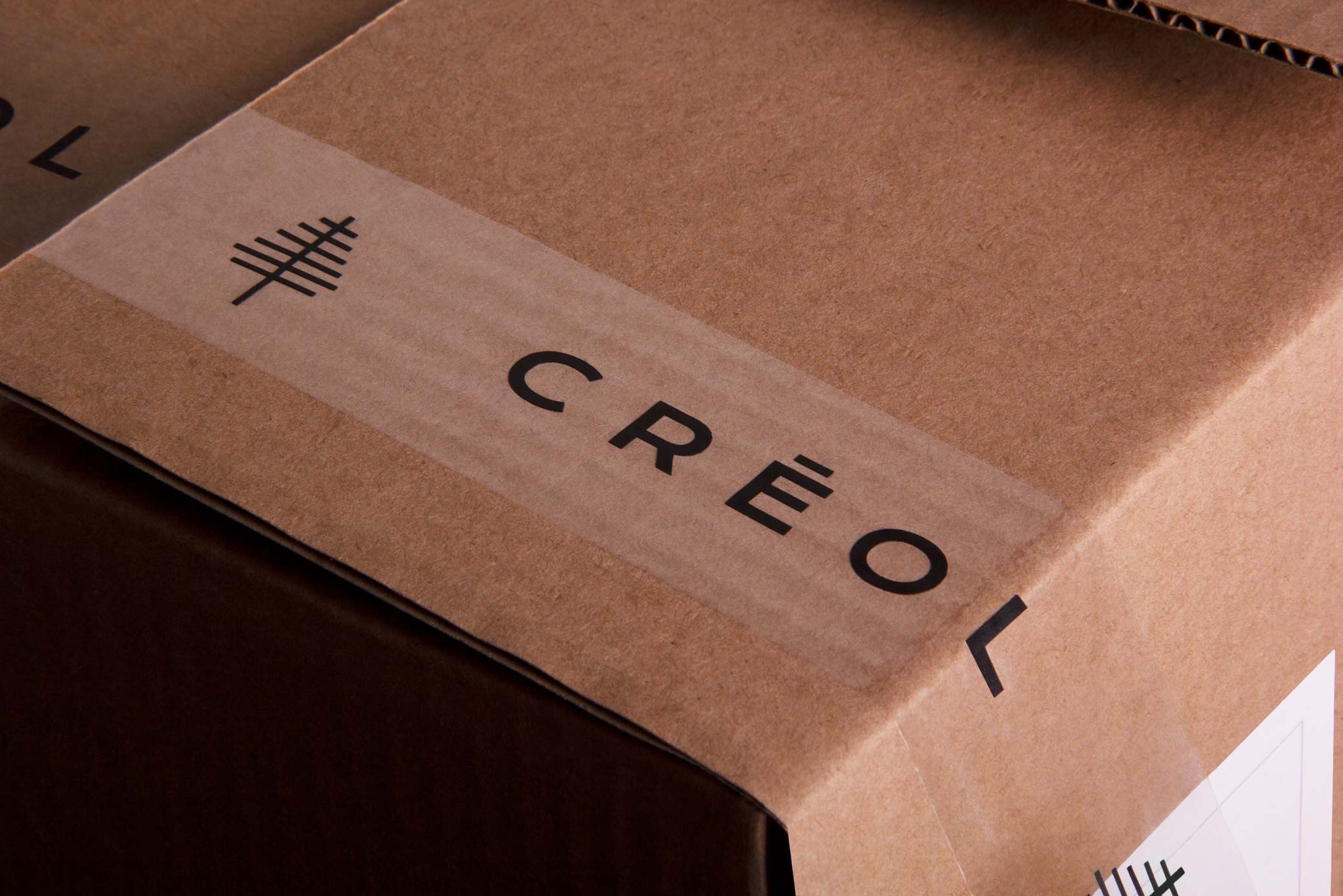
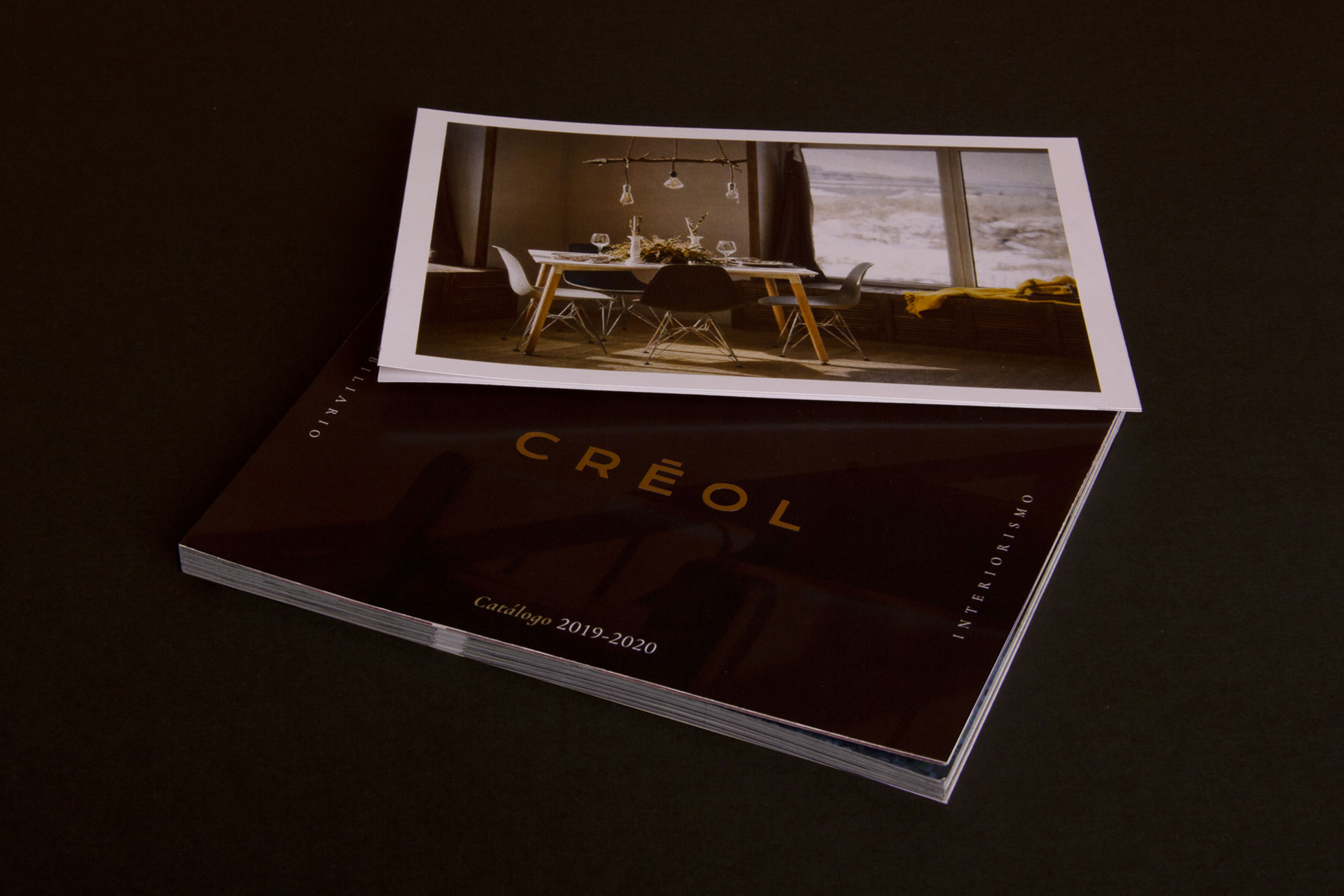
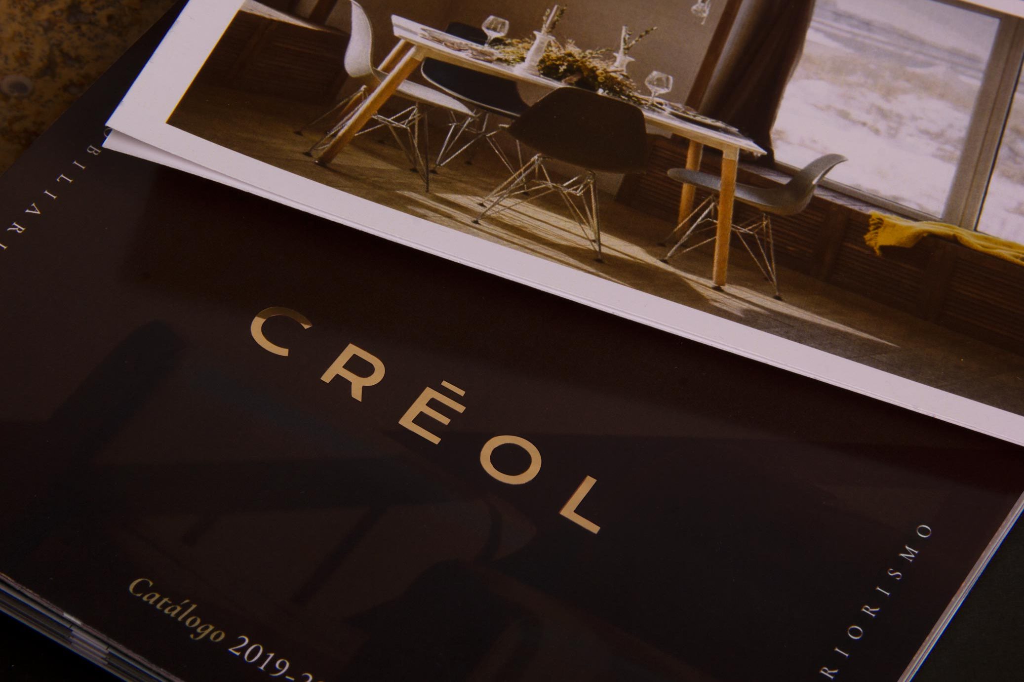
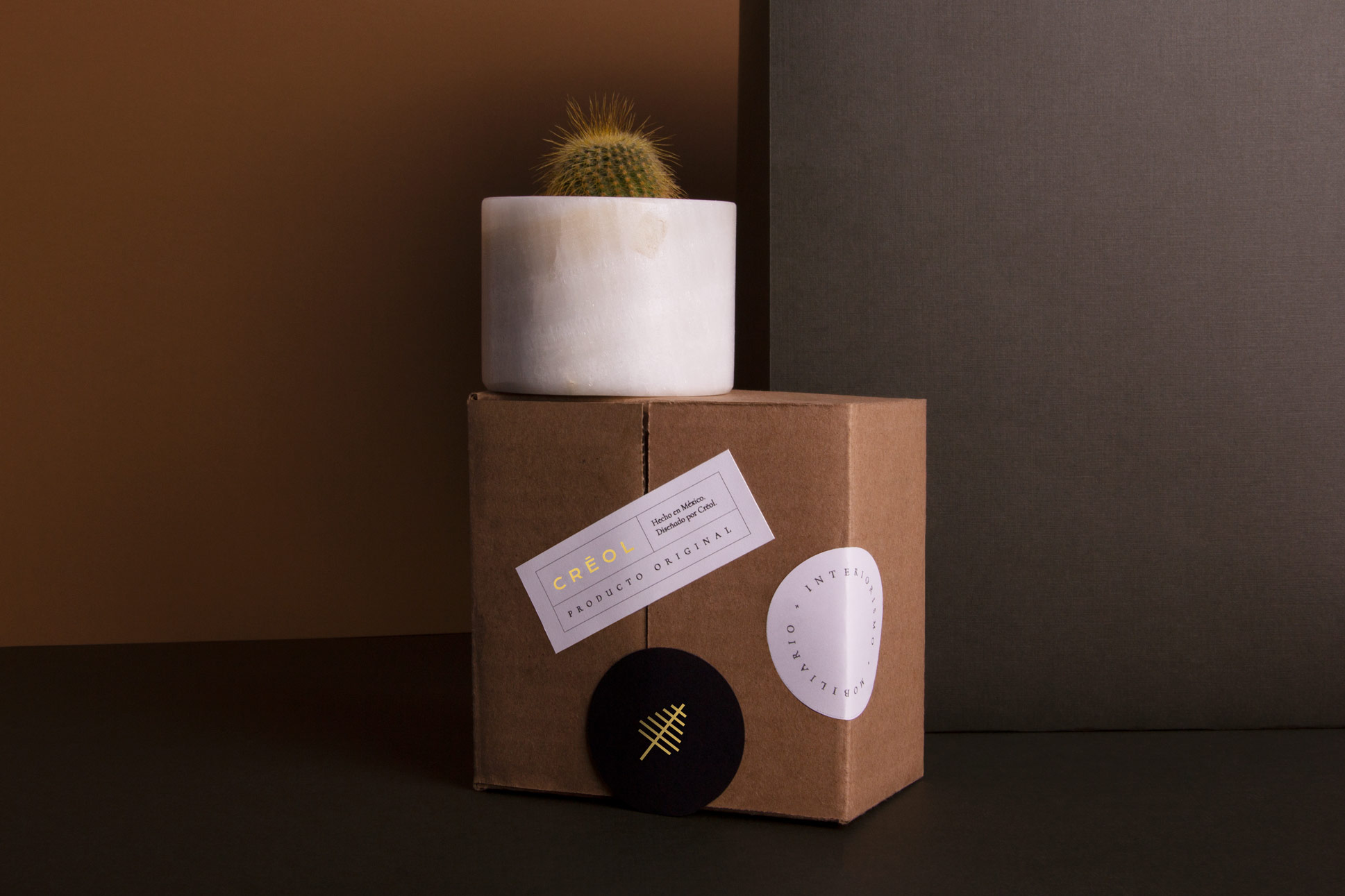
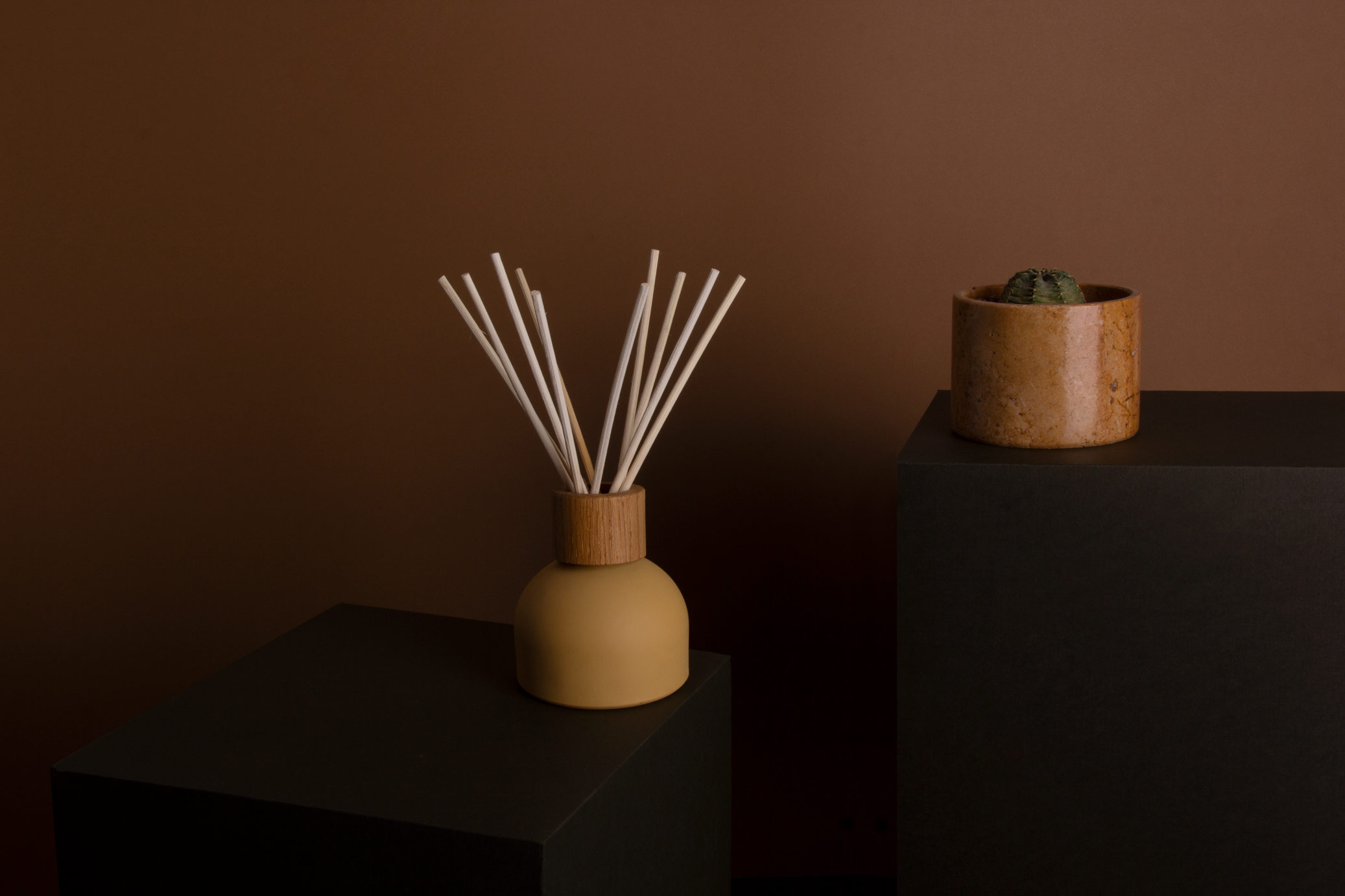
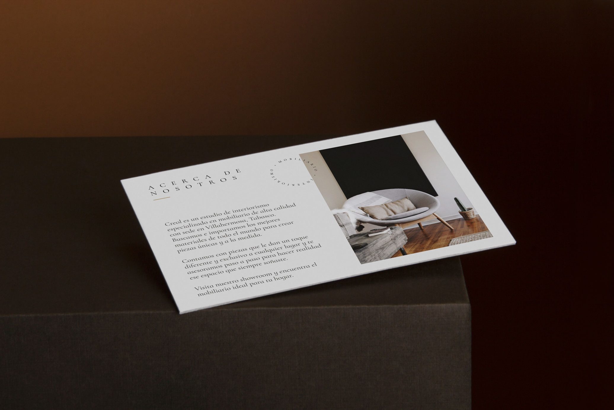
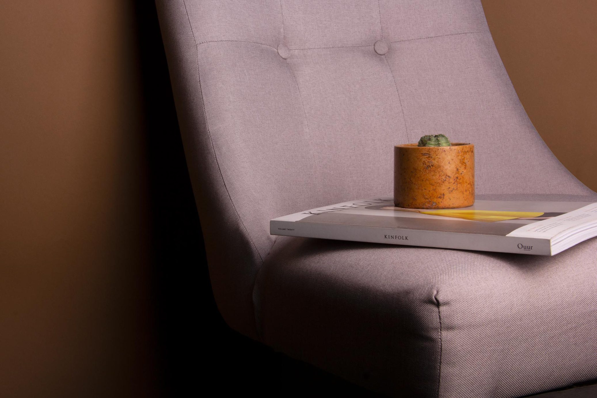
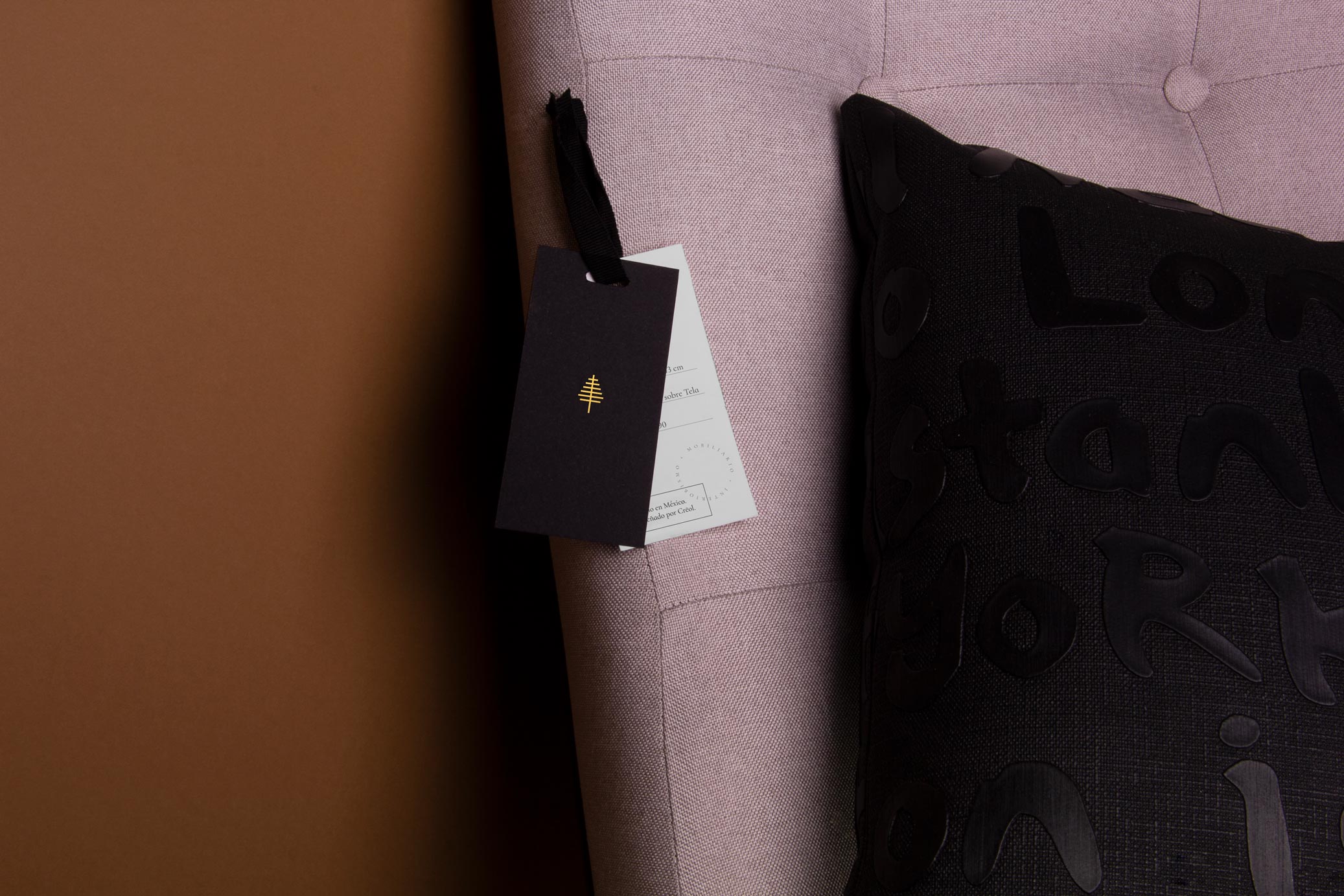
Creol is a workshop focused on interior design, luxury furniture and high-end decoration pieces made with exclusive materials from different parts of the world, by Mexican hands.
The name refers to the mixture and diversity of each material’s origin, so the final product is a combination of different regions and cultures around the world. The sobriety of black and white materials in combination with gold details gives to the brand a luxury and exclusive look.
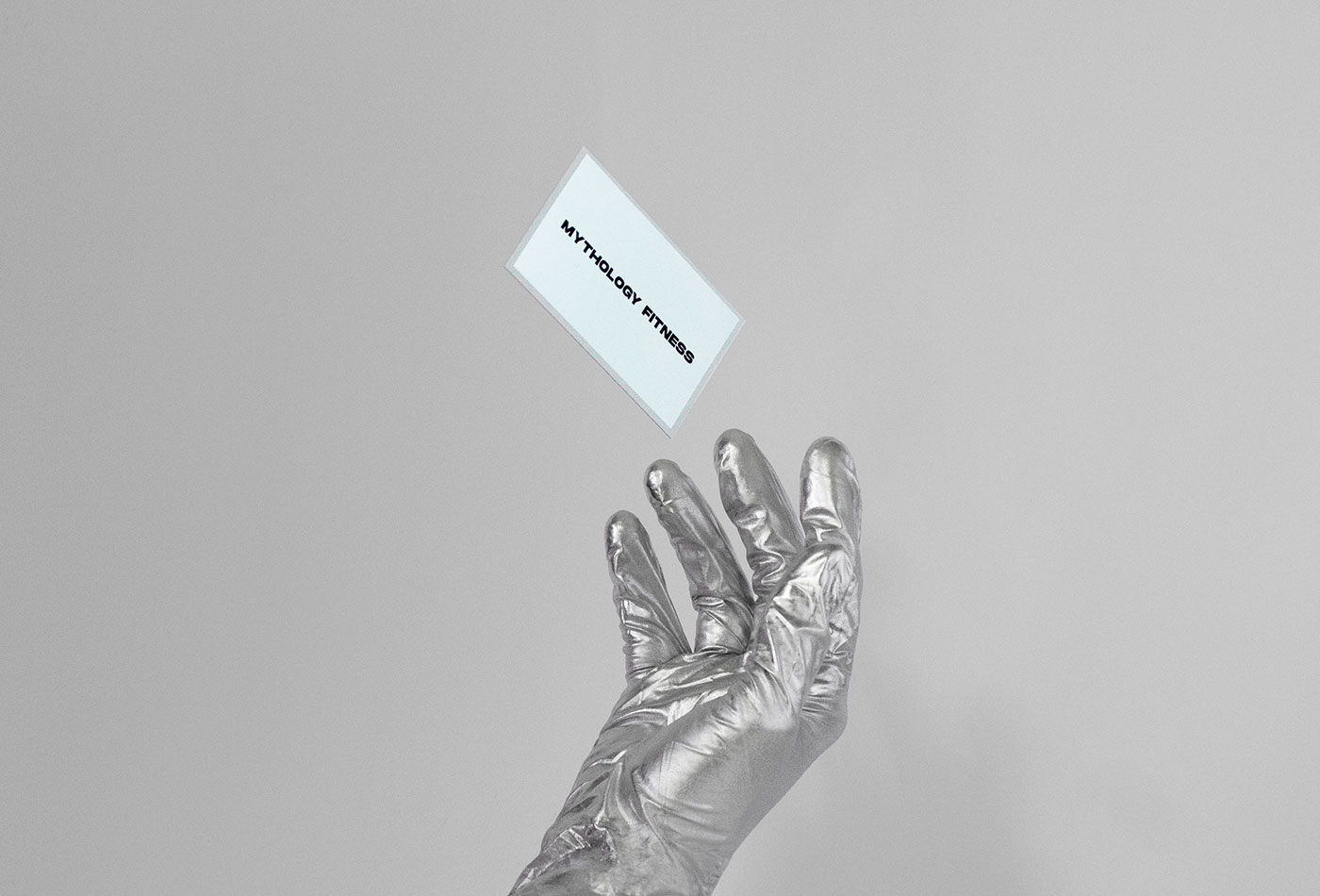
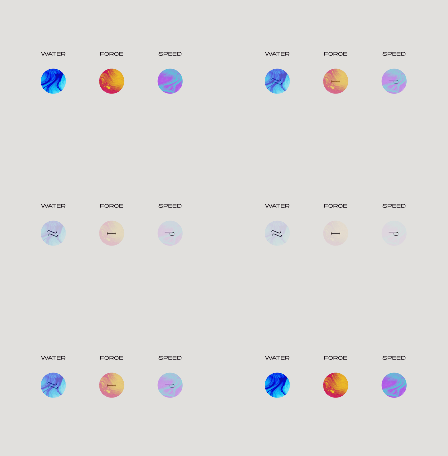
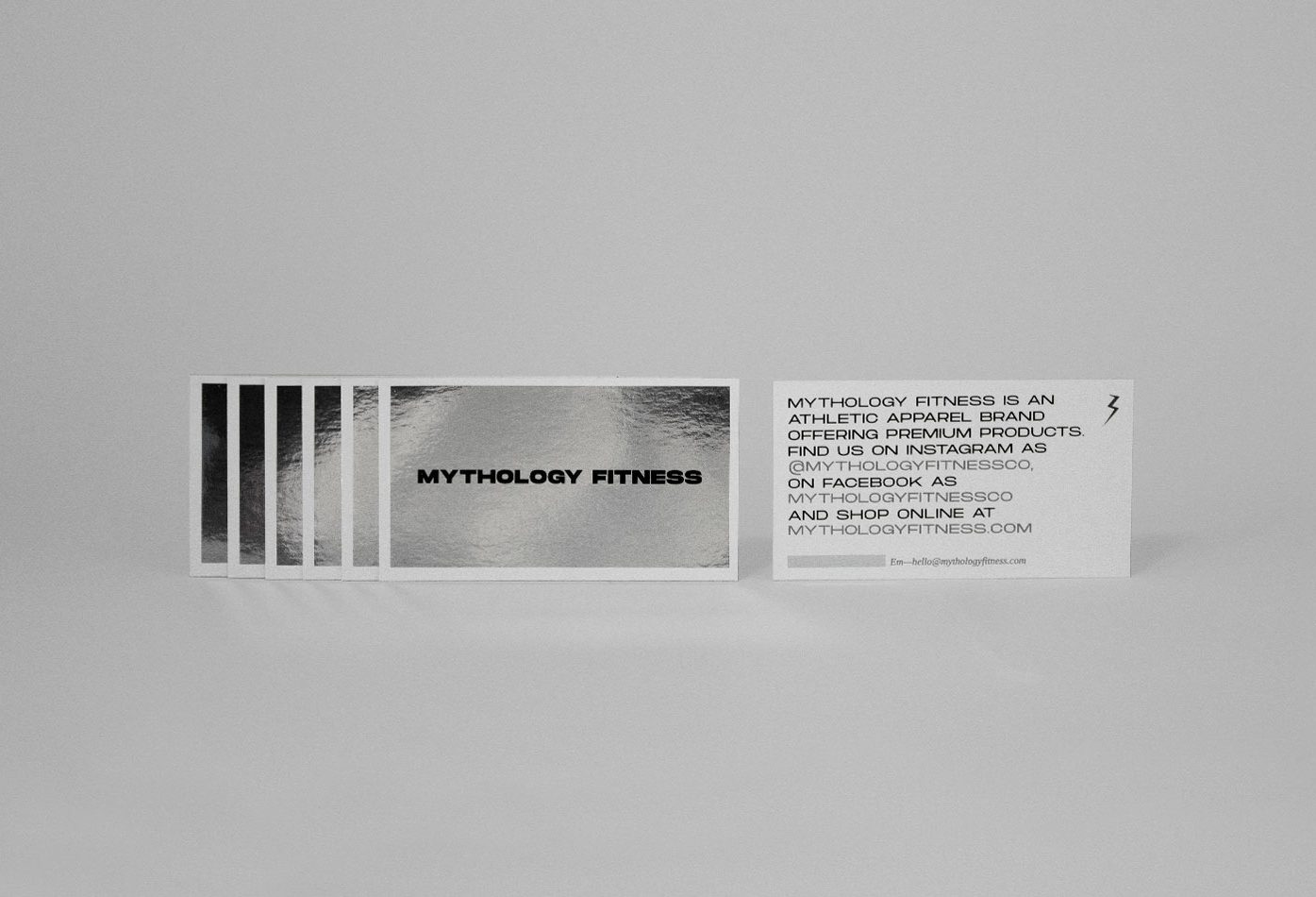
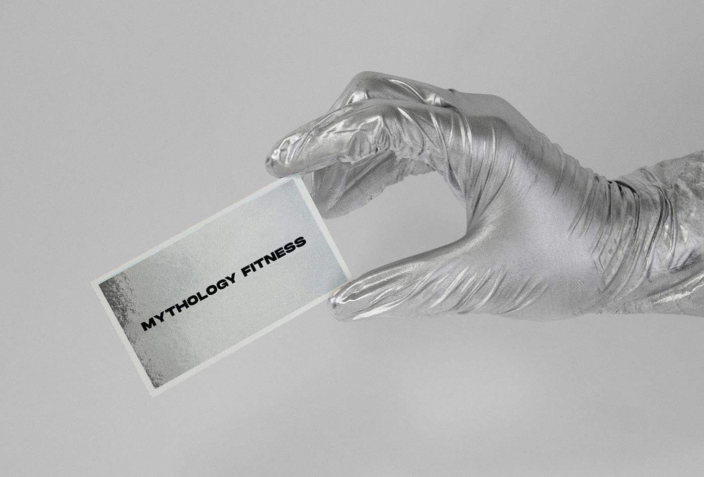
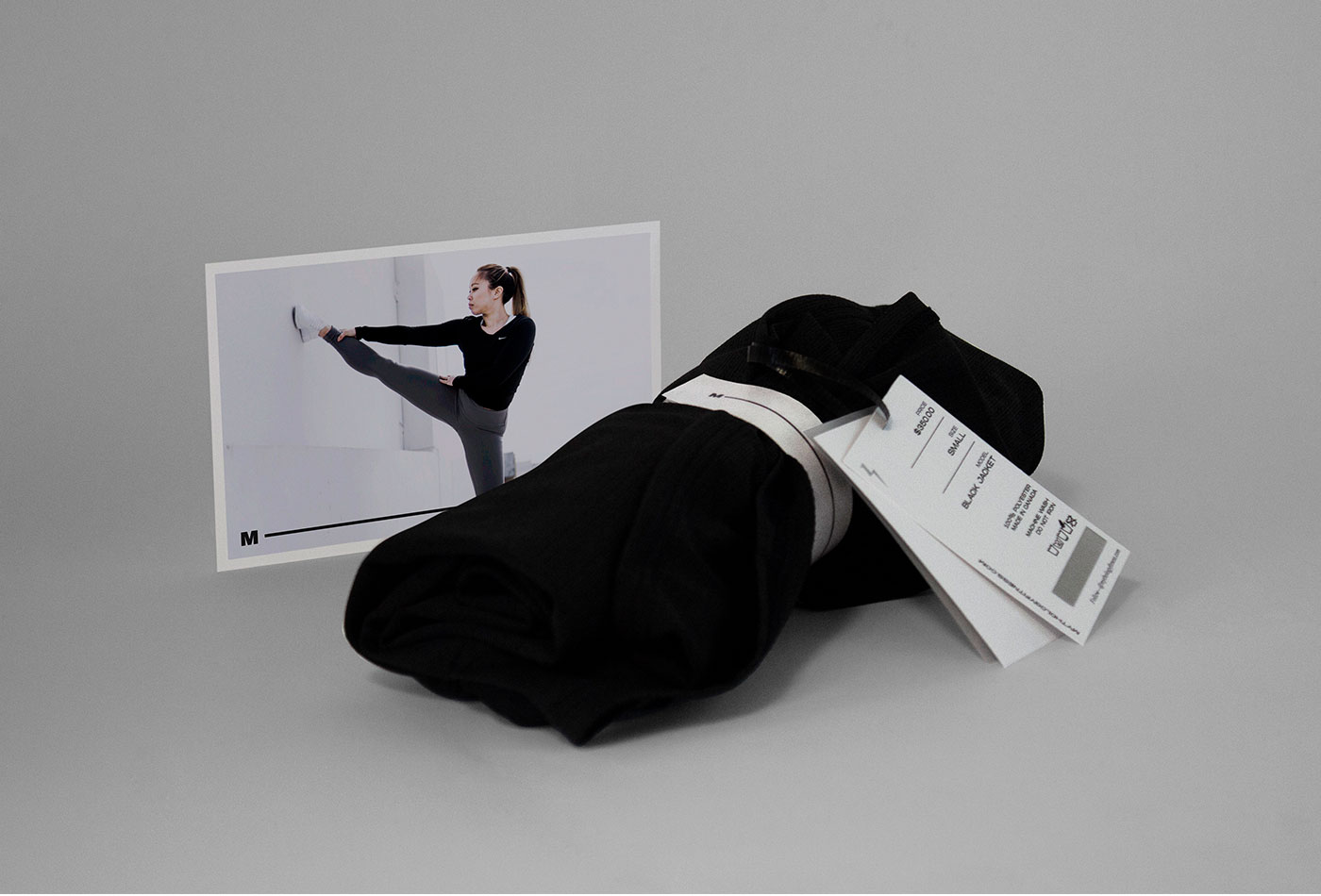
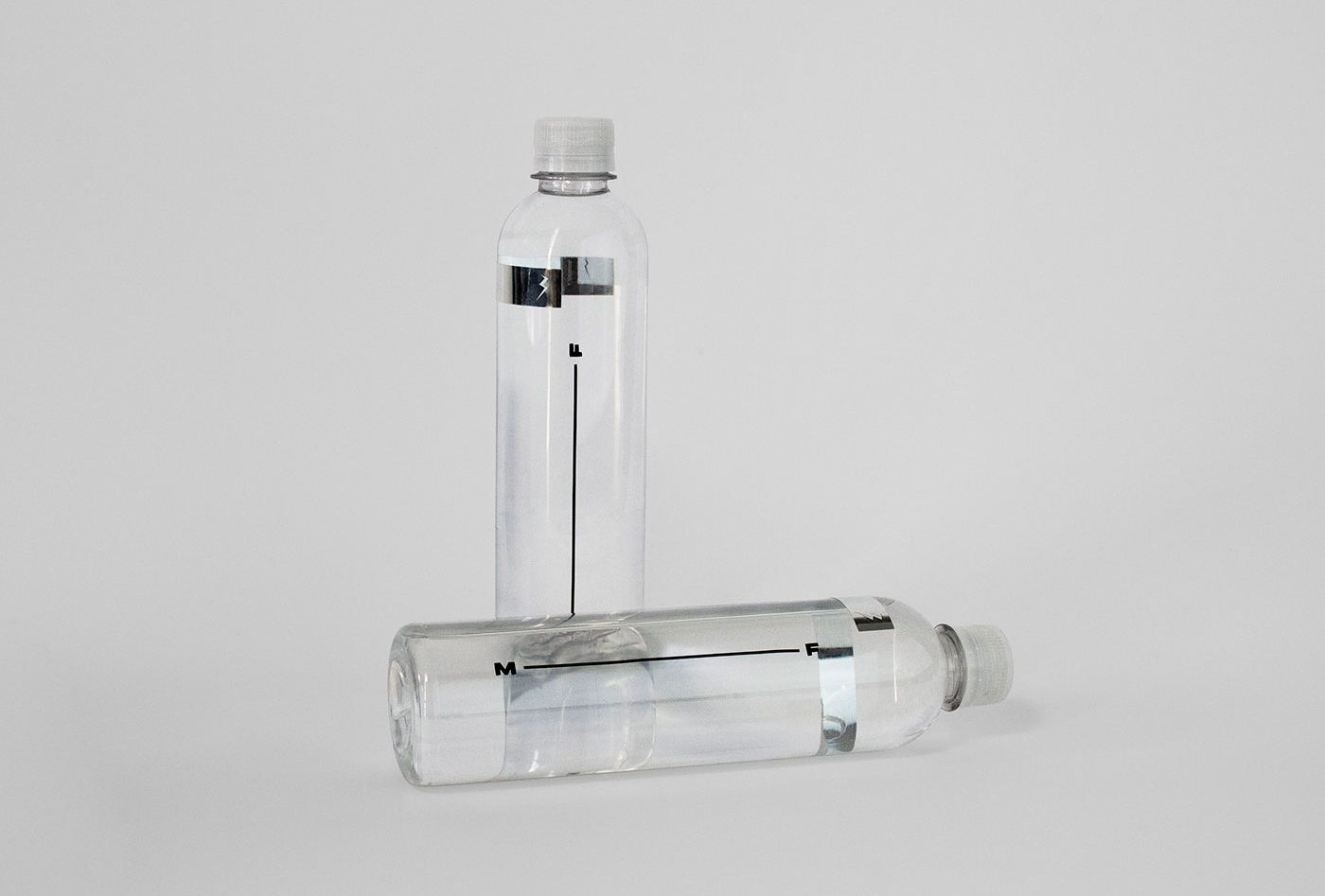
Mythology Fitness is an emerging sportswear brand based in Vancouver, Canada. The main statement is remember us that the man was made in the image and likeness of the Gods, and the difference between the present and what he wants to achieve is in the determination of each one. For this reason, the brand has so much inspiration in Greek mythology: from the monochromatic color palette and the lightning isotype, to the selection of emblematic characters for each of the clothing lines, as well are complemented by abstract symbols inspired in the graphic style of some characters of the Greek alphabet.
All brand’s applications have at least one detail on silver foil, so the person that carries it can be reflected in it, creating an analogy with the idea that the human being was made in the image and likeness of the Gods.
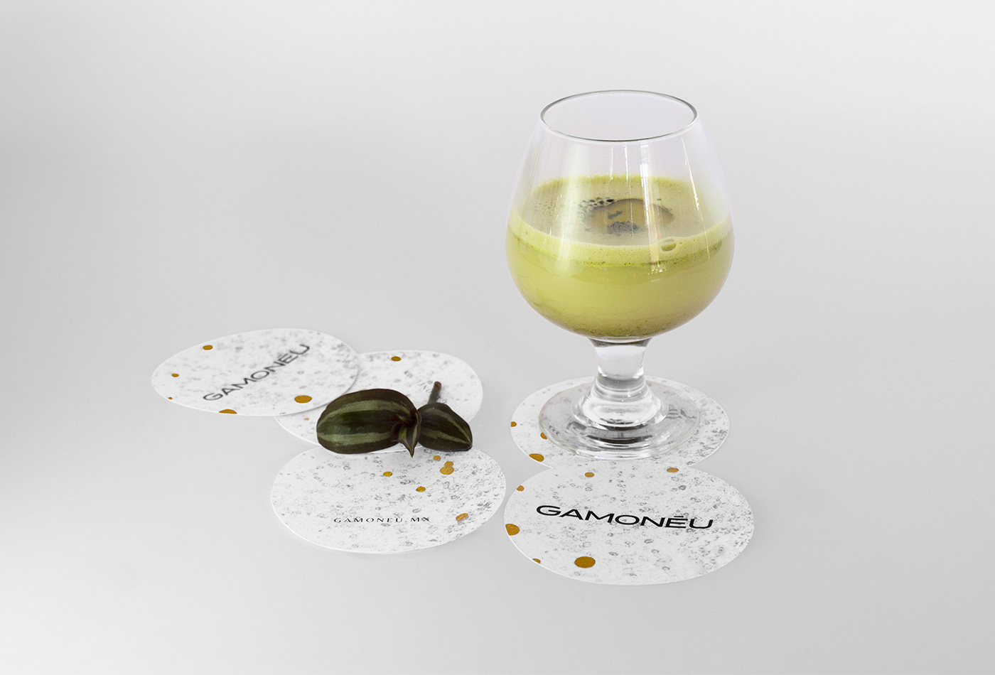
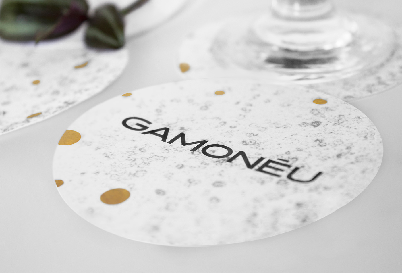
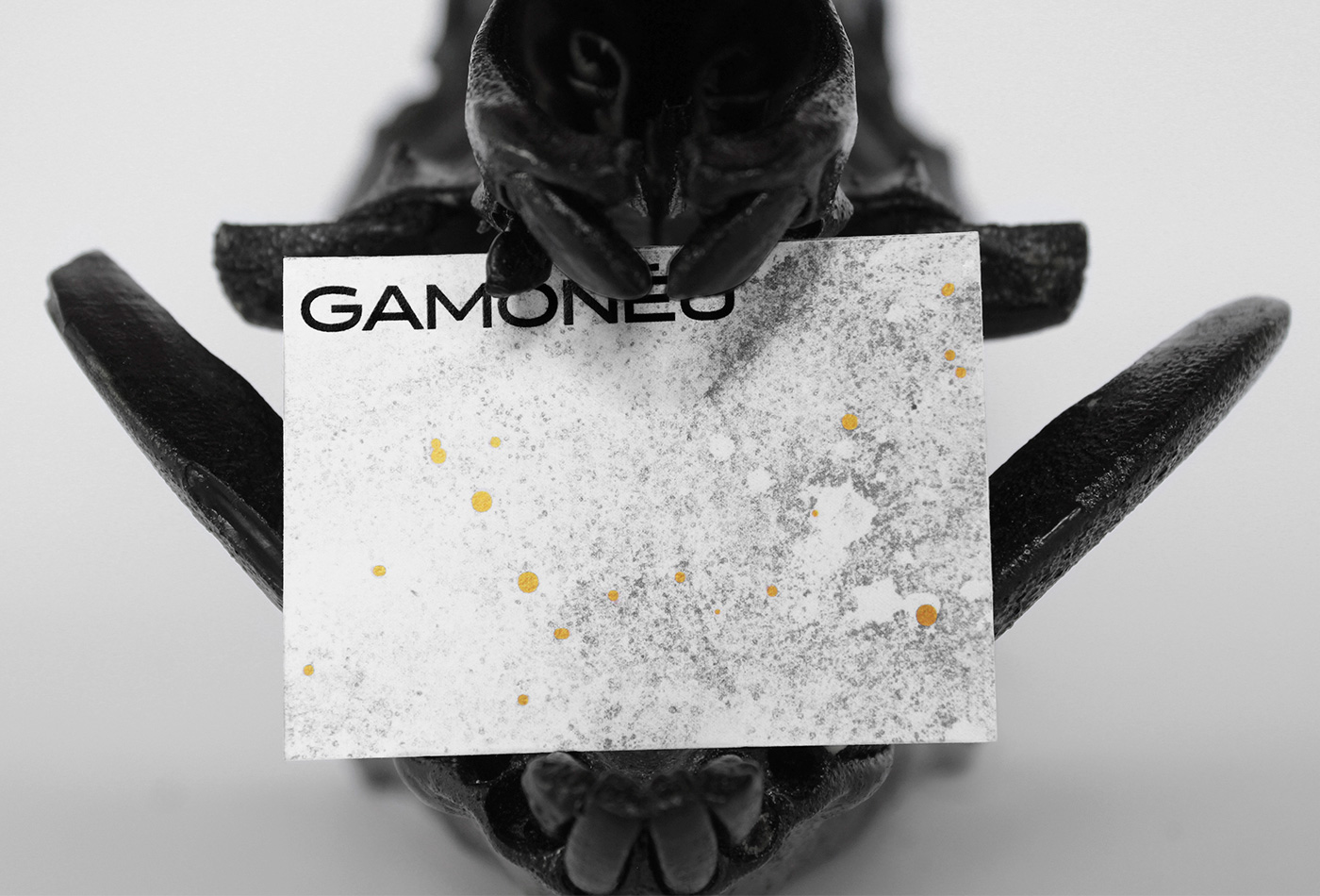
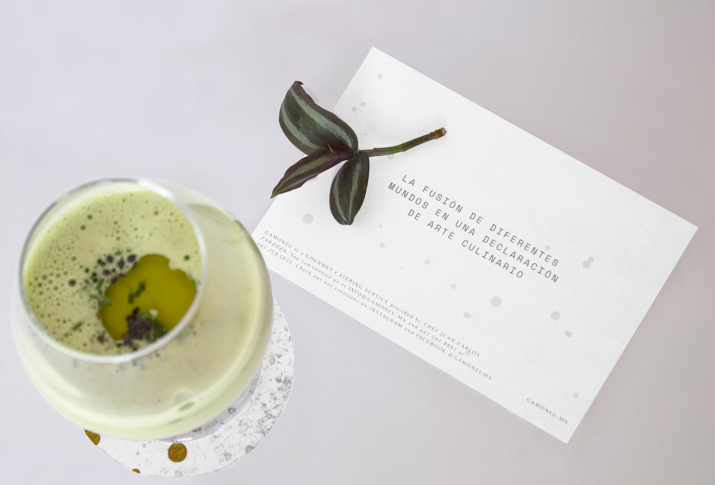
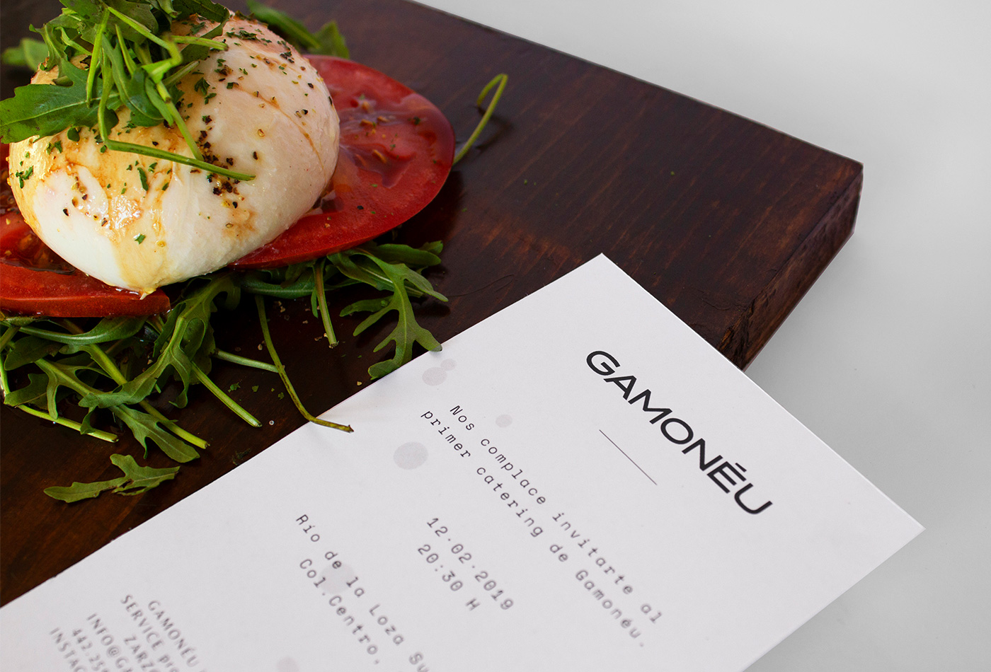
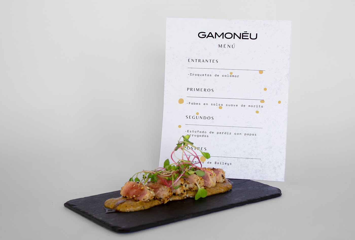
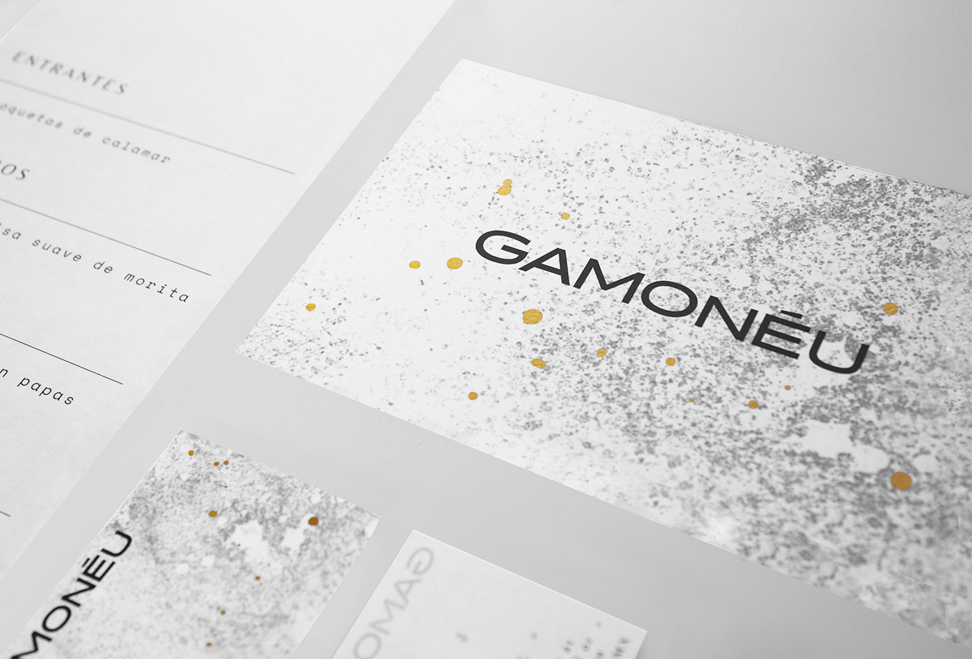
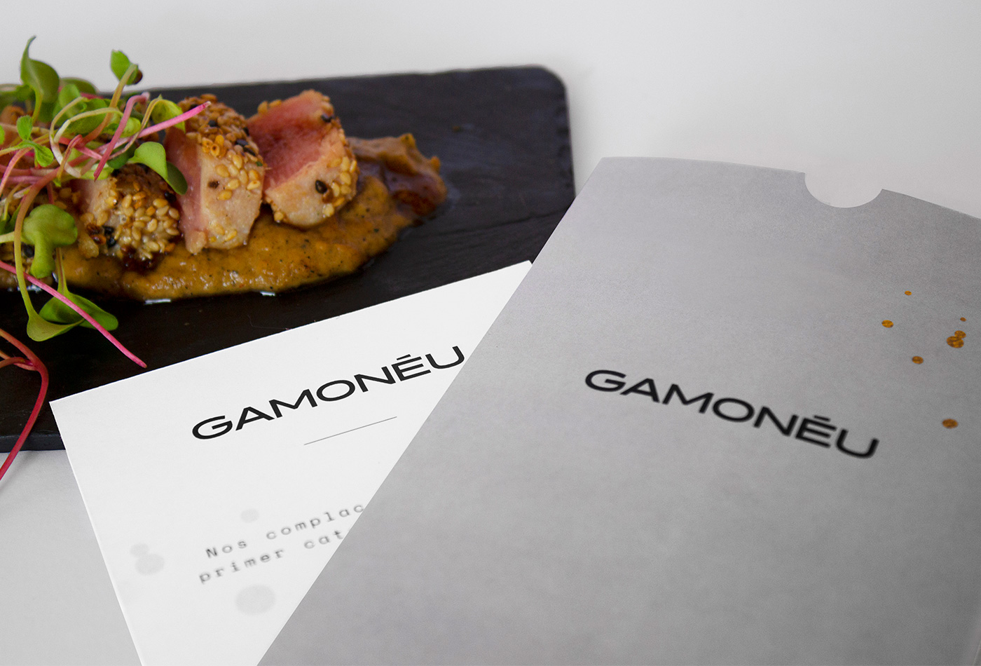
Gamonéu is an exclusive Catering Service with an experimental style. They compare food with master pieces, making analogies between food and art, changing the culinary experience. This gives us a unique and exclusive perspective.
For this reason, we represent Gamonéu as pure art: golden details reflects elegance and the predominant white reflects the canvas to put food under the spot. This fusion is a statement of classic and contemporary styles.
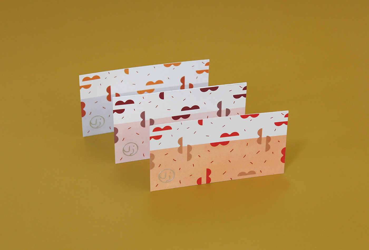
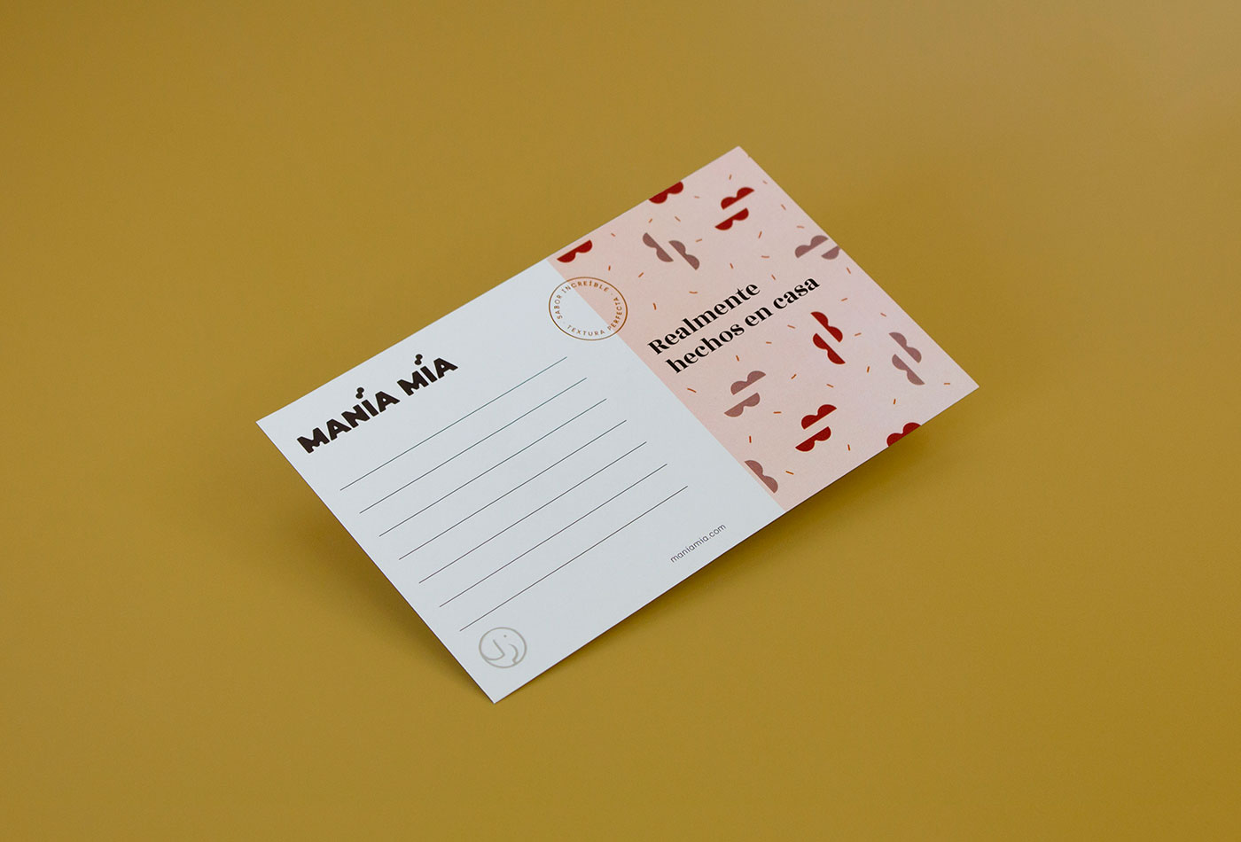
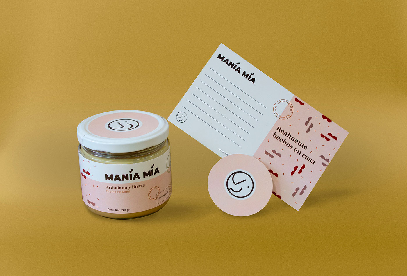
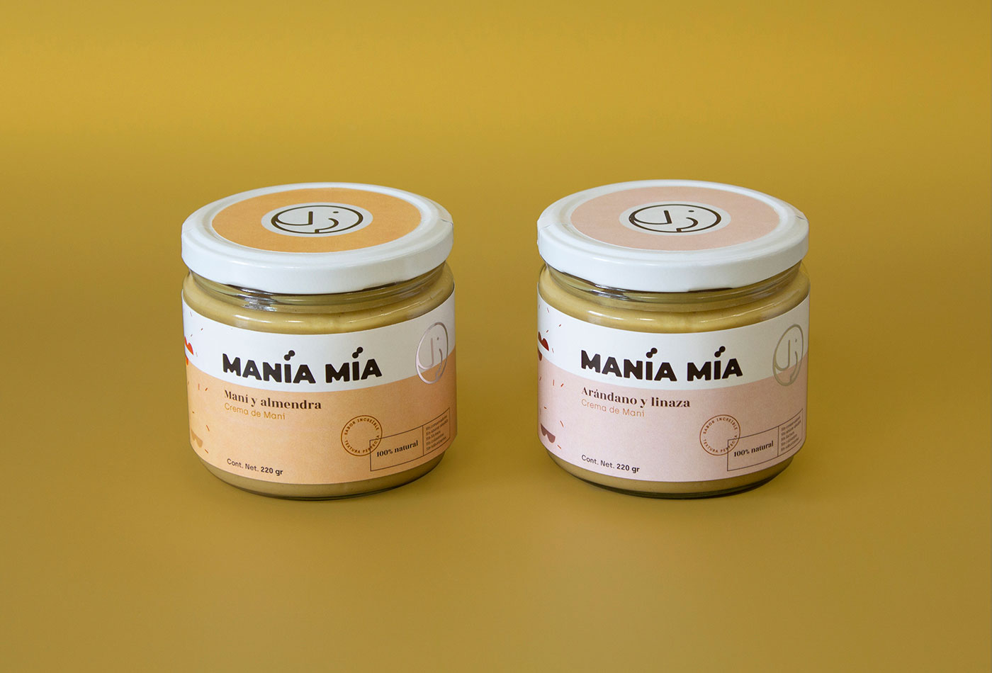
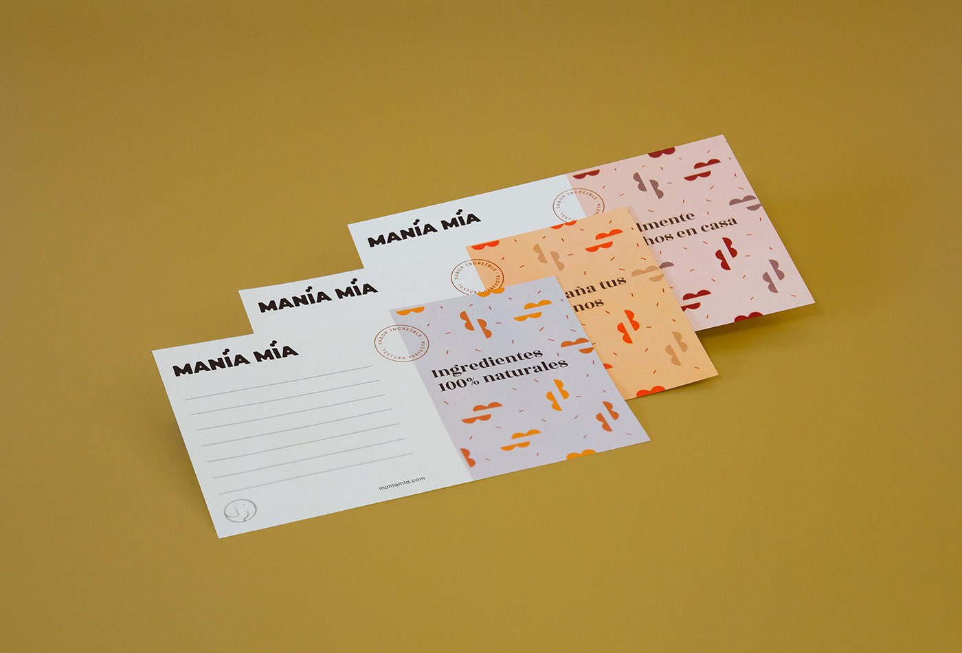
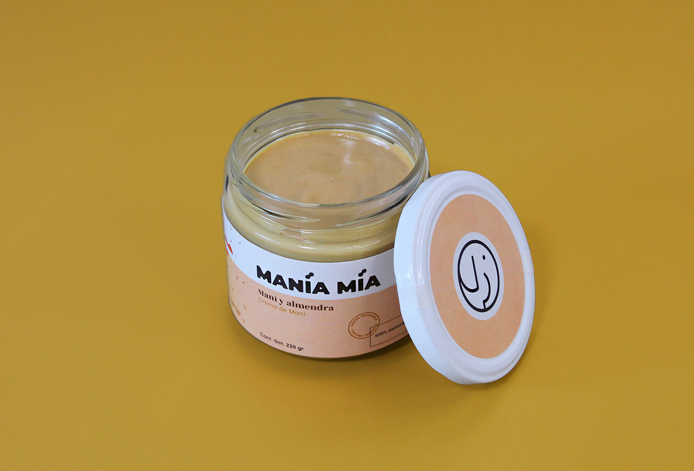
Manía Mía is a company based in Mexico that manufactures 100% natural peanut butter. The requirement was to create a brand that reflects quality with a homemade and fun touch, and that could also be adapted to the packaging and reproduced in different flavors of the product.
For the logo we create a bold typeface with curved edges. The isotype is an abstraction of an elephant, created as a seal for easy reproduction and identification. This is complemented with monospaced / serif typographies, creating a contrast between modern and classic. Finally, a pattern was created from the basic form of peanuts to add a fun touch to the brand.
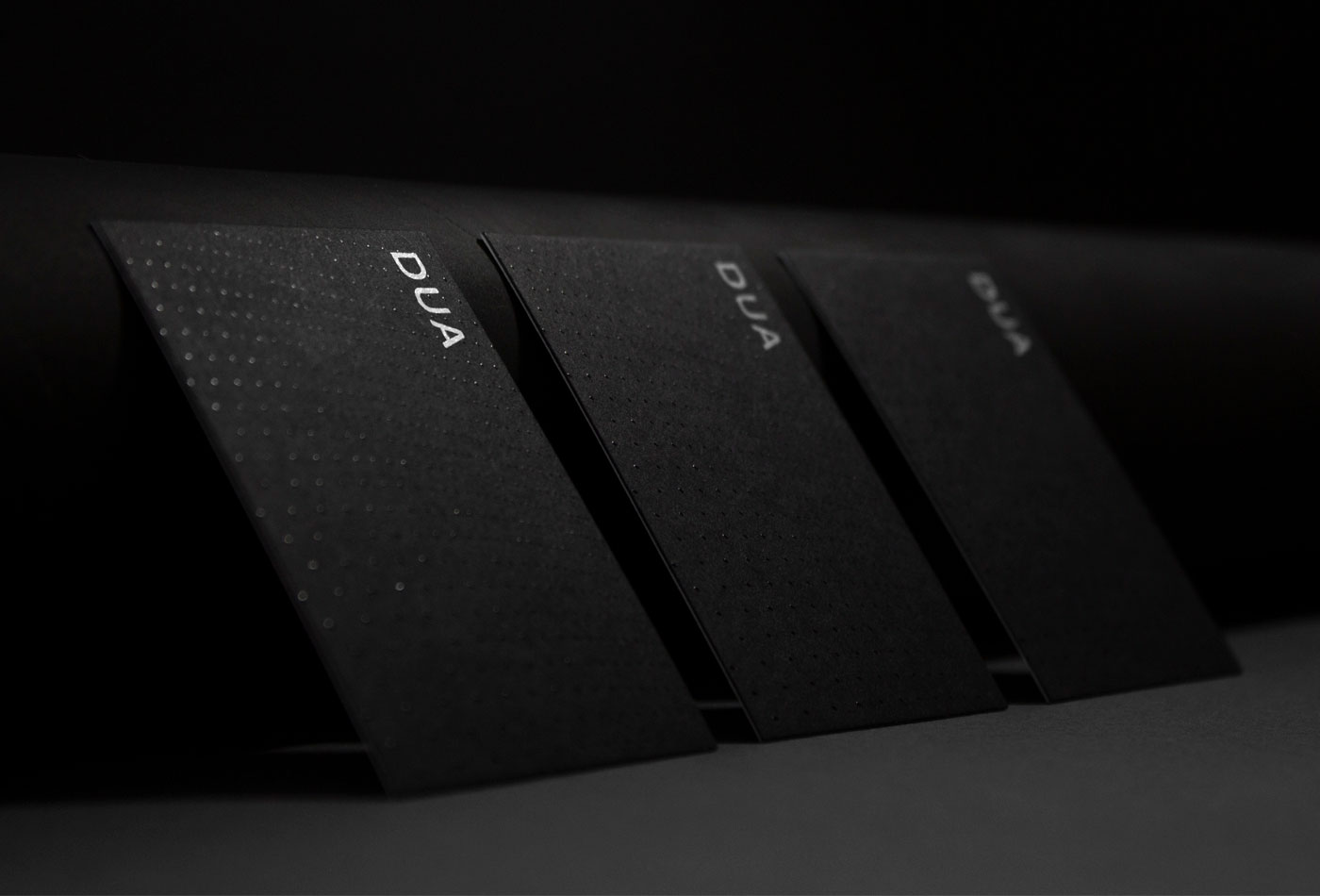
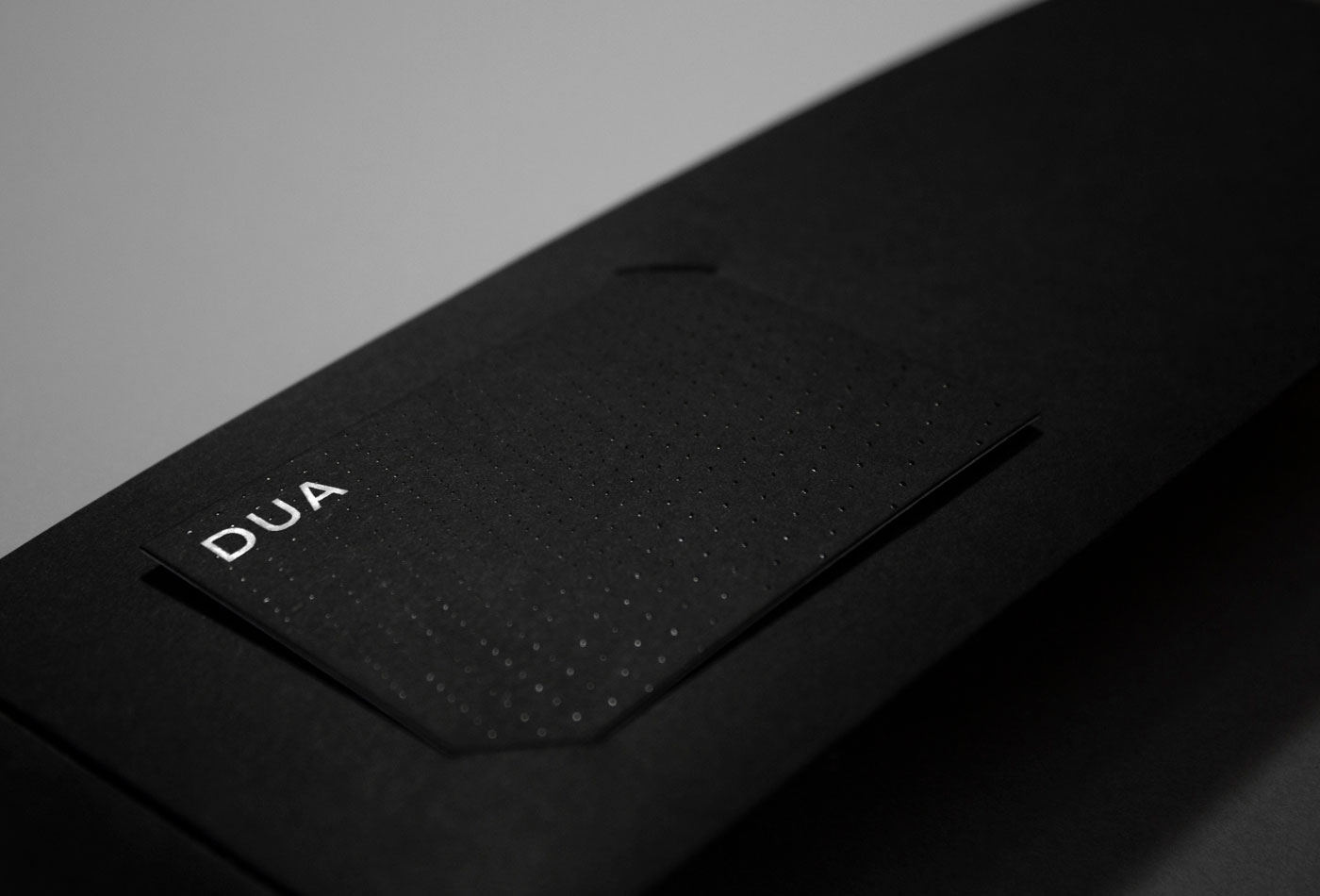
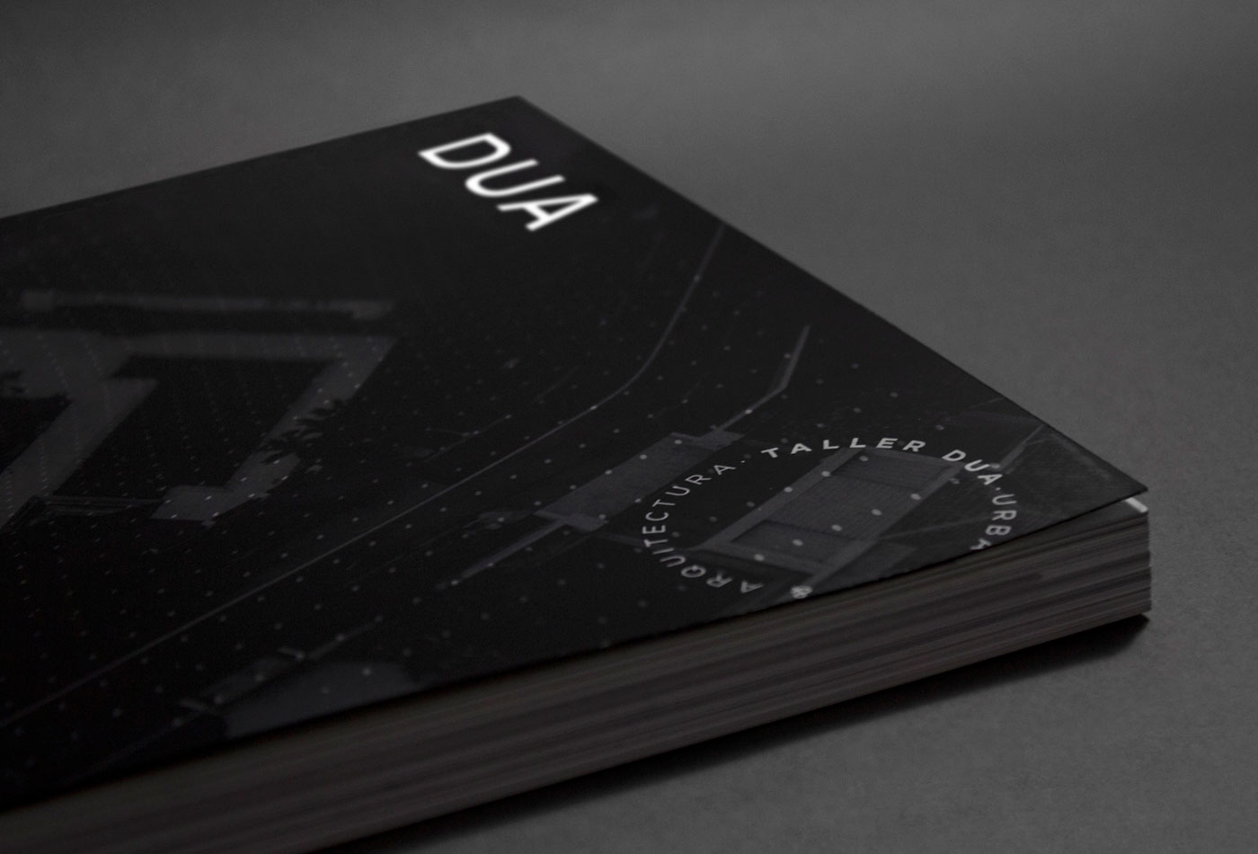
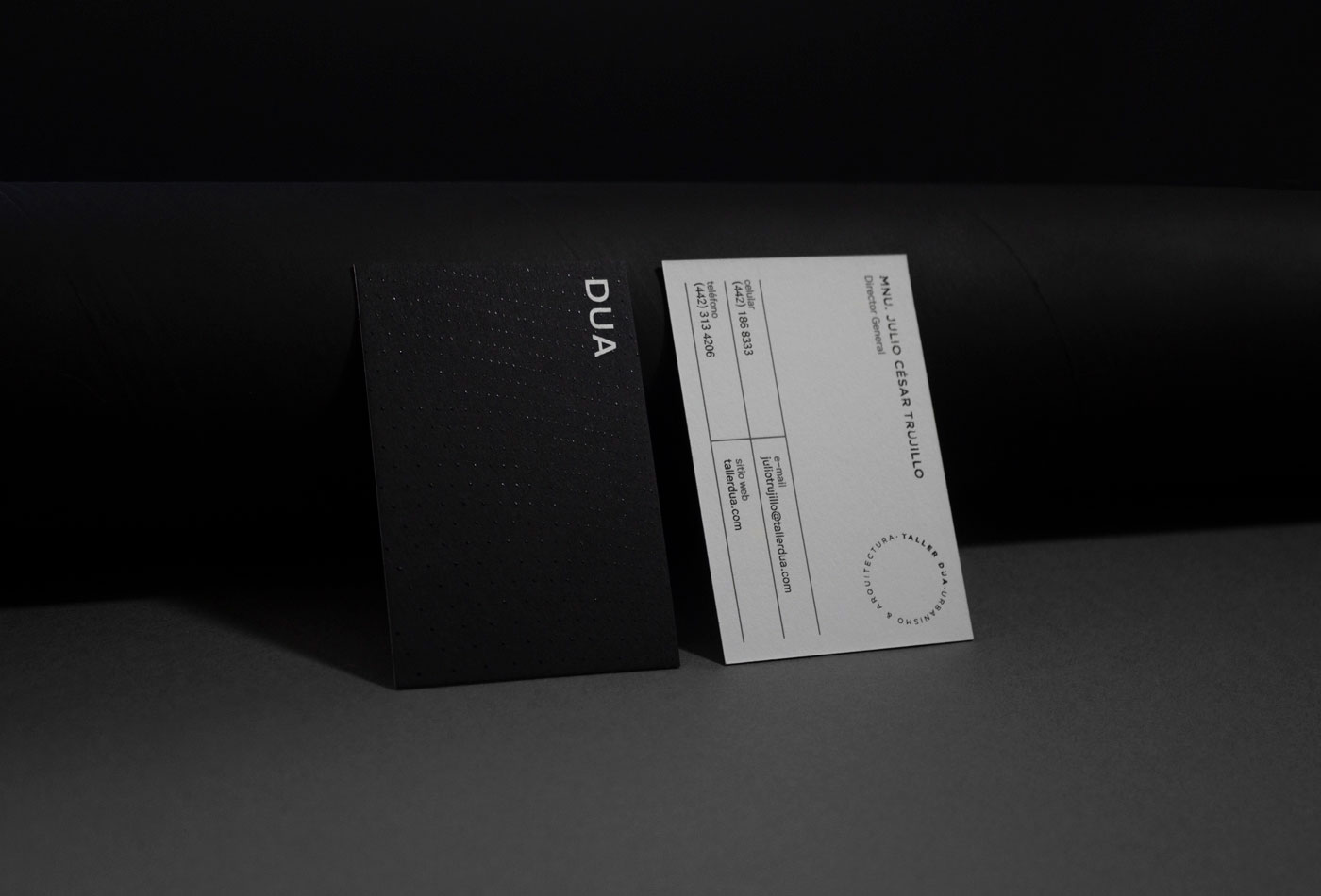
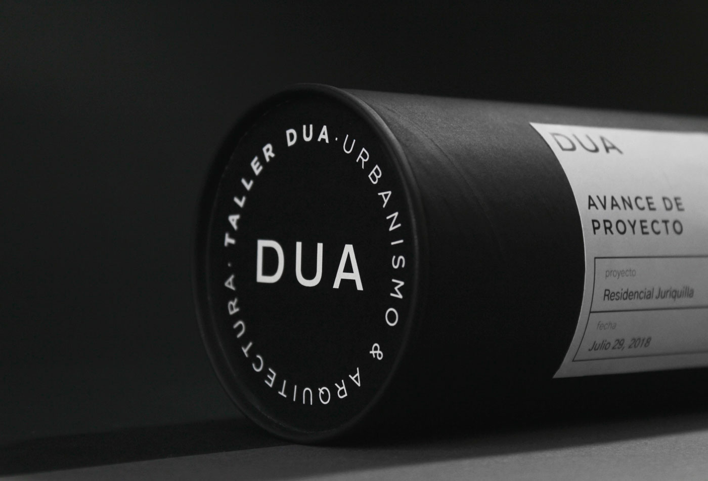
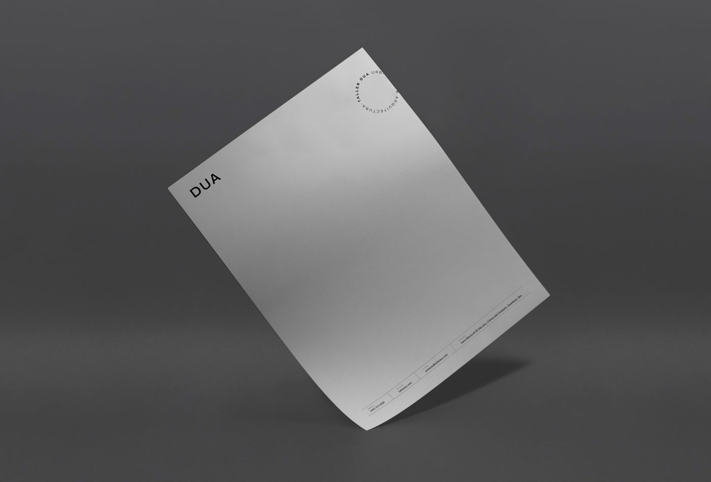
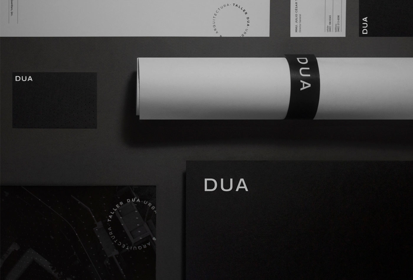
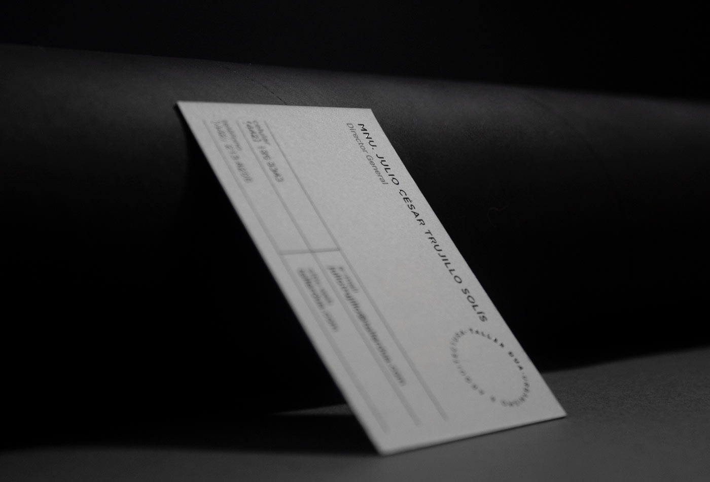
DUA is an architecture workshop that develops urban and architectural projects, starting from scratch and delivering the project with every detail reflected at the executive level. The core is to understand the background of the project and translate it into an architectural and urban integral business project.
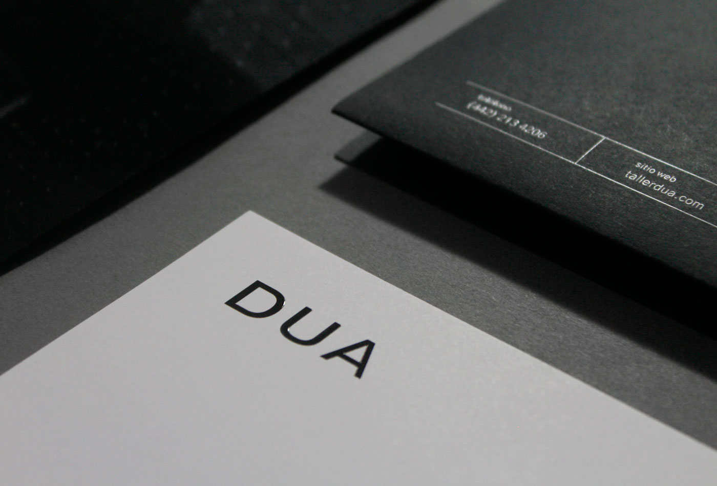
For the identity we consider 3 main areas: experience, expertise and high rank. This last one is the most important considering that the company deals directly with executives, directors and entrepreneurs. For this reason it seeks to be a simple and formal identity.
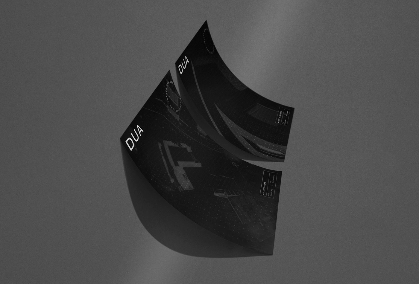
We took as a reference the idea that a project starts on paper and ends as a construction, in a process which its stages change until the final result is obtained. For this reason, we build a pattern that begins in a 2D plane, but it changes until it becomes reality and change to 3D.
The neutrality of the identity makes each material very direct, without unnecessary elements, and at the same time gives an exclusive touch to each piece.
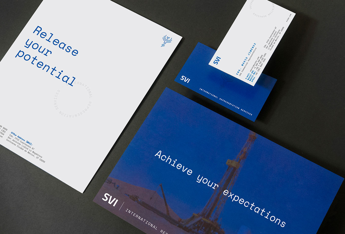
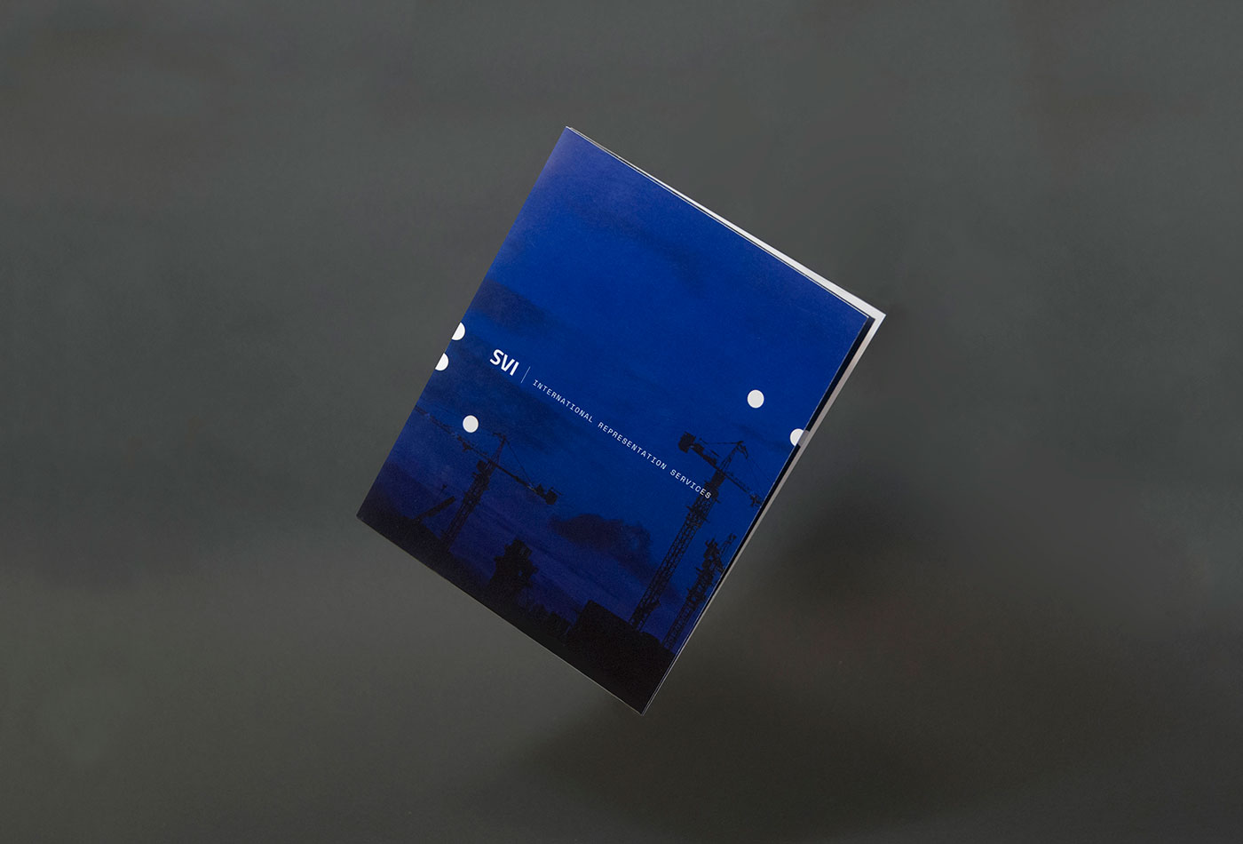
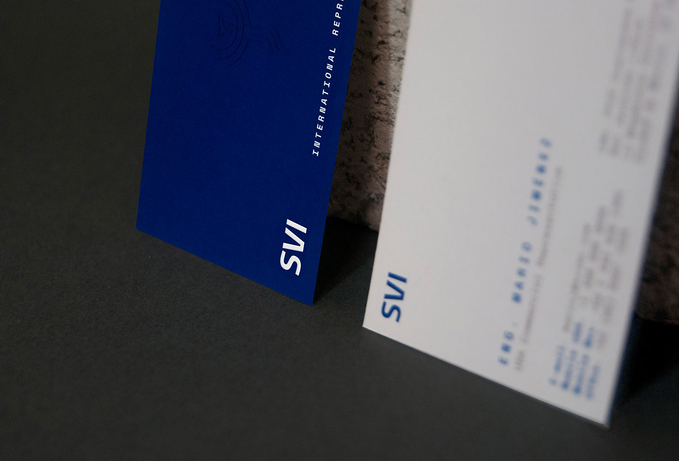
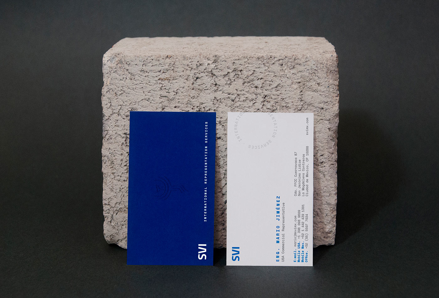
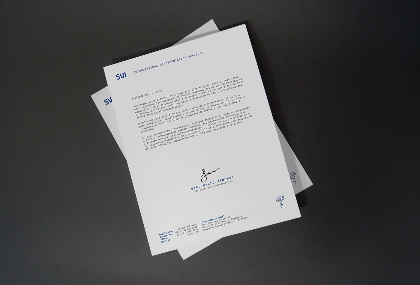
SVI is an independent inspection company, focused on supervision, testing and technical audits of international companies. With a deep knowing of the oil & gas processes, SVI has acquired through the years a deep knowledge of the main manufacturers in America and Worldwide.
For the identity we take 3 main axes: it’s an international company, with 20 years of experience and that the services they offer are completely technical. These points were our start point for the colors, typographic selection and graphic style in general.
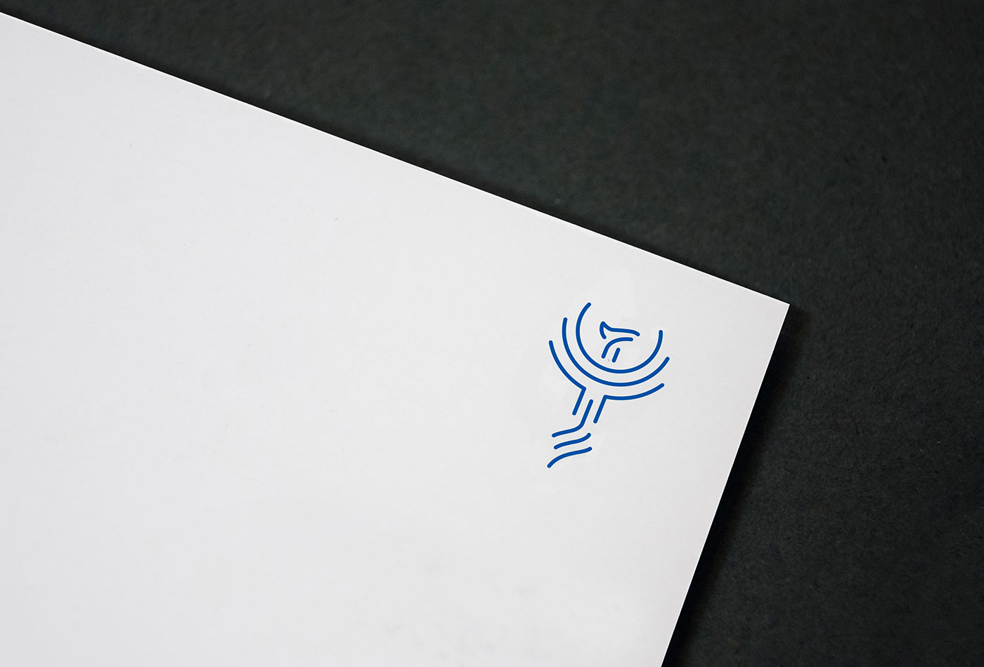
Finally, as a specific requirement, we created a phoenix symbol, which functions as a sort of stamp and complements the identity.
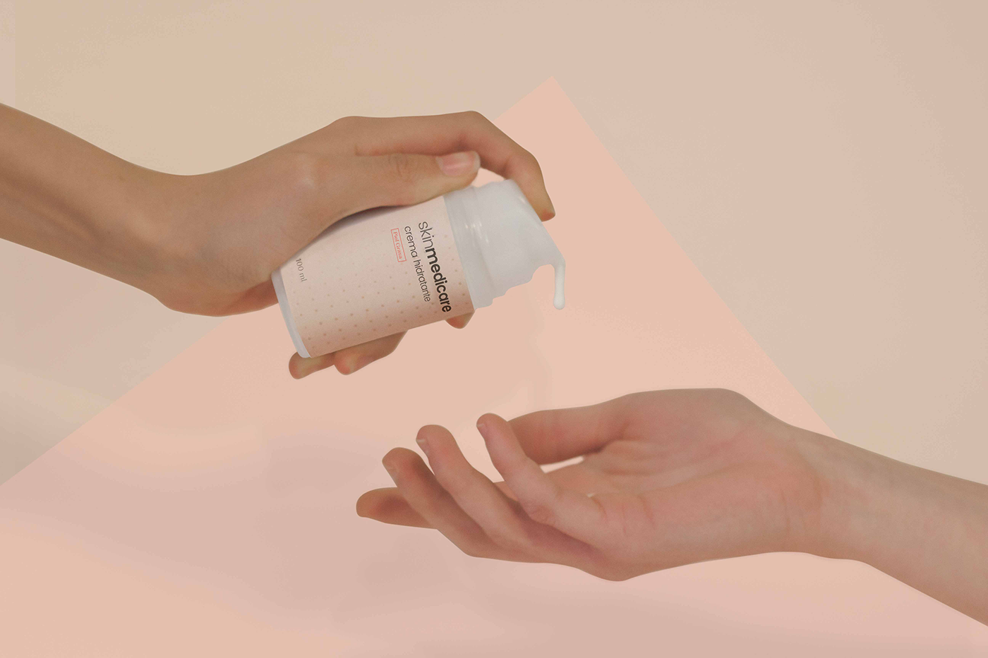
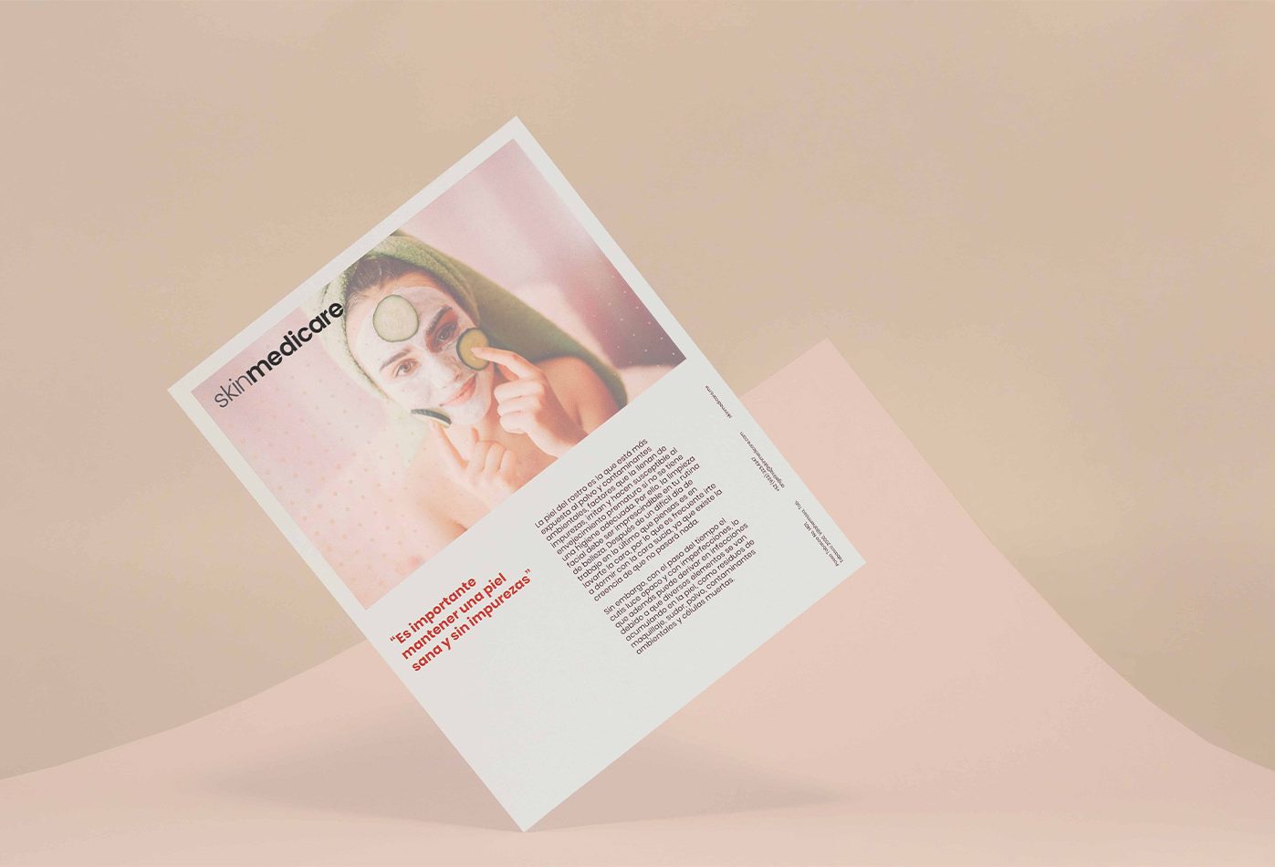
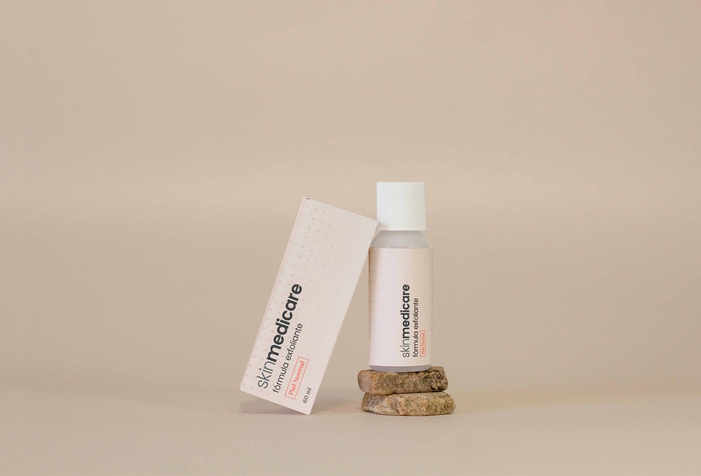
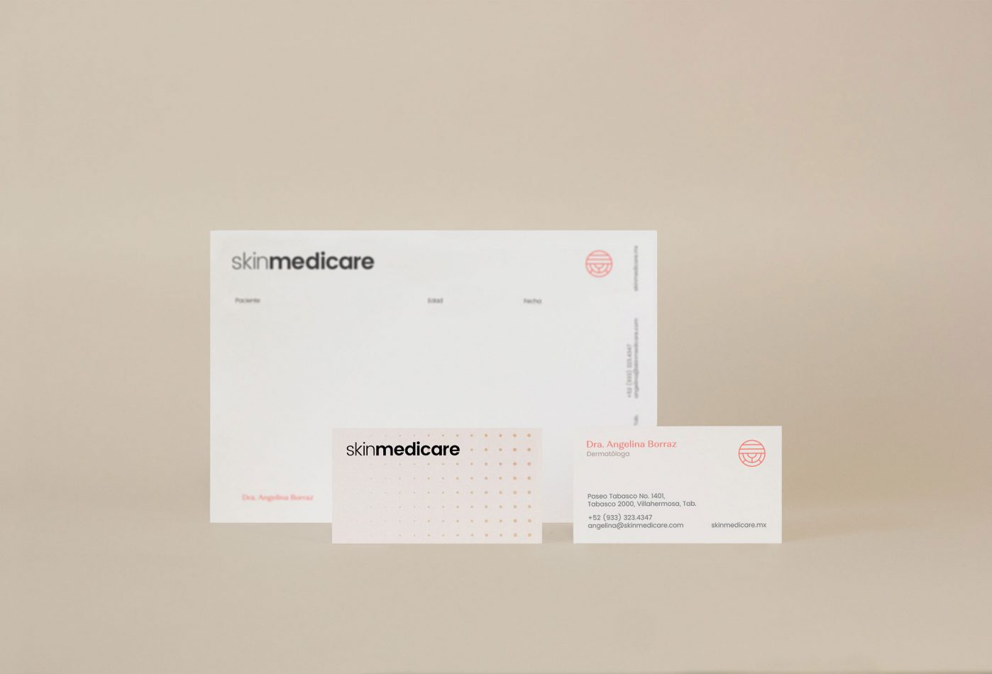
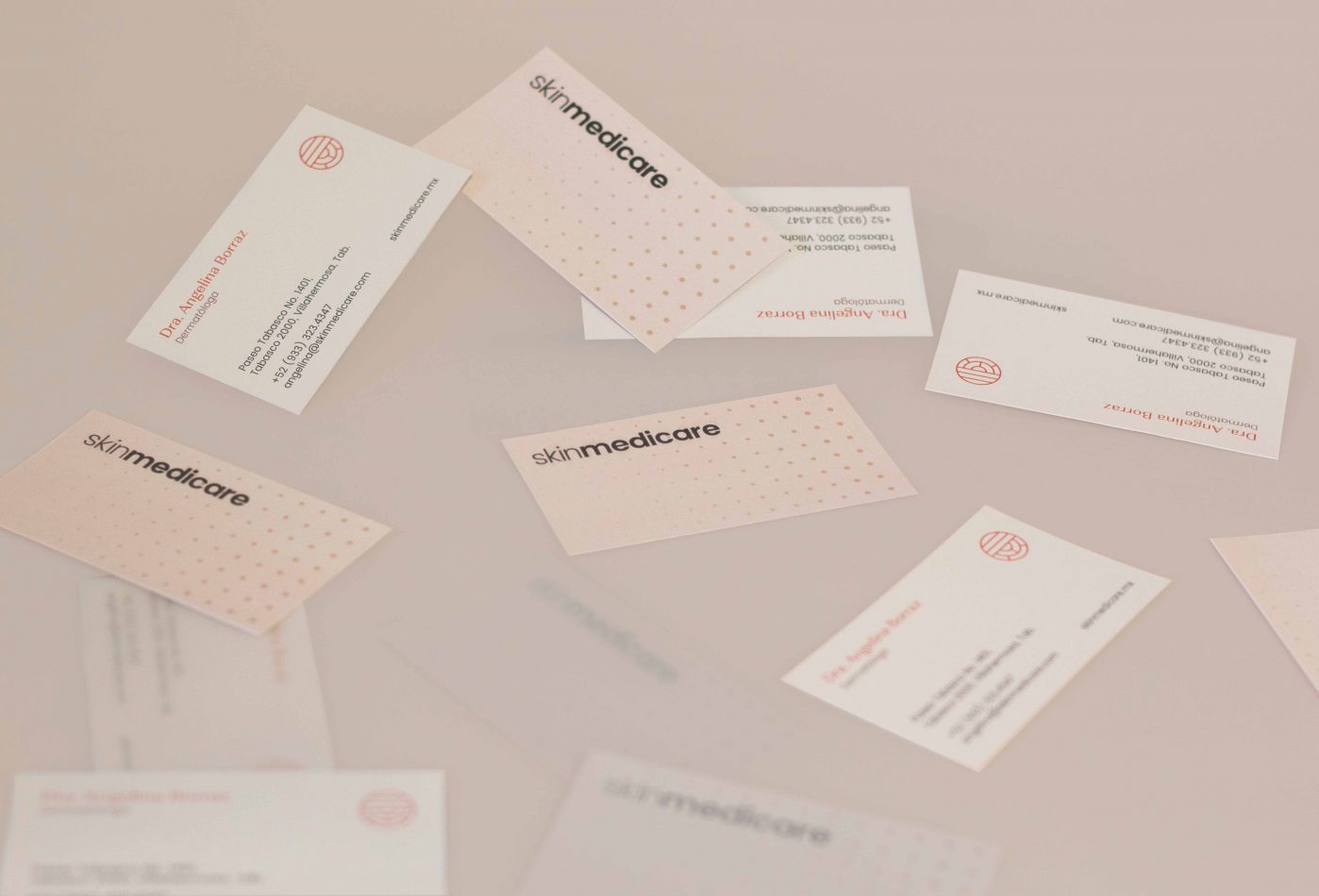
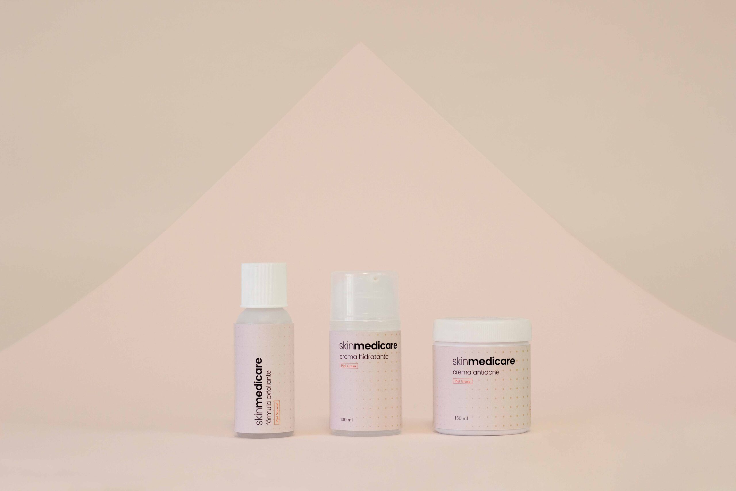
Skin Medicare is a specialized dermatological clinic in the city of Villahermosa, Tabasco, in southern Mexico. Our job was to build the brand’s visual identity. We used as reference the work object of the clinic: the skin.
First, an abstraction of the layers of the skin was created to use as an identifier, used as a complement to the main logo. In addition, we created a texture based on the skin pores, and this idea was applied to different visual elements used in the brand.
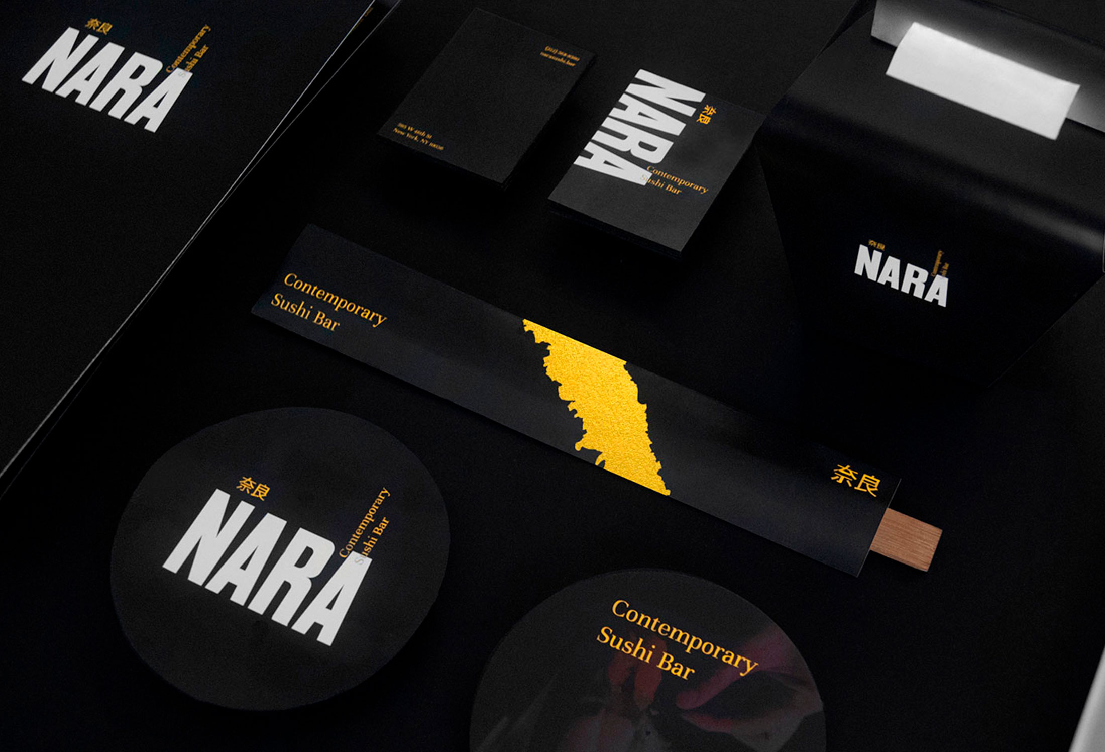
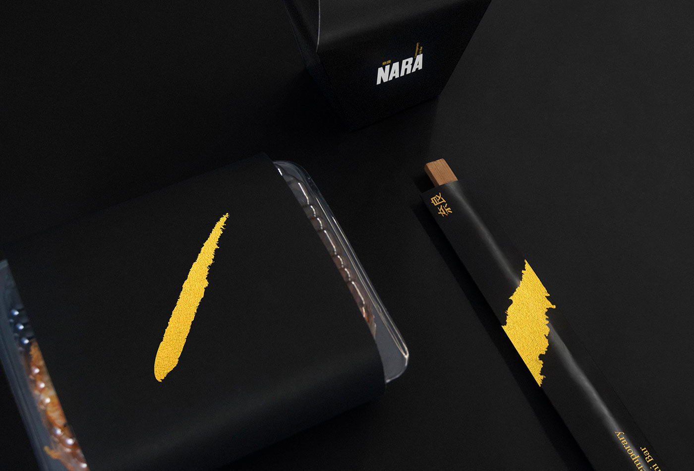
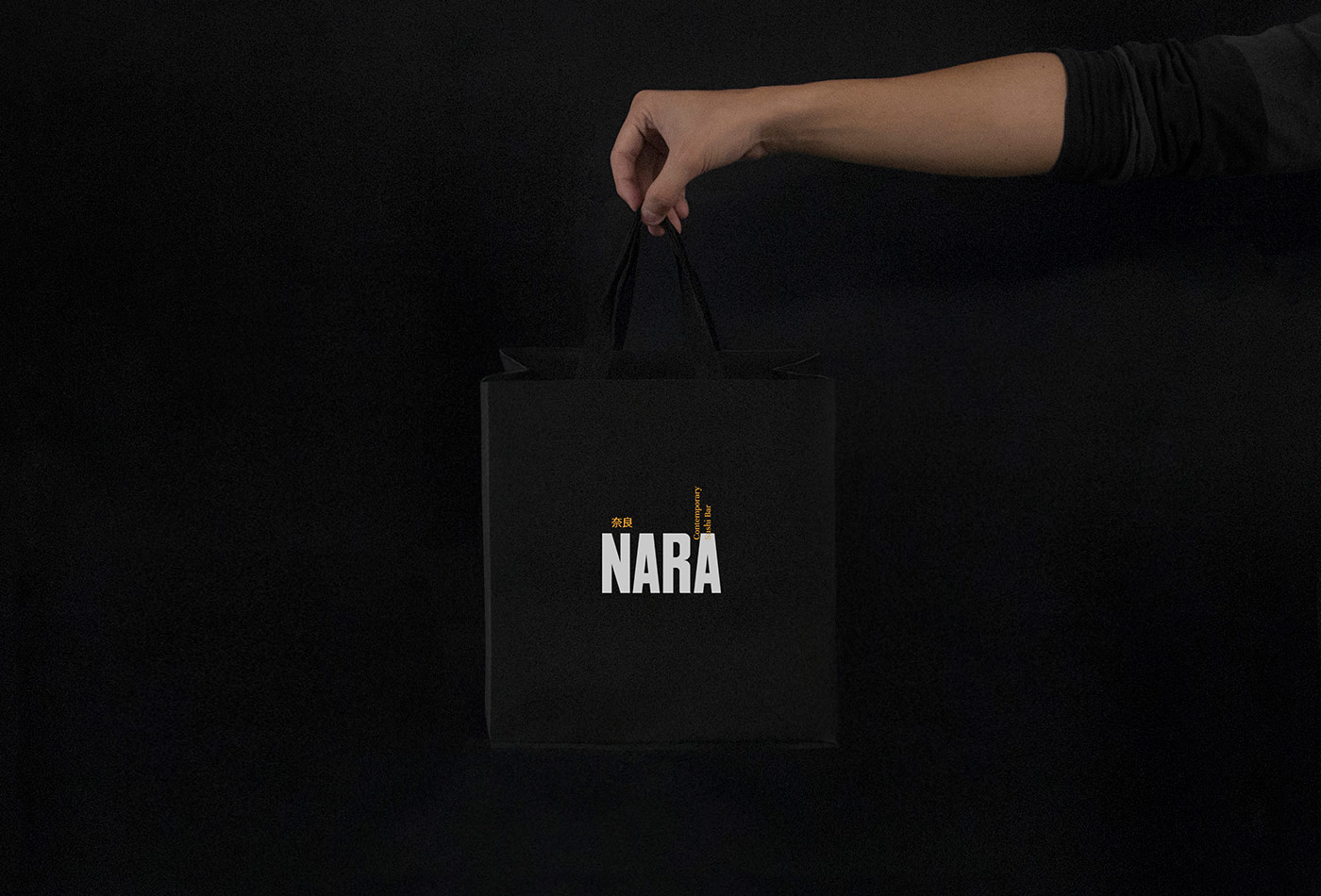
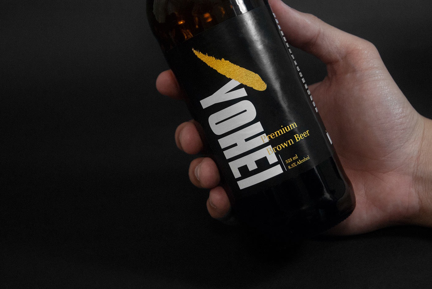
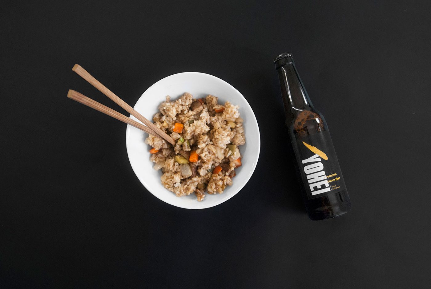
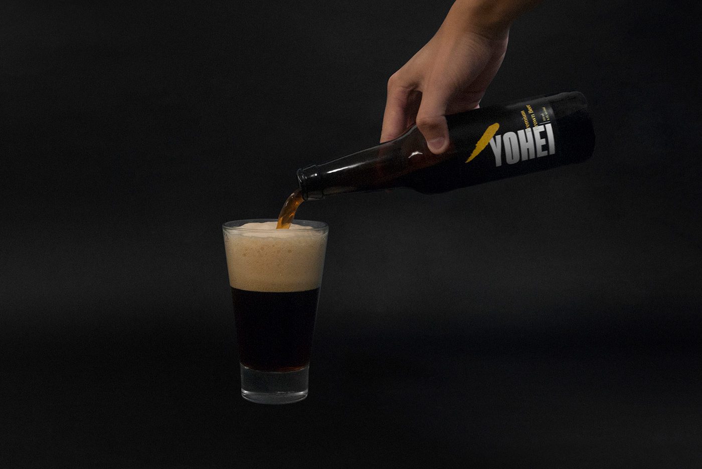
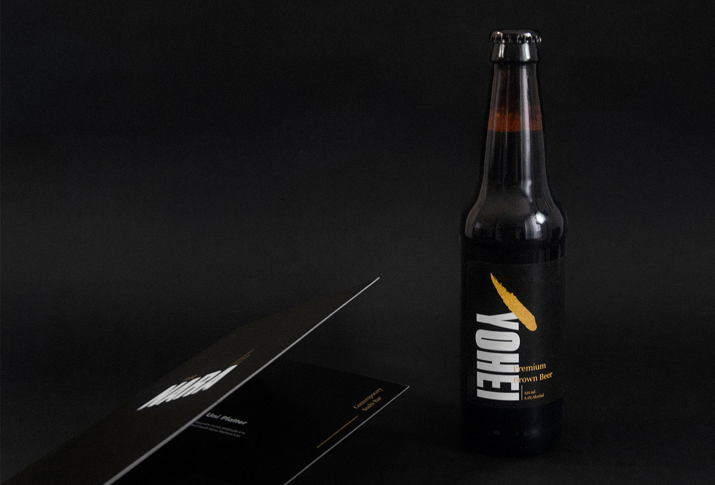
Nara is a Contemporary Sushi Bar, result of the combination between traditional Japanese recipes and the multicultural context of New York City. For this reason we took those ideas as main communication axes, creating a sober identity with Japanese characteristics but, with an international feeling.
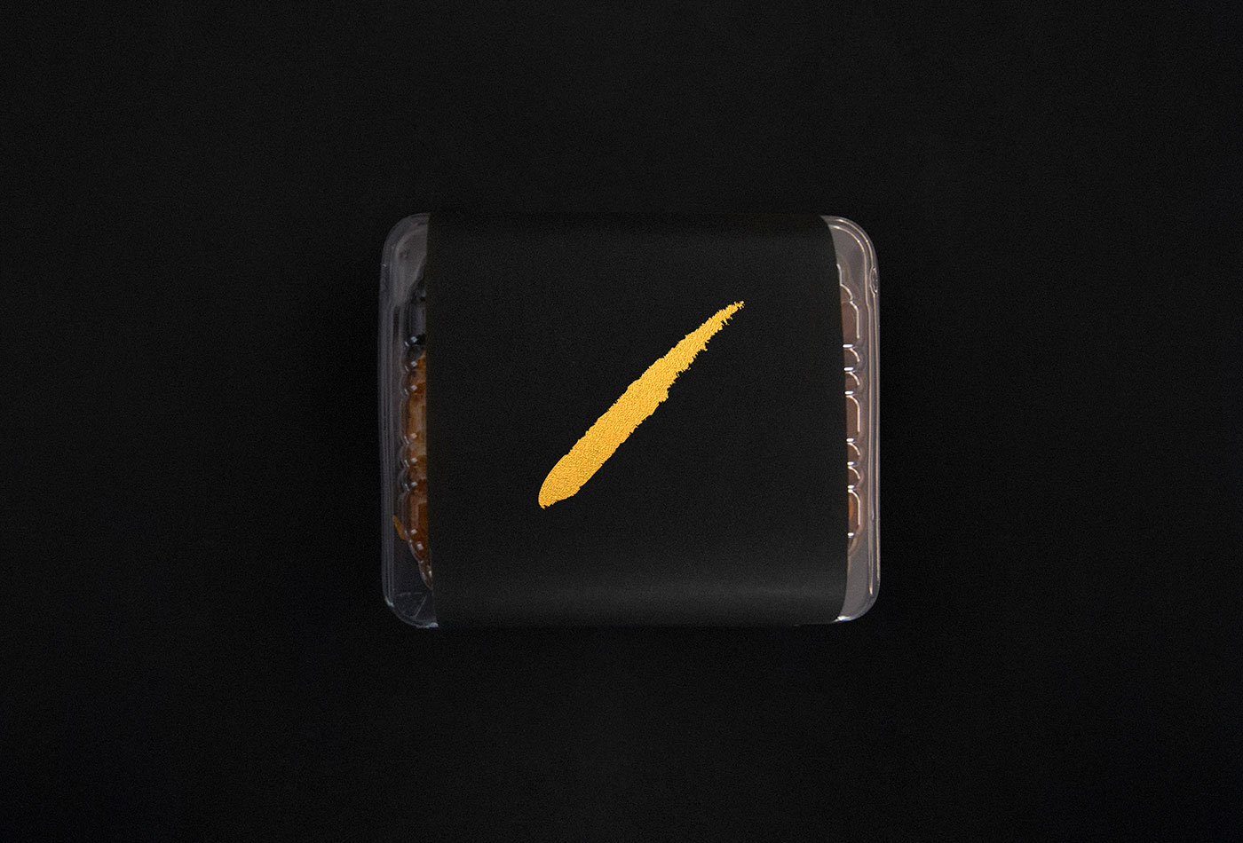
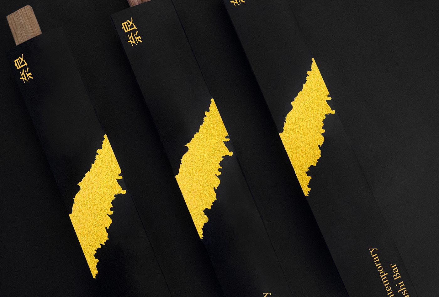
We designed a custom made font used in main logotype and sub-product’s logotypes (like its own beer “Yohei”). Additionally, a bold and recognizable golden brushstroke complements the identity to make it memorable.
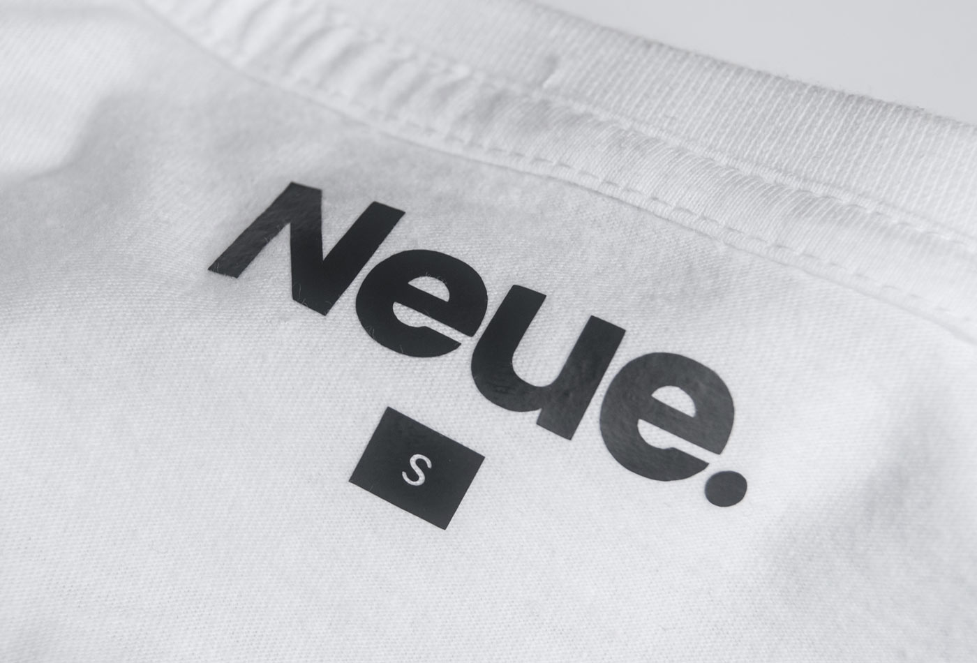
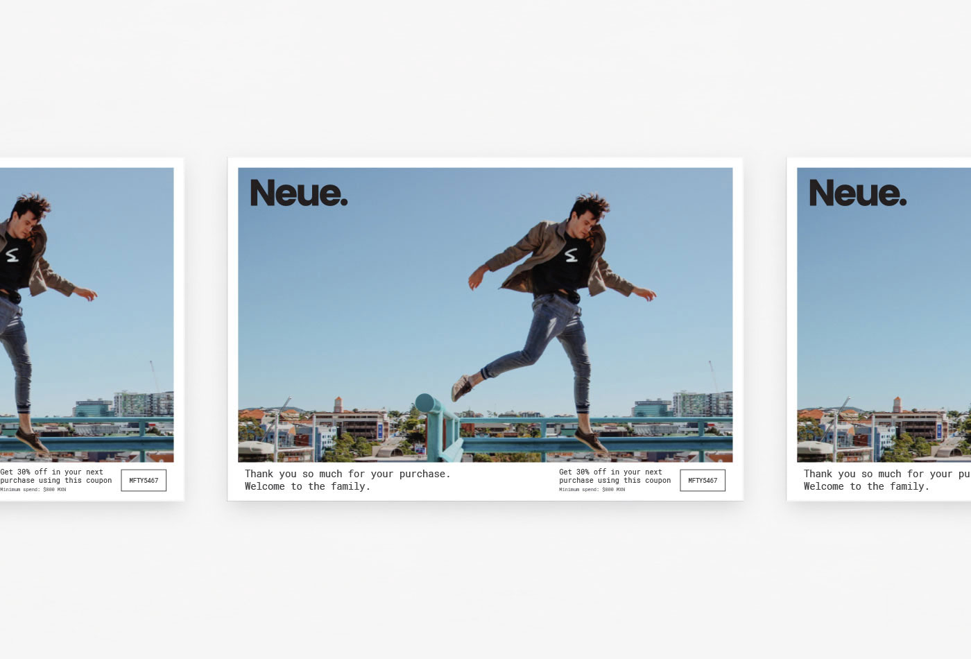
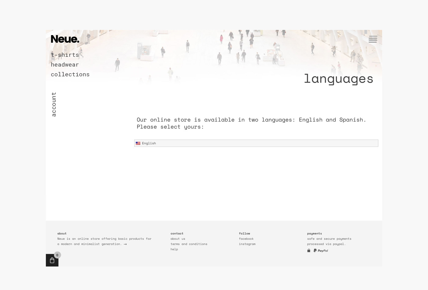
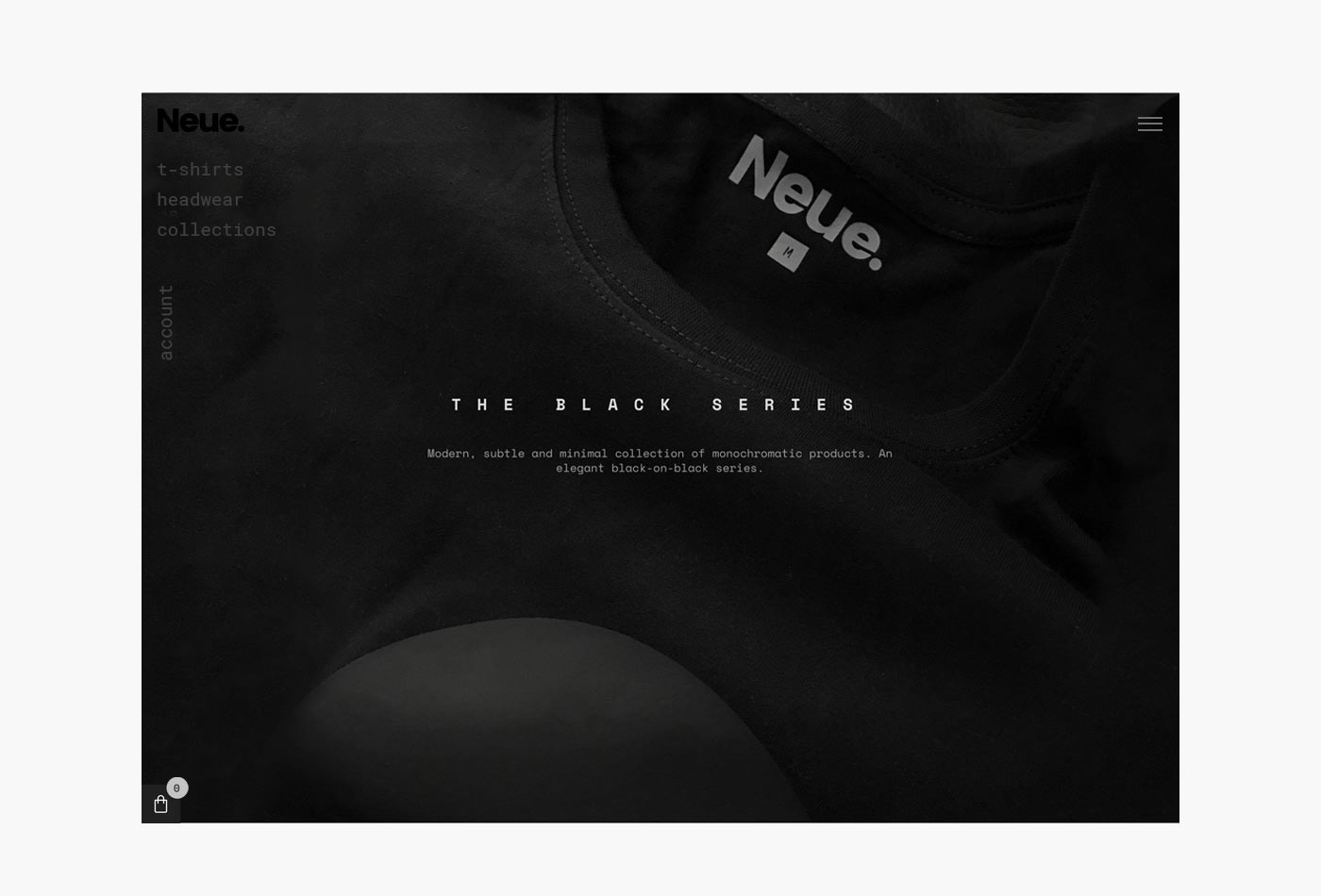
Neue is an online store offering basic products for a fresh, young, aesthetic, minimal, contemporary, artistic and casual generation inspired by design and art culture.
Our purpose: create a very simple and timeless brand so each piece could shine by its own essence.
We developed all the brand communication, from name and packaging to website and e-commerce platform.
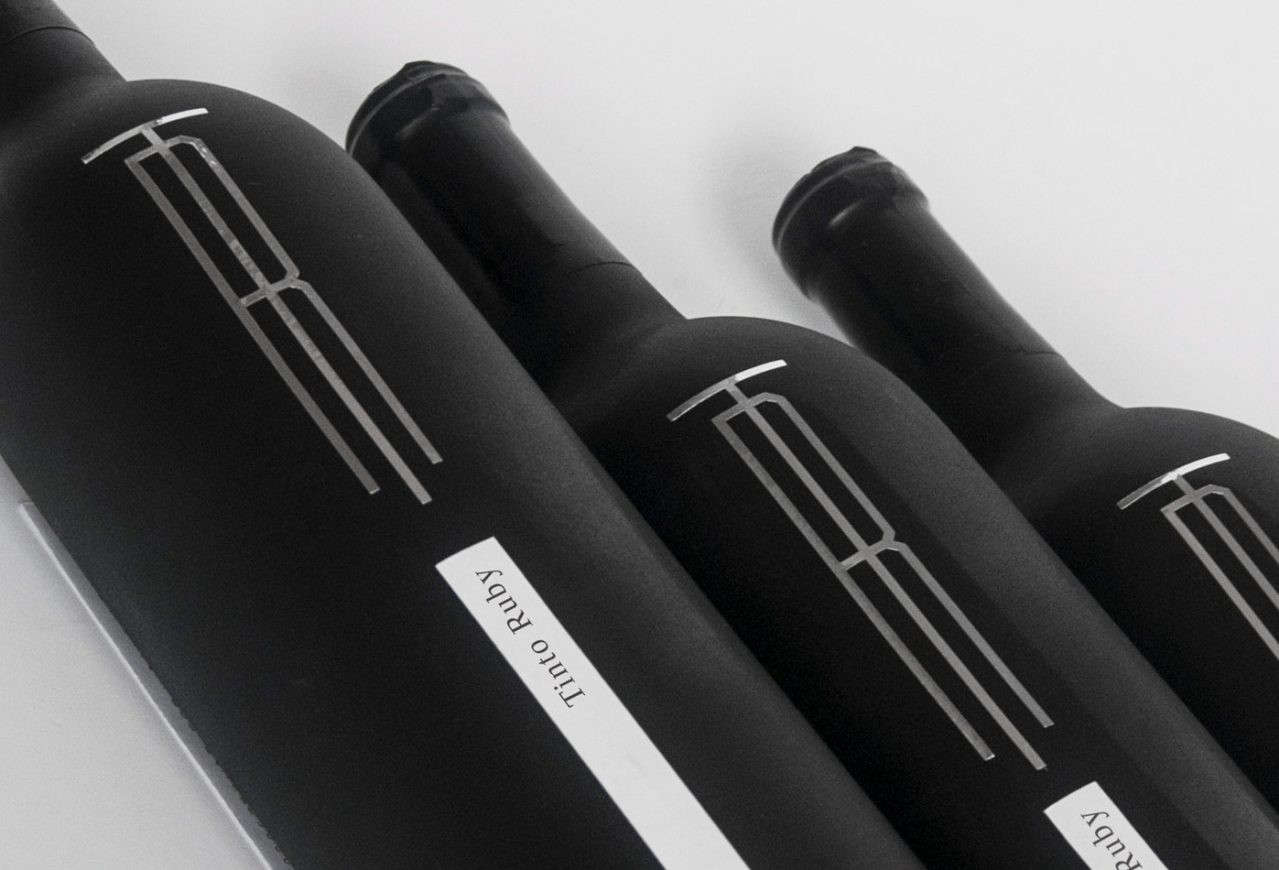
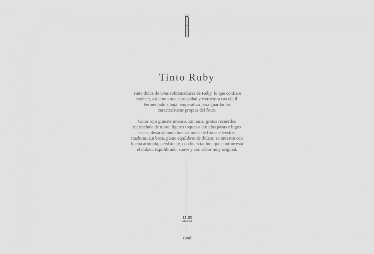
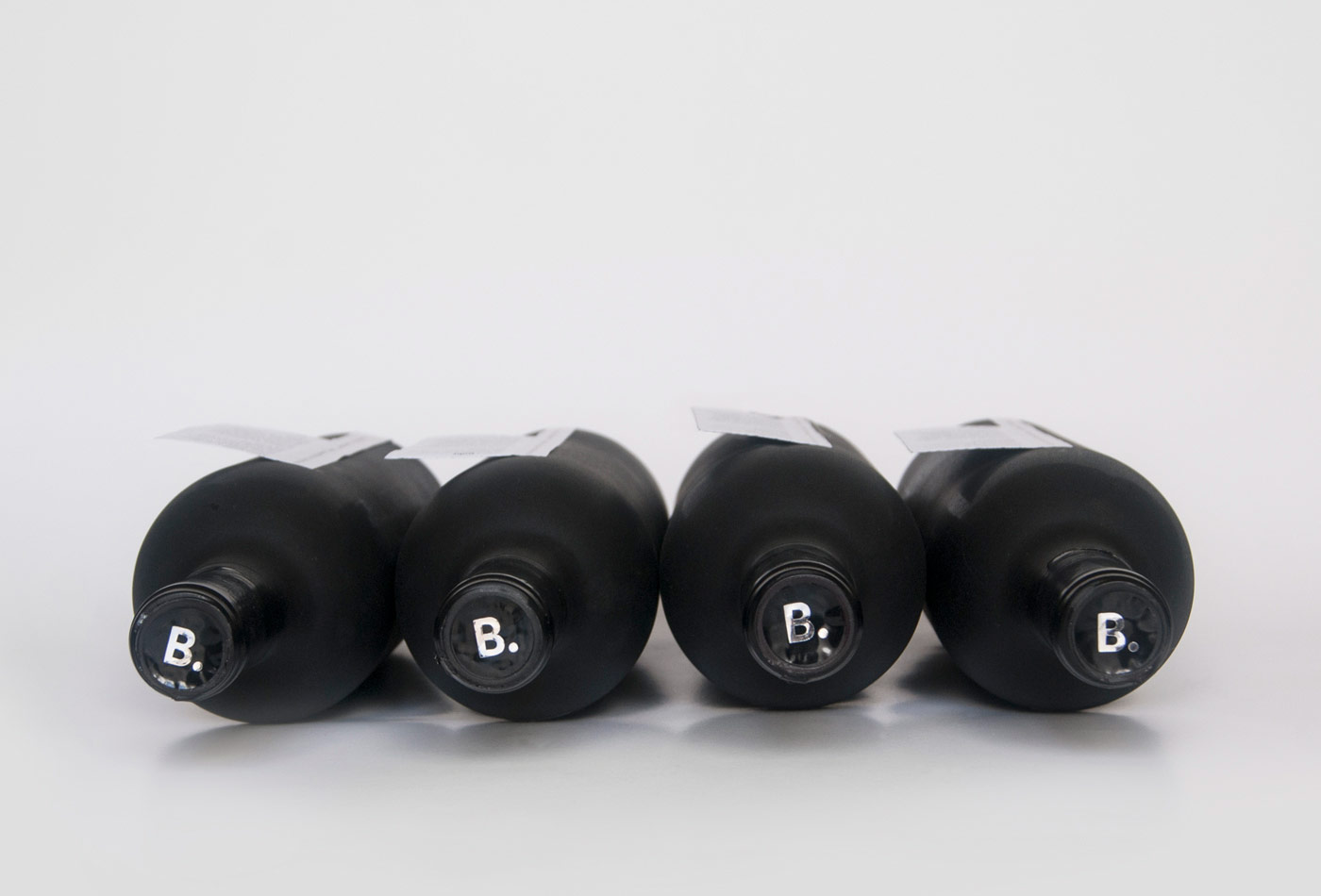
Tinto Ruby is a red wine made by La Redonda, in Queretaro, Mexico, and is definitely one of our favorite local wines. For this reason, we choose it to give as a present to our clients. But not only do we share it, but we add our own style on it by redesigning the bottle’s presentation, so each client can have a unique bottle, created with passion and love to celebrate a year full of work and adventures.