BRADA IS A GRAPHIC DESIGN STUDIO SPECIALIZED IN BRANDING. IF YOU WANT TO CONTACT US PLEASE FEEL FREE TO SEND US AN EMAIL TO INFO@BRADA.CO OR CHECK OUR CONTACT SECTION.
BRADA IS A GRAPHIC DESIGN STUDIO SPECIALIZED IN BRANDING. IF YOU WANT TO CONTACT US PLEASE FEEL FREE TO SEND US AN EMAIL TO INFO@BRADA.CO OR CHECK OUR CONTACT SECTION.
BRADA IS A GRAPHIC DESIGN STUDIO SPECIALIZED IN BRANDING. IF YOU WANT TO CONTACT US PLEASE FEEL FREE TO SEND US AN EMAIL TO INFO@BRADA.CO OR CHECK OUR CONTACT SECTION.
BRADA IS A GRAPHIC DESIGN STUDIO SPECIALIZED IN BRANDING. IF YOU WANT TO CONTACT US PLEASE FEEL FREE TO SEND US AN EMAIL TO INFO@BRADA.CO OR CHECK OUR CONTACT SECTION.
Mascareña is a natural gourmet products brand, extracted from the Huasteca Veracruzana, an area located in eastern Mexico and known for its rich vegetation, which allows obtaining high quality natural products.
For this identity, we created a graphic line adaptable to different types of products, highlighting the use of a pattern and isotype that represent the natural richness of the area, and a refined logo and complementary typographic selection that give the brand a gourmet touch.
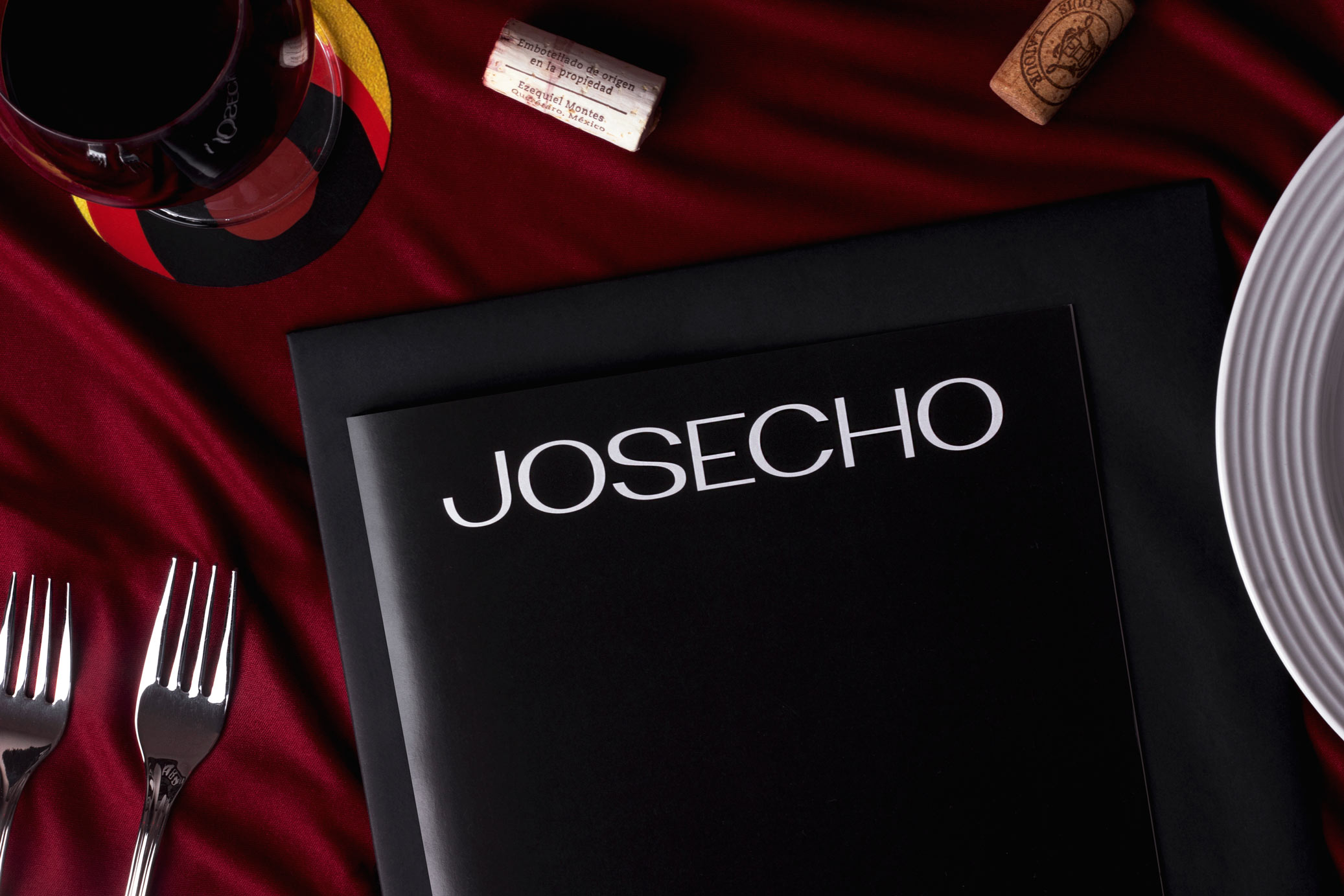
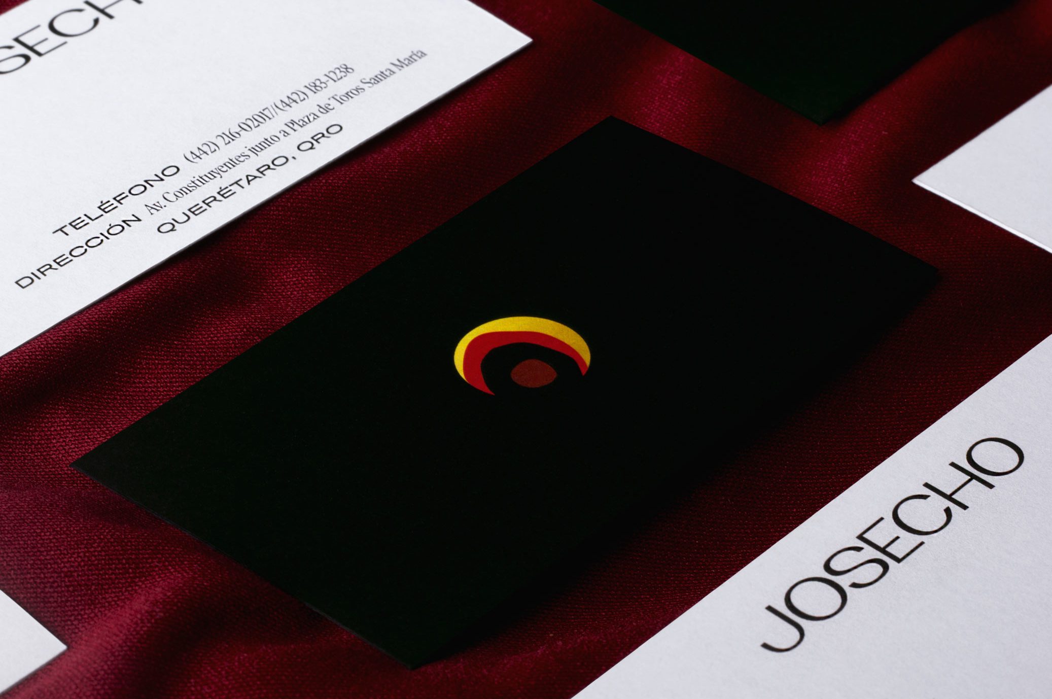
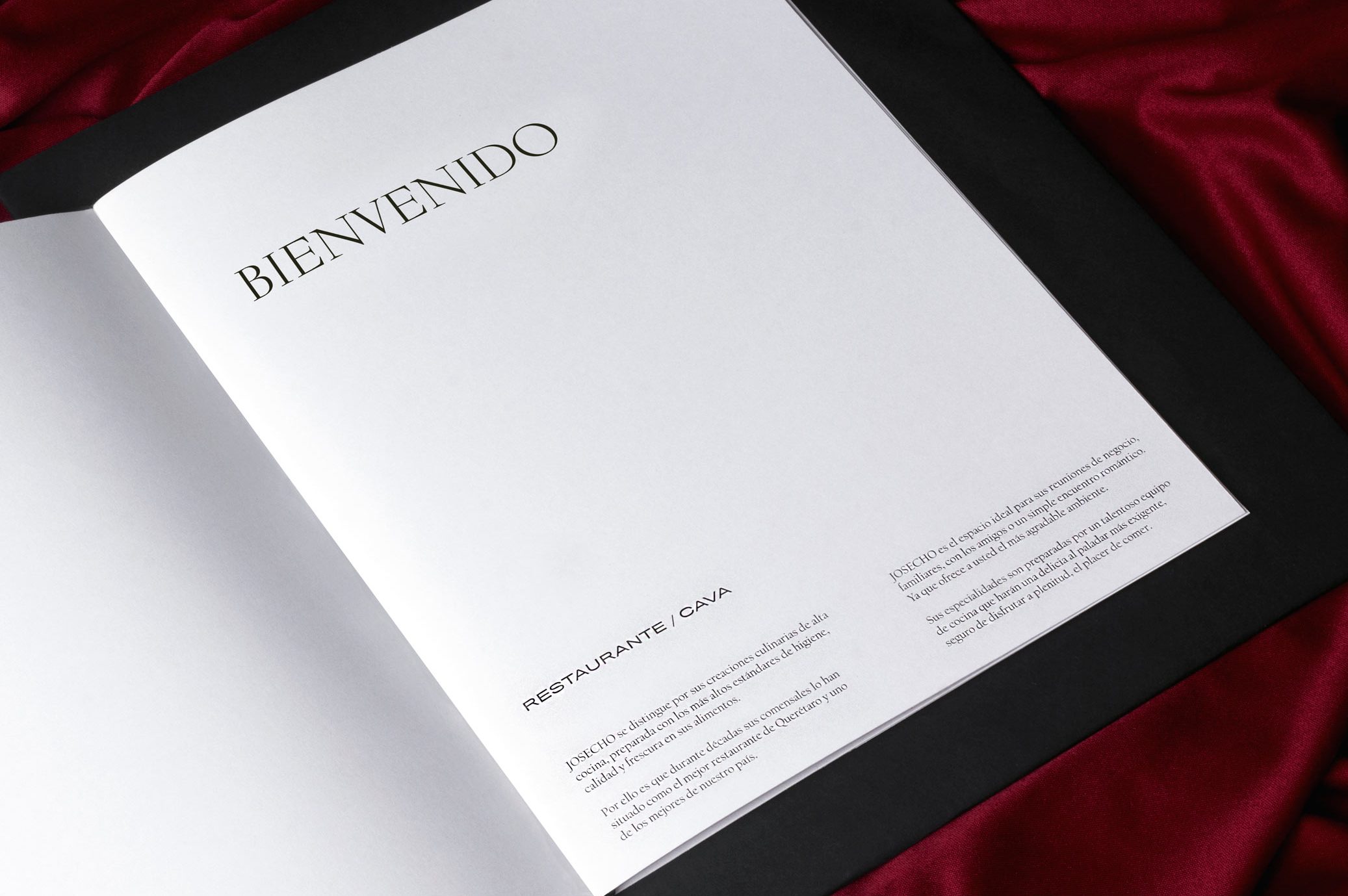
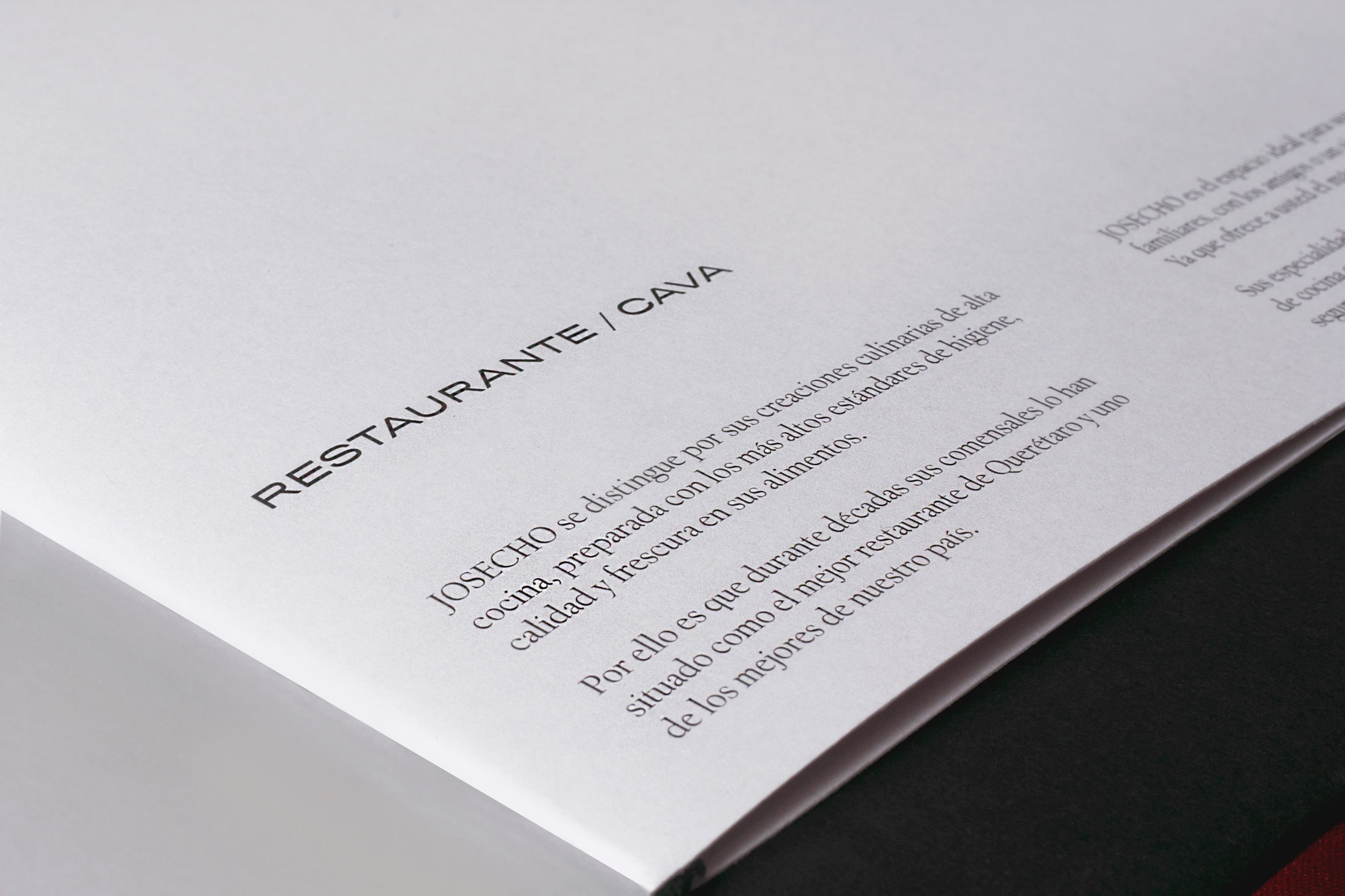
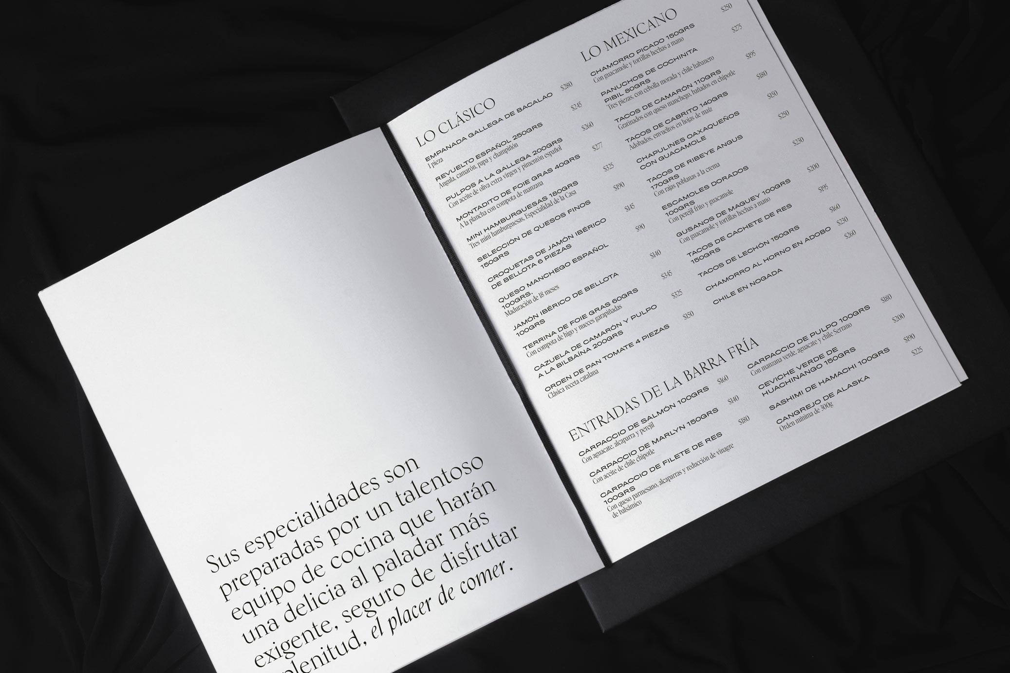
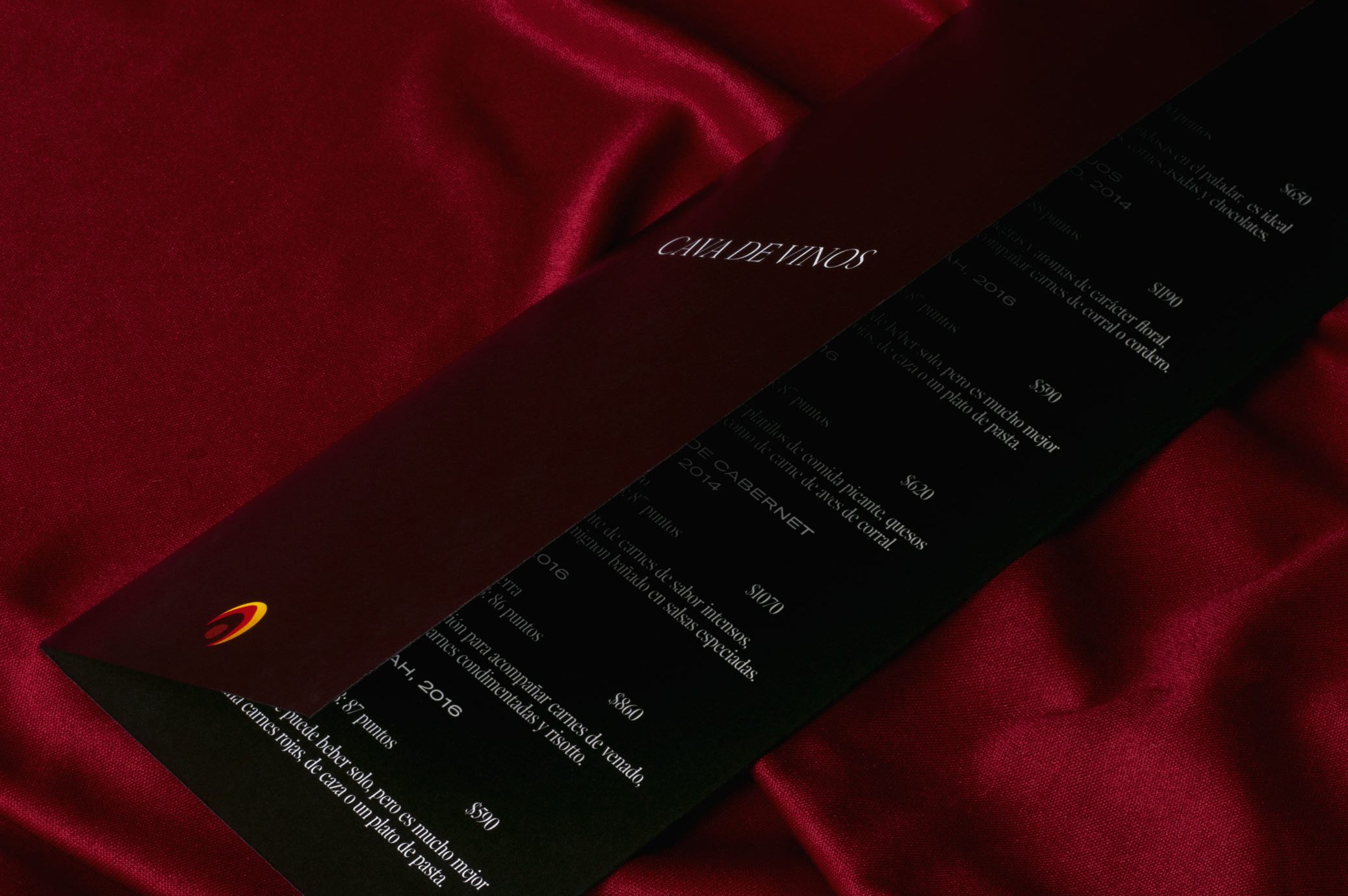
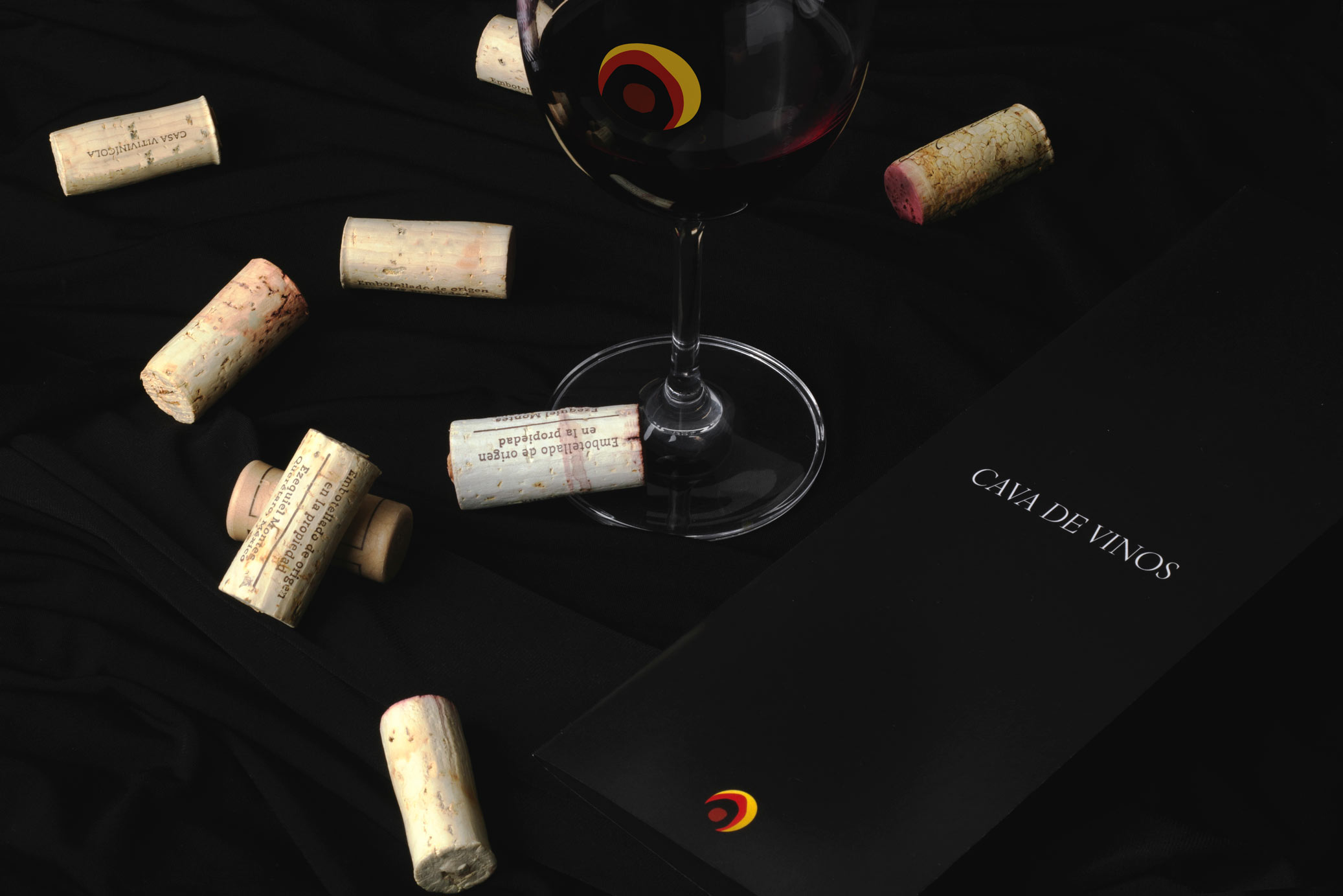
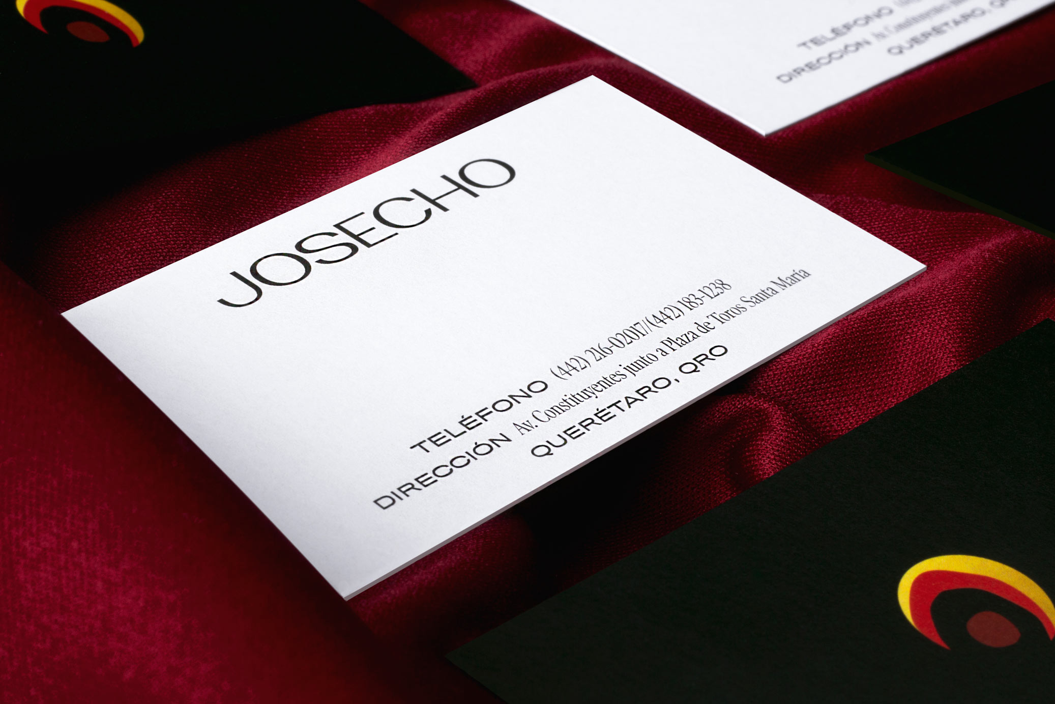
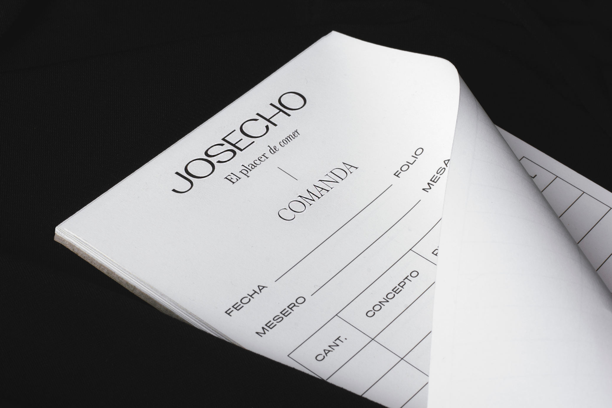
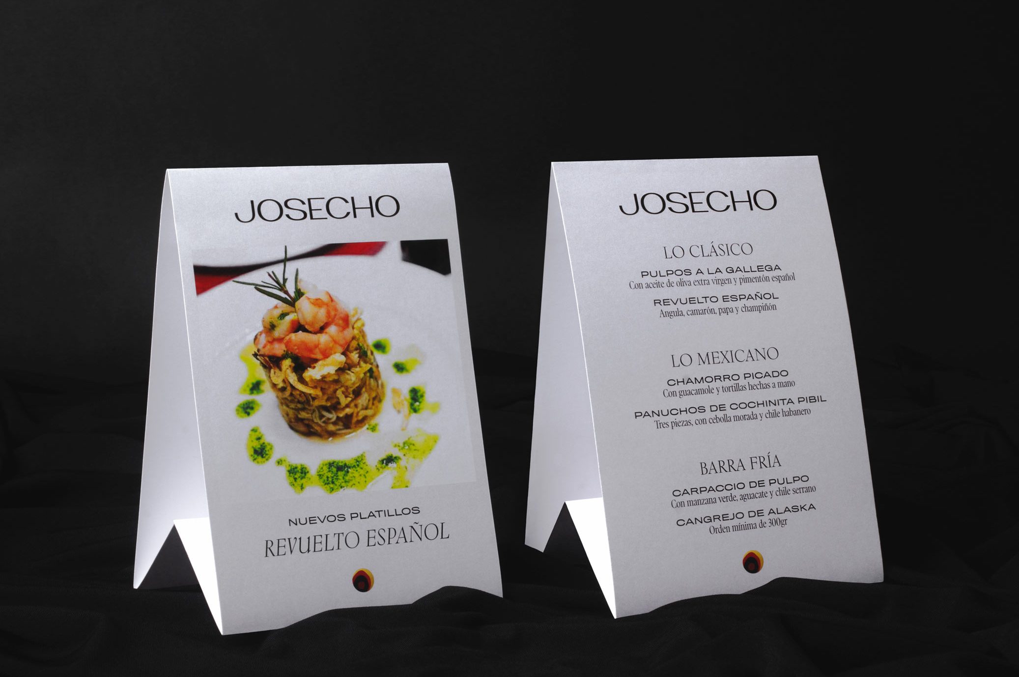
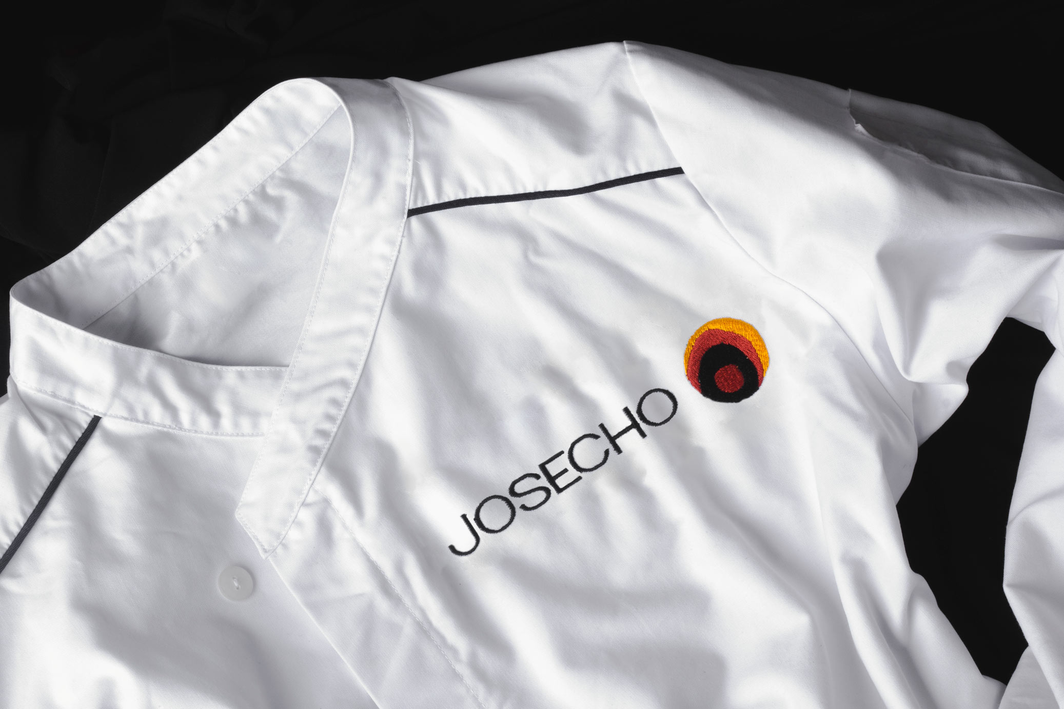
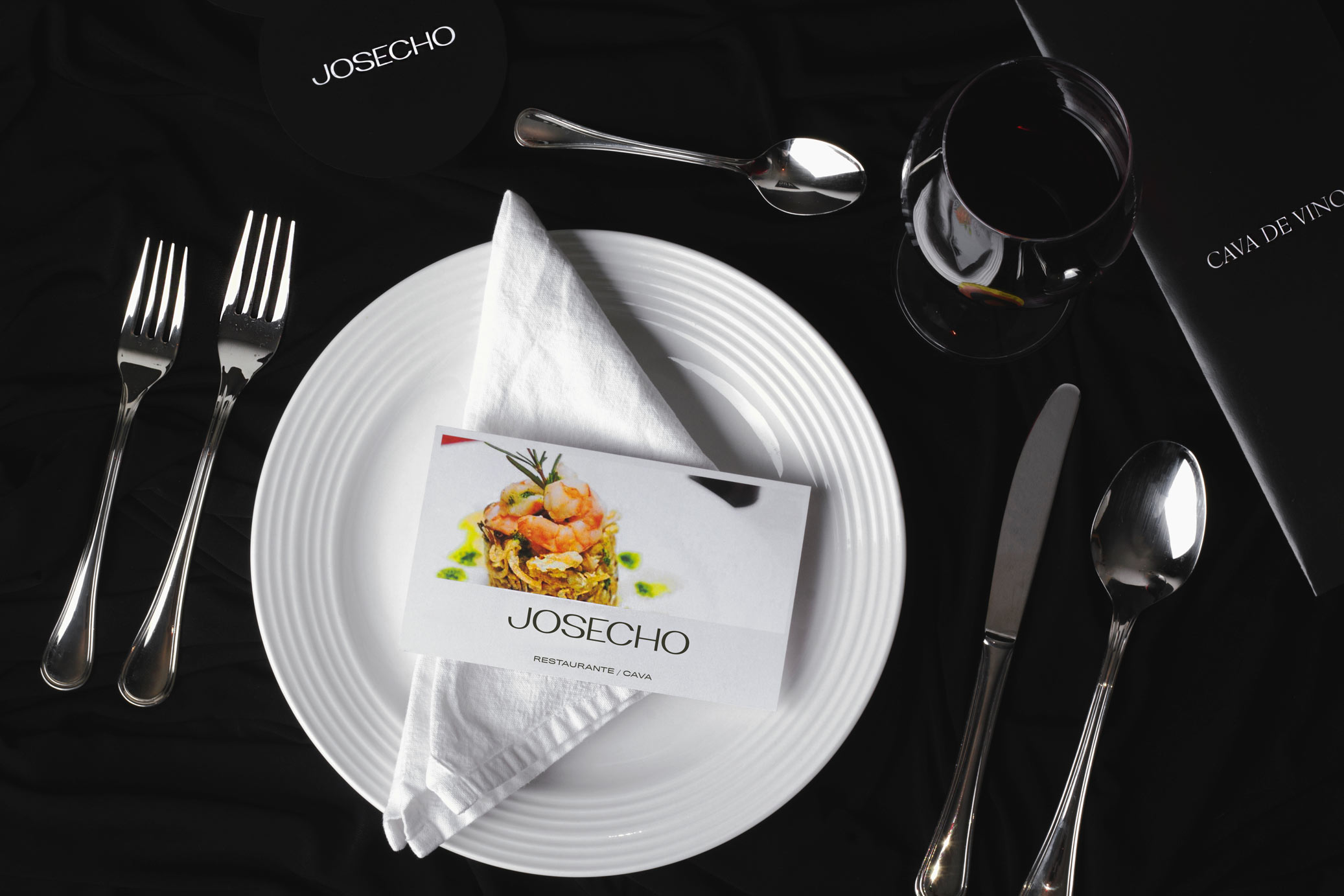
Josecho is a restaurant distinguished by its culinary creations of haute cuisine, and for many people it is considered the best restaurant in Queretaro and one of the best in the country.
For this project we seek to create a balance between traditional and contemporary, without leaving aside the elegance of the place. The logo typography was custom made and we created a symbol that represents the restaurant’s most iconic element of the place: a large stained glass window located at the back of the restaurant.
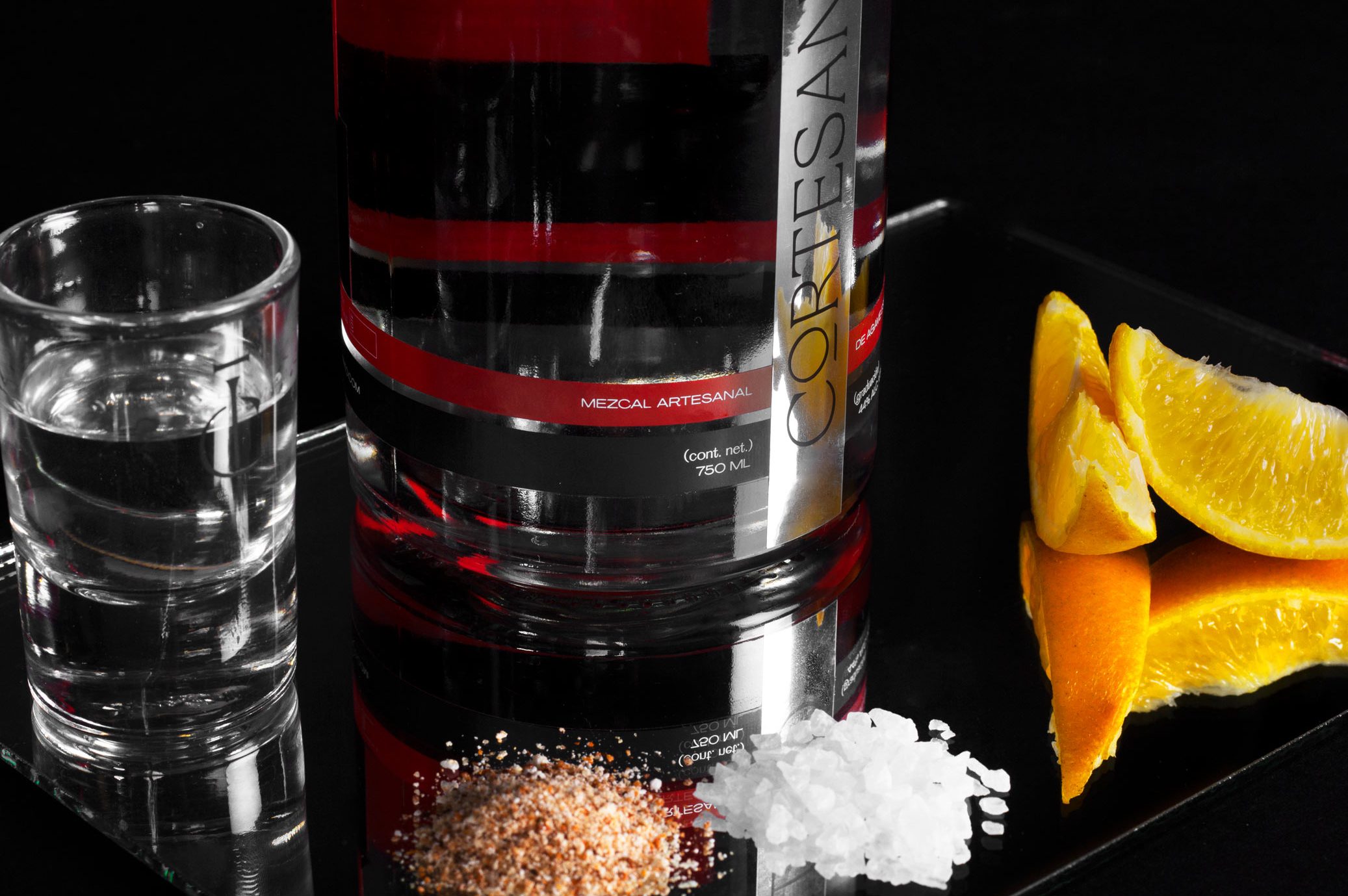
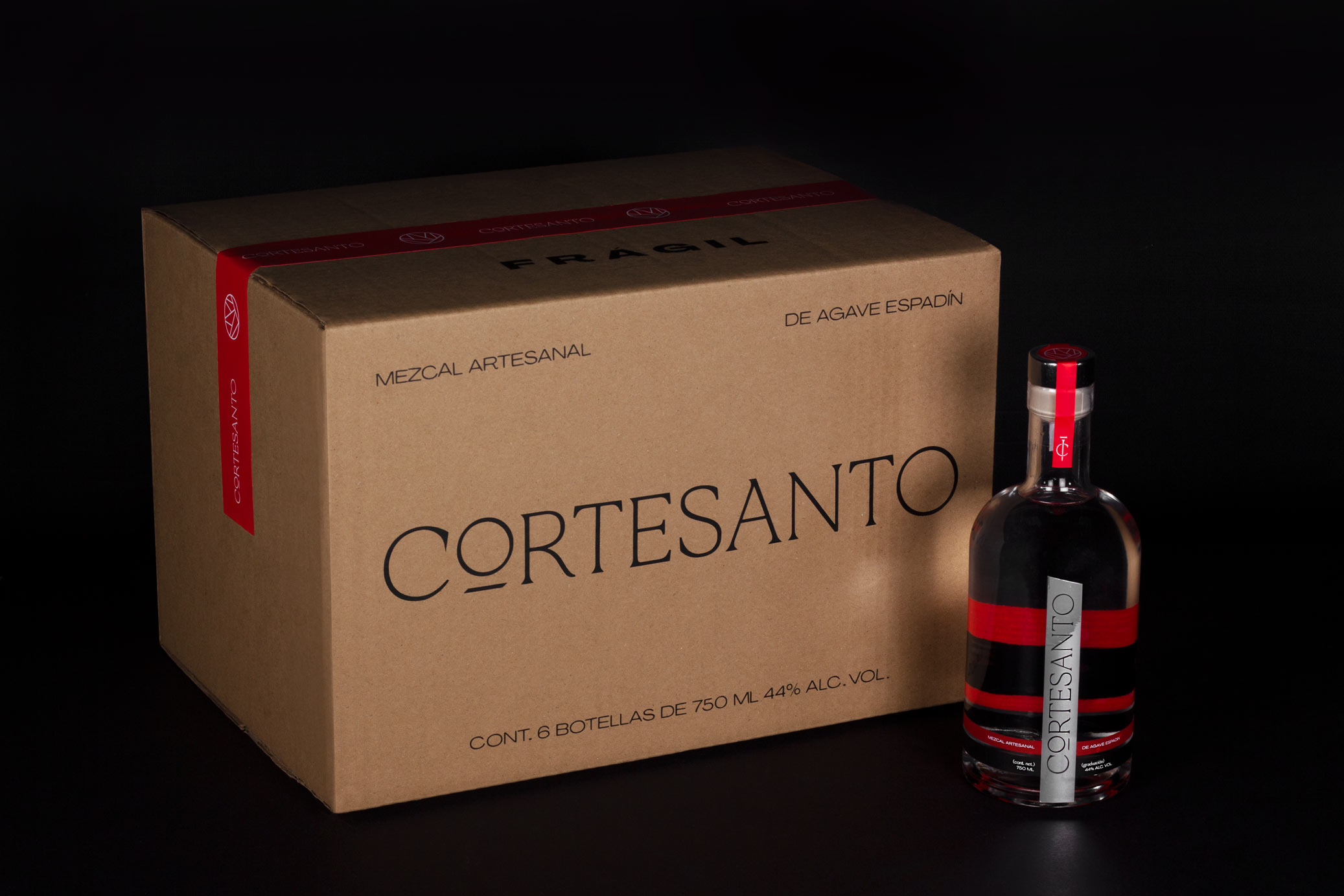
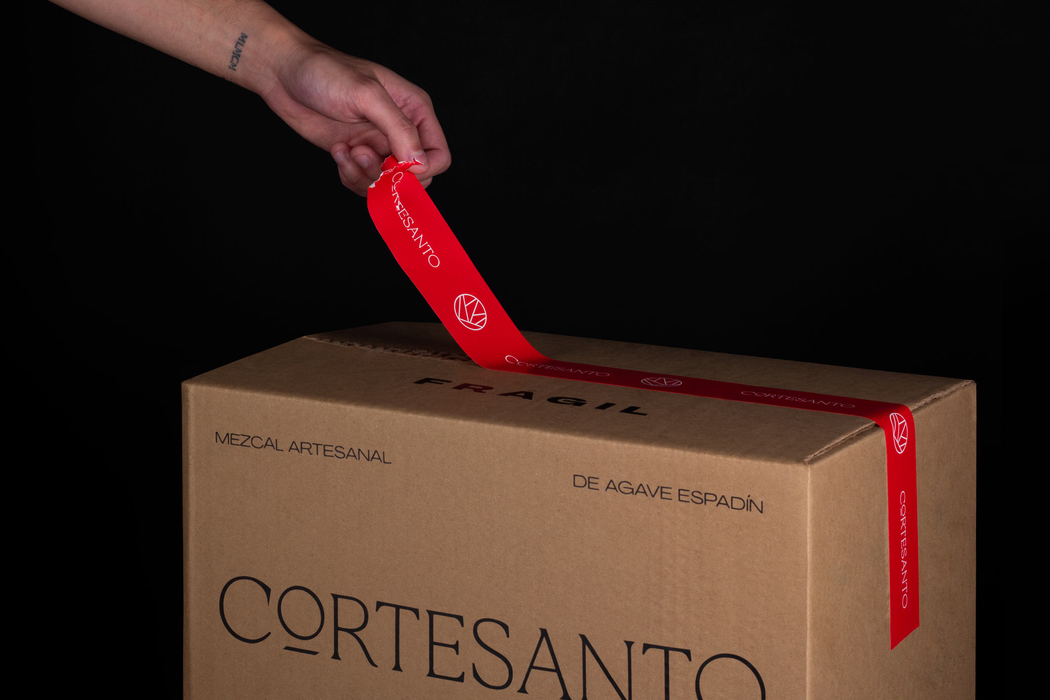
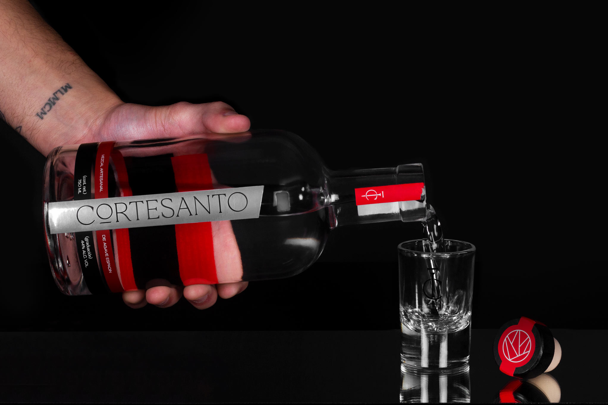
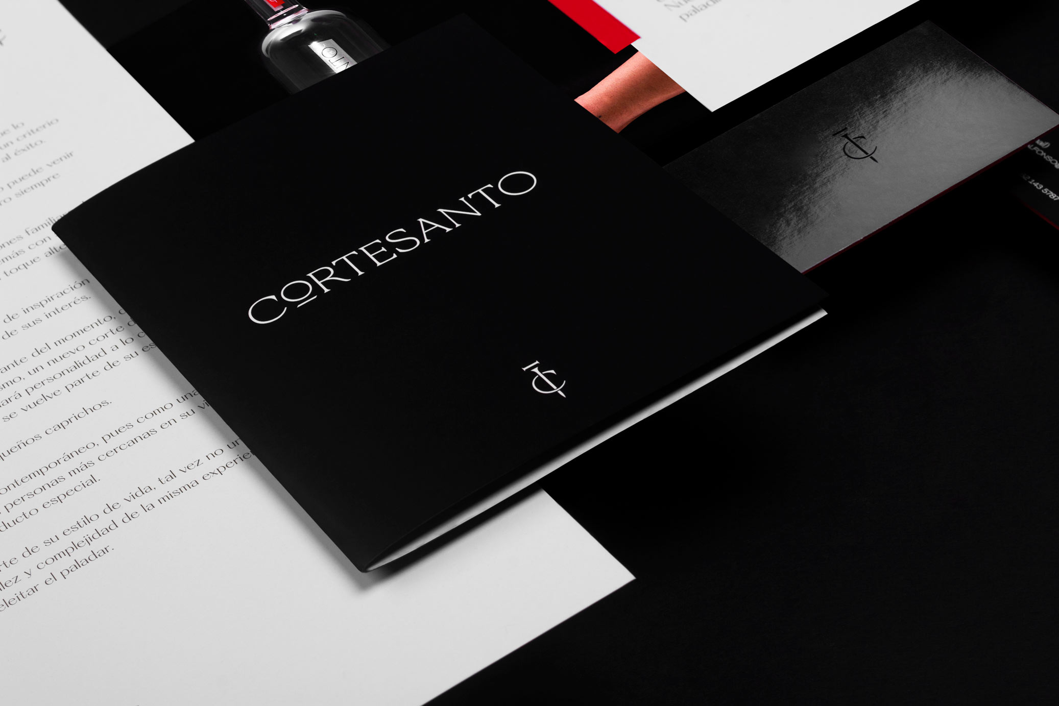
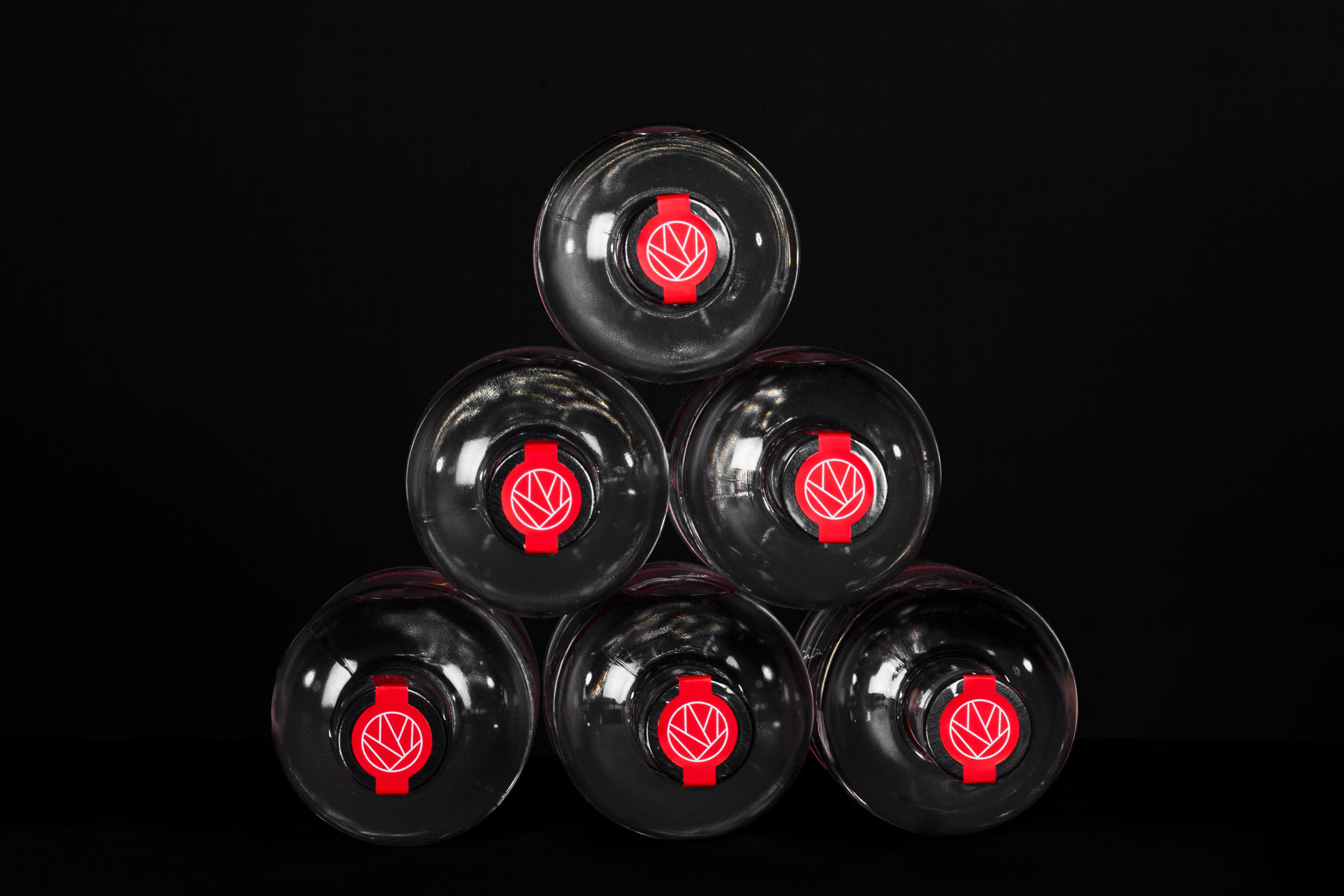
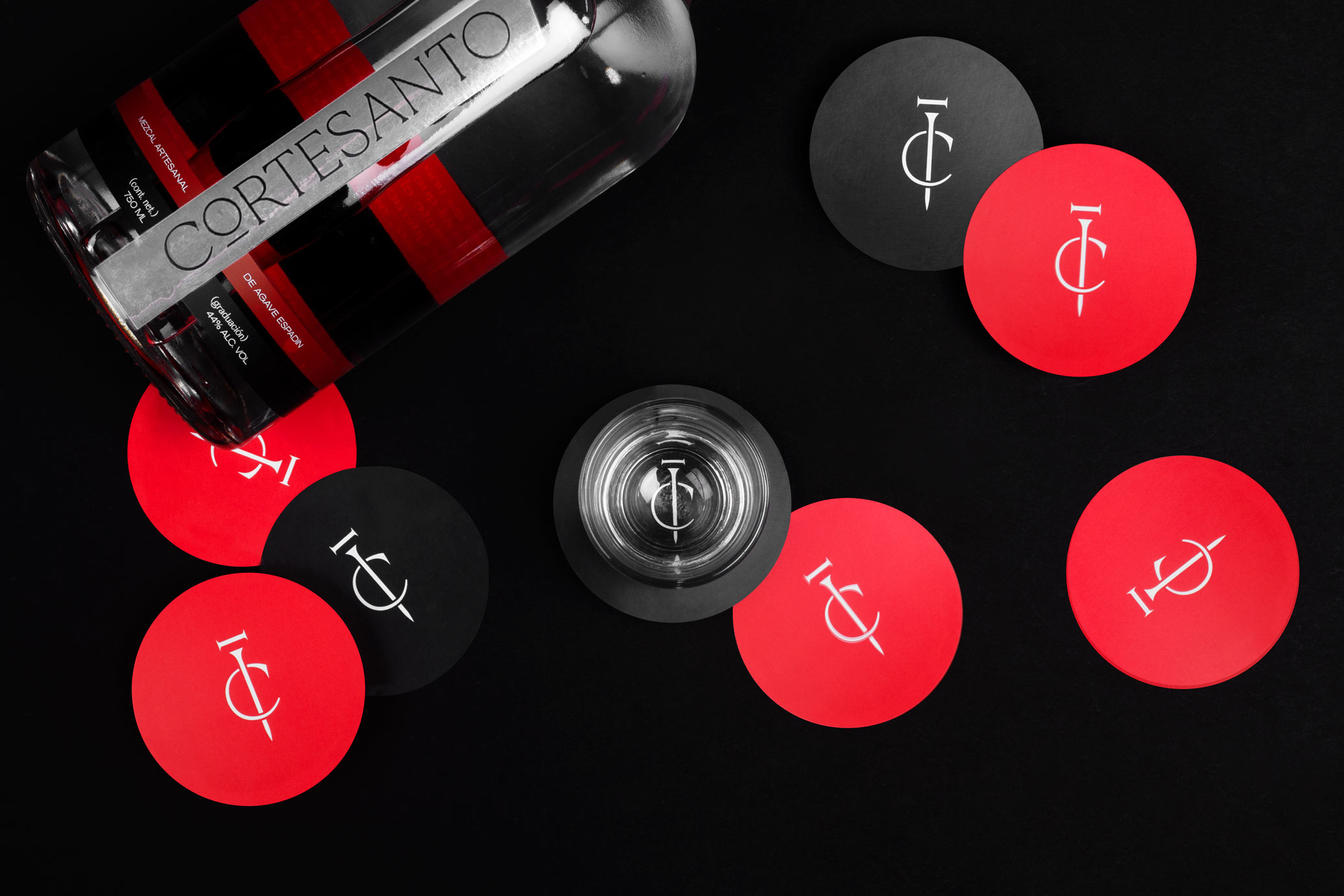
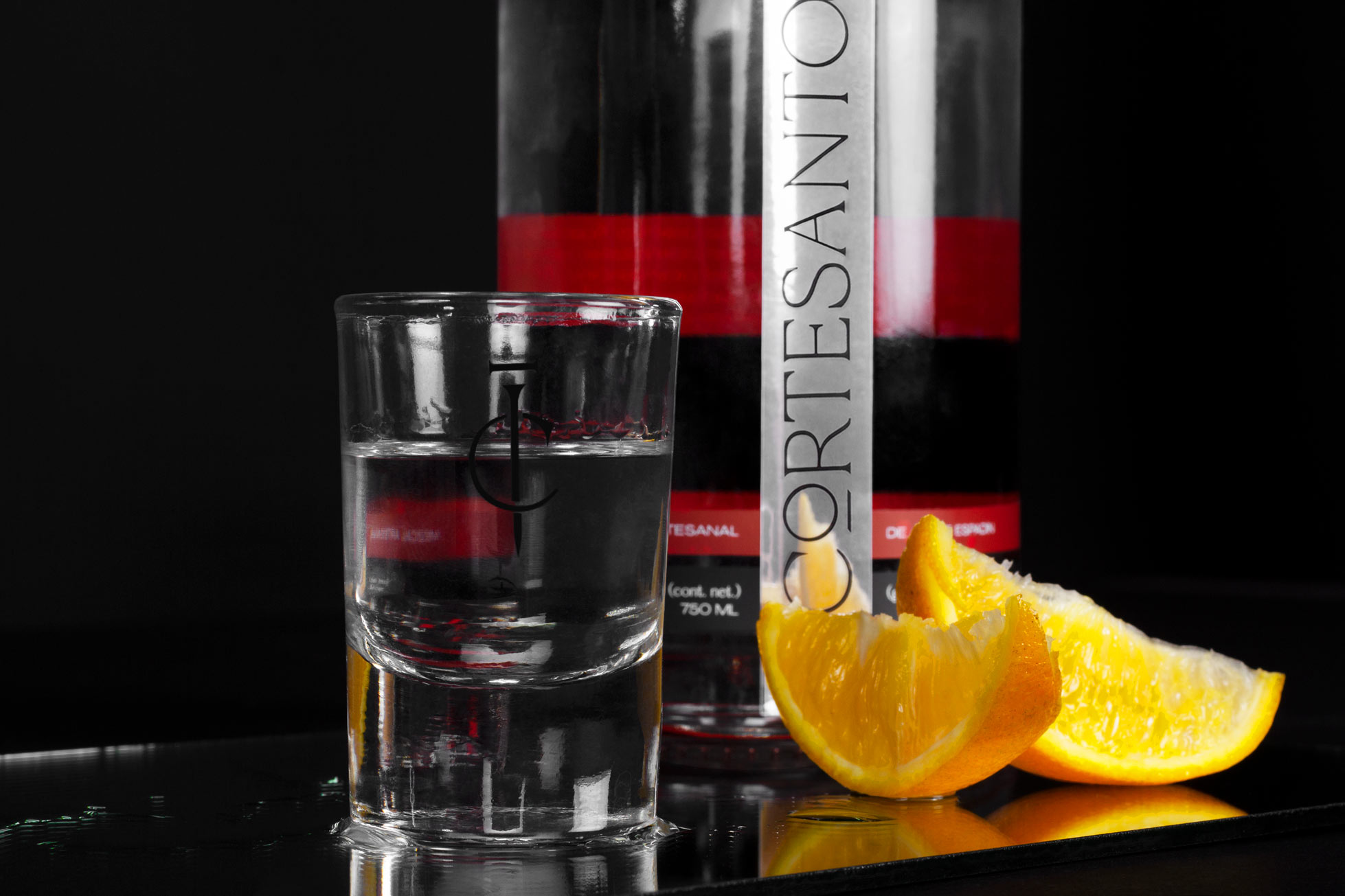
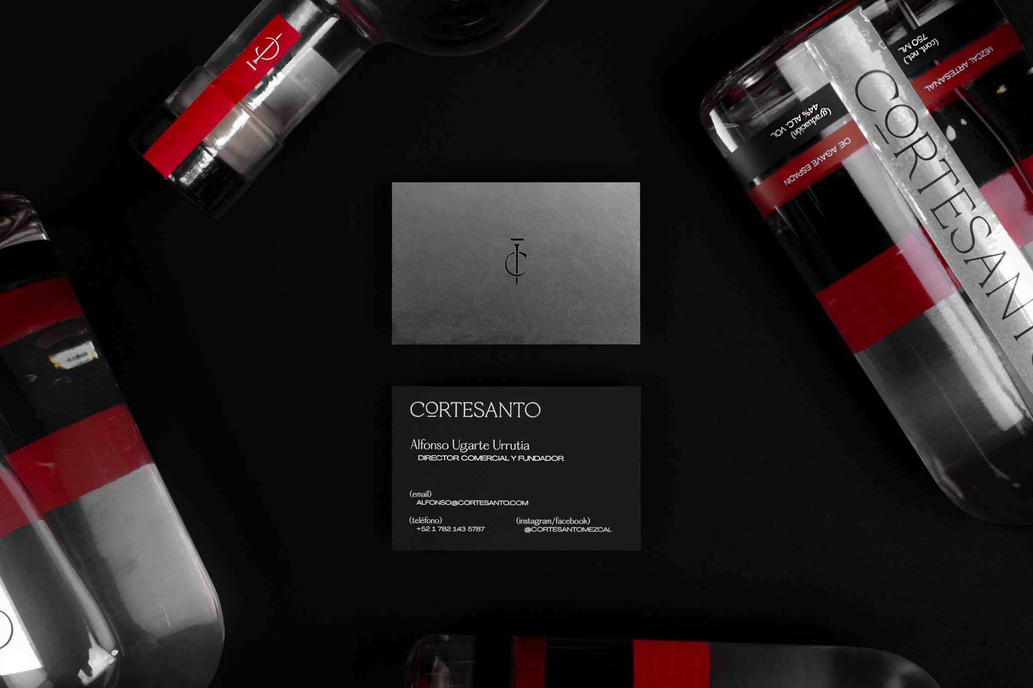
Cortesanto is a premium artisanal mezcal from agave espadín produced in Oaxaca, Mexico. The concept dates back to several centuries ago with the idea of knights and swords. The name comes from the union of the words “Corte” (cut) and “Santo” (holy), because the cut of agave is a key part of the mezcal production process, a drink that was considered holy / sacred by ancient pre-hispanic peoples.
The brand represents the modern knight; the hard-working, dreamer and brave man. For this reason, the graphic was created from the figure of the paladin: that knight distinguished in the war by his brave and noble achievements.
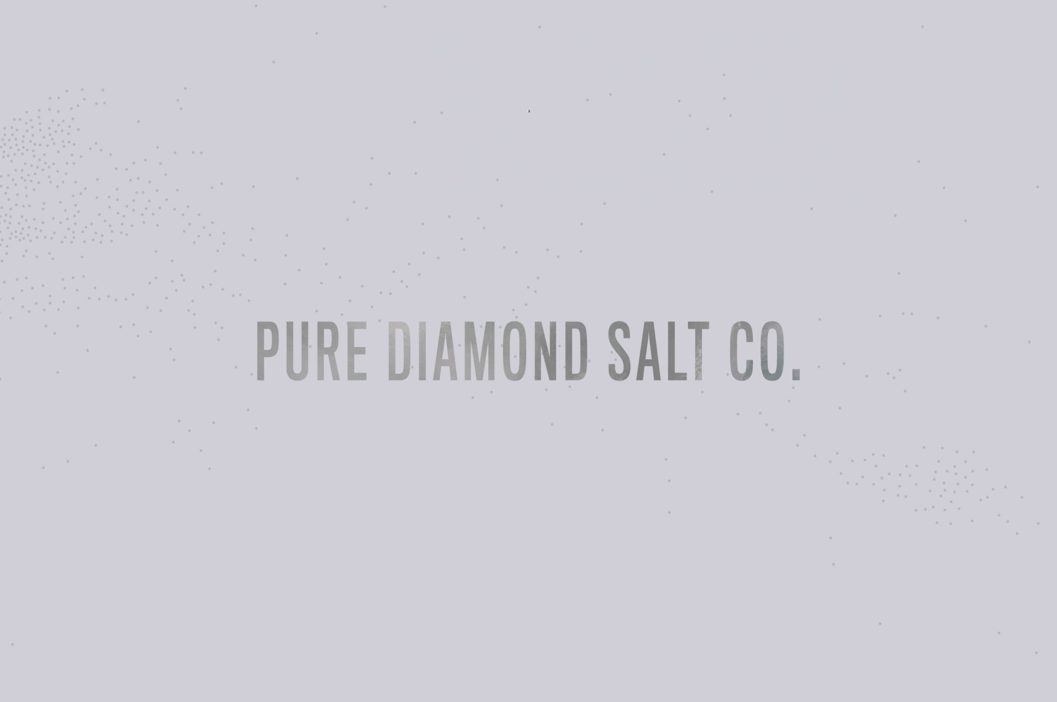
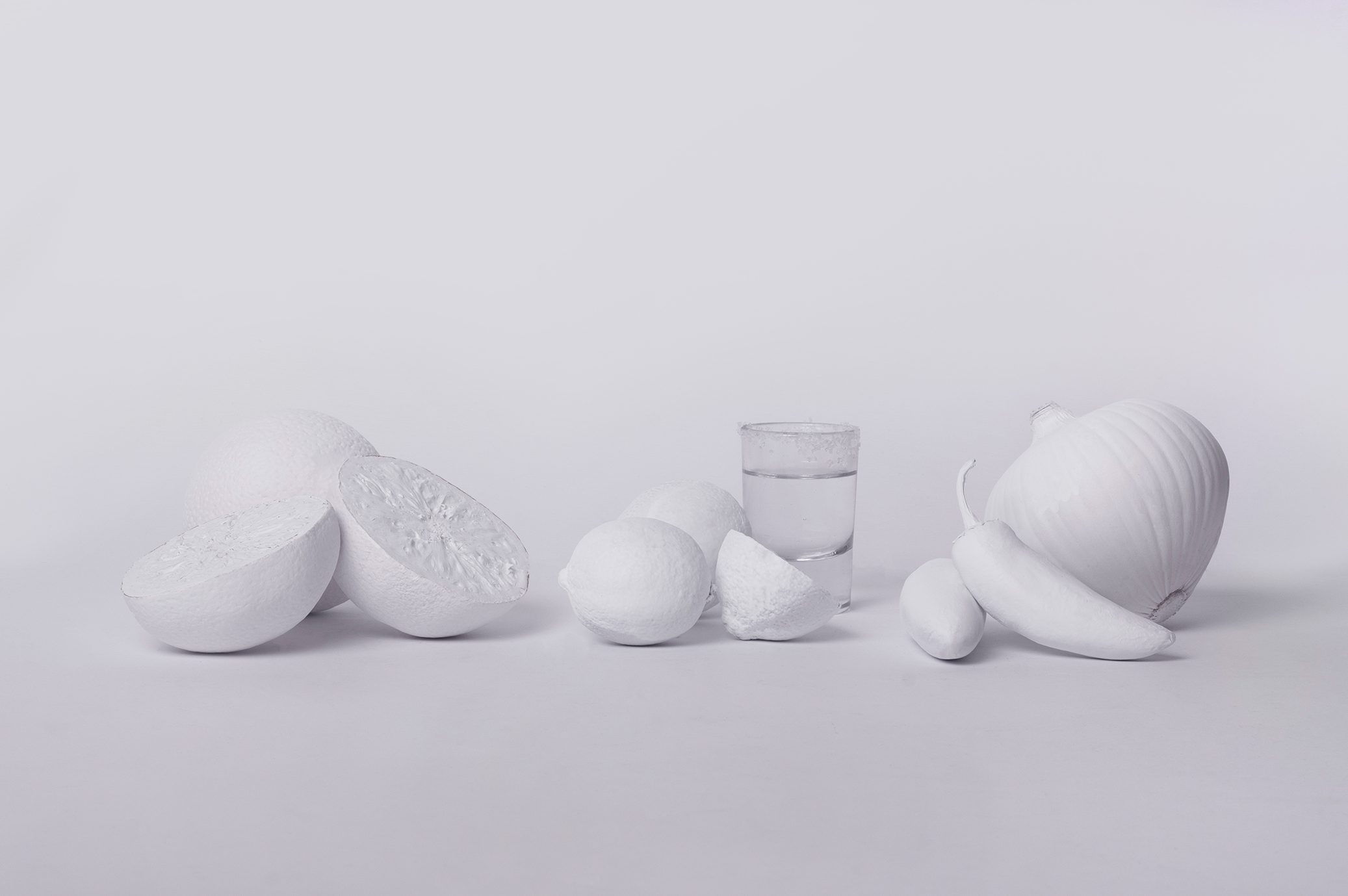
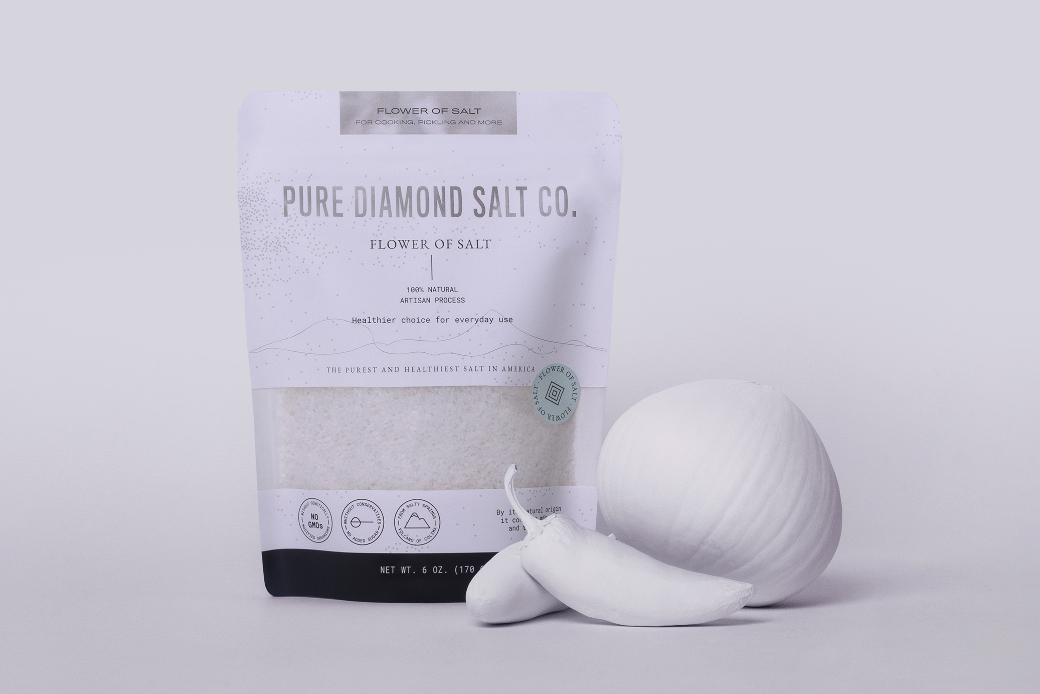
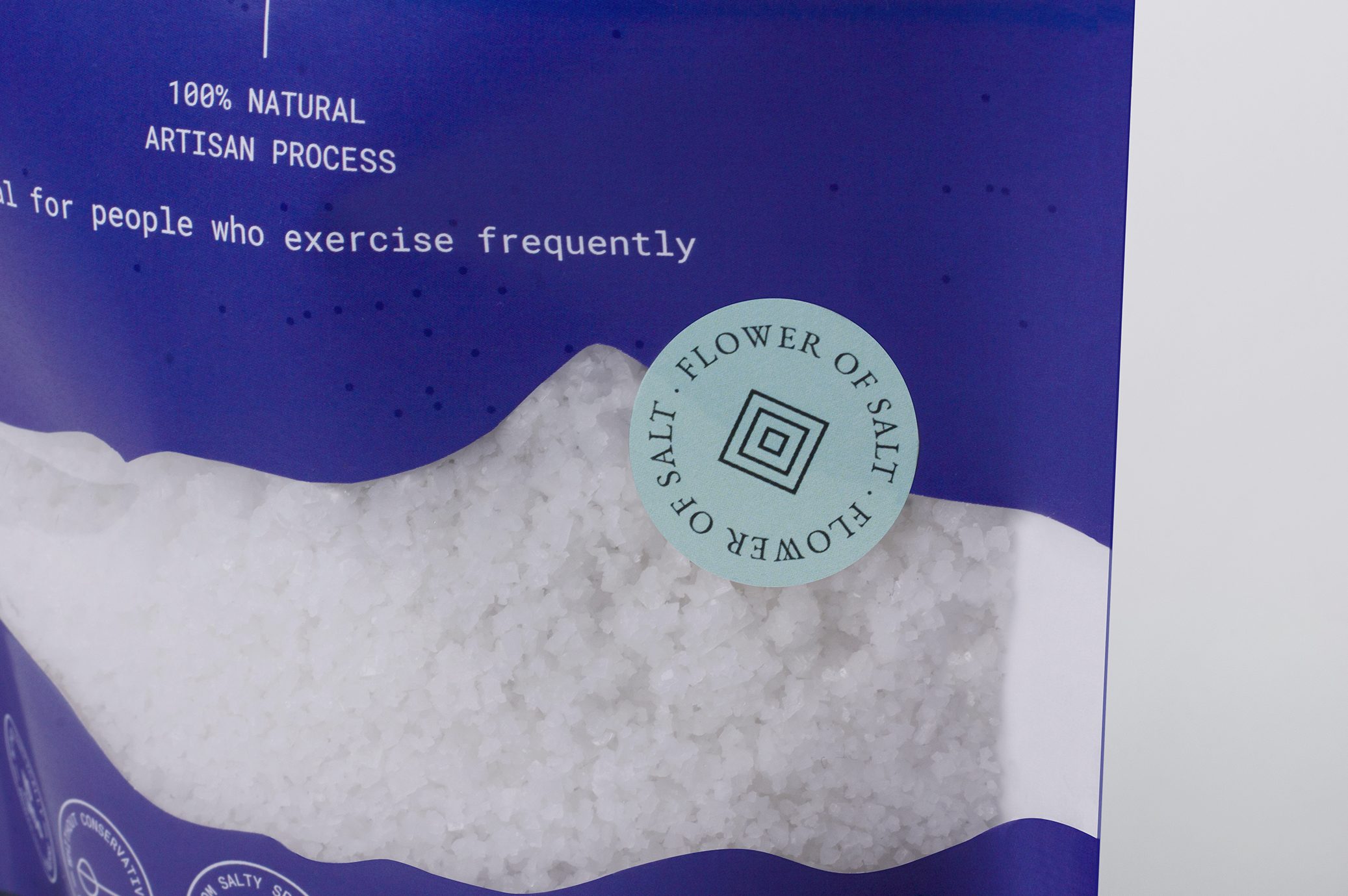
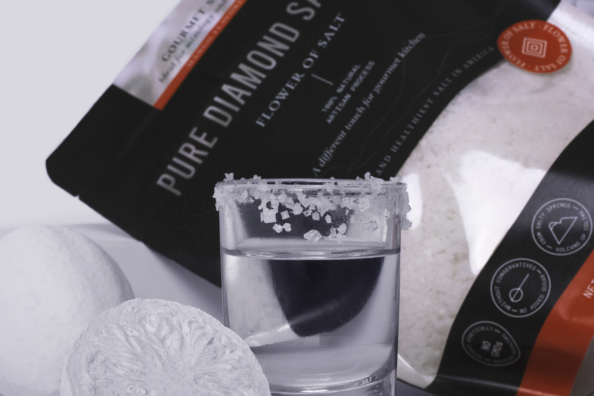
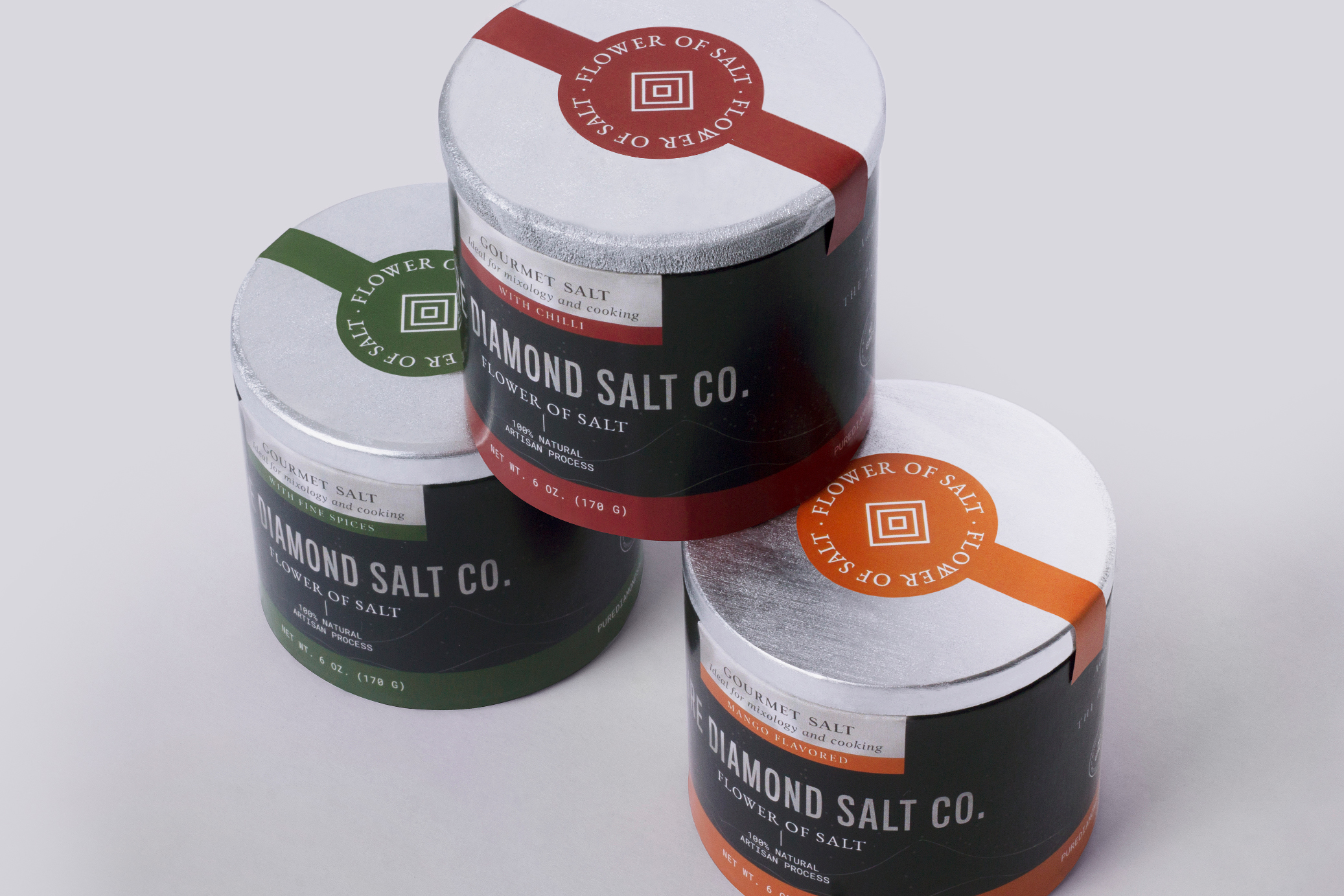
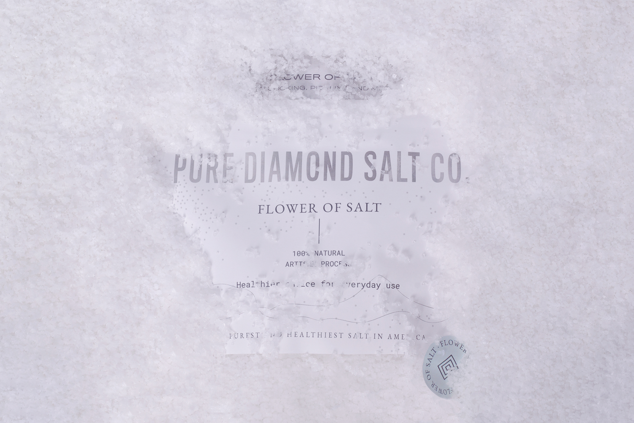
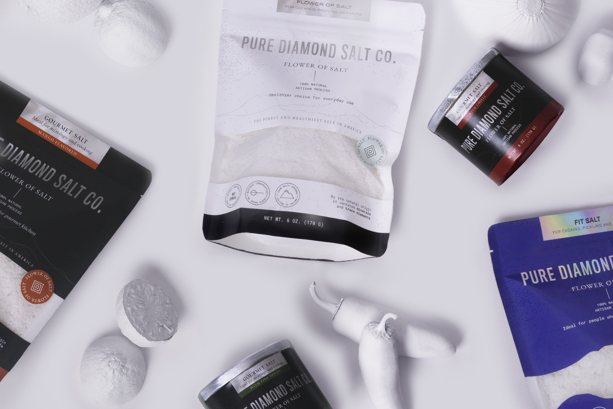
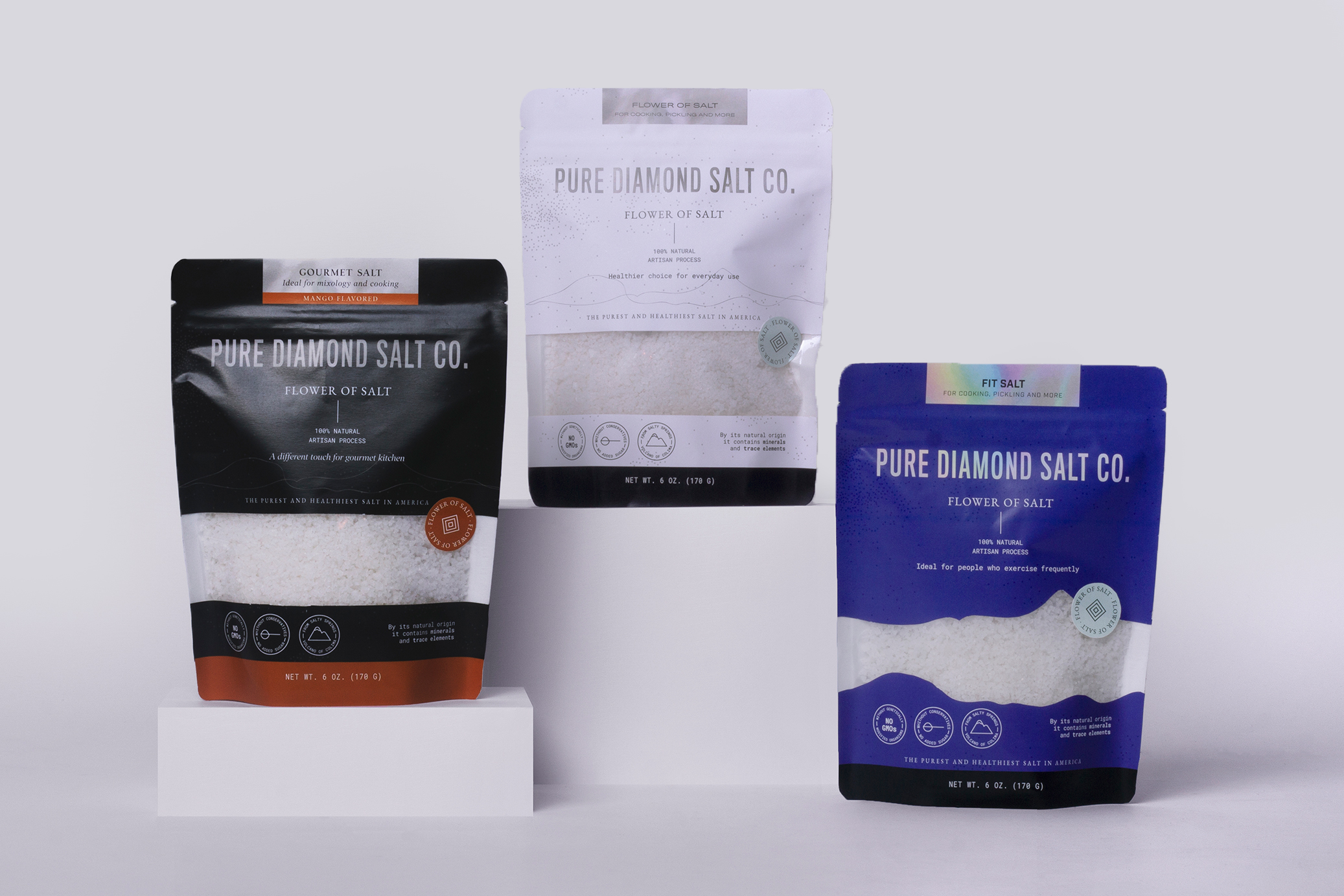
Pure Diamond Salt Co is a flower of salt brand. The product is harvested by hand in Mexico and distributed in the United States. It seeks to highlight the health benefits that this type of salt grants.
Our work started with naming, using purity as the main brand attribute, which is transmitted throughout the graphic line of branding and packaging.
Lines and dots represent traditional craftsmanship of the process of collecting salt, while the colors refer to the purity and brightness reflected by the sun when make contact with the salt mountains.
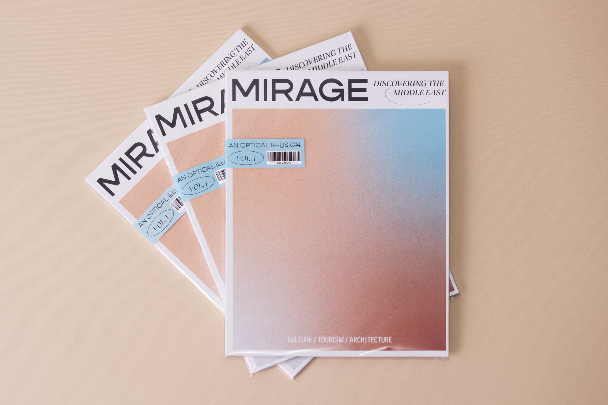
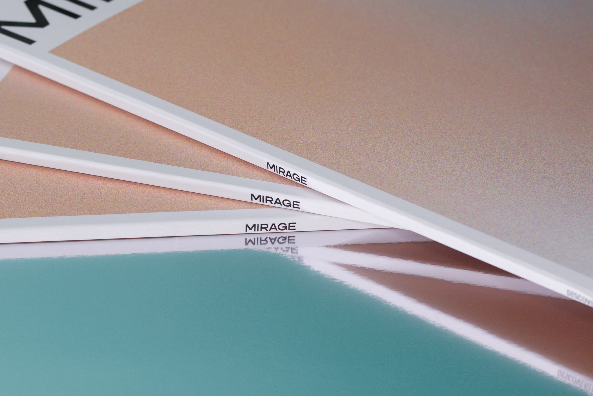
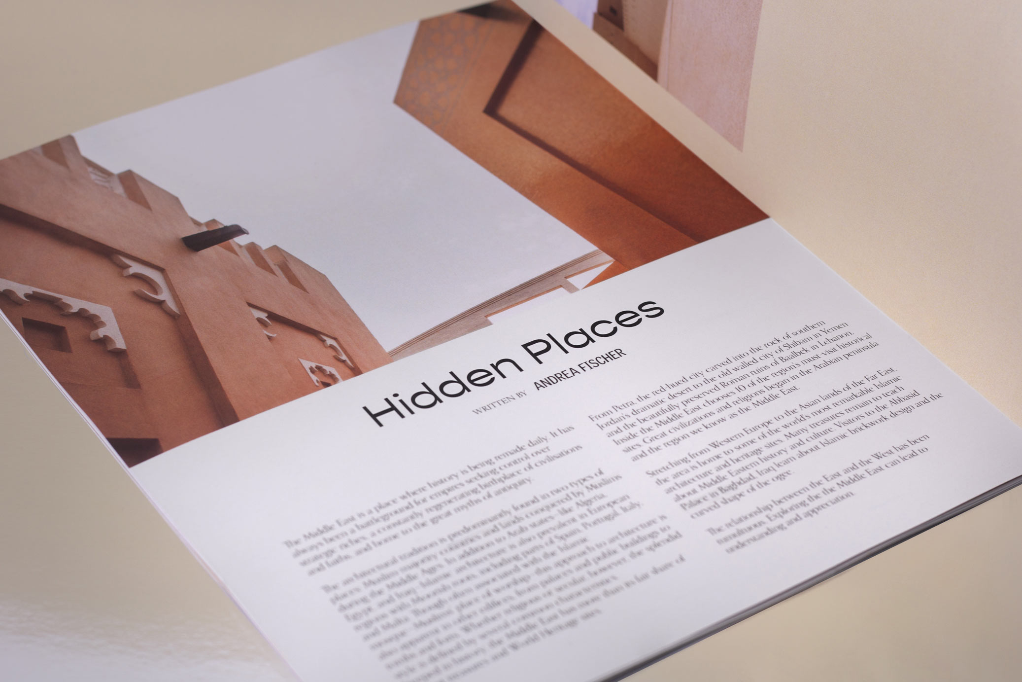
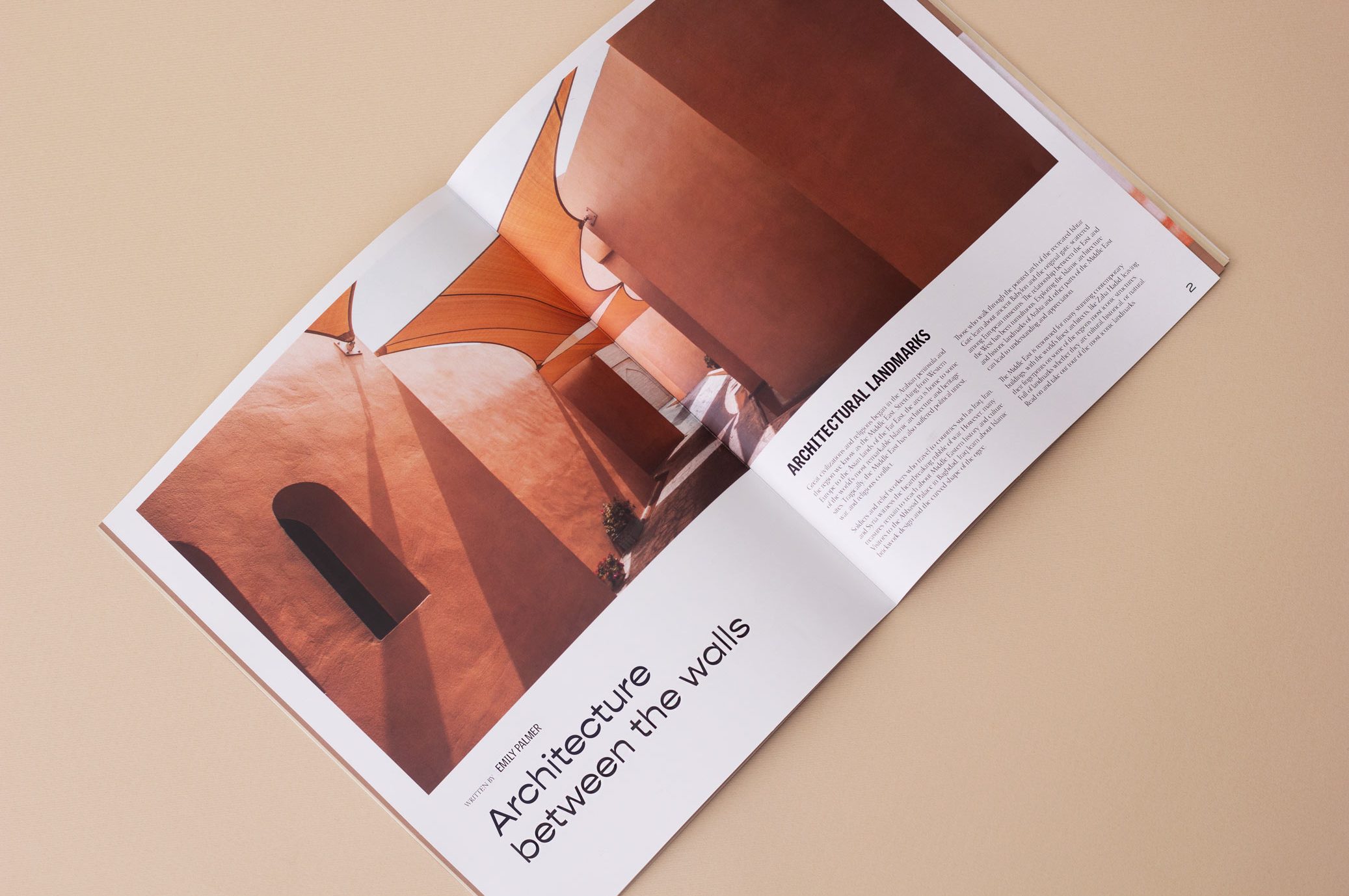
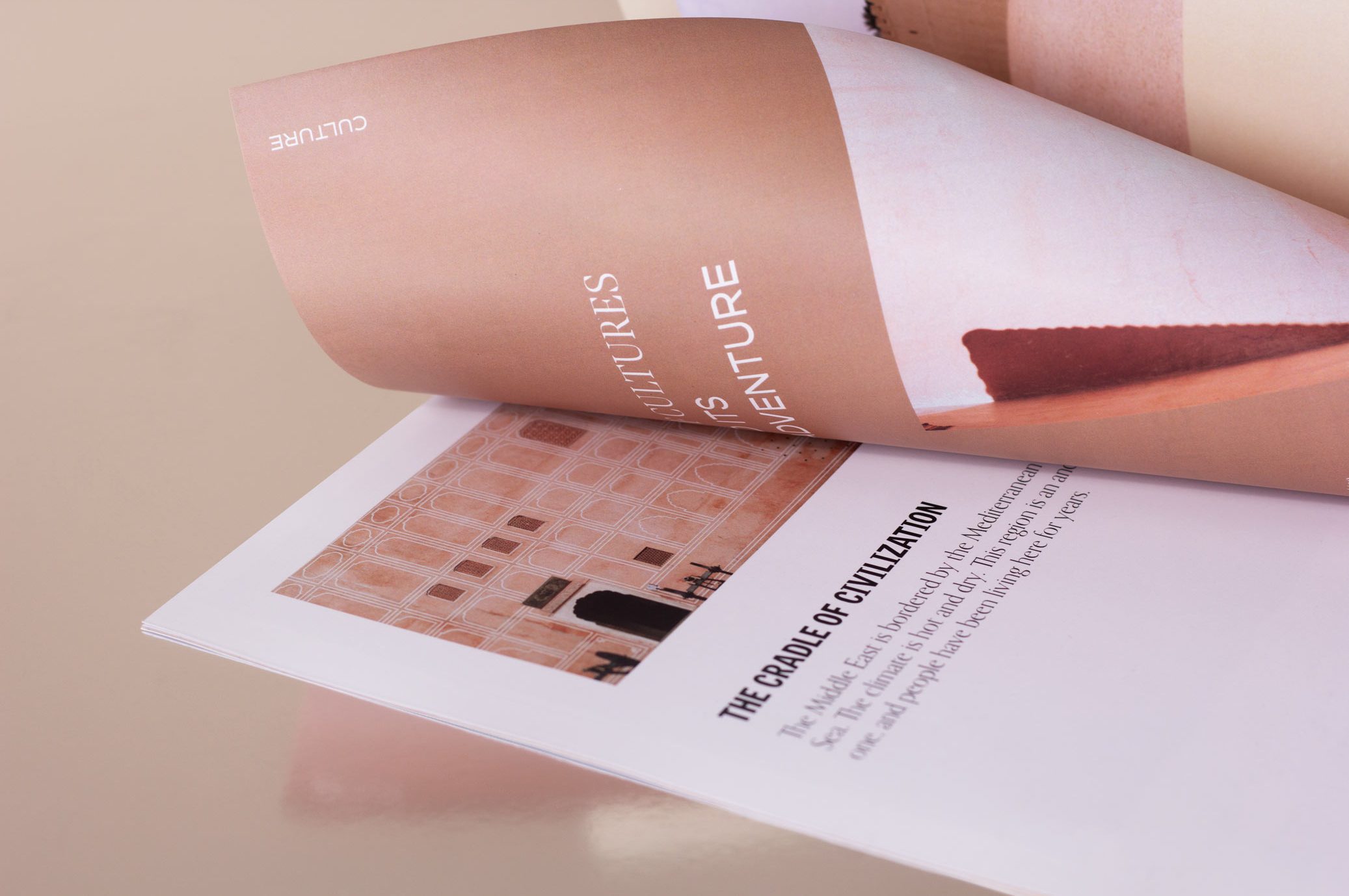
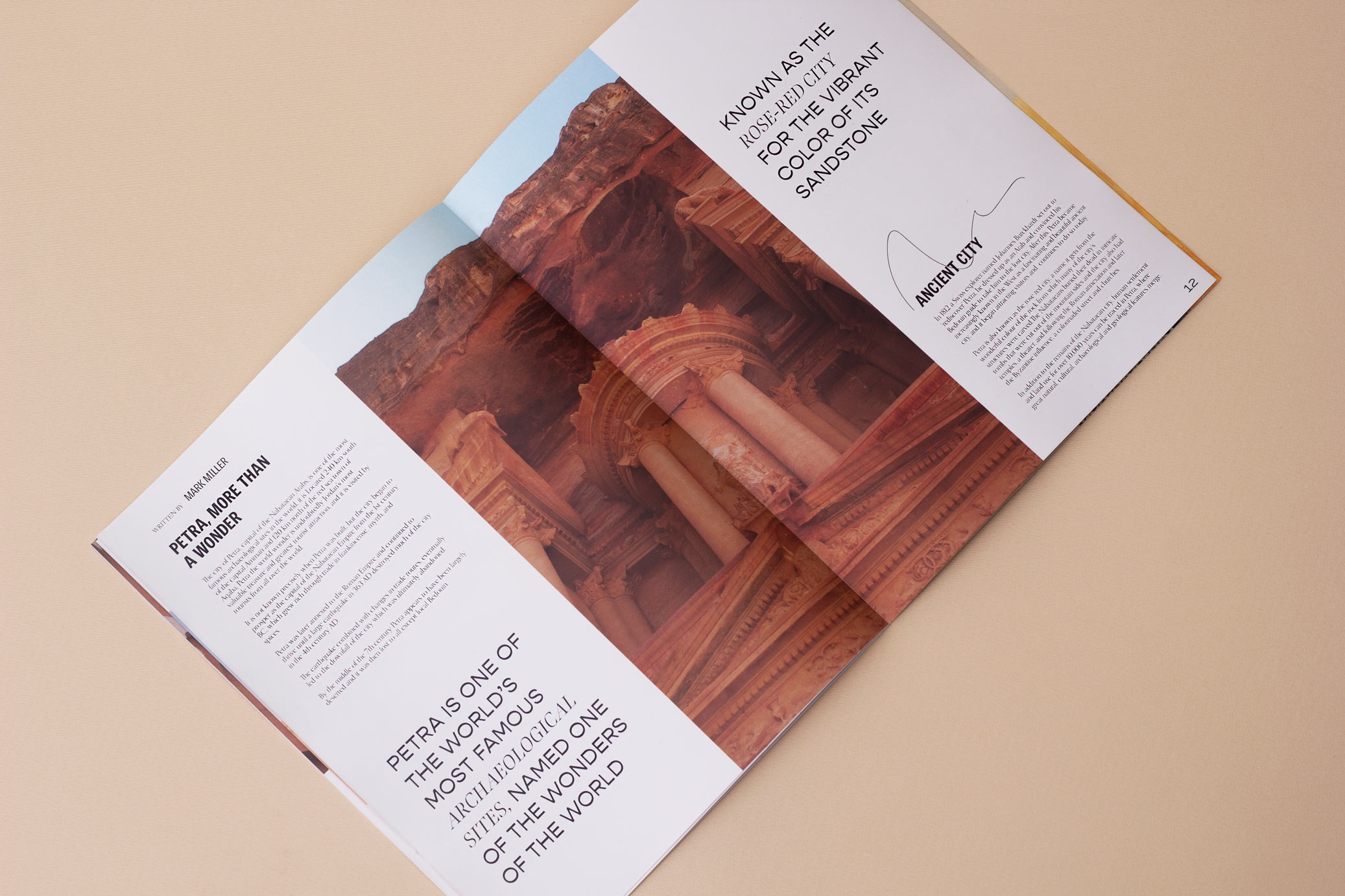
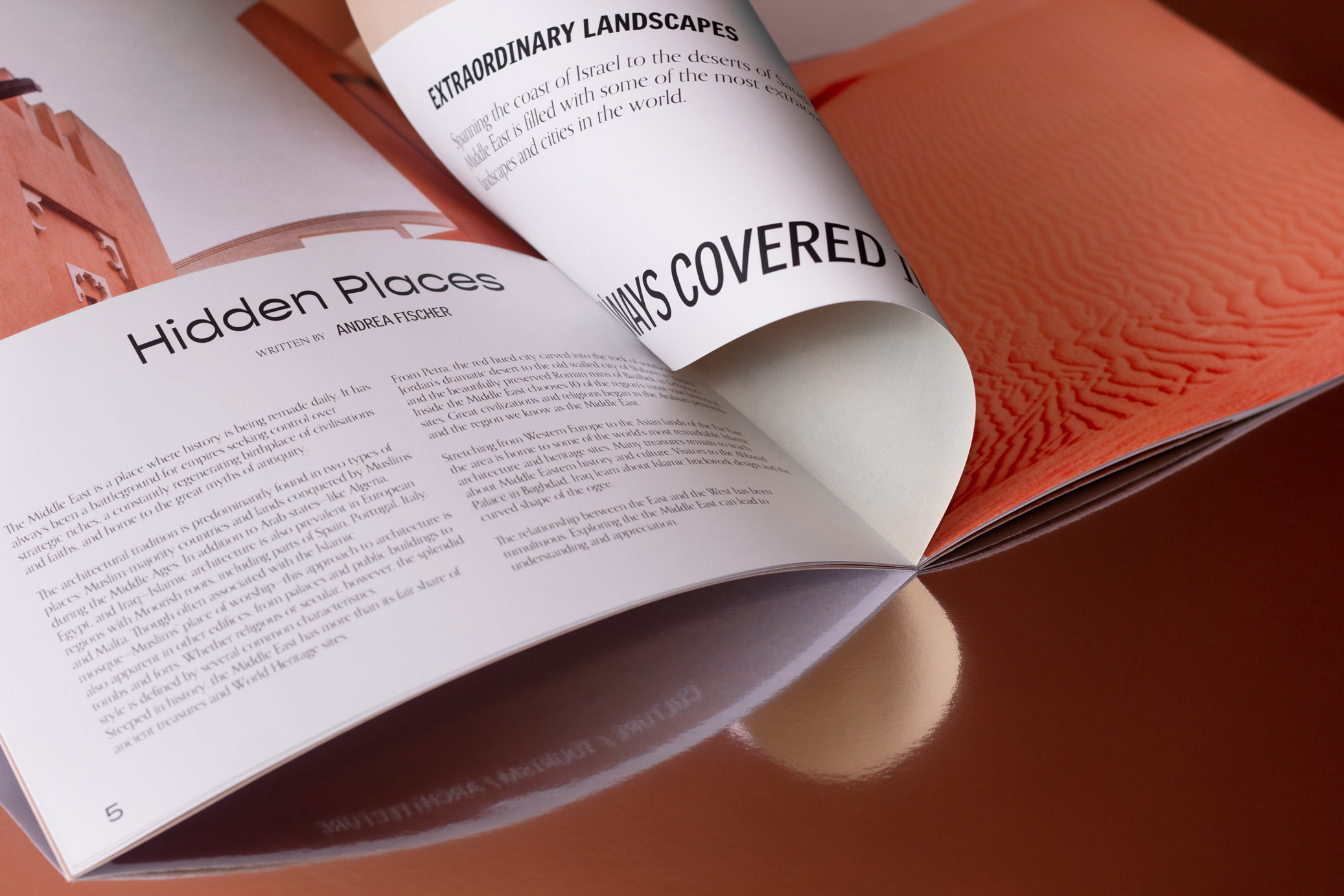
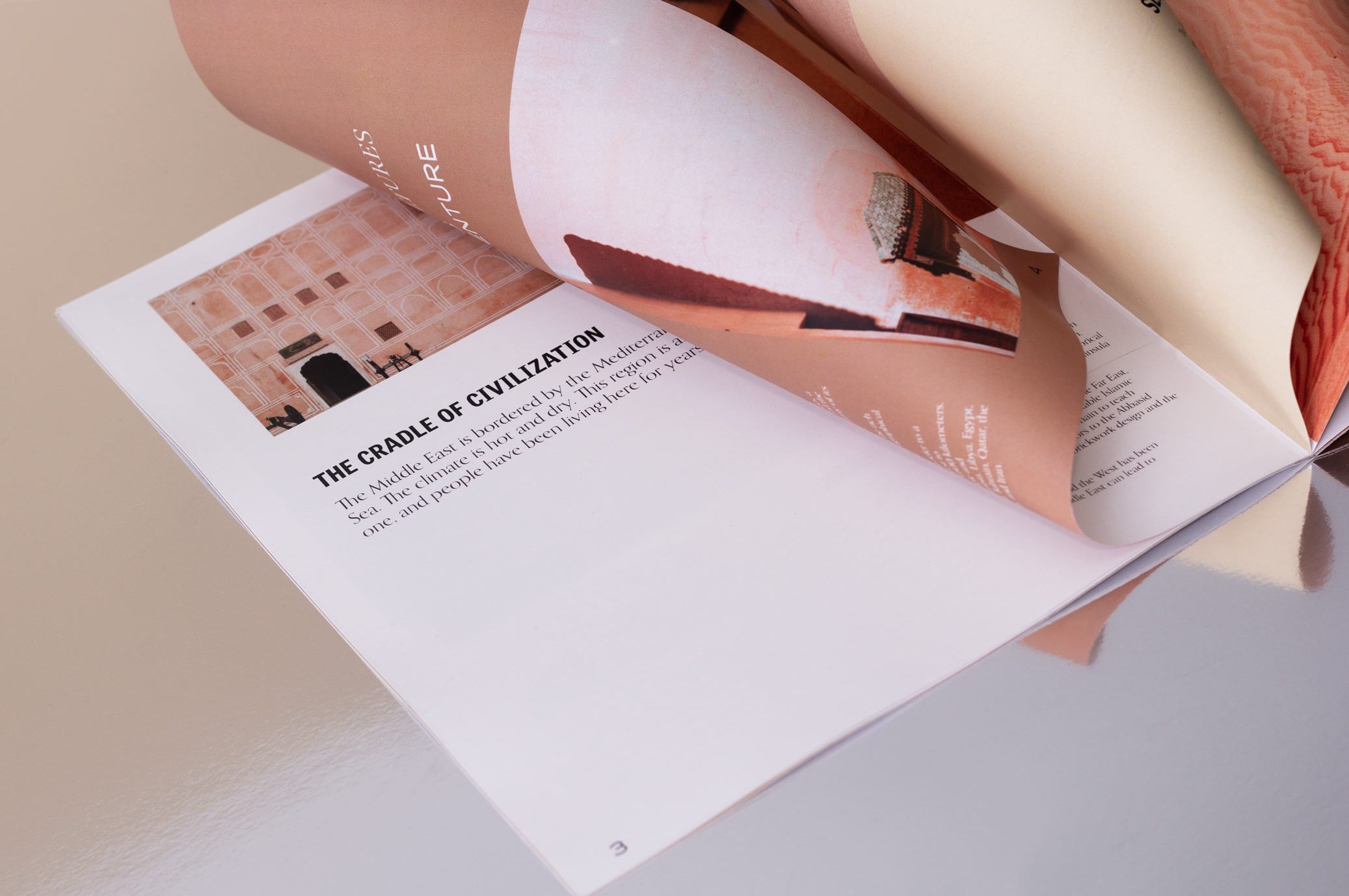
Mirage is a travel and tourism experiences magazine in the Middle East, with documentary, photographic and informative contents about the places of interest in the area.
For this project we develop branding and editorial design, proposing a contemporary and globalized idea of this geographical area, moving away from the stereotypical idea to which it is commonly associated.
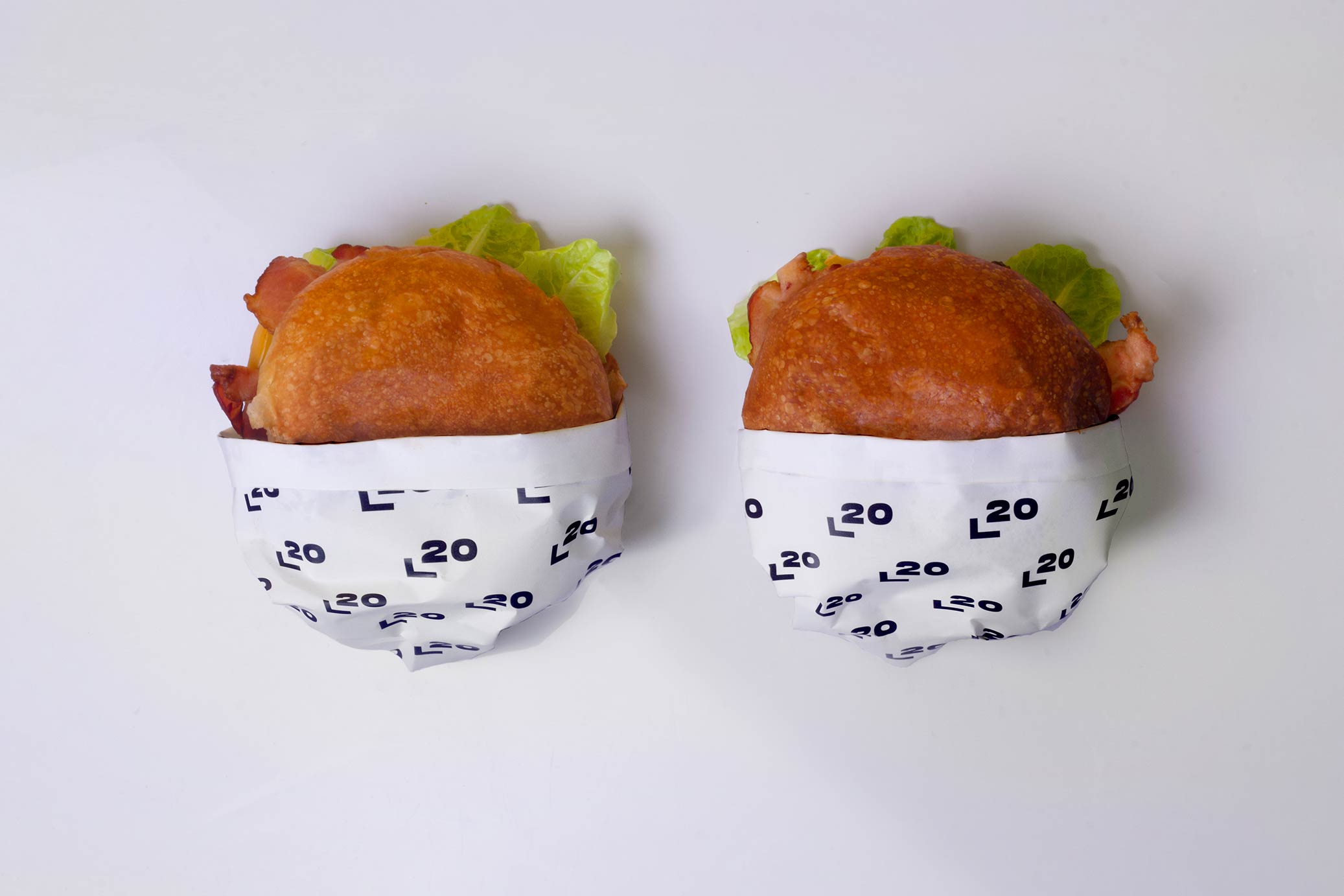
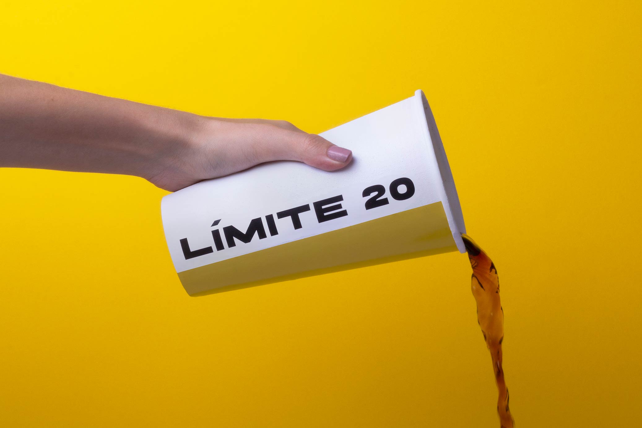
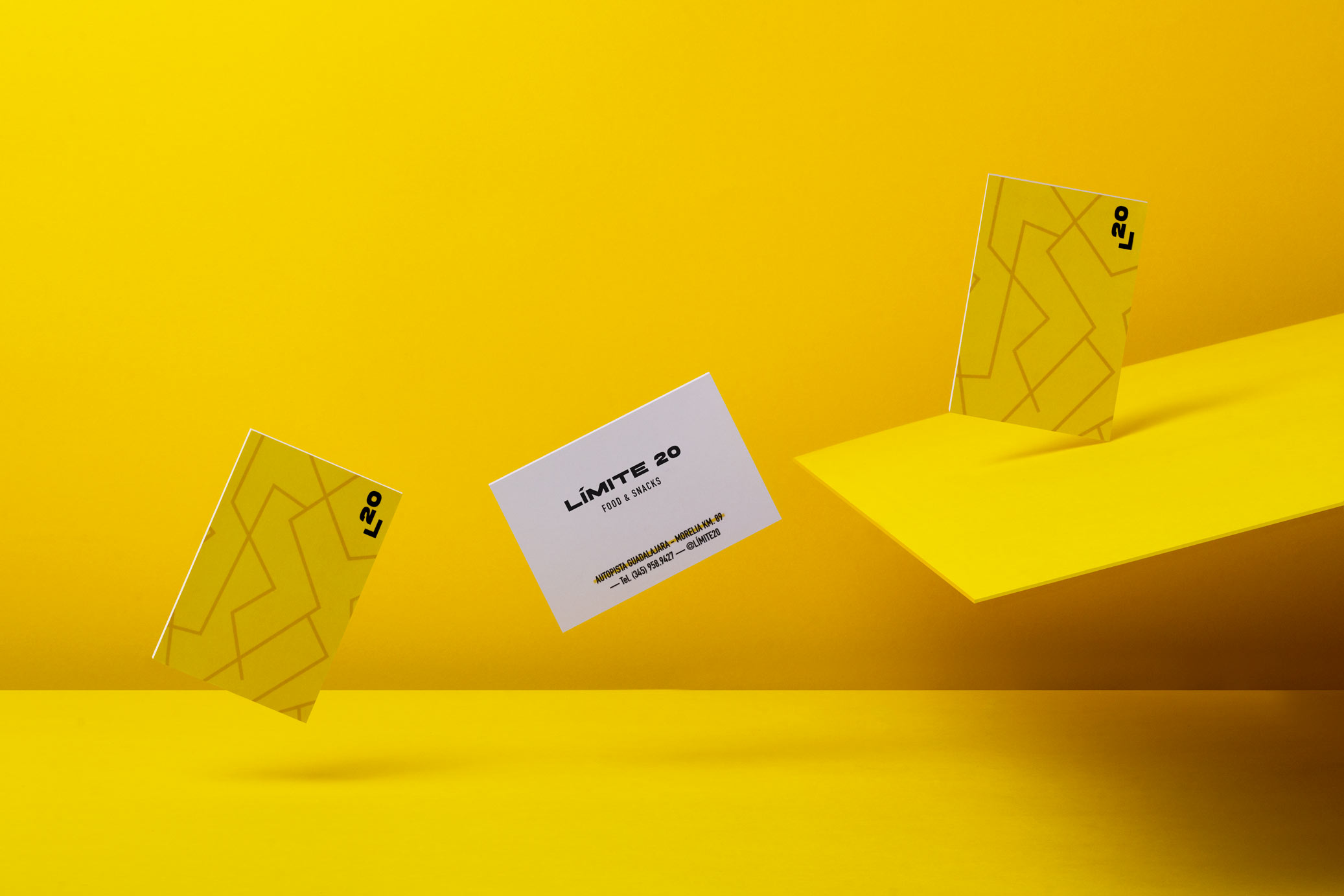
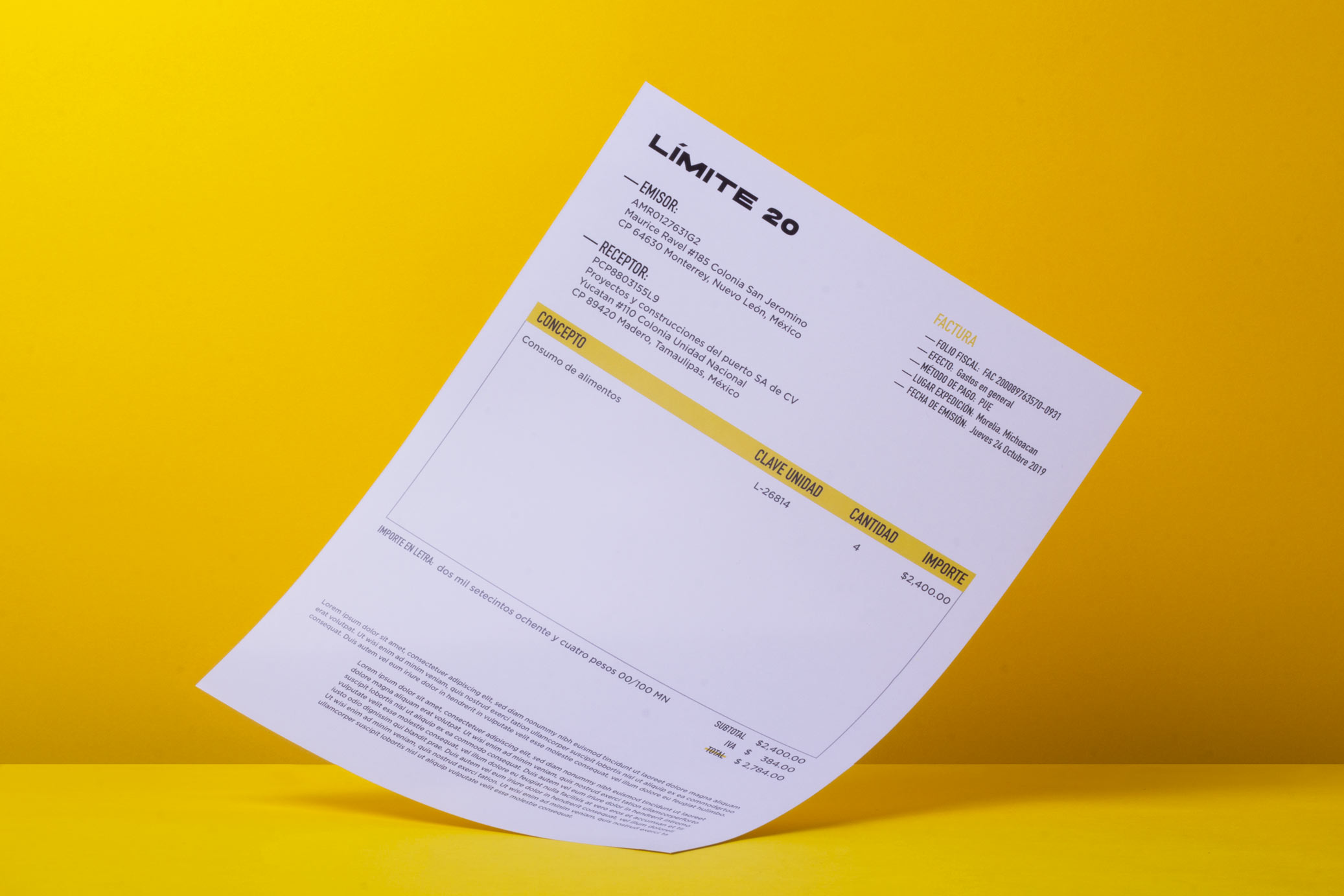
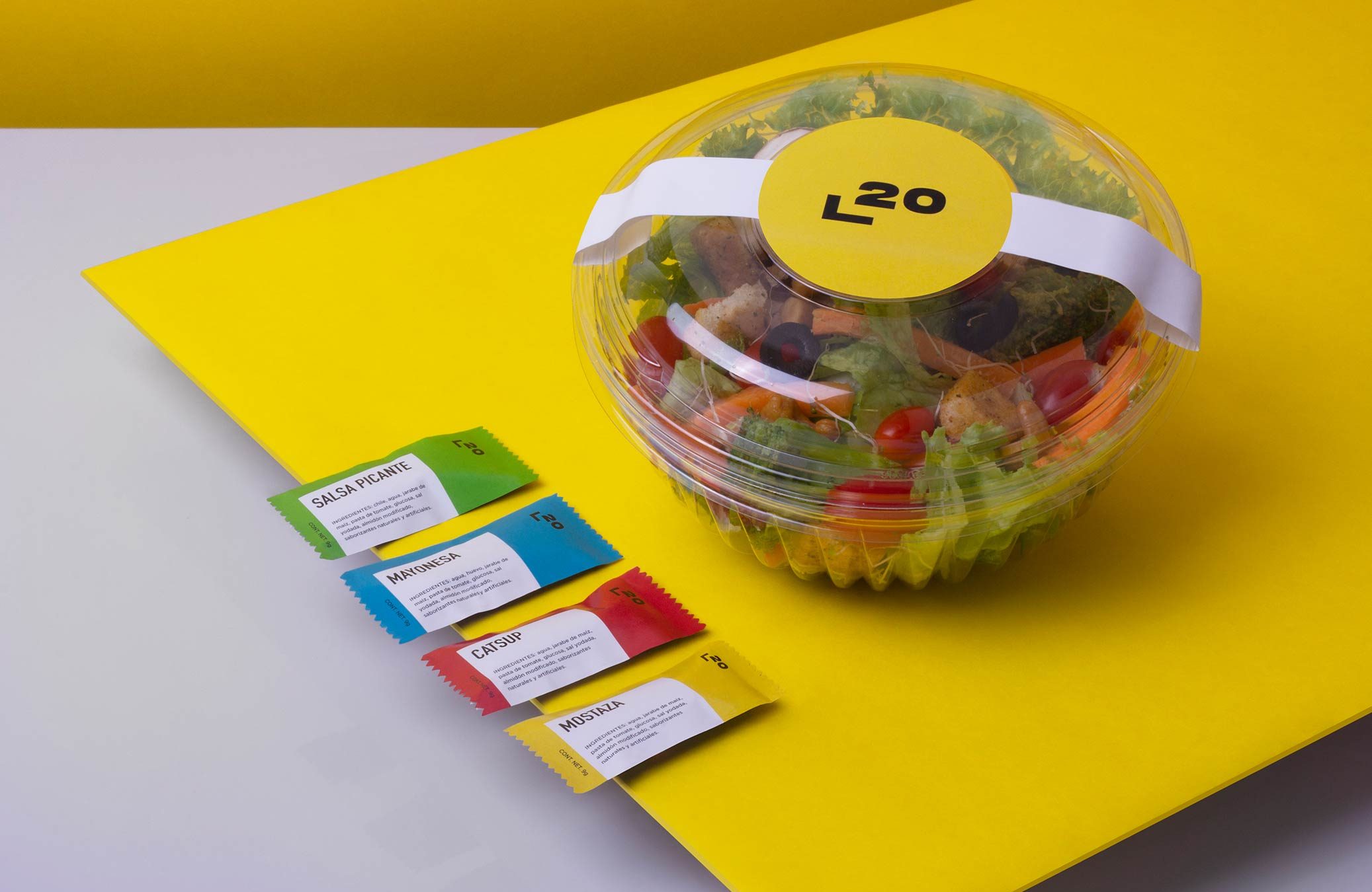
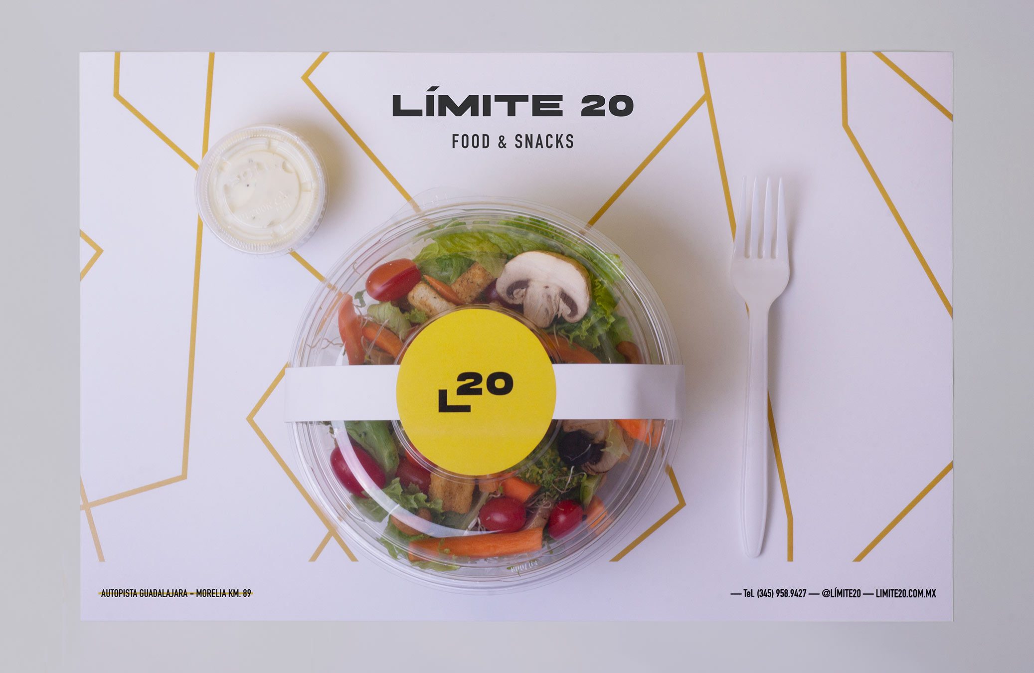
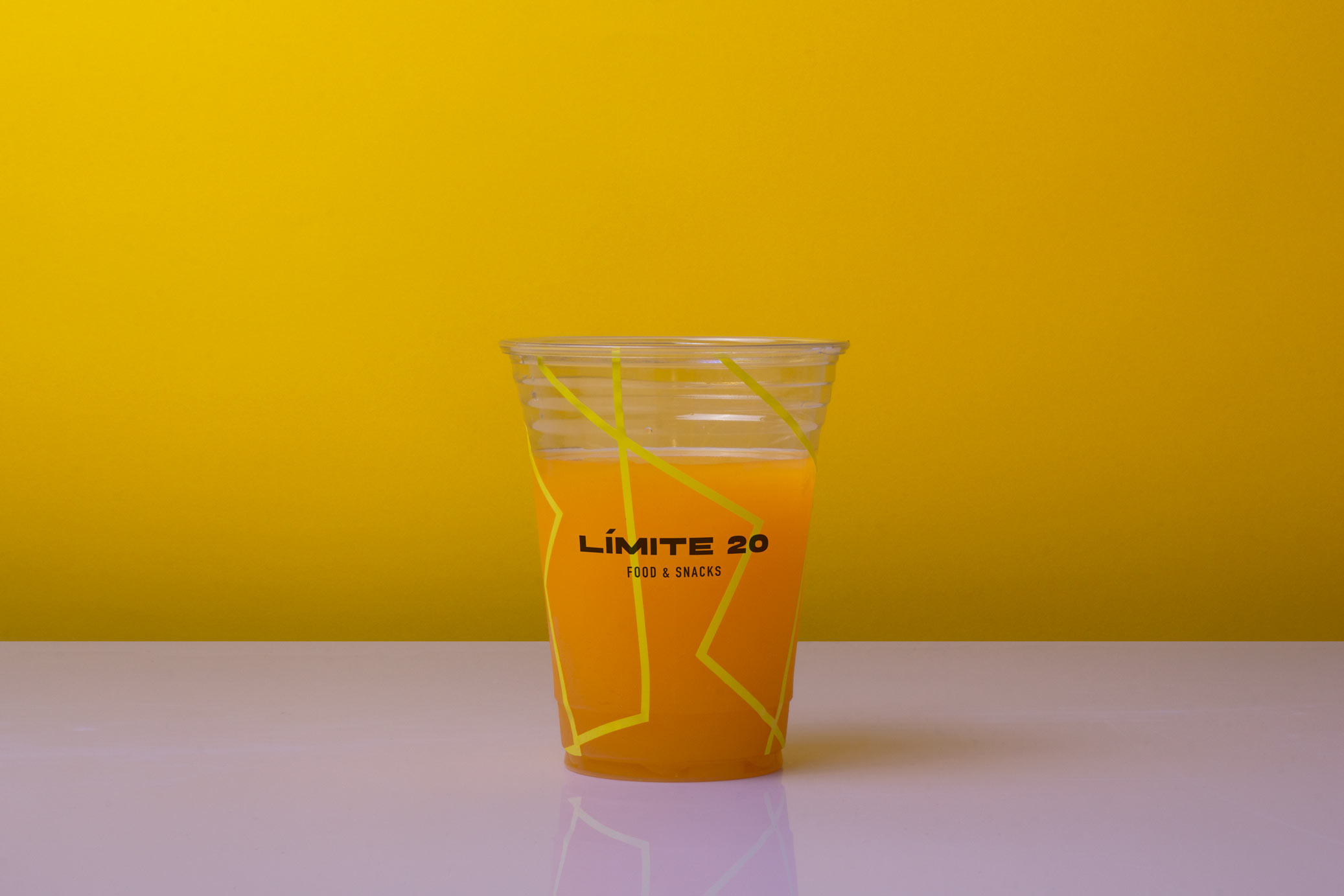
Límite 20 is a roadside restaurant located on the limits of Lake Cuitzeo, in Mexico. The goal was to give the place an American fast food appearance, but in a slightly more sophisticated atmosphere.
The name comes from the idea of road signs, in which, when arriving to a town, a speed limit is indicated and often coincides with being 20. Also the restaurant is located on the limits of Lake Cuitzeo, which length is 20 km.
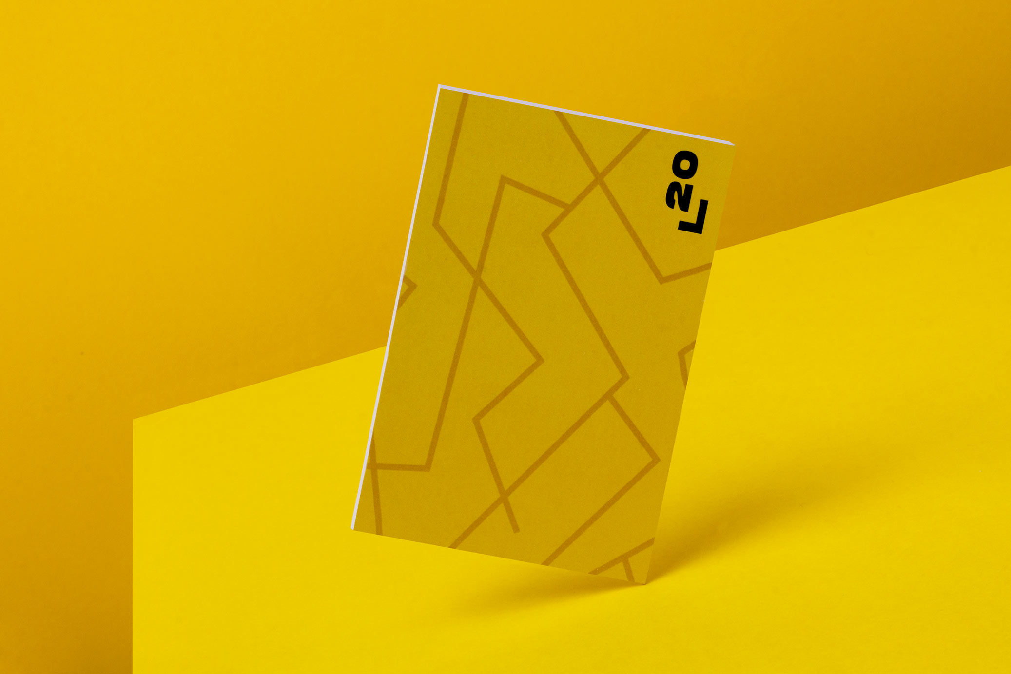
The graphic proposal incorporates lines that simulate roads from an aerial view, as they are commonly represented on maps. This is combined with an extended typography that gives a contemporary touch to the place.
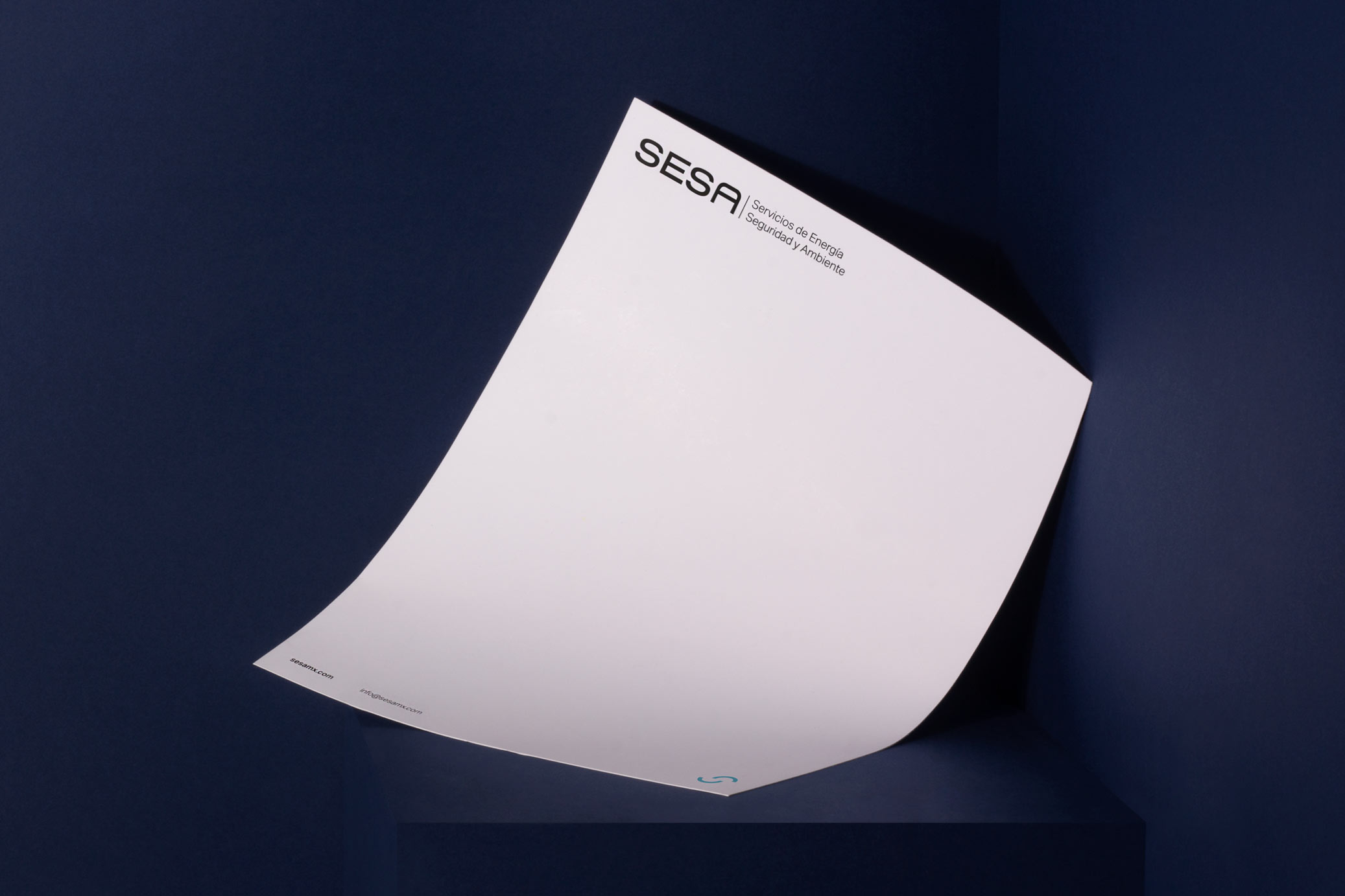
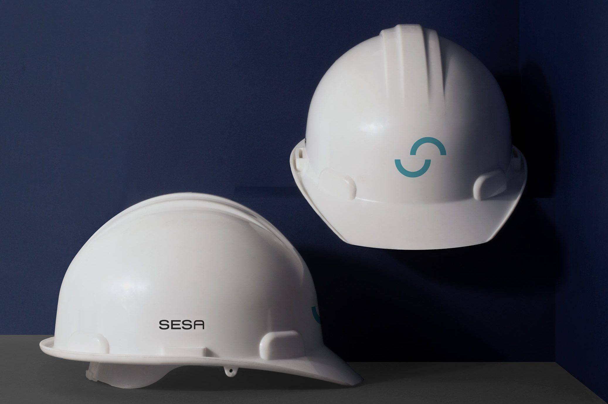
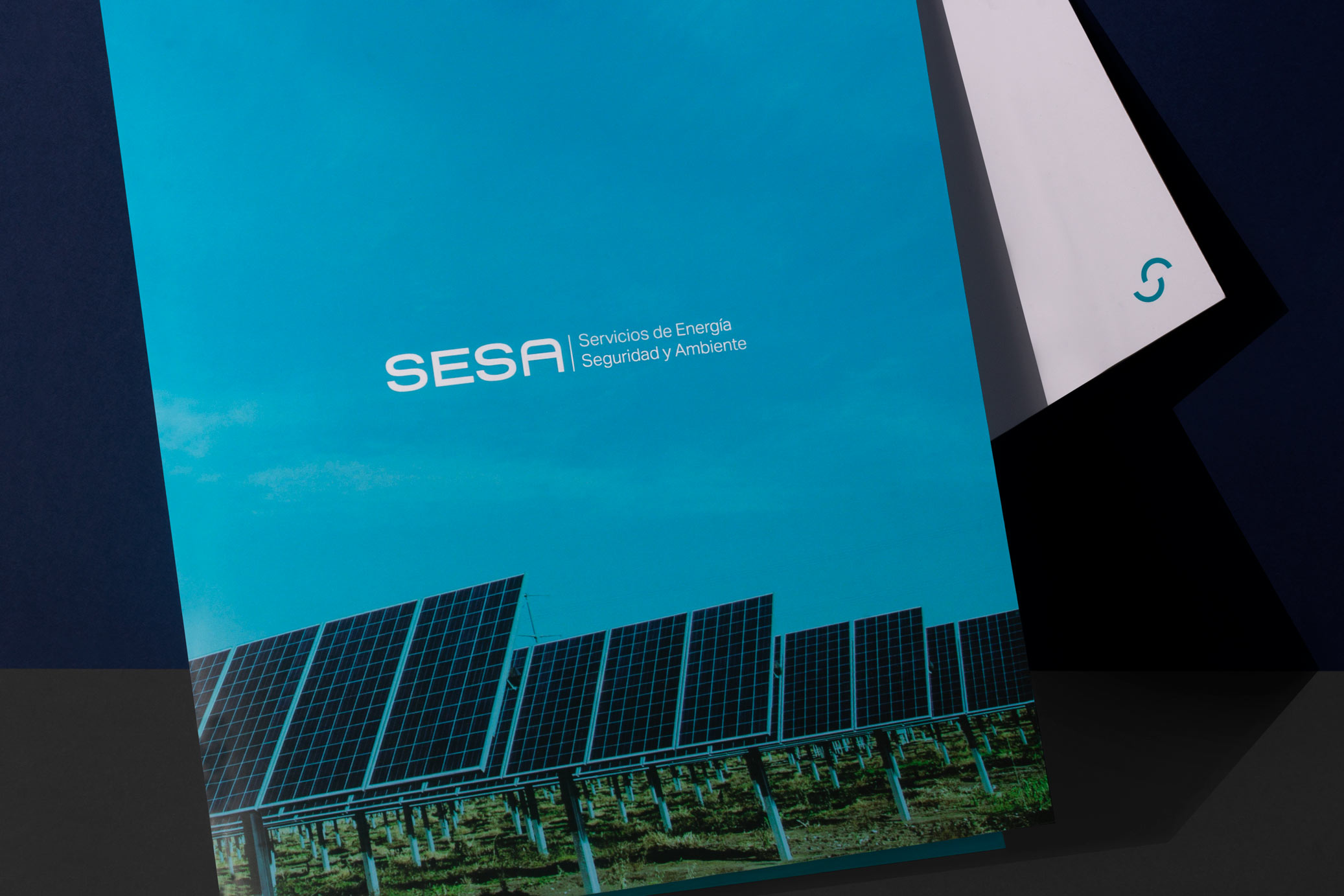
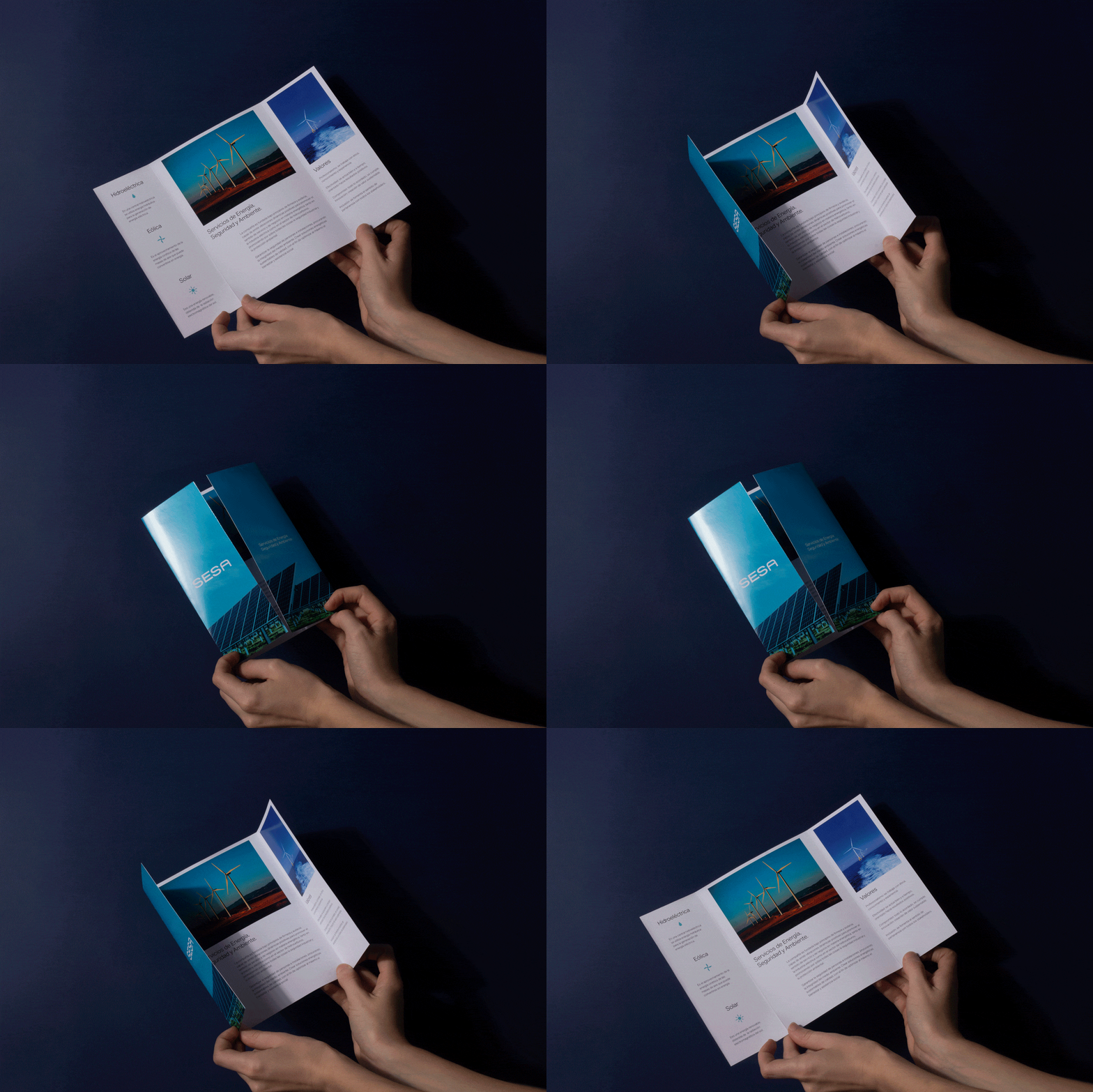
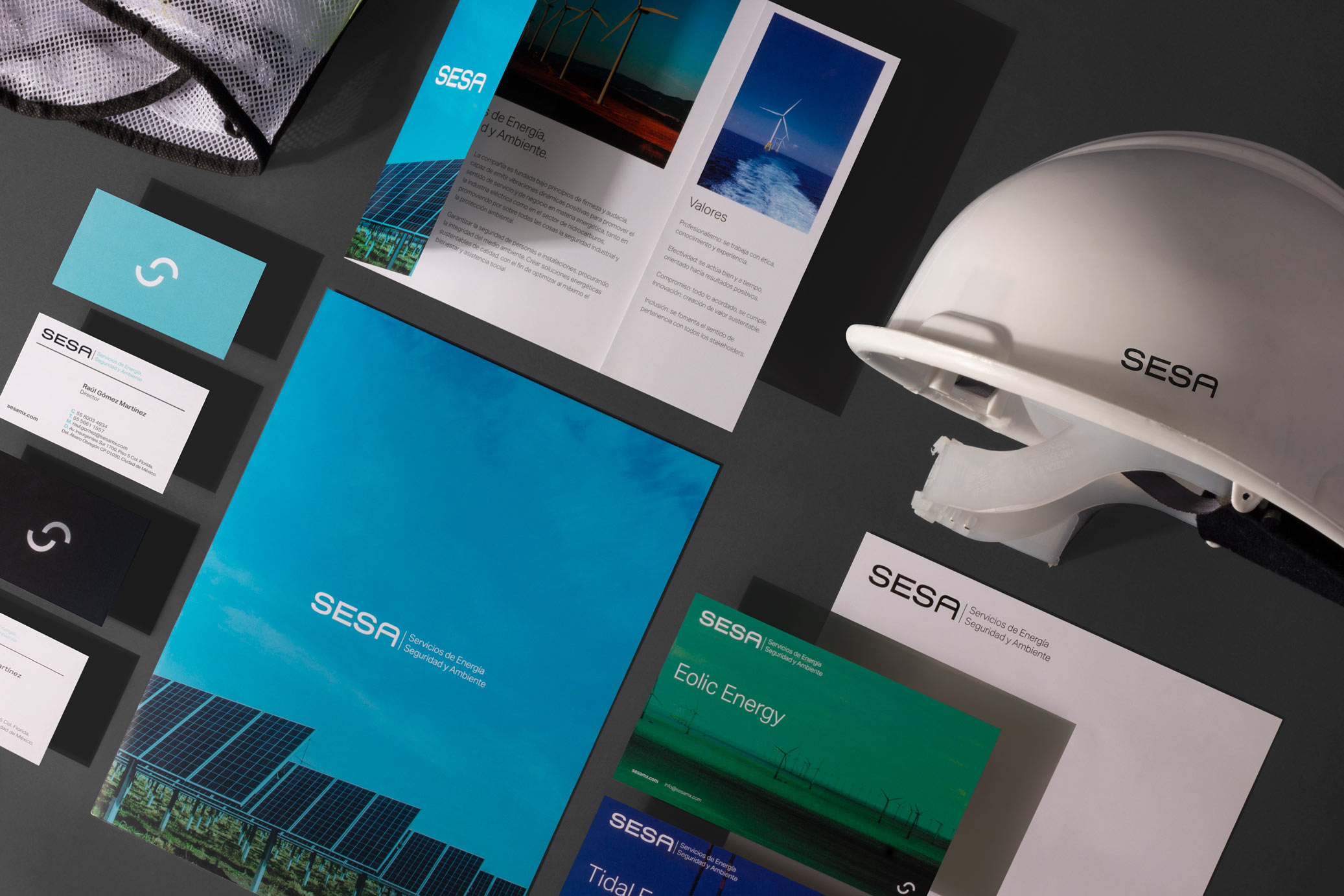
SESA is a company that provides quality sustainable energy solutions, guaranteeing the safety of people and facilities, ensuring the integrity of the environment. Our work was developed a visual identity that conveyed the sense of environmental responsibility and clean energy for a corporate sector.
The graphic line remains sober in order to communicate corporate values, using a logo with custom typography, and an isotype created from the two “S” in the name, forming a figure that evokes a cycle, related to renewable energy.
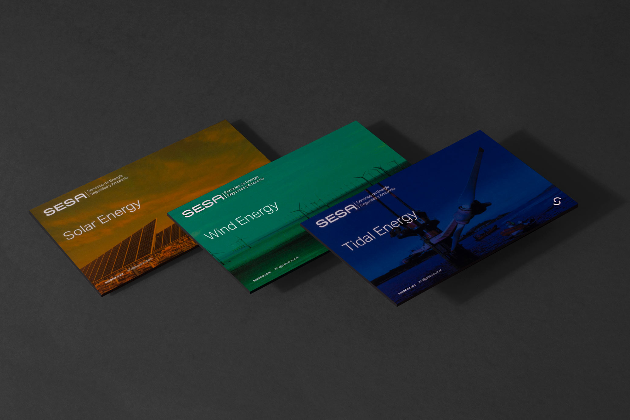
The color palette conveys a much younger feeling, creating a mix between a consolidated company with a young touch. In addition, each color is assigned to a different type of energy.
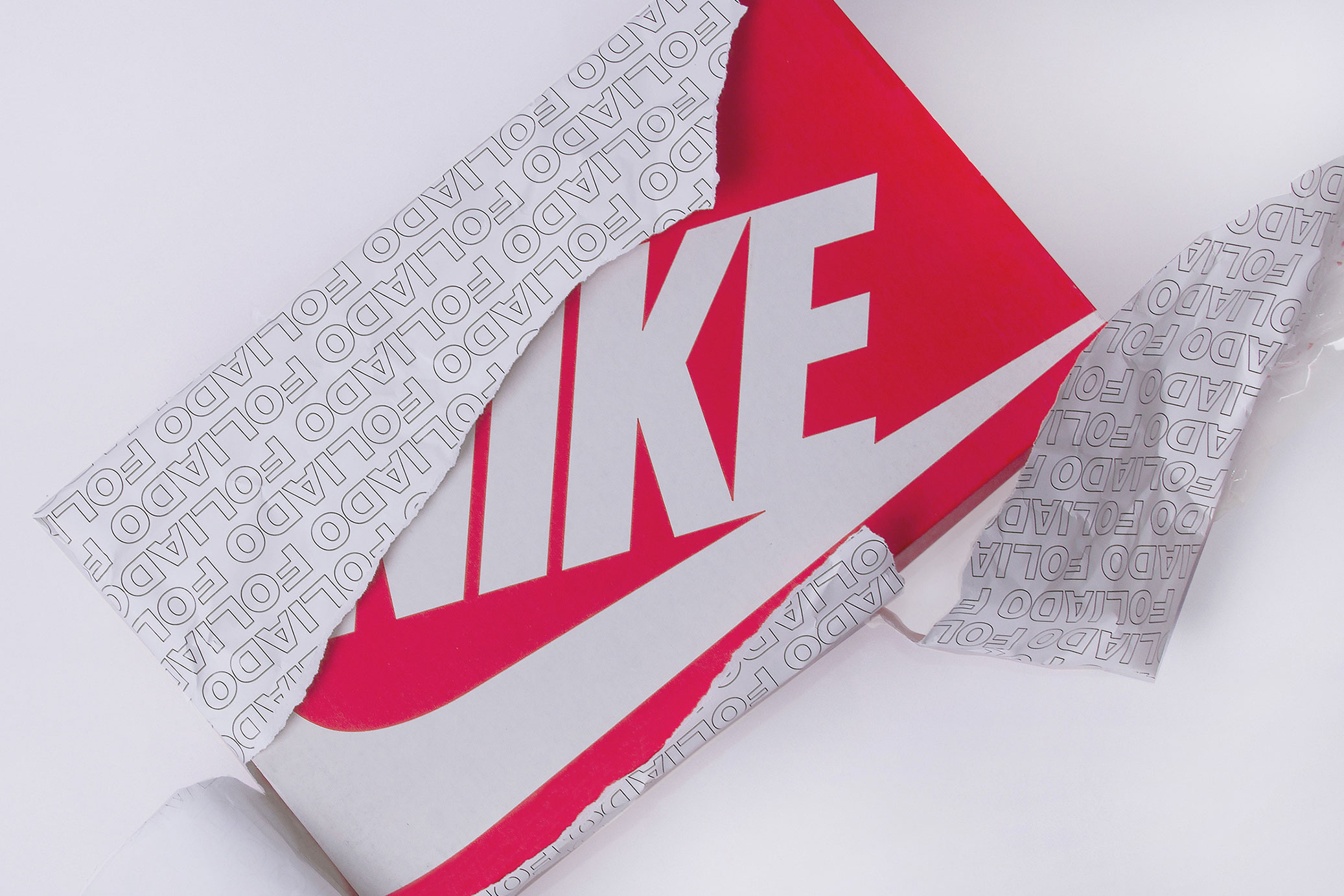
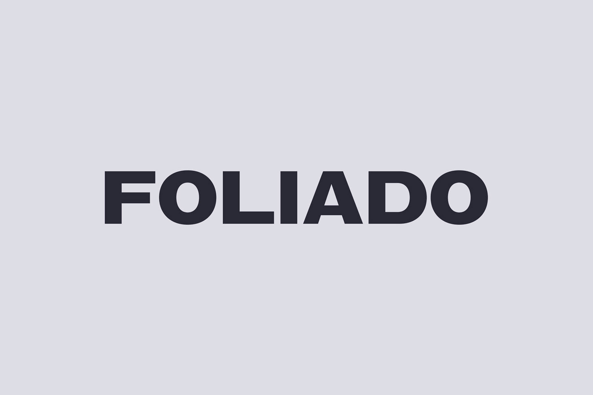
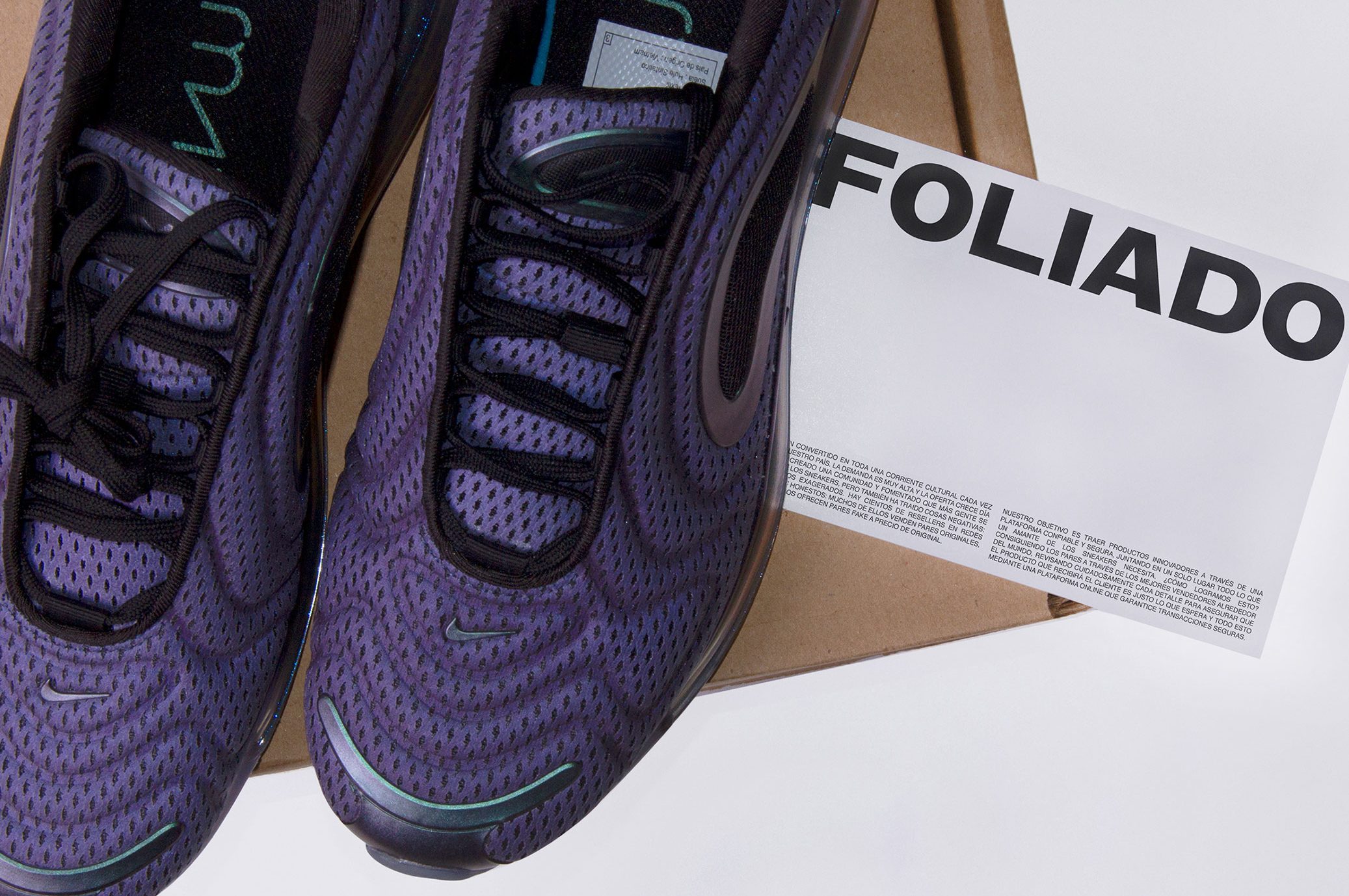
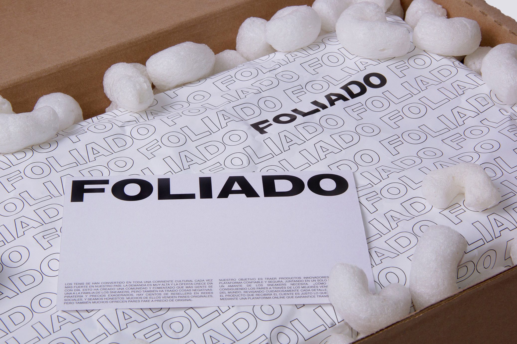
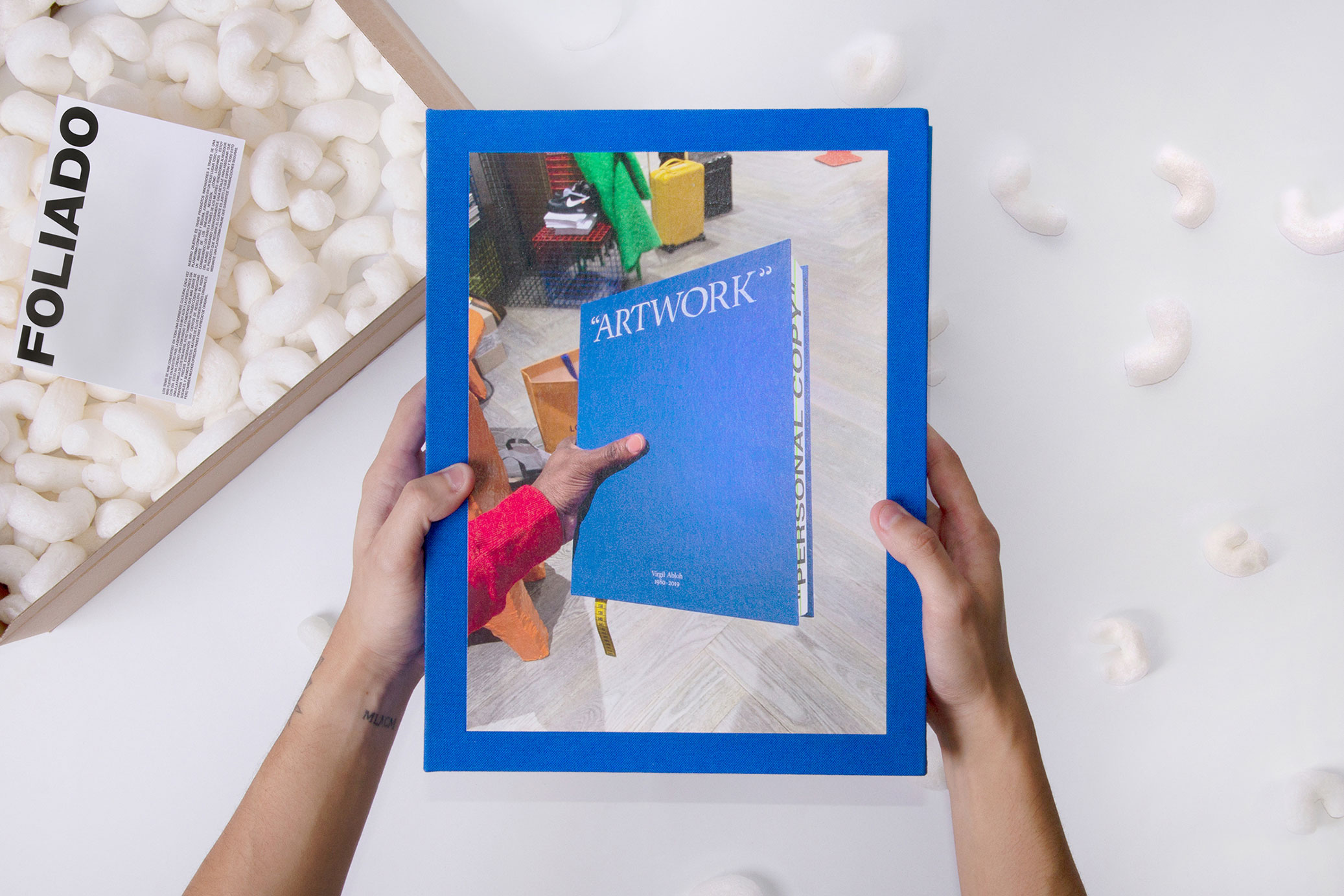
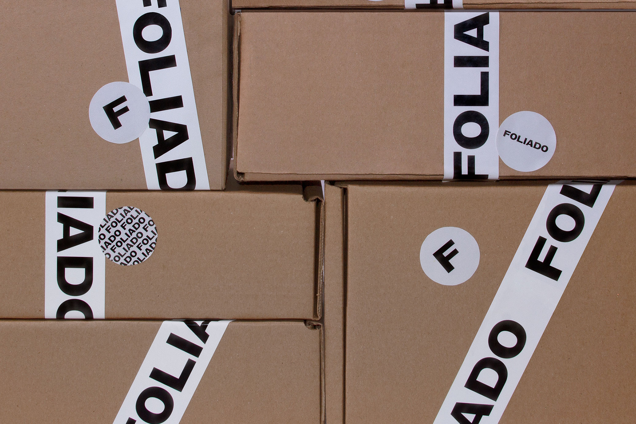
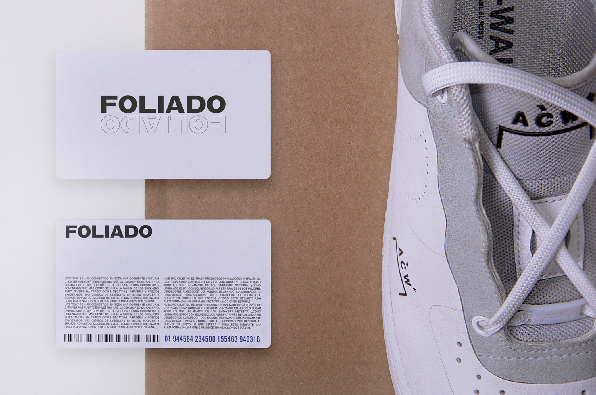
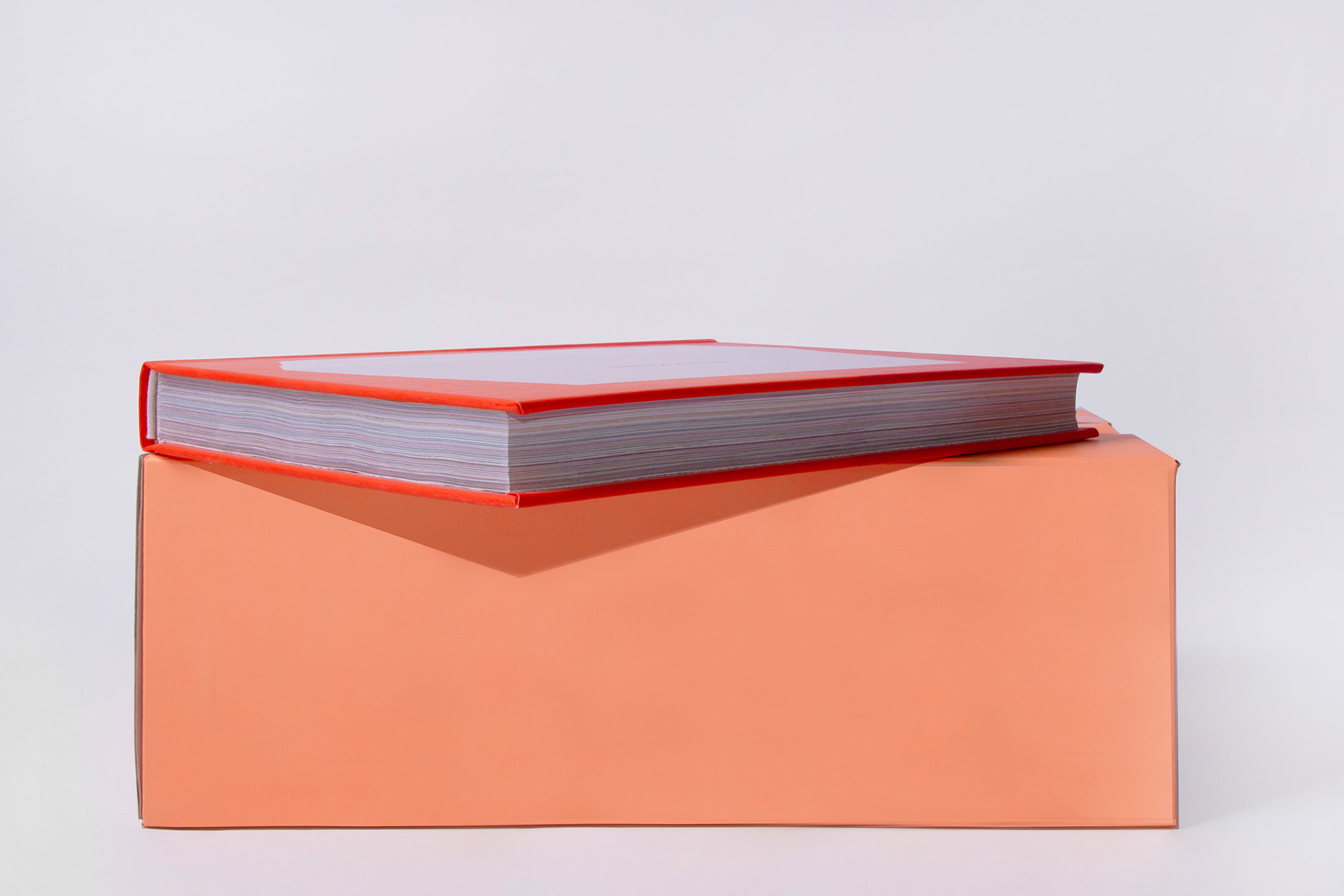
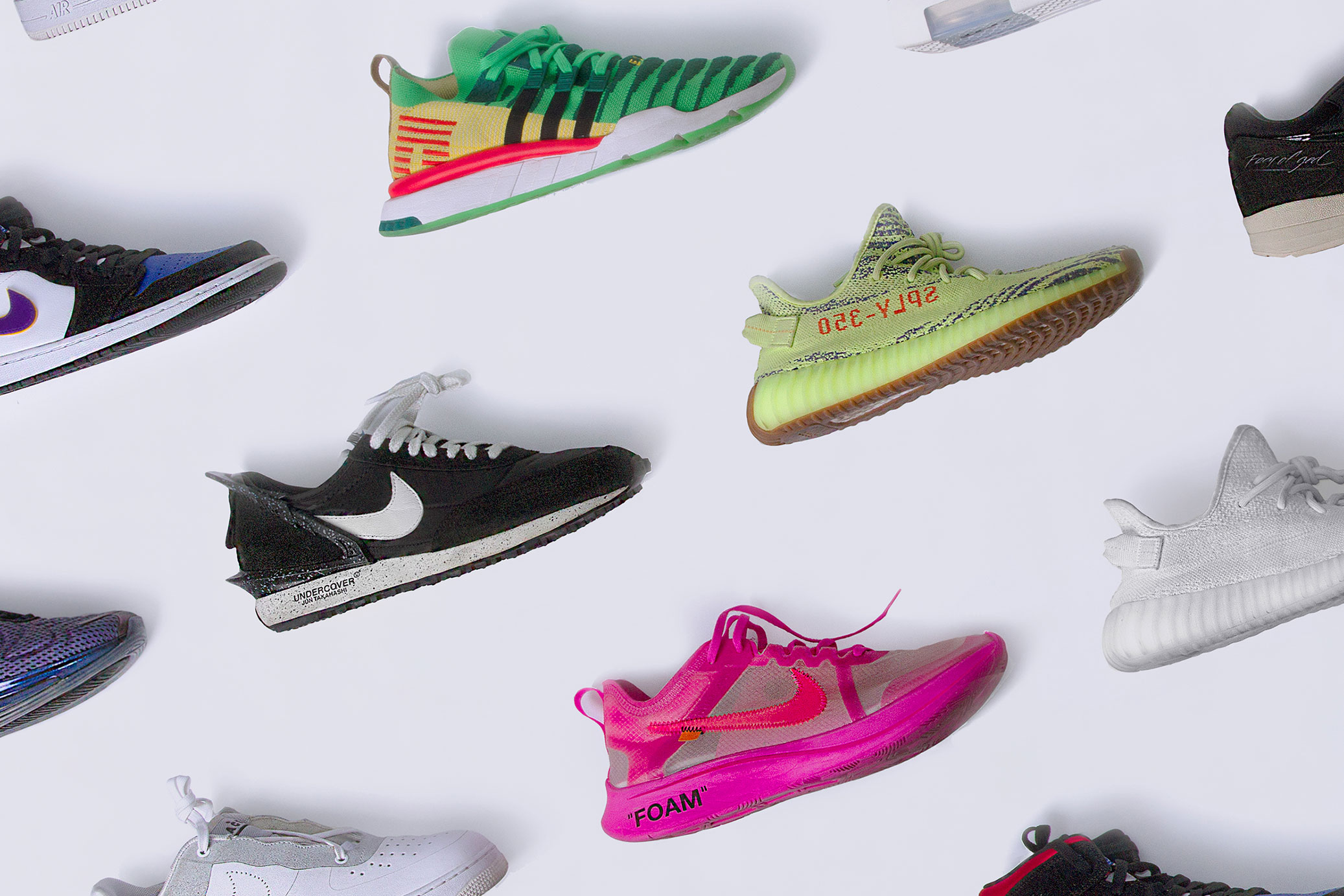
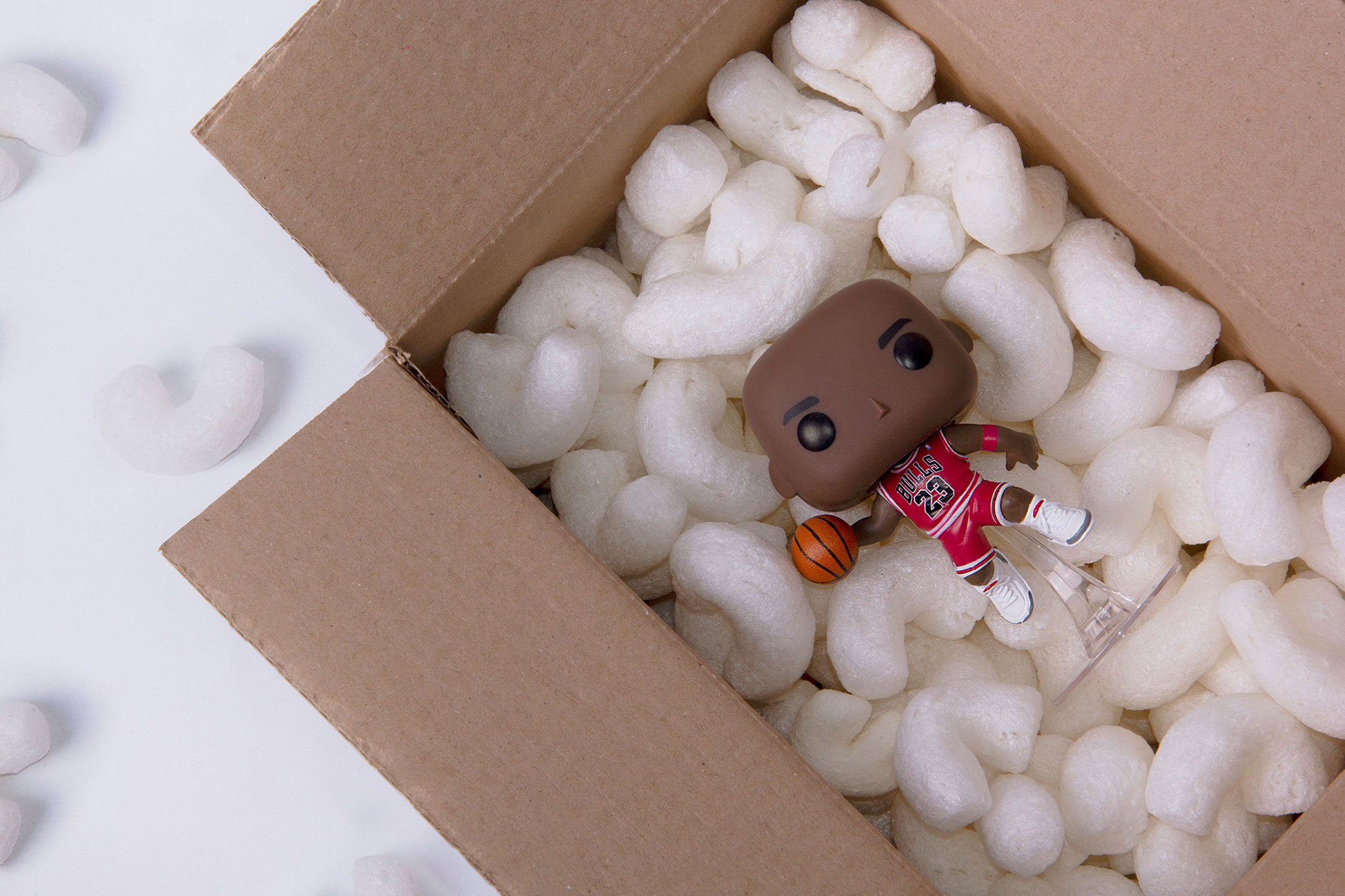
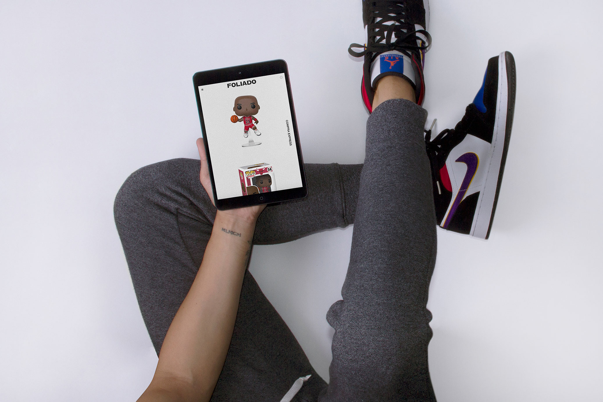
Foliado is an online platform selling exclusive sneakers and accessories for sneaker lovers. This is a very competitive market in Mexico, and the offer seems to be very similar: bold elements and strongly associated with the streets. For this reason Foliado proposes a clean identity that is far from any urban association, breaking with what is offered by the competition.
The name and concept of the brand come from the idea that each product is limited, so it is authenticated with a folio number, guaranteeing that each piece is legitimate.
Its simplicity, in addition to serving as an element that differentiates the brand with respect to the competition, results in each product standing out on the website, this being the protagonist.
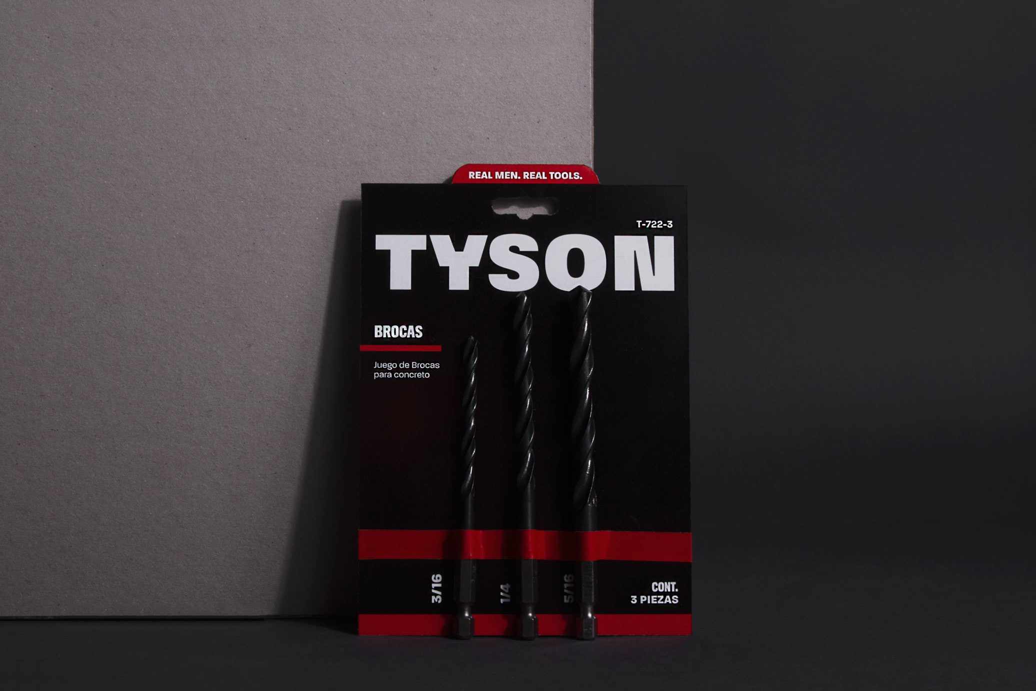
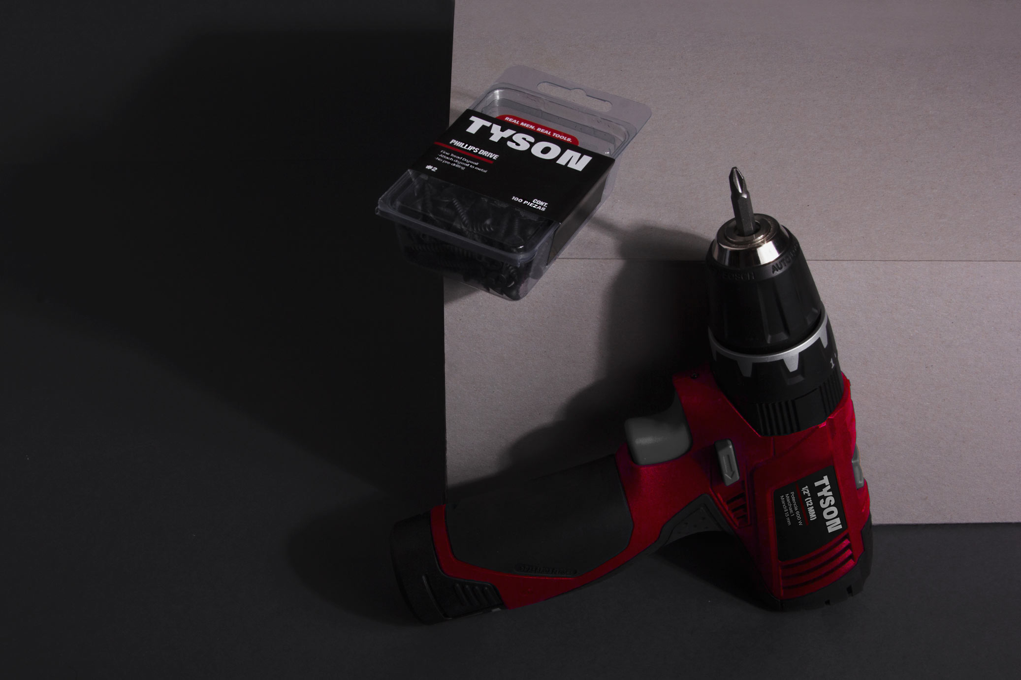
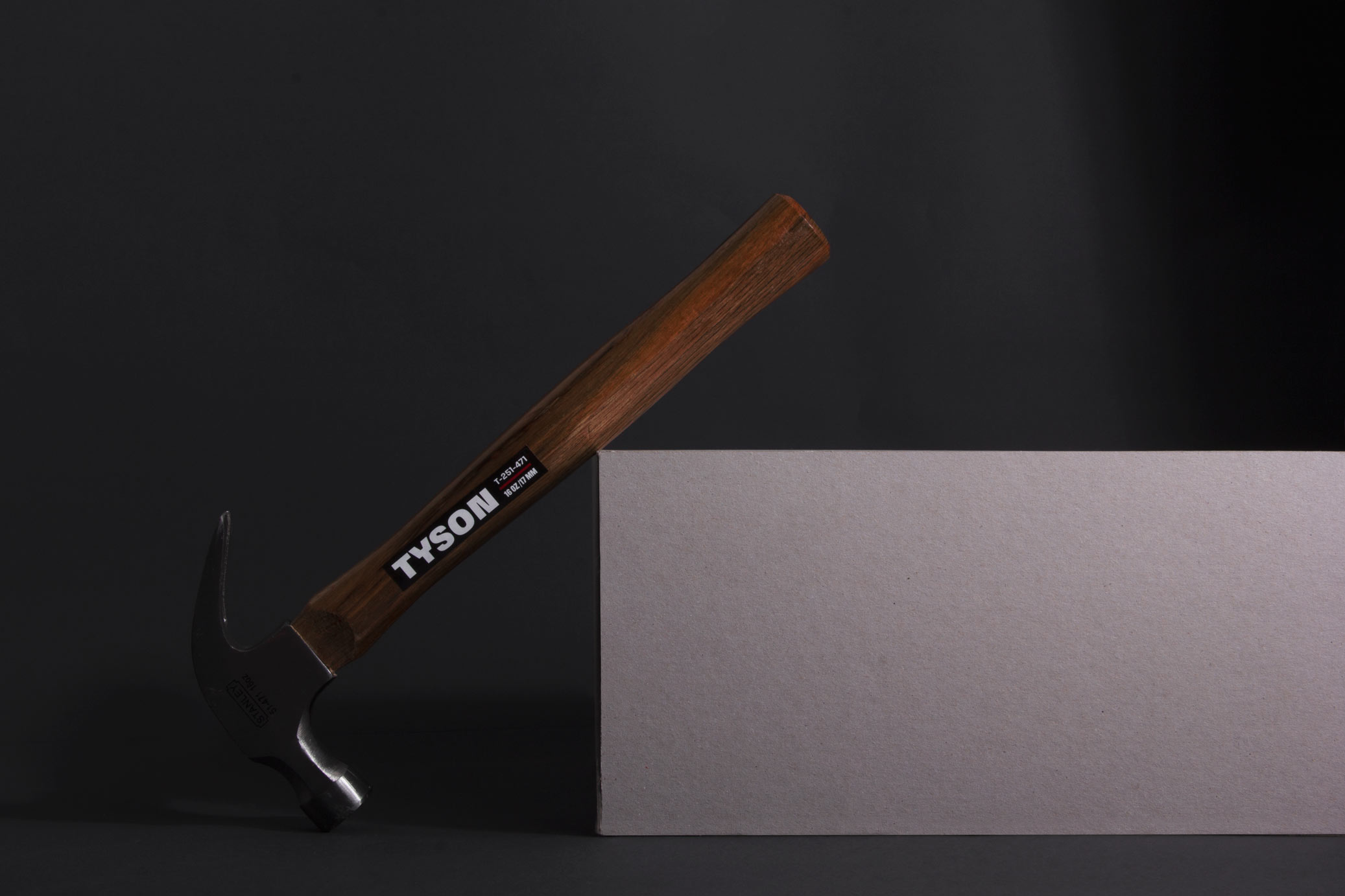
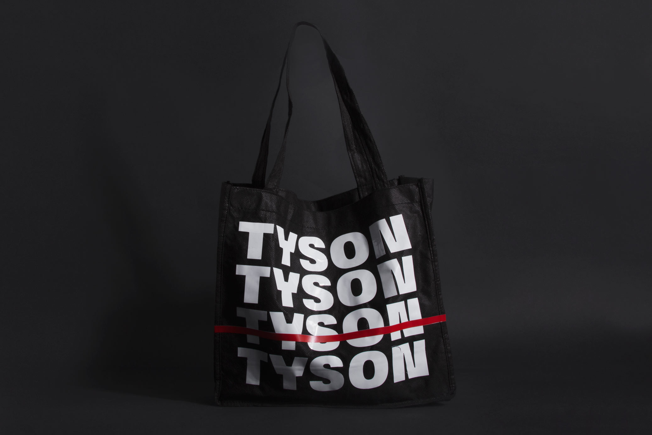
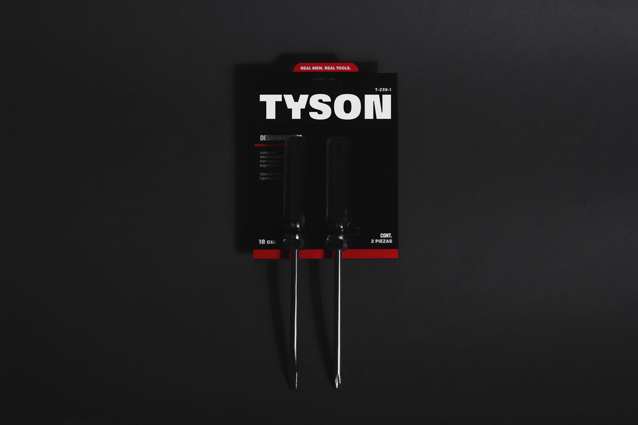
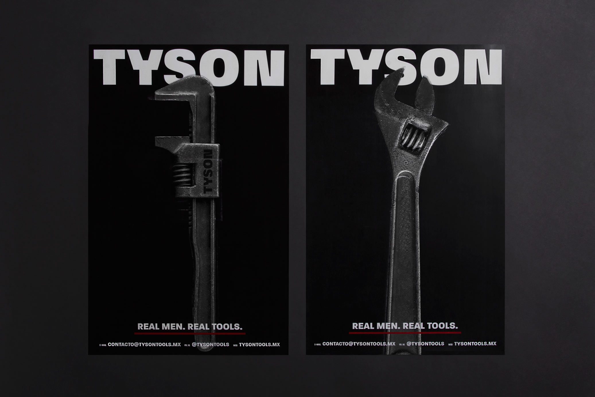
Tyson is a Mexican tools brand. The main communication attribute is the strength and resistance of the tools. This idea mixed with the brand’s name led us to propose a graphic line that refers to the box: black backgrounds, red lines as detail of the ring, big photos of the product and layout inspired by retro box posters.
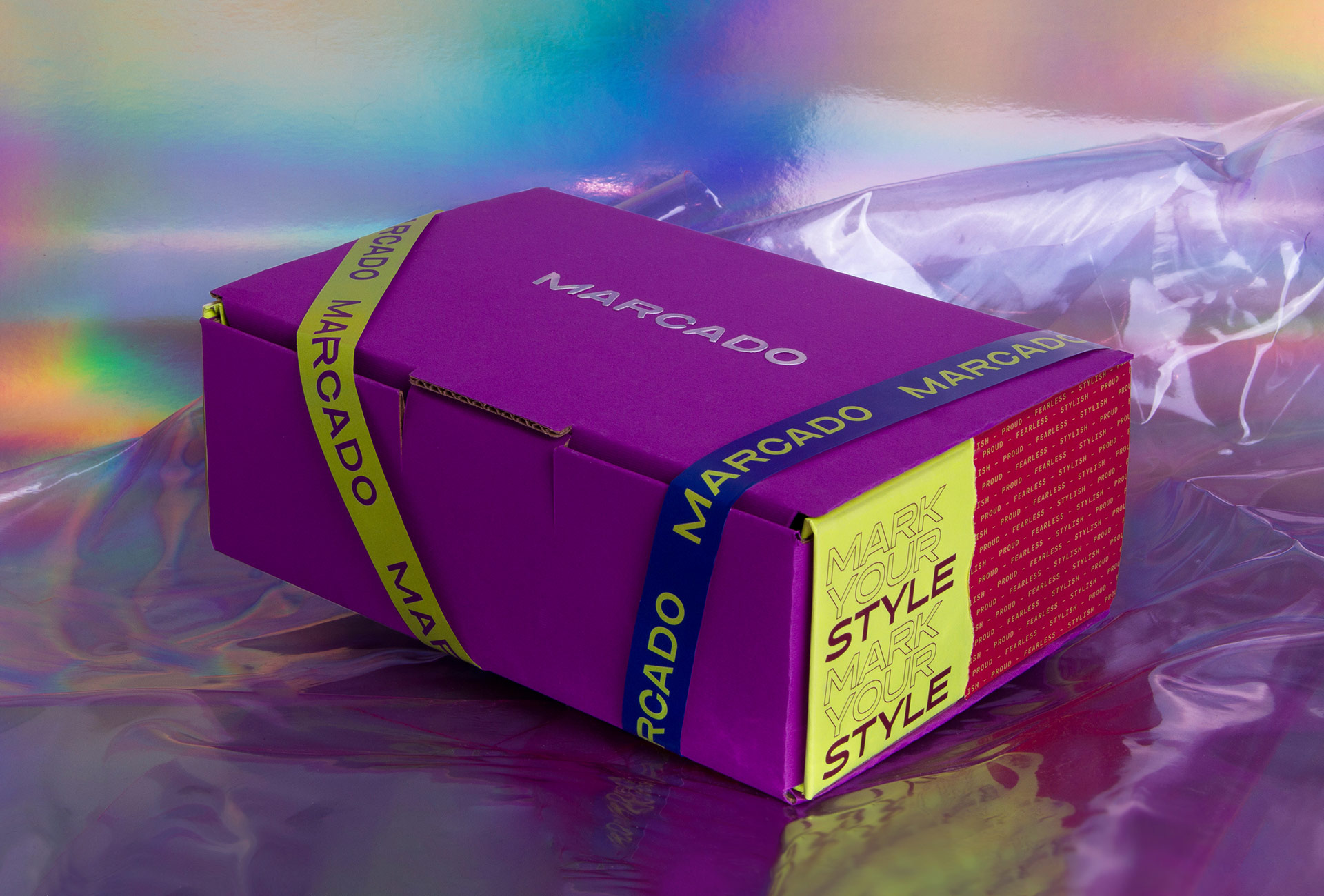
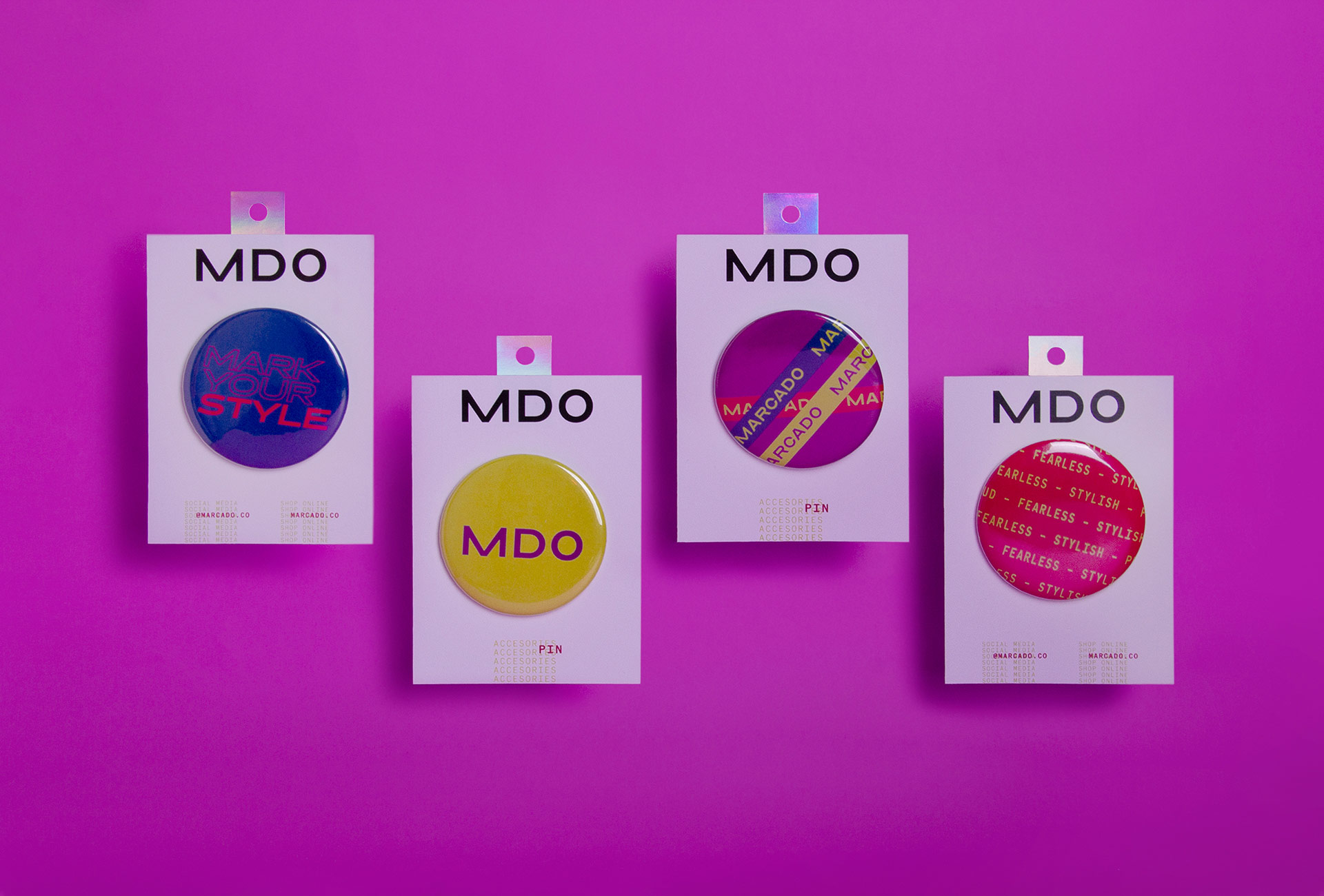
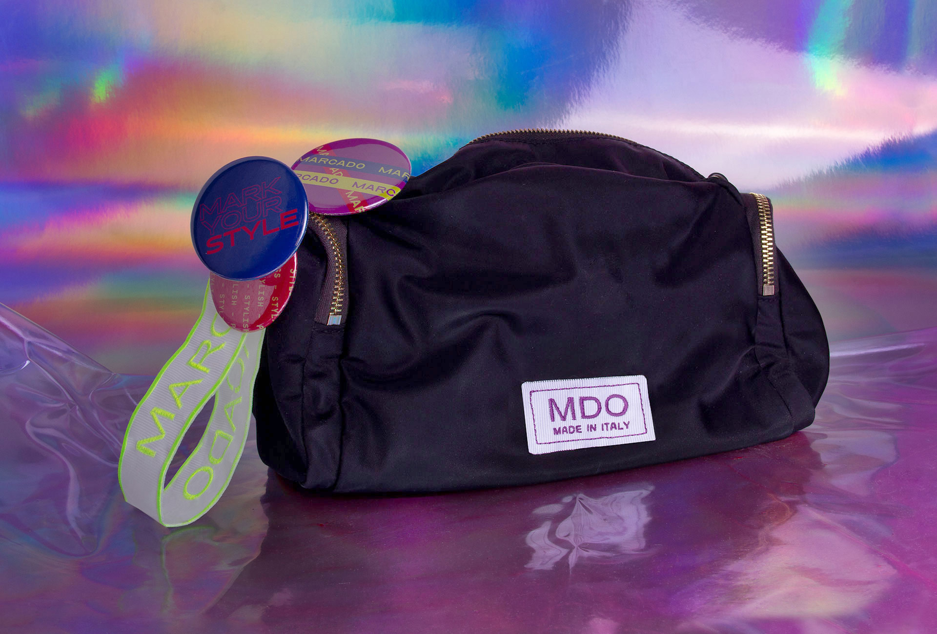
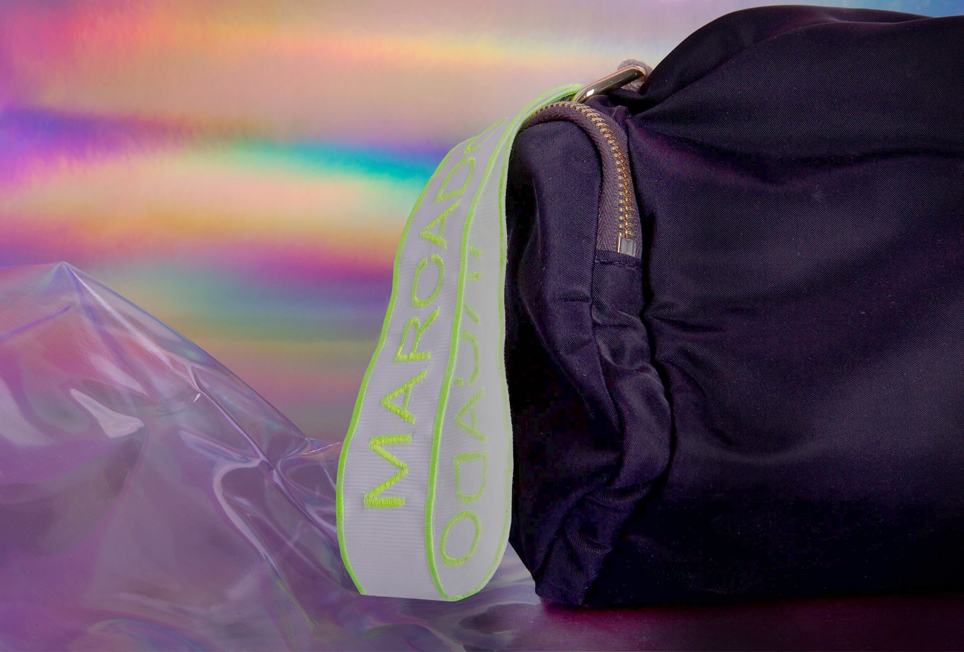
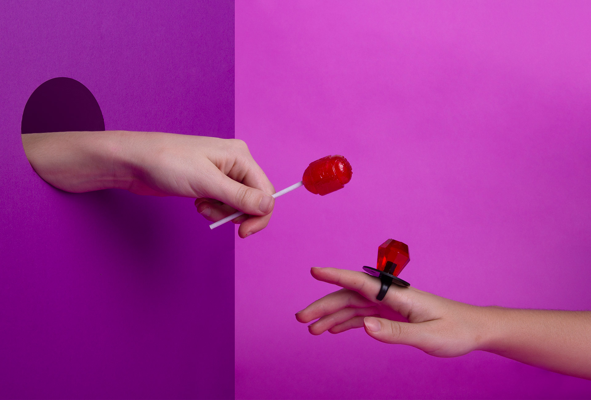
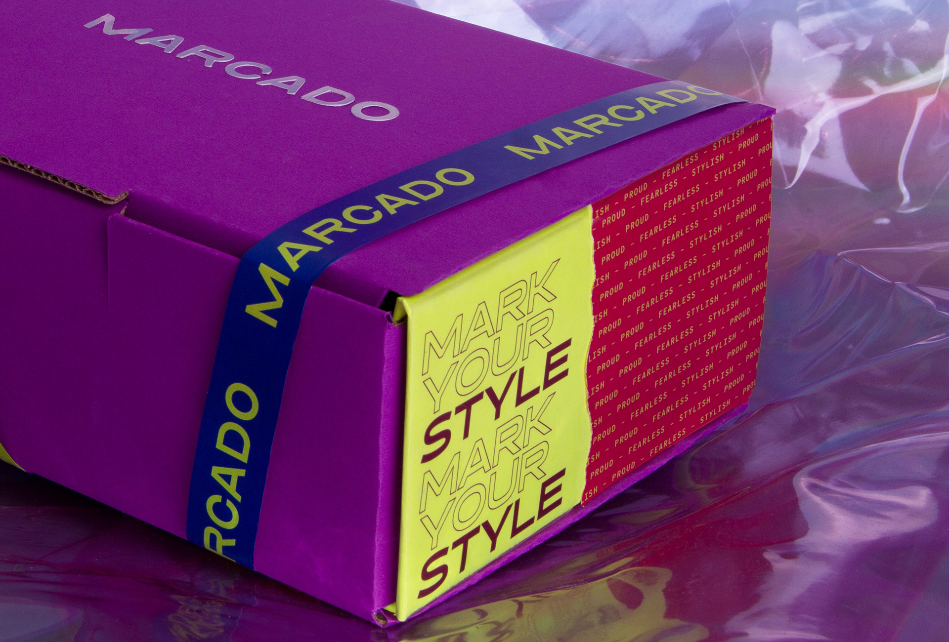
Marcado is an accessories brand with 80’s vibes. They design and produce straps and pins that allows people to customize their bags and accessories.
The concept starts with the name Marcado (marked), because that’s exactly the purpose of the brand: to mark your accessories with your own style. The color palette came from visual references from 80’s fashion, with an eccentric mixture of materials and colors. Typographic selection contrasts with the retro vibes, and gives to Marcado a fashion brand look.