BRADA IS A GRAPHIC DESIGN STUDIO SPECIALIZED IN BRANDING. IF YOU WANT TO CONTACT US PLEASE FEEL FREE TO SEND US AN EMAIL TO INFO@BRADA.CO OR CHECK OUR CONTACT SECTION.
BRADA IS A GRAPHIC DESIGN STUDIO SPECIALIZED IN BRANDING. IF YOU WANT TO CONTACT US PLEASE FEEL FREE TO SEND US AN EMAIL TO INFO@BRADA.CO OR CHECK OUR CONTACT SECTION.
BRADA IS A GRAPHIC DESIGN STUDIO SPECIALIZED IN BRANDING. IF YOU WANT TO CONTACT US PLEASE FEEL FREE TO SEND US AN EMAIL TO INFO@BRADA.CO OR CHECK OUR CONTACT SECTION.
BRADA IS A GRAPHIC DESIGN STUDIO SPECIALIZED IN BRANDING. IF YOU WANT TO CONTACT US PLEASE FEEL FREE TO SEND US AN EMAIL TO INFO@BRADA.CO OR CHECK OUR CONTACT SECTION.
Amero is an athlete representation and promotion agency focused on soccer players, with presence in America and Europe. The brand wanted to transmit seriousness and discretion, but at the same time extensive knowledge in soccer. For this reason we take influences from England, a place considered the cradle of soccer.
The logo is based on the English typeface Gil Sans, with modifications that take us to the current era. In addition, 3 complementary identifiers were developed: two monograms with strokes inspired by old soccer teams emblems and a laurel wreath, related to victory, greatness and a symbol of mastery.
The complementary typographic selection consists of 3 fonts: Caslon for being a classic and elegant English typeface, Alienor Display as a complement to Caslon as it is a serif typeface but with unconventional touches in some characters, and Non Natural Grotesk to contrast the brand’s typographic style, avoiding a completely classic look.
Ethiopian Wolf Coffee is a coffee brand sourced, roasted and packed in Ethiopia. The concept around the brand is the Ethiopian wolf, one of the rarest species in the world, within the idea of coffee as an endemic specie to the land before it was introduced to the rest of the world.
Nowadays, coffee is grown in every corner of the world. Yet, there is still nothing like the original taste of Ethiopian coffee.
Cafeterías de x ahí (Cafeterias from around there) is an instagram account that shares information about different cafeterias in Monterrey, Mexico, inviting people to discover new places in the city.
The typography of the logo is based on the idea of spilled liquid coffee using irregular strokes and curved edges, which, complemented with bright colors and typefaces with unconventional characteristics, give the brand a relaxed and playful personality.
Future Space is a creative place for design activities that includes offices and rooms for workshops or conferences.
The space serves as headquarters for creative agencies. For this reason, the identity does not seek to be the protagonist, but to serve as a showcase for the creatives who live in the space.
A brand without limits that crosses the borders of different disciplines and products. A mix between classic and contemporary. Between conservative and bold.
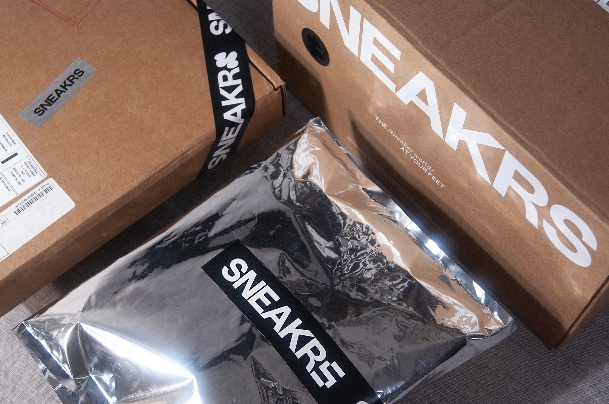
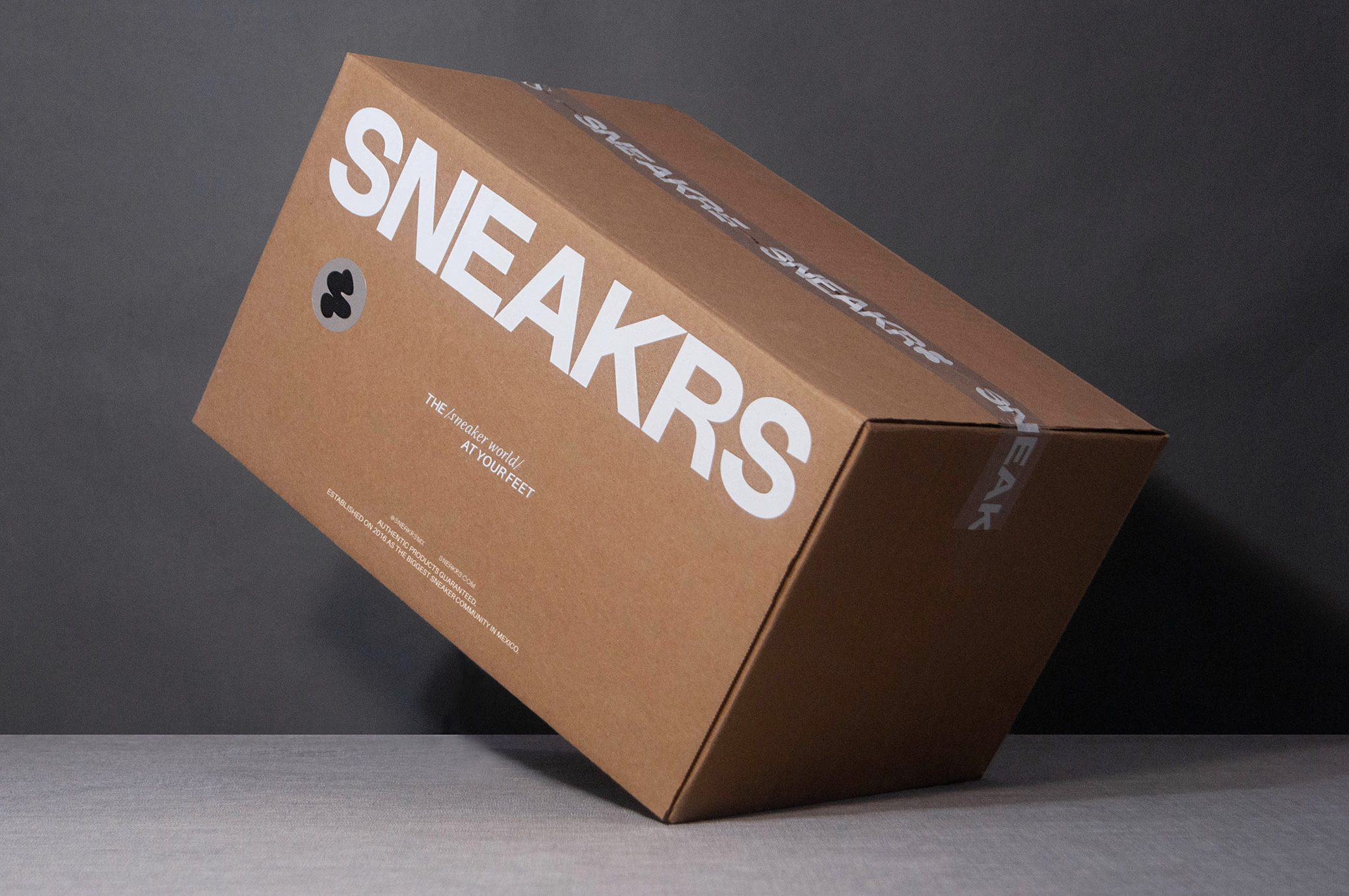
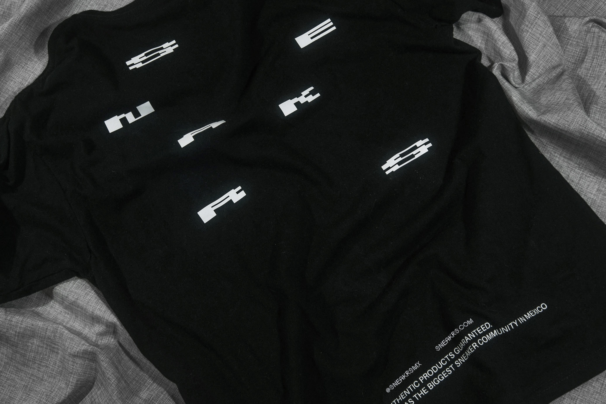
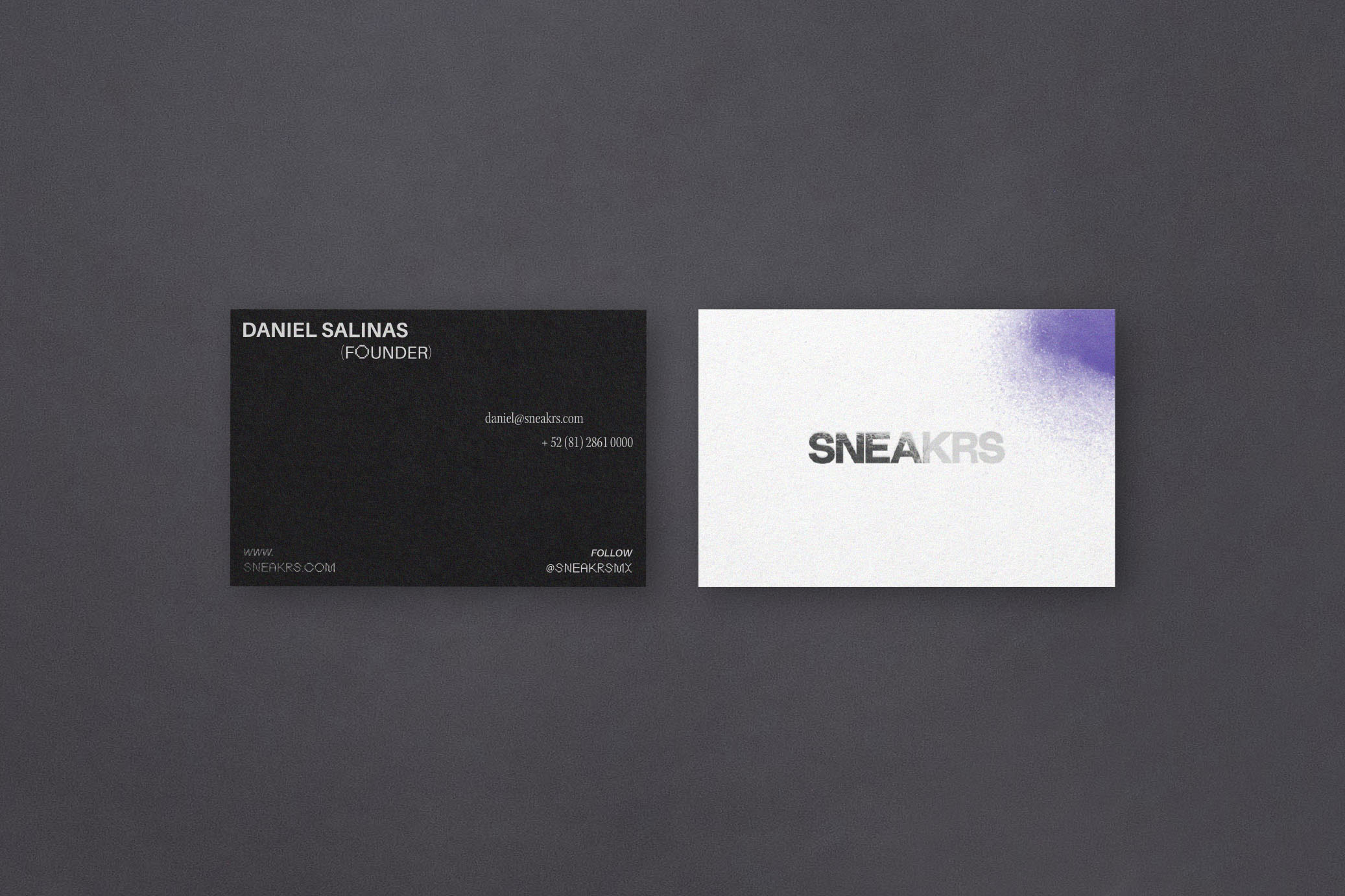
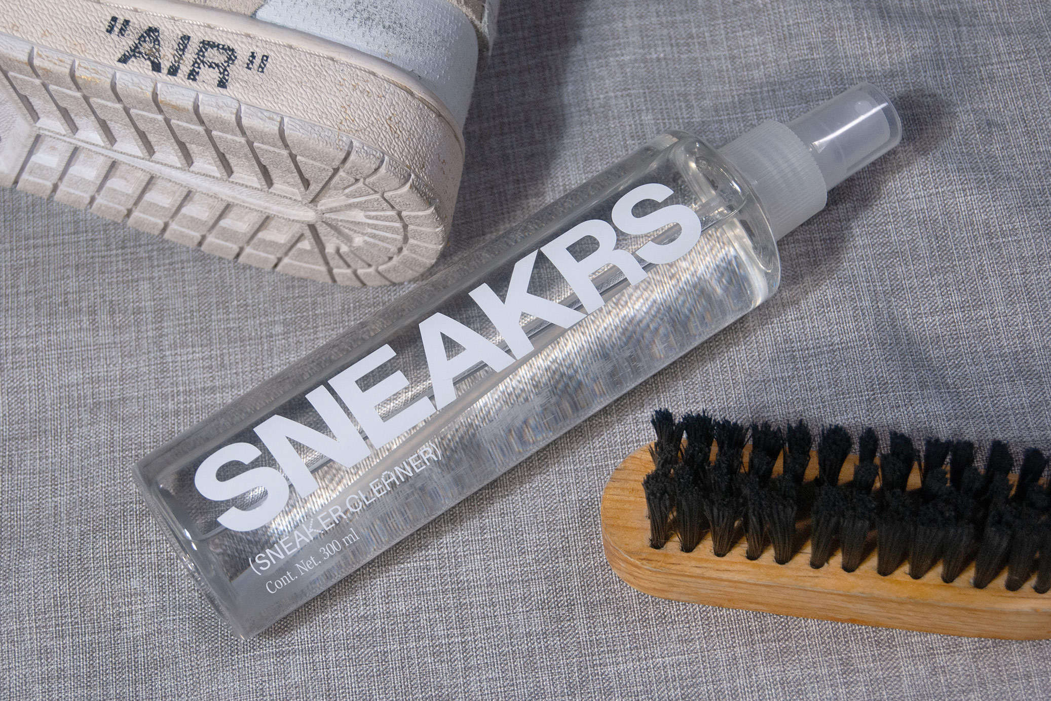
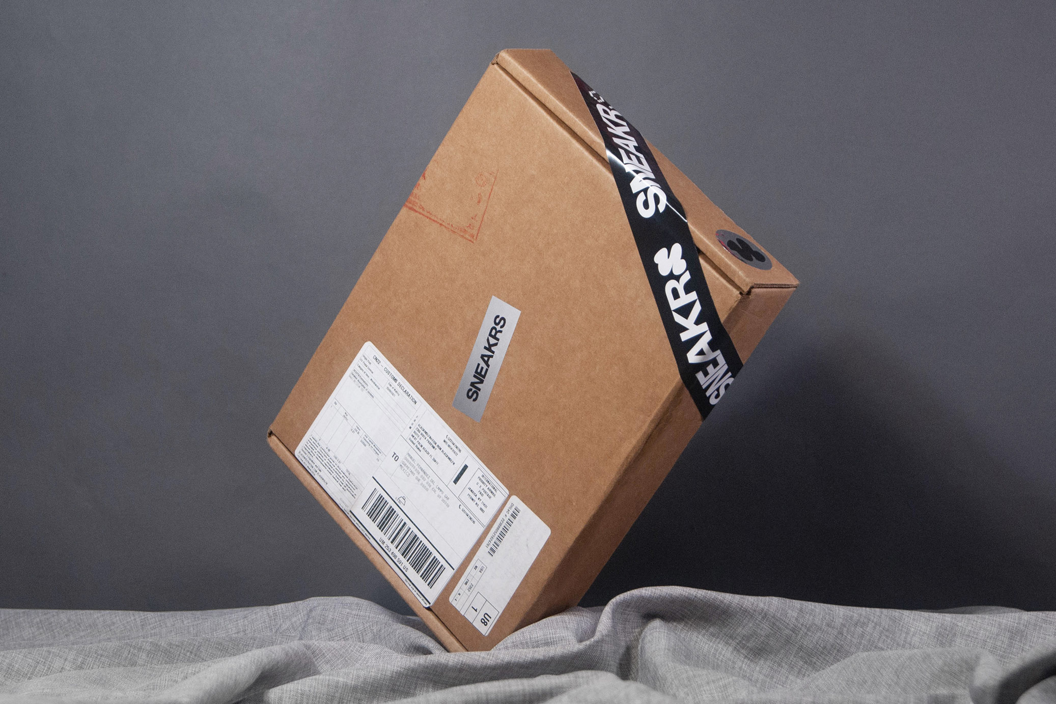
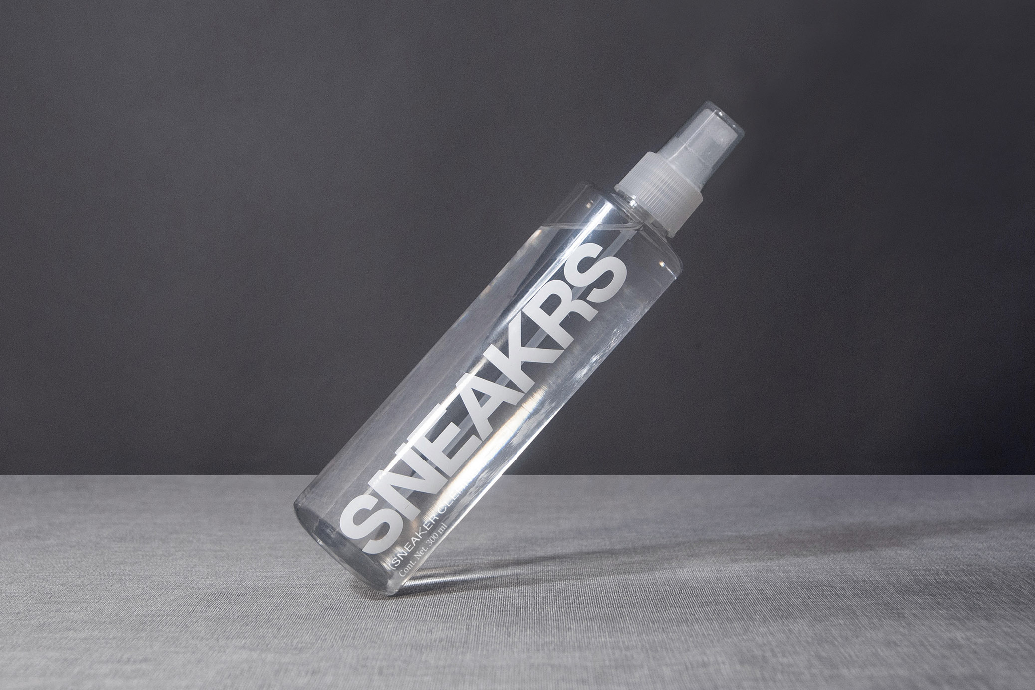
SNEAKRS is a limited edition sneakers, clothing and accessories marketplace. A community where members have access to news, content and the best products in the world.
The project communicates 4 axes: the streets as the place where streetwear was born, technology as the medium where the brand lives, luxury as an attribute acquired from limited products and the historical and nostalgic value of the sneakers they used on the field.
The contrasting typographic selection, the use of a secondary logo, the typographic modification in the “S” of the main logo, the use of silver foil and subtle paint stains that allude to graffiti convey the aforementioned axes. All this framed in a direct and clear graphic line, which tells us about the accessibility of the platform.
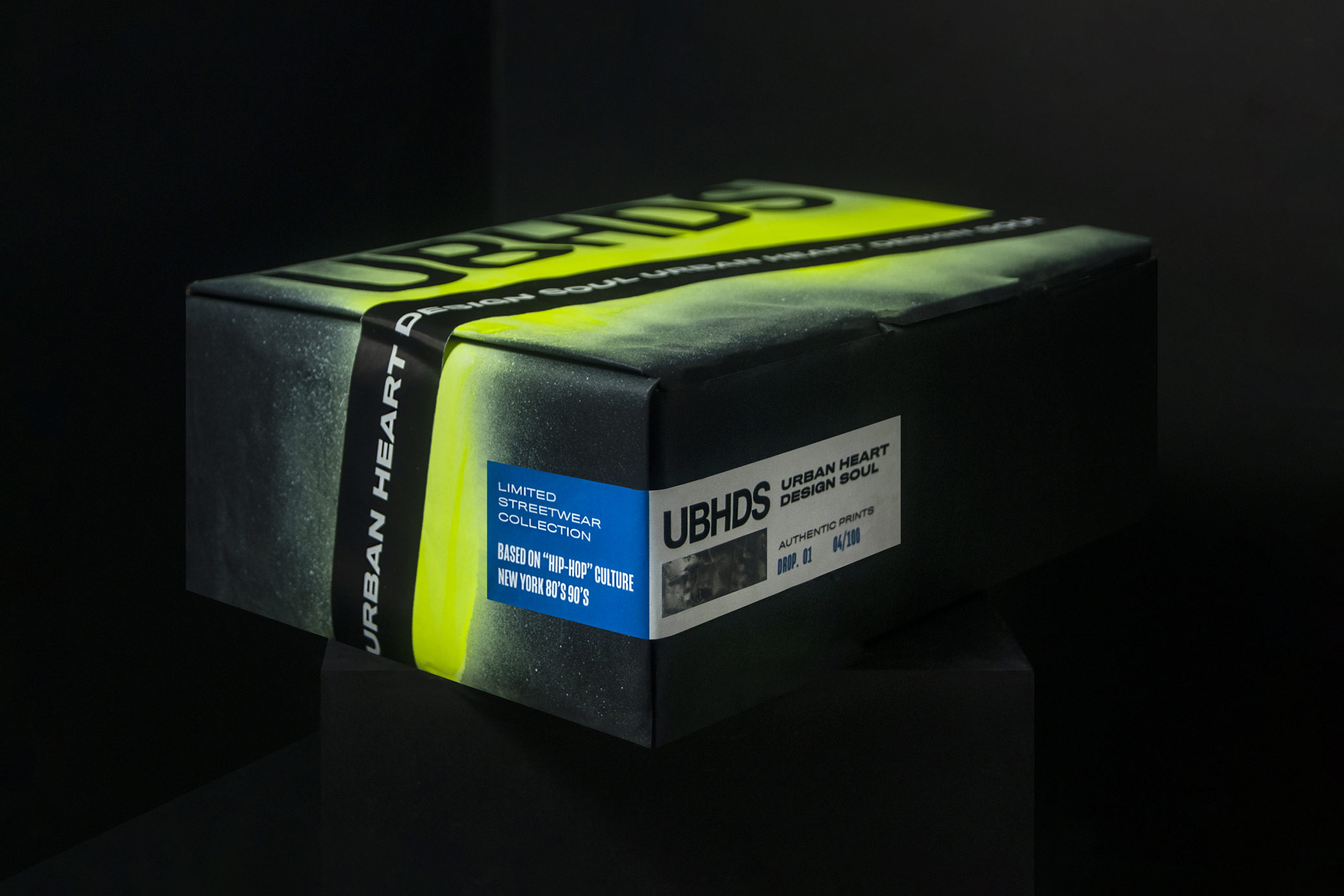
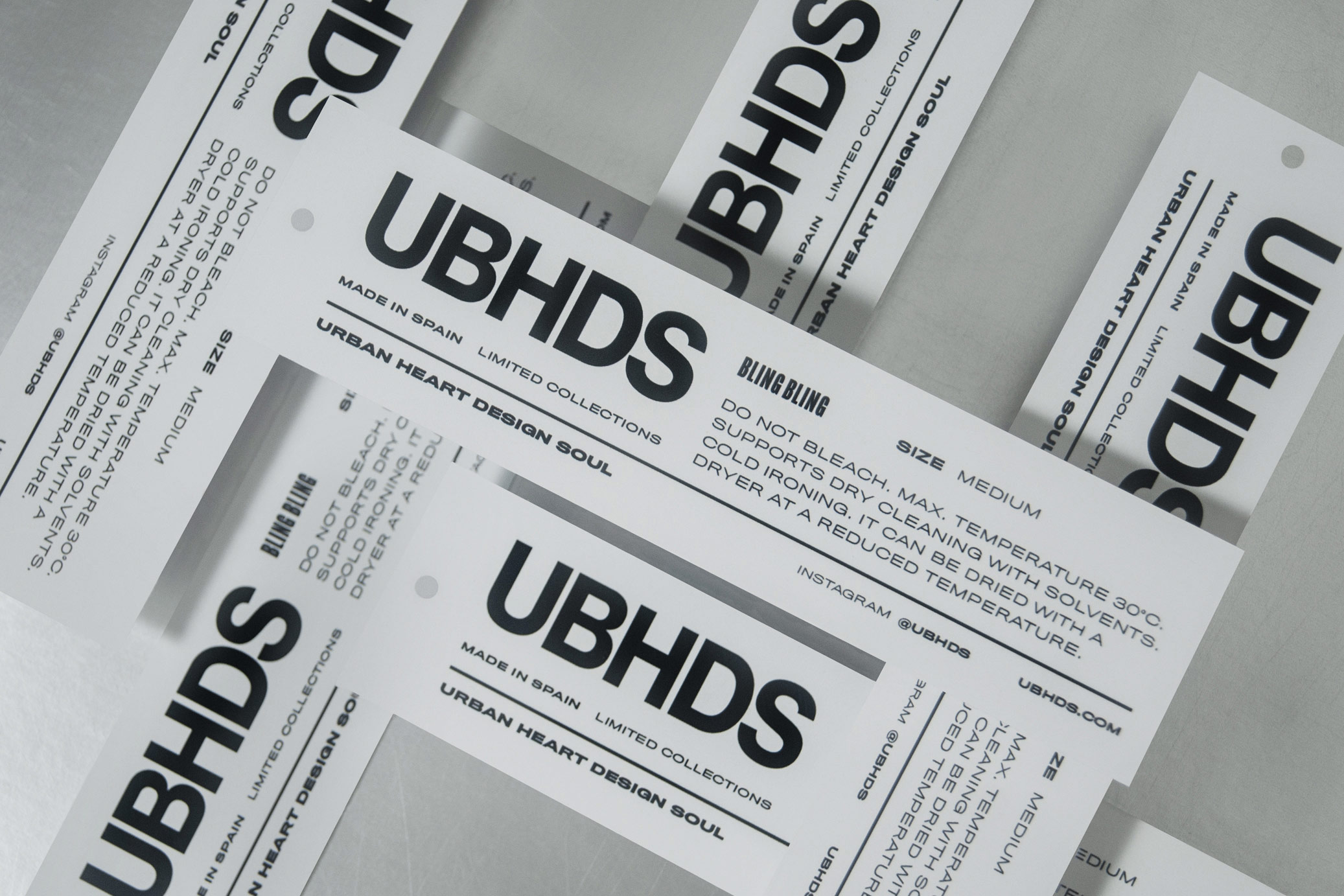
Urban Heart Design Soul is a streetwear label reflecting a sense of unique and extravagant style with limited collections inspired in 80’s hip hop culture.
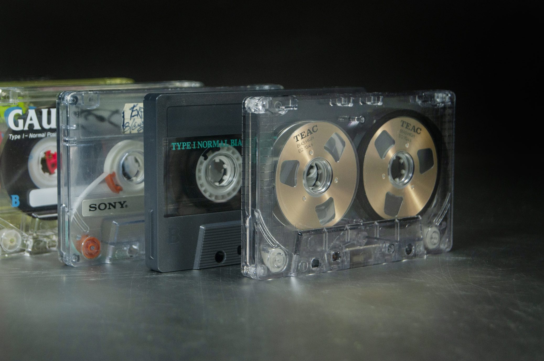
The logo and the compositions allude to the cassette boxes of the time (RUN DMC was the main reference), while the graphic elements recreates the context where the culture lived, such as graffiti and cassettes, complemented with extravagant colors and bright details with the use of foil.
T-shirt illustrations: Ana Cuna for UBHDS. Photos where t-shirts appear are just for illustrative purposes and are property of UBHDS.
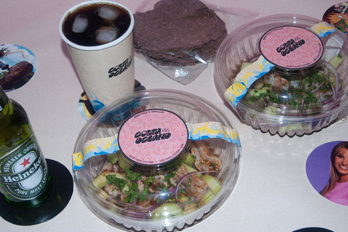
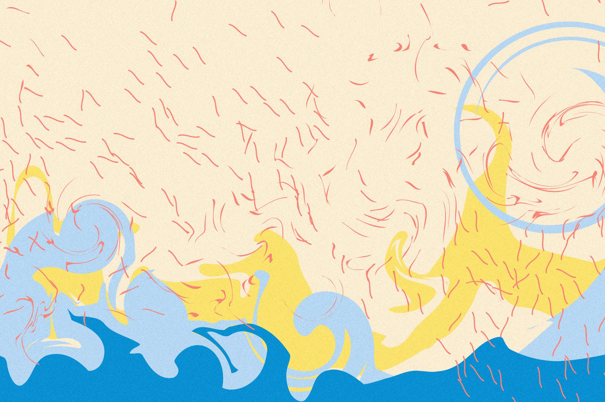
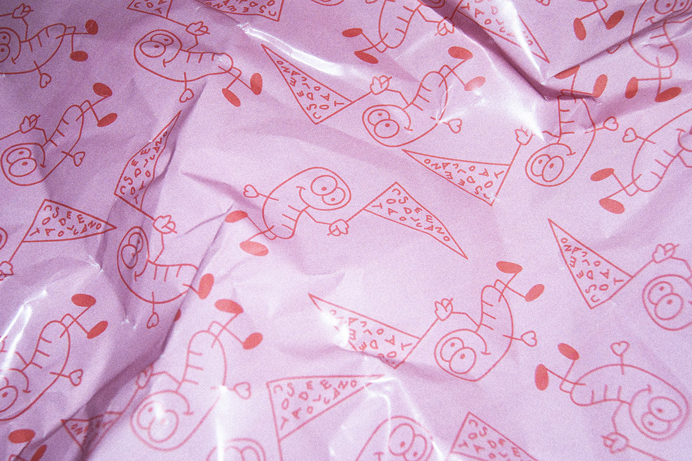
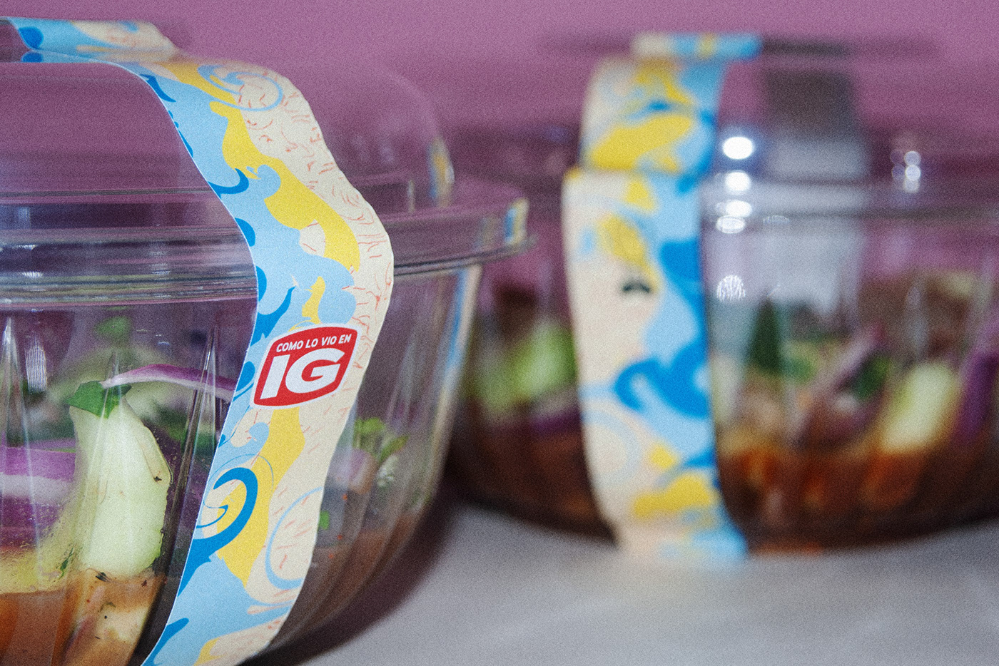
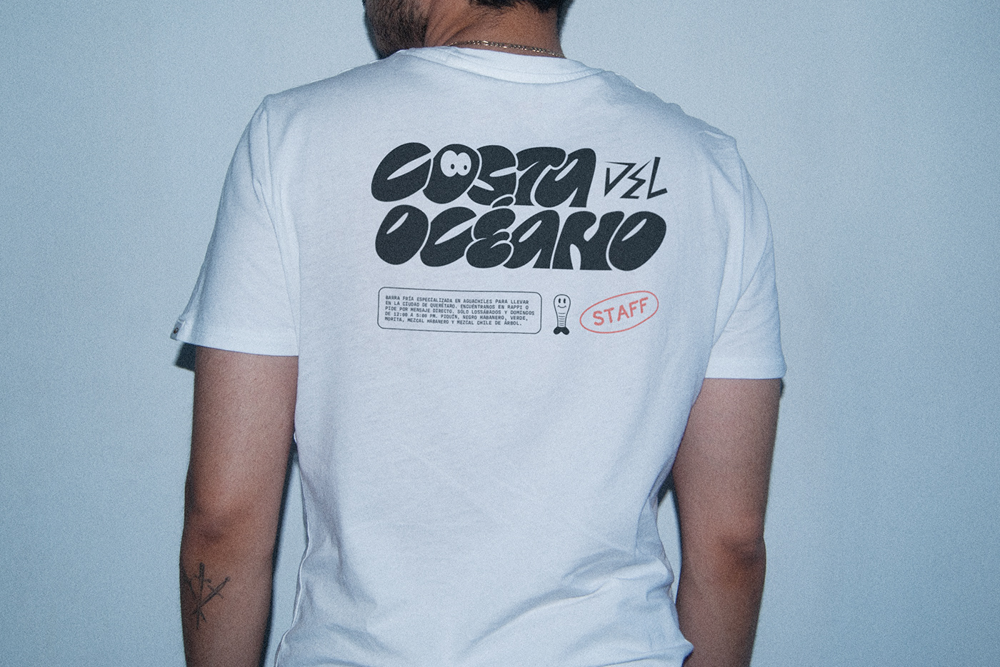
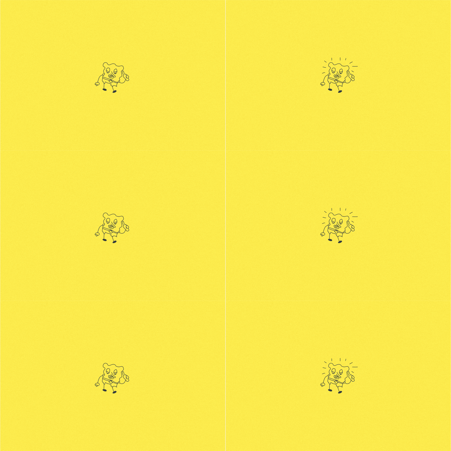
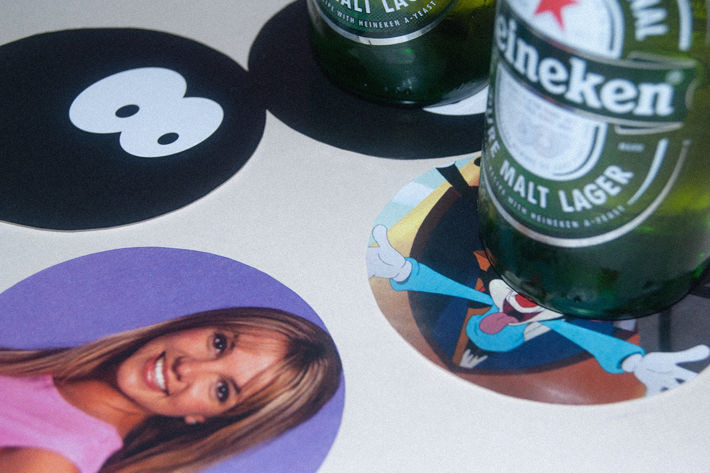
Costa del Océano is a seafood bar specialized in aguachiles (a Mexican dish made of shrimp, submerged in liquid seasoned with chili peppers, lime juice and other ingredients) located in Queretaro, Mexico. The main concept is the nostalgia of the 90’s, taking inspiration from cartoons, series, films and artists. For this reason, the brand is full of references from that time.
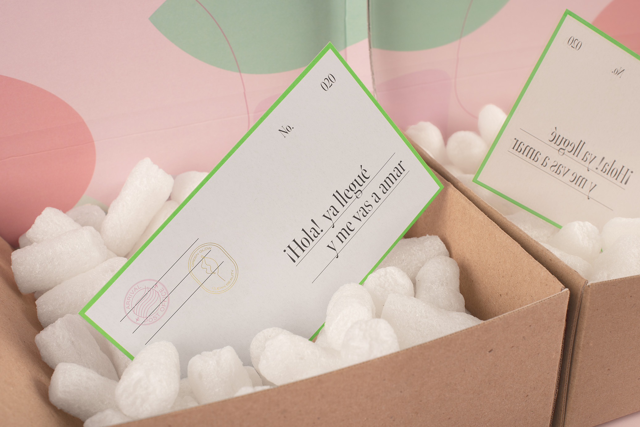
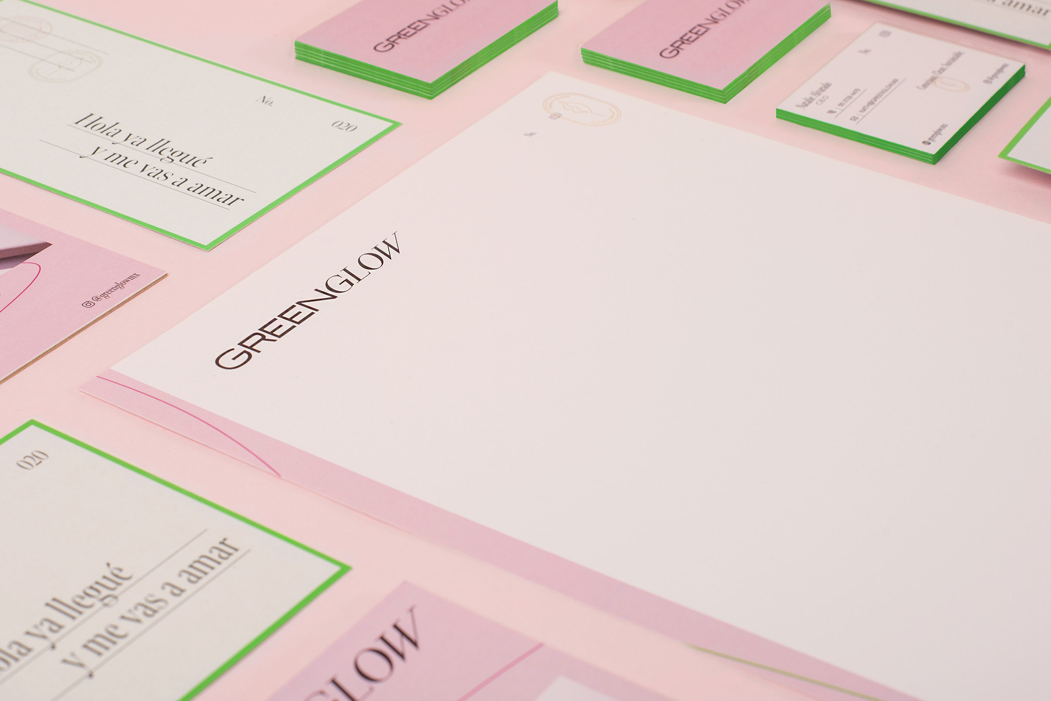
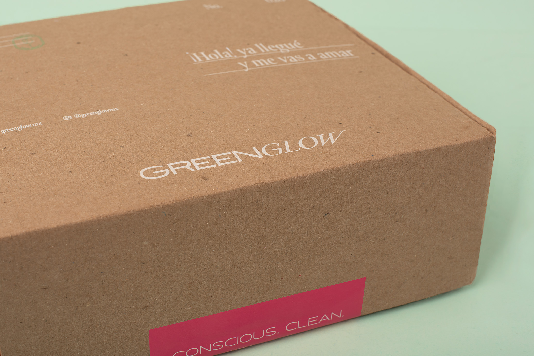
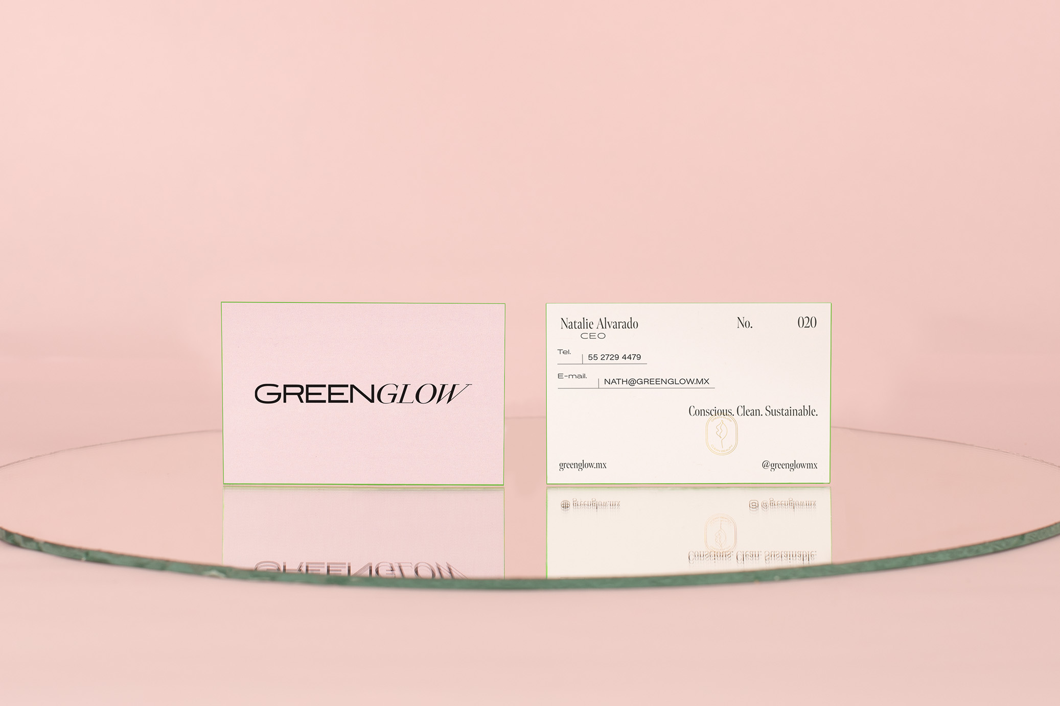
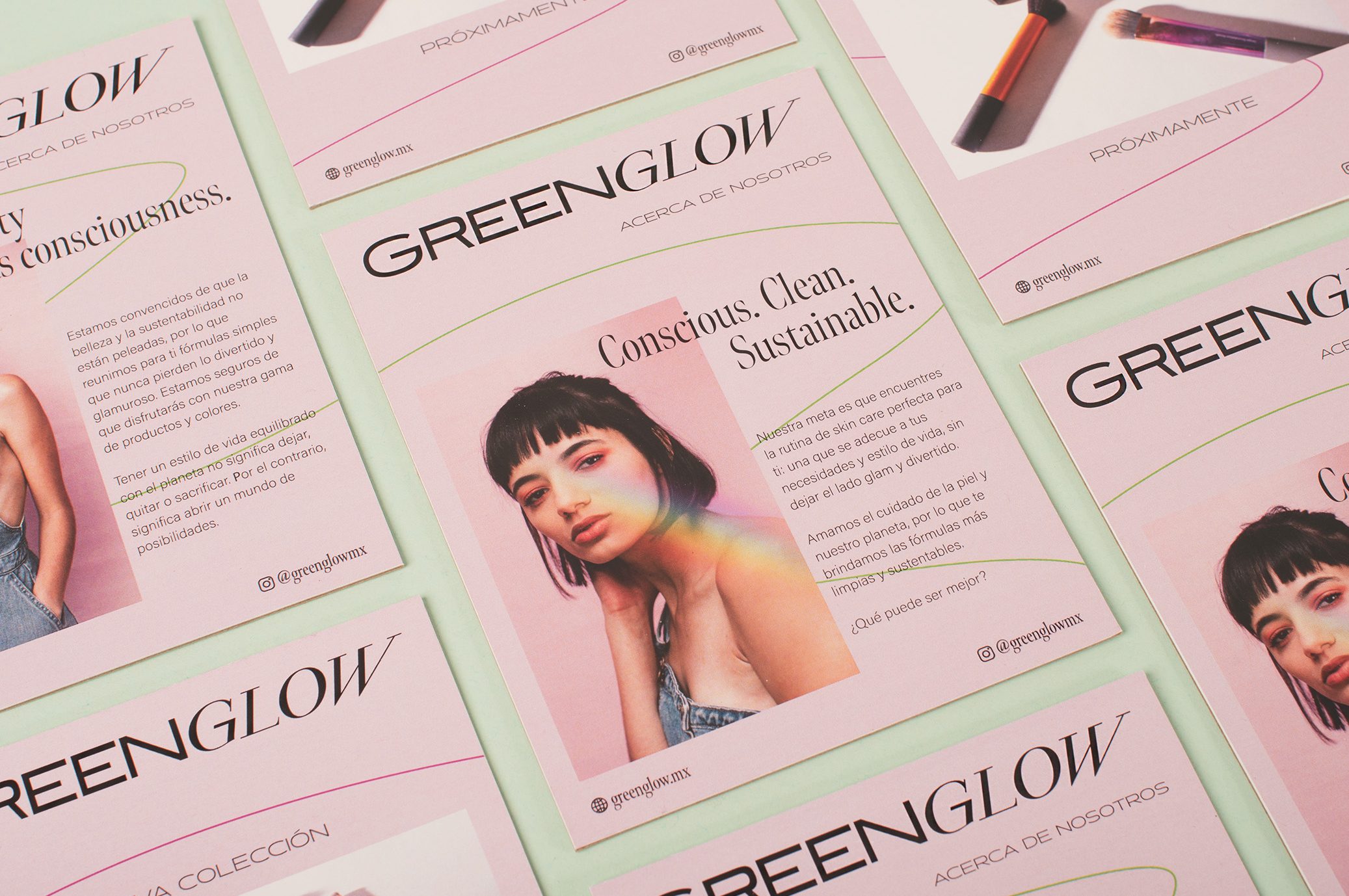
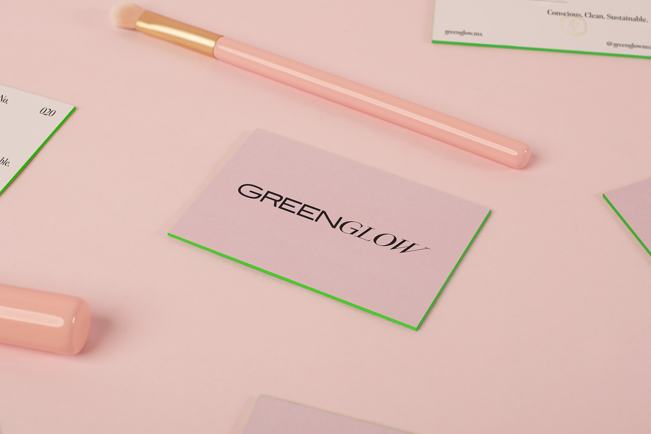
GreenGlow is a Mexican platform that distributes clean beauty products, free from ingredients that are harmful to health. The main discourse of the brand is based on the fact that beauty and consciousness can be together. For this reason, it was essential to have a balance between the glamorous world of beauty, and the healthy and conscious world.
The identity is influenced by the classic 70’s with neon touches and organic shapes that, in combination with elegant and contemporary typefaces, give us the balance that the brand needs to live up to its slogan: Where Beauty meets consciousness.
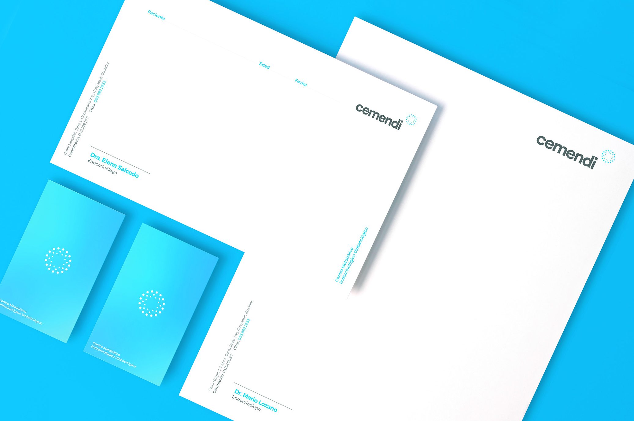
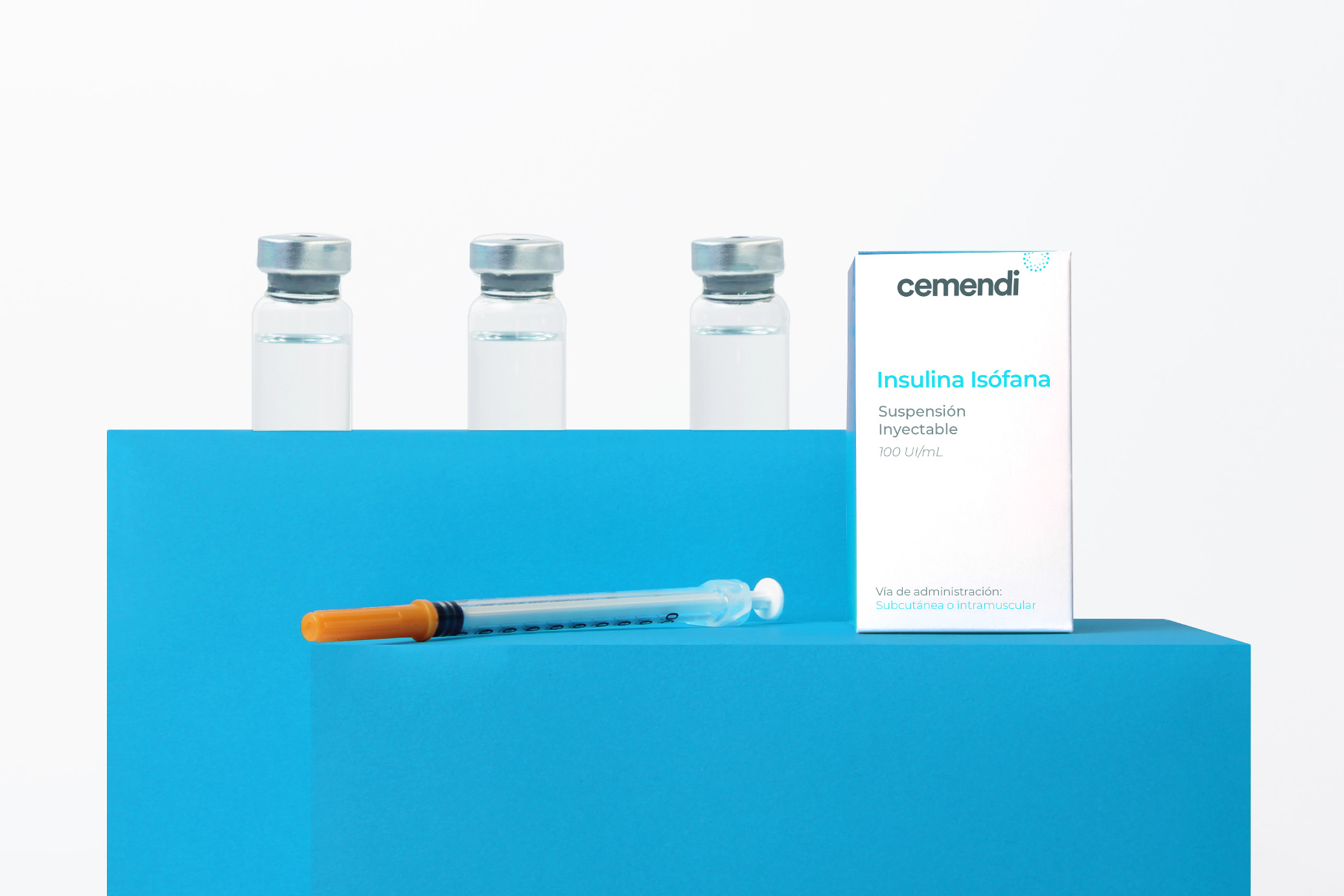
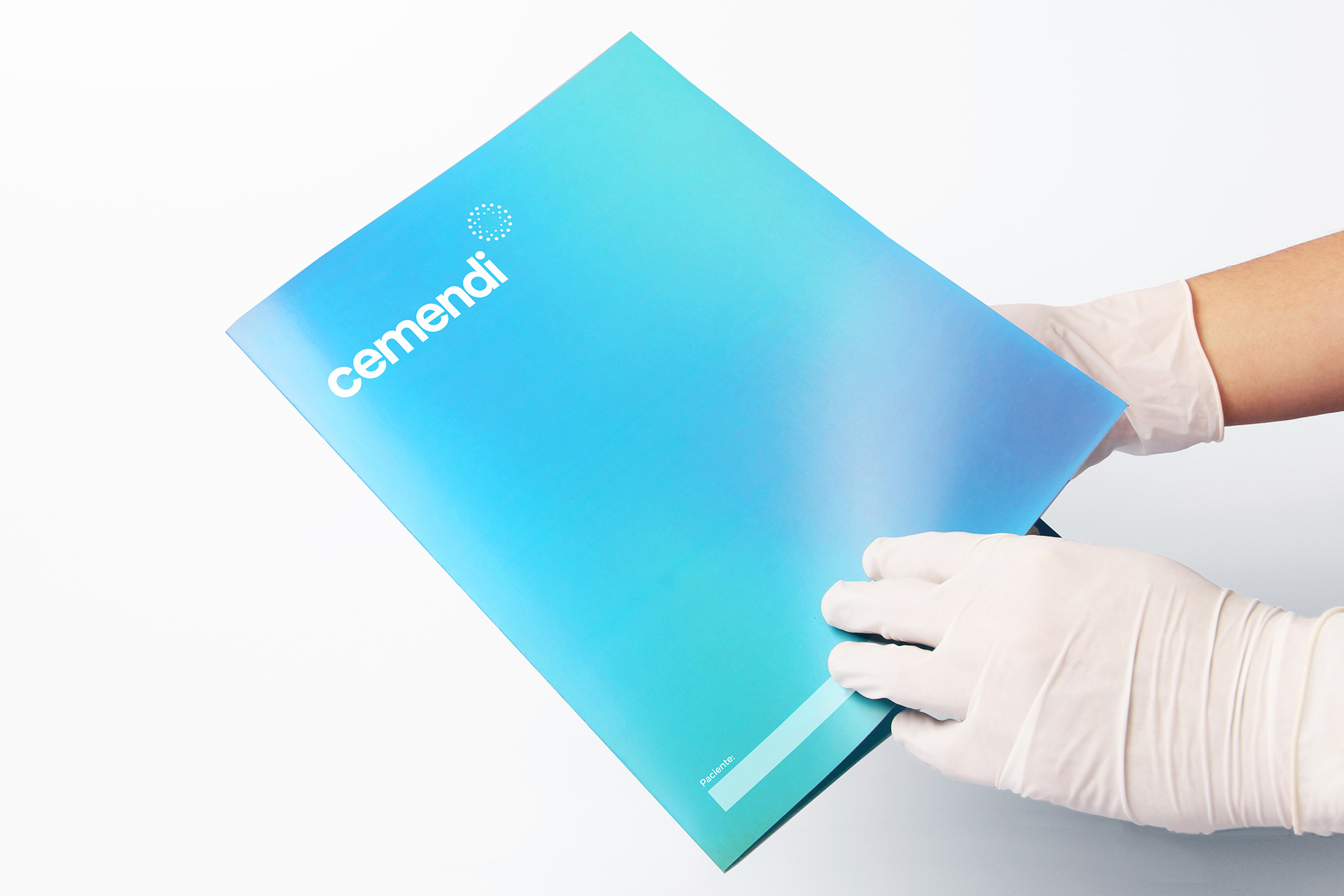
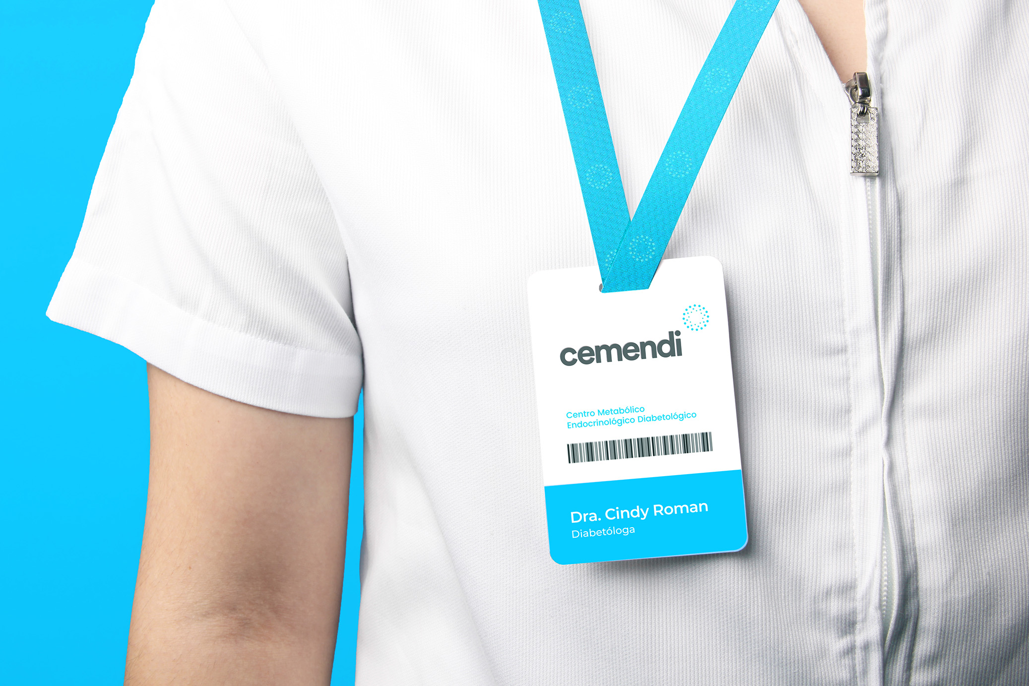
CEMENDI is a medical center specialized in metabolism, endocrinology, and diabetes located in the city of Guayaquil, Ecuador.
The objective was to create a simple institutional brand that started from the idea of metabolism, for which we played with repeated circles as an analogy with the cells that form the organism and their biochemical reactions.