BRADA IS A GRAPHIC DESIGN STUDIO SPECIALIZED IN BRANDING. IF YOU WANT TO CONTACT US PLEASE FEEL FREE TO SEND US AN EMAIL TO INFO@BRADA.CO OR CHECK OUR CONTACT SECTION.
BRADA IS A GRAPHIC DESIGN STUDIO SPECIALIZED IN BRANDING. IF YOU WANT TO CONTACT US PLEASE FEEL FREE TO SEND US AN EMAIL TO INFO@BRADA.CO OR CHECK OUR CONTACT SECTION.
BRADA IS A GRAPHIC DESIGN STUDIO SPECIALIZED IN BRANDING. IF YOU WANT TO CONTACT US PLEASE FEEL FREE TO SEND US AN EMAIL TO INFO@BRADA.CO OR CHECK OUR CONTACT SECTION.
BRADA IS A GRAPHIC DESIGN STUDIO SPECIALIZED IN BRANDING. IF YOU WANT TO CONTACT US PLEASE FEEL FREE TO SEND US AN EMAIL TO INFO@BRADA.CO OR CHECK OUR CONTACT SECTION.
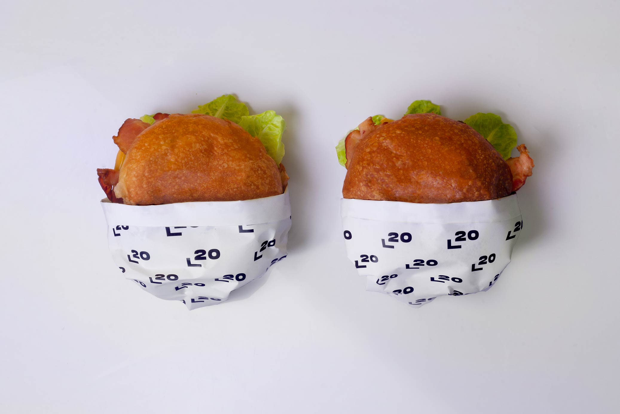
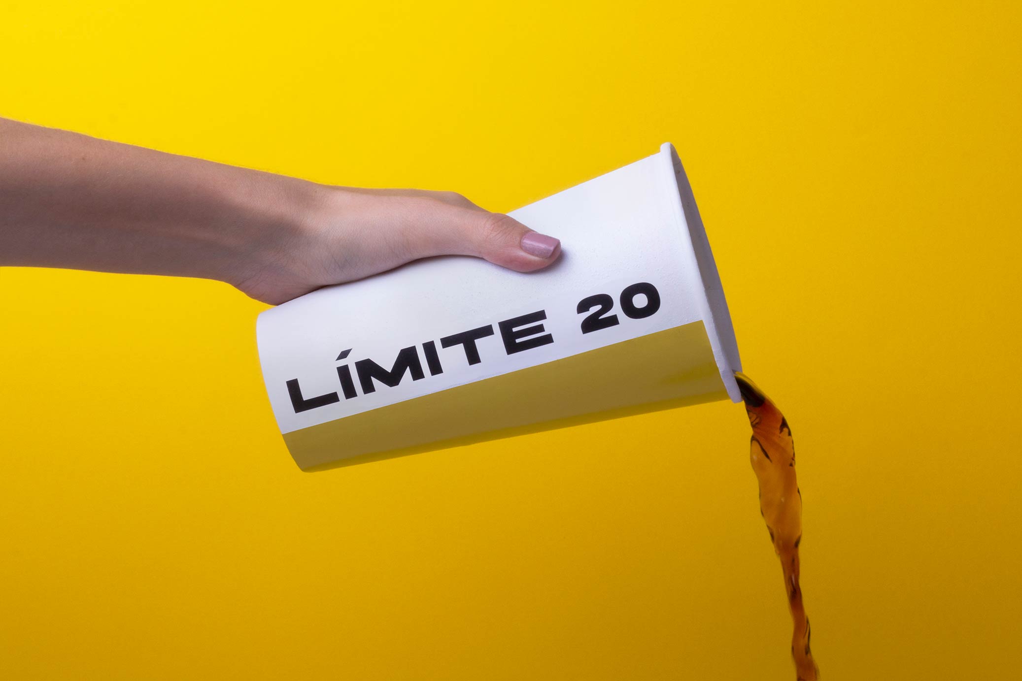
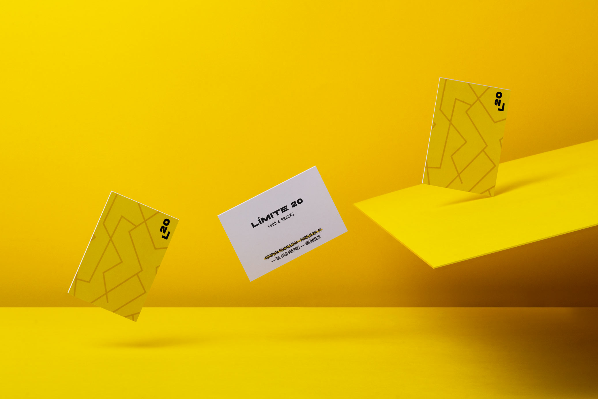
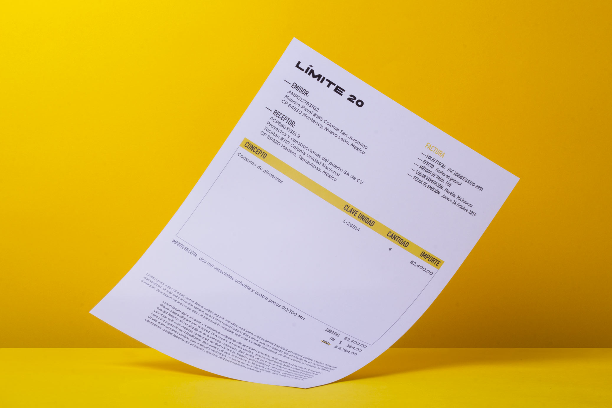
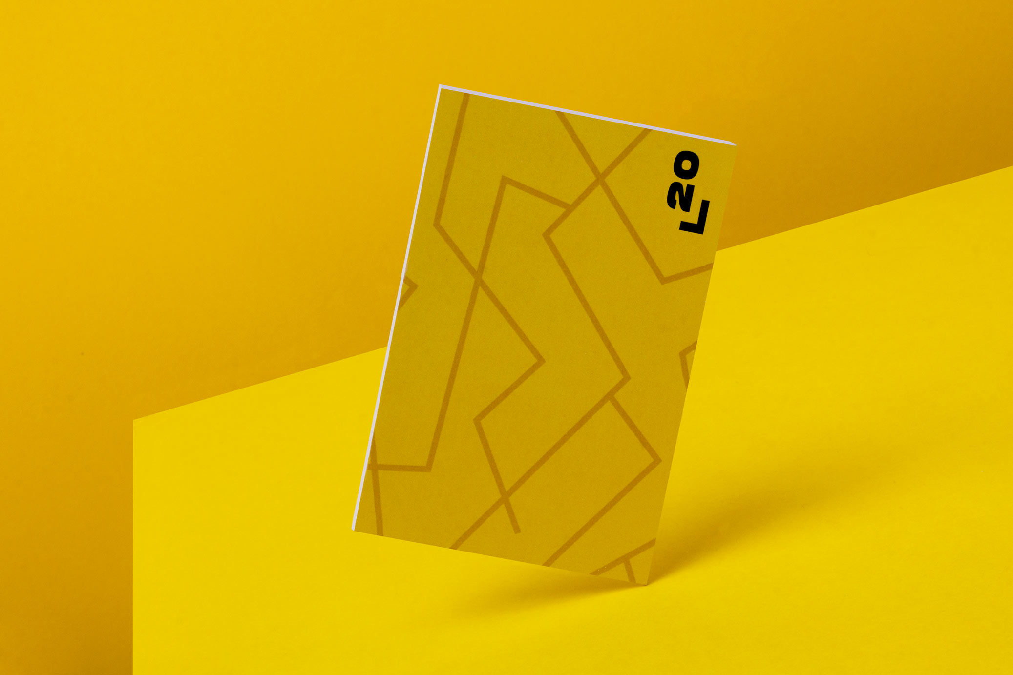
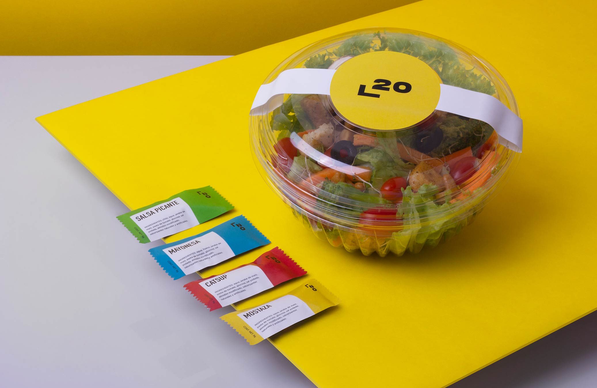
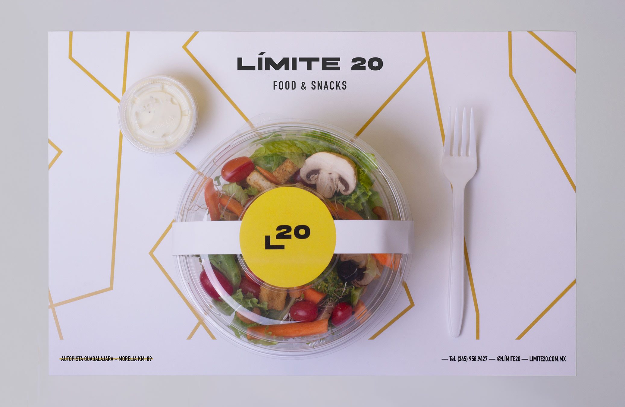
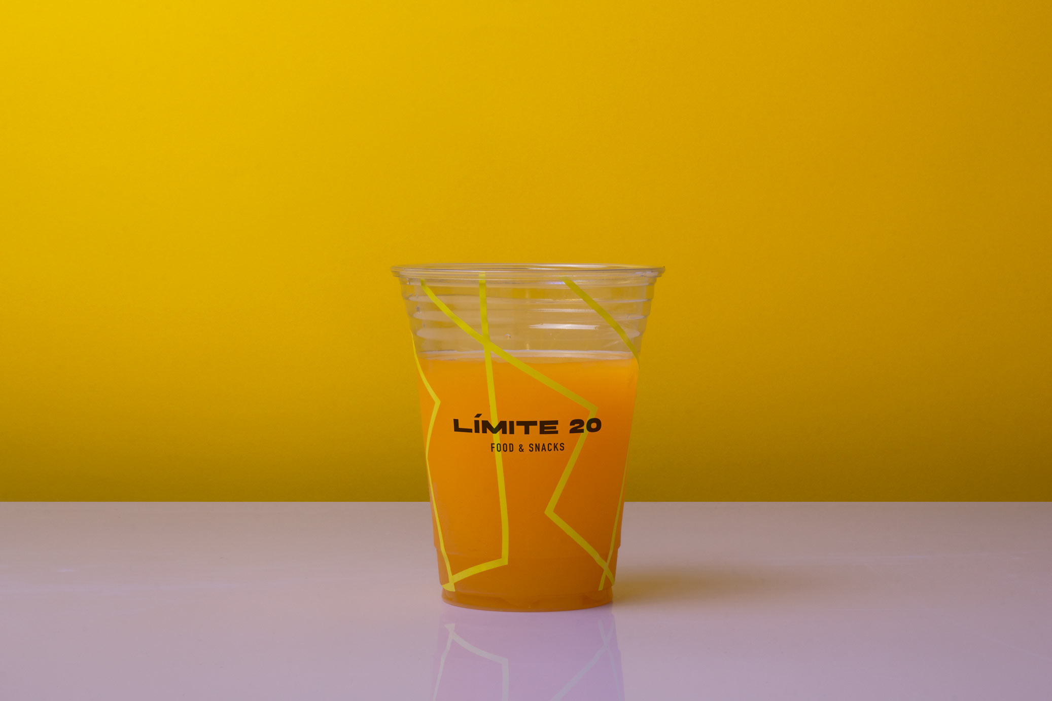
Límite 20 is a roadside restaurant located on the limits of Lake Cuitzeo, in Mexico. The goal was to give the place an American fast food appearance, but in a slightly more sophisticated atmosphere.
The name comes from the idea of road signs, in which, when arriving to a town, a speed limit is indicated and often coincides with being 20. Also the restaurant is located on the limits of Lake Cuitzeo, which length is 20 km.
The graphic proposal incorporates lines that simulate roads from an aerial view, as they are commonly represented on maps. This is combined with an extended typography that gives a contemporary touch to the place.
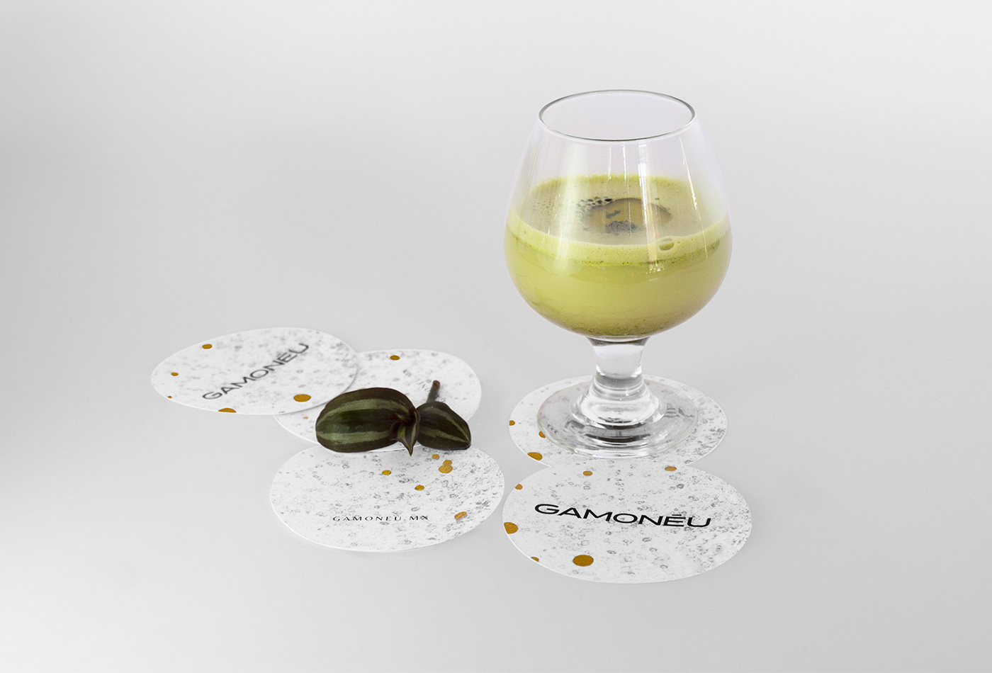
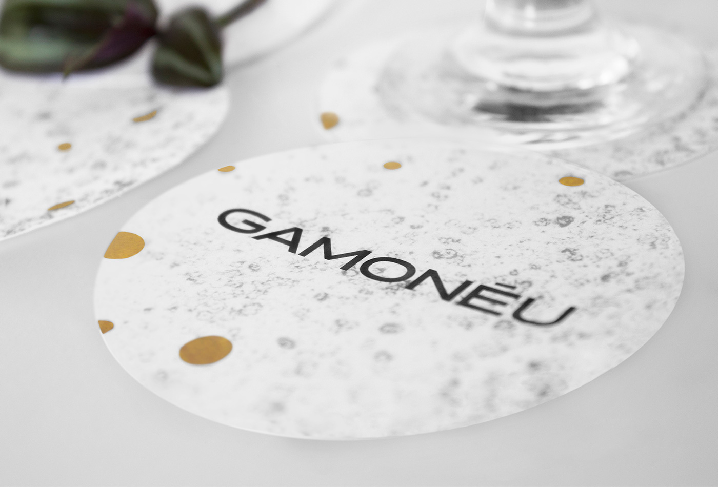
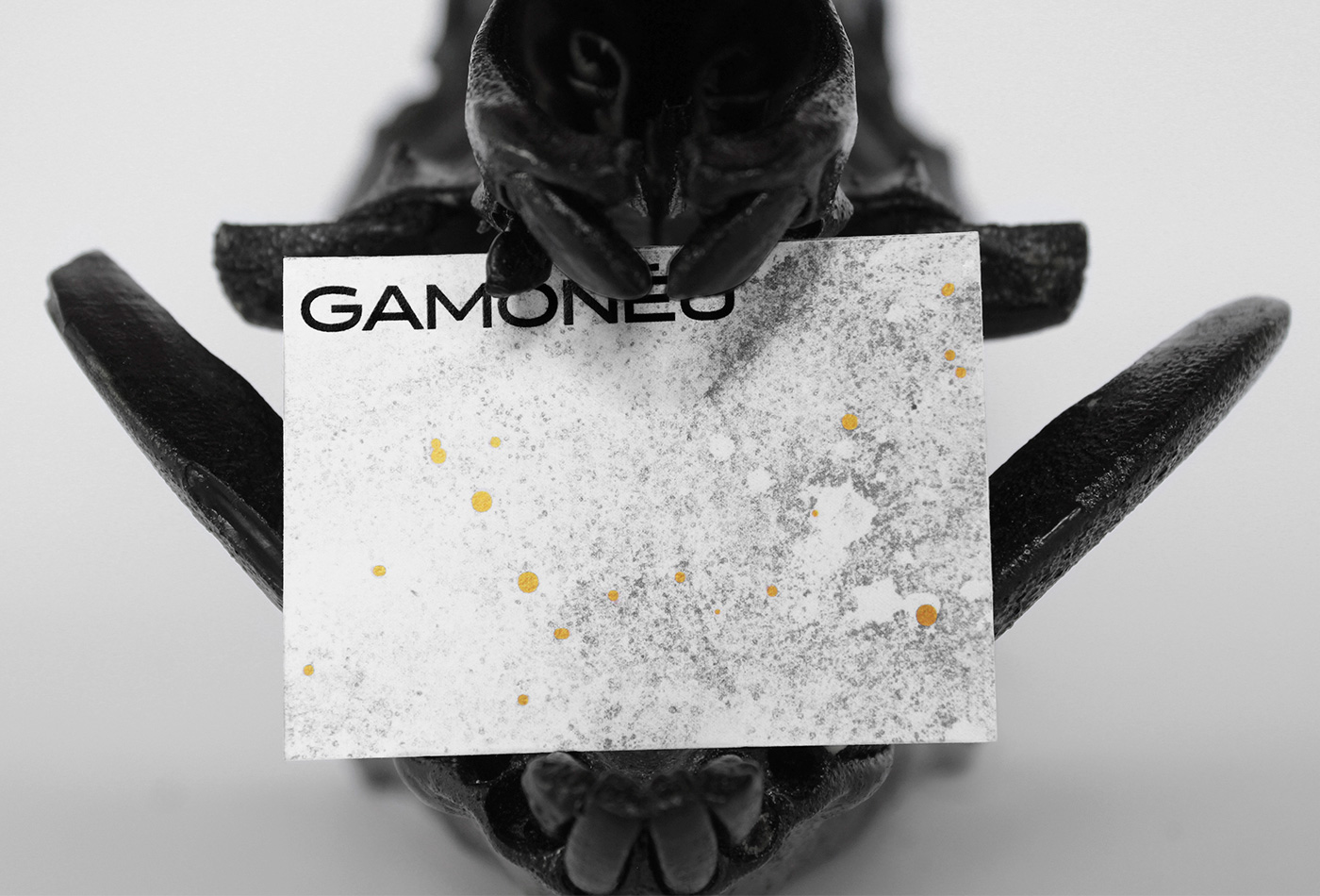
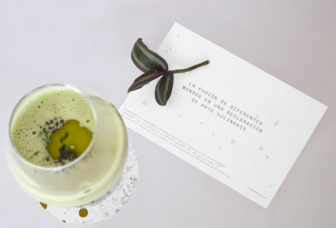
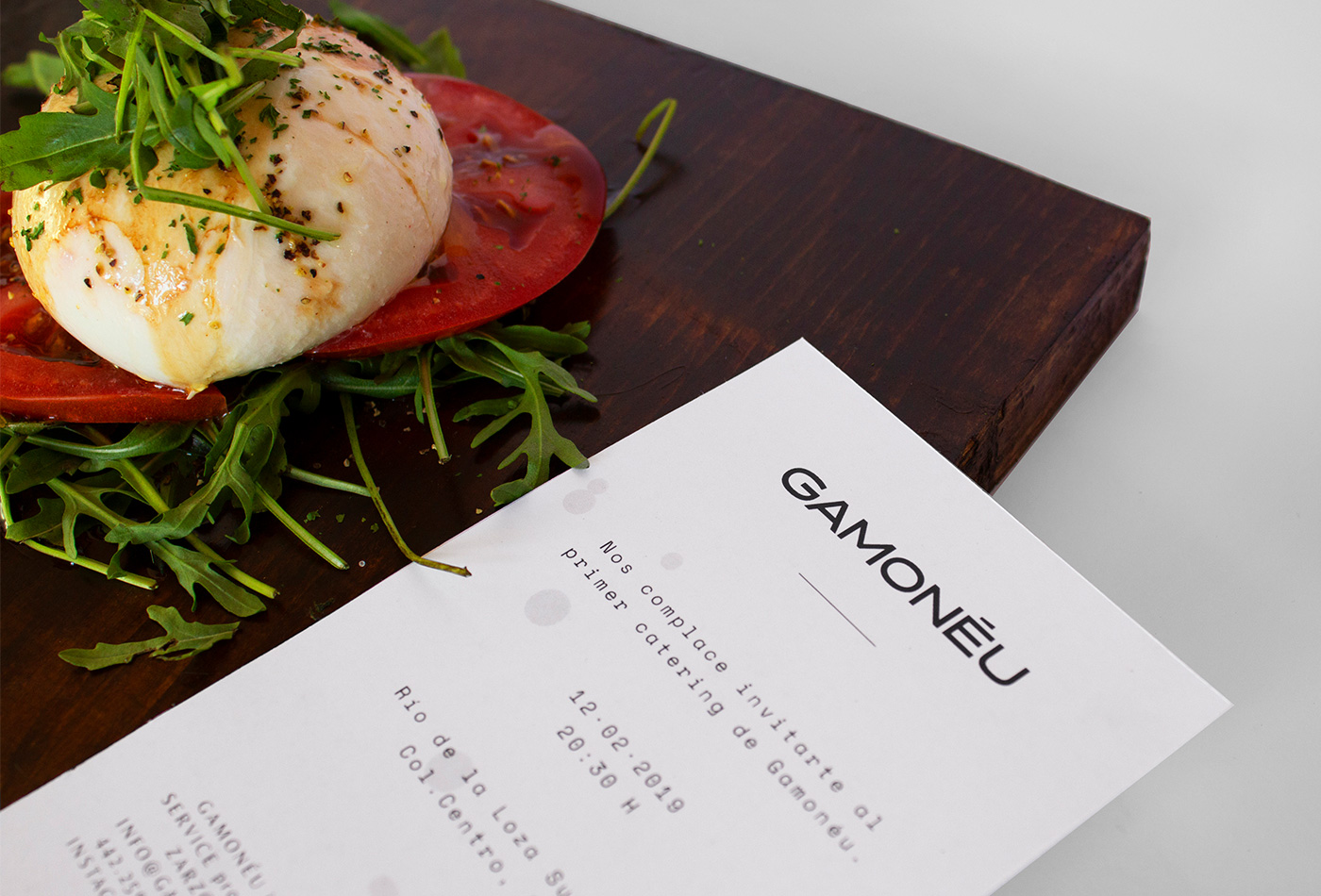
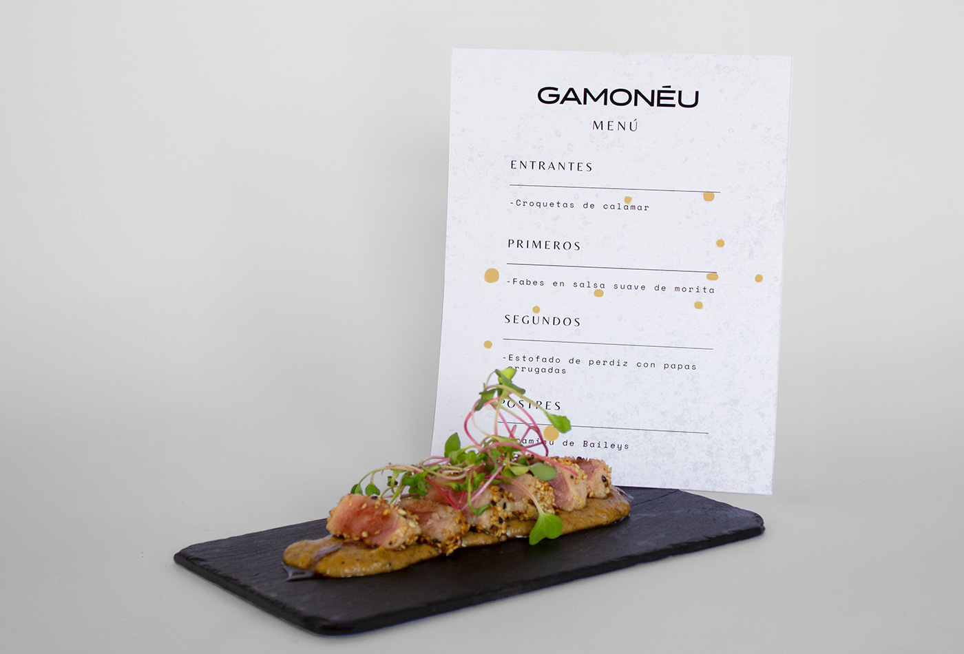
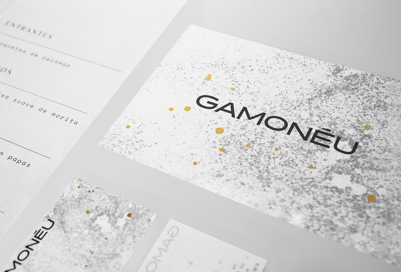
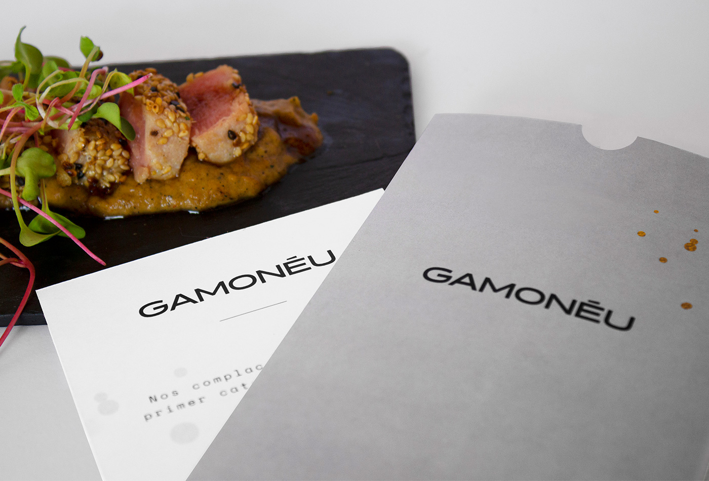
Gamonéu is an exclusive Catering Service with an experimental style. They compare food with master pieces, making analogies between food and art, changing the culinary experience. This gives us a unique and exclusive perspective.
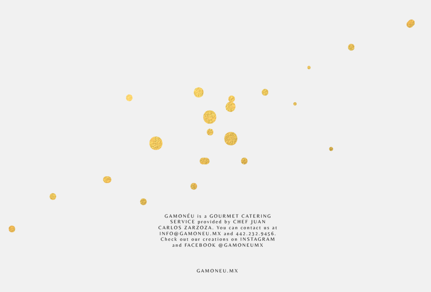
For this reason, we represent Gamonéu as pure art: golden details reflects elegance and the predominant white reflects the canvas to put food under the spot. This fusion is a statement of classic and contemporary styles.
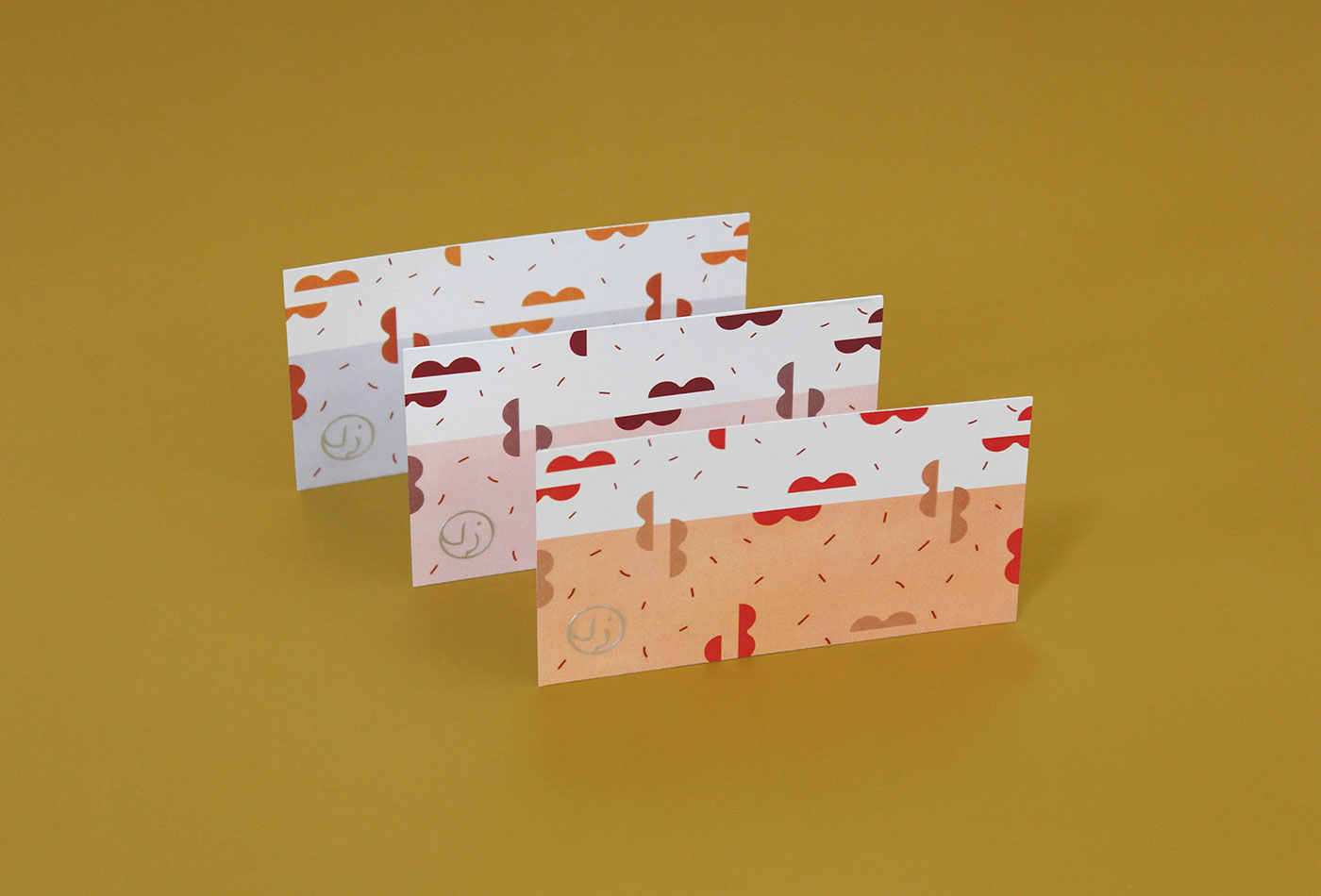
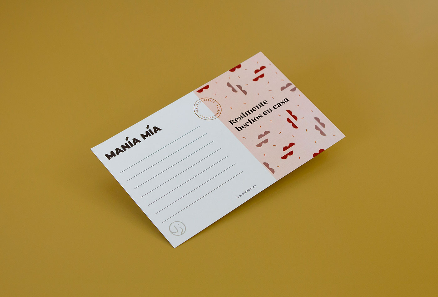
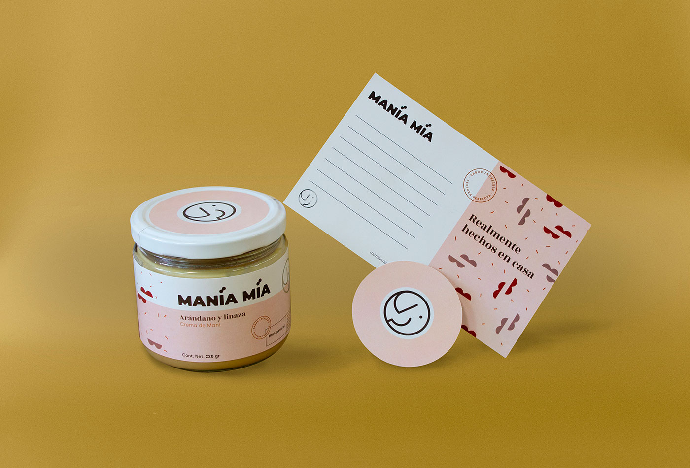
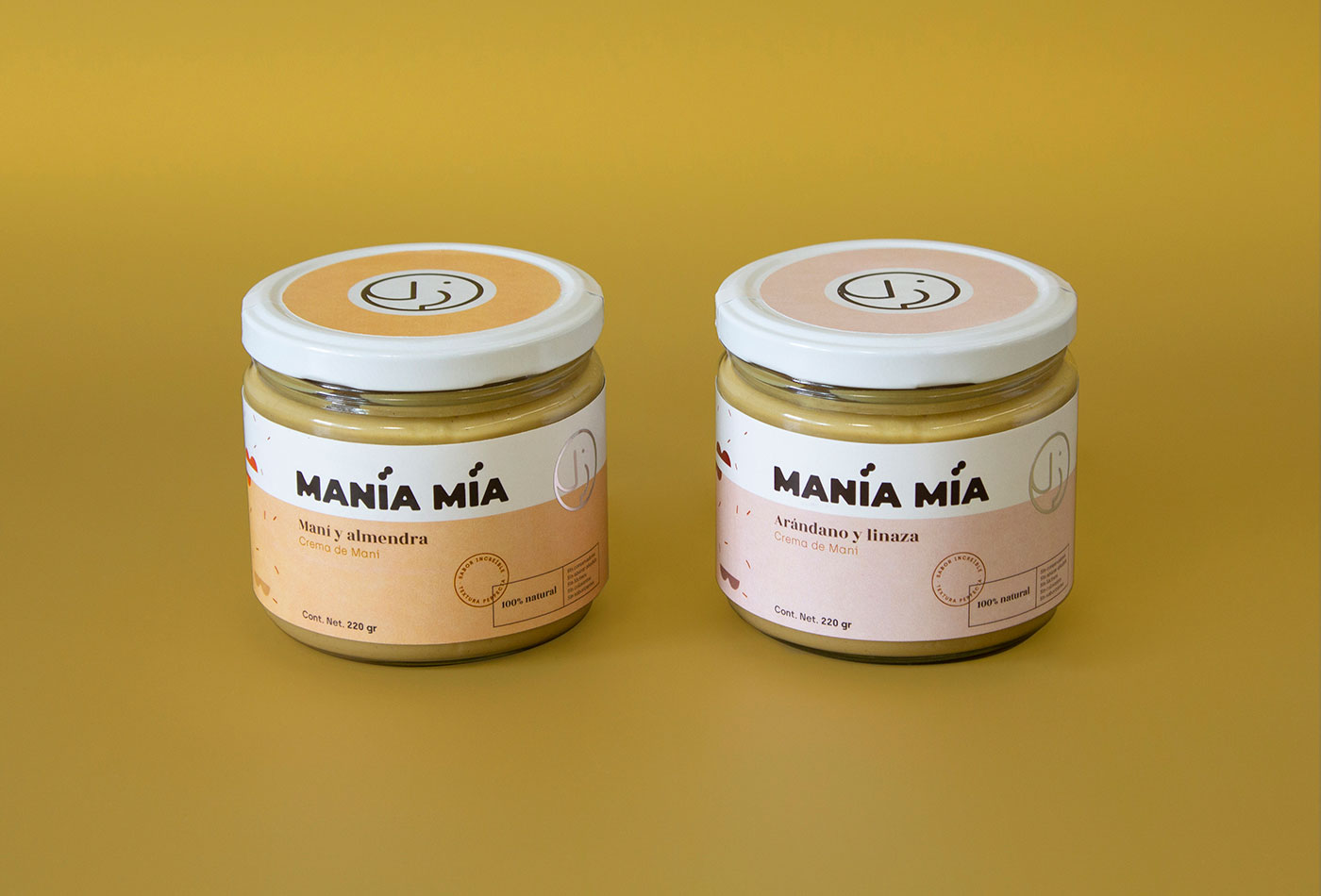
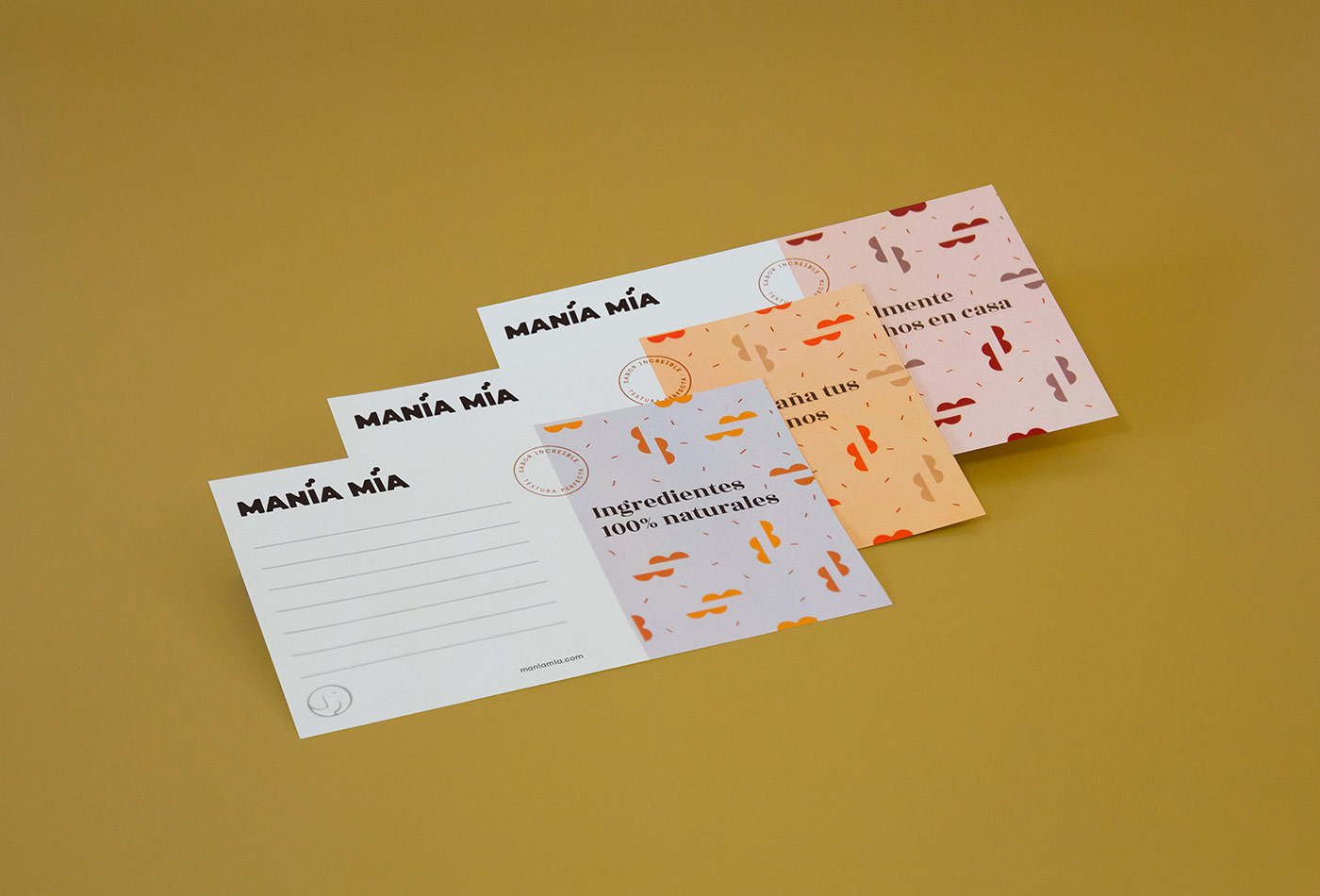
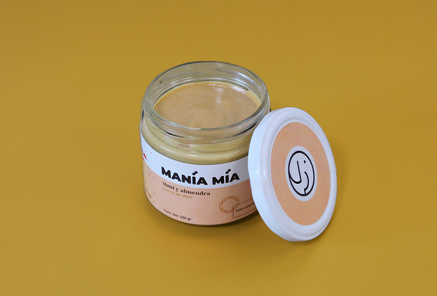
Manía Mía is a company based in Mexico that manufactures 100% natural peanut butter. The requirement was to create a brand that reflects quality with a homemade and fun touch, and that could also be adapted to the packaging and reproduced in different flavors of the product.
For the logo we create a bold typeface with curved edges. The isotype is an abstraction of an elephant, created as a seal for easy reproduction and identification. This is complemented with monospaced / serif typographies, creating a contrast between modern and classic. Finally, a pattern was created from the basic form of peanuts to add a fun touch to the brand.
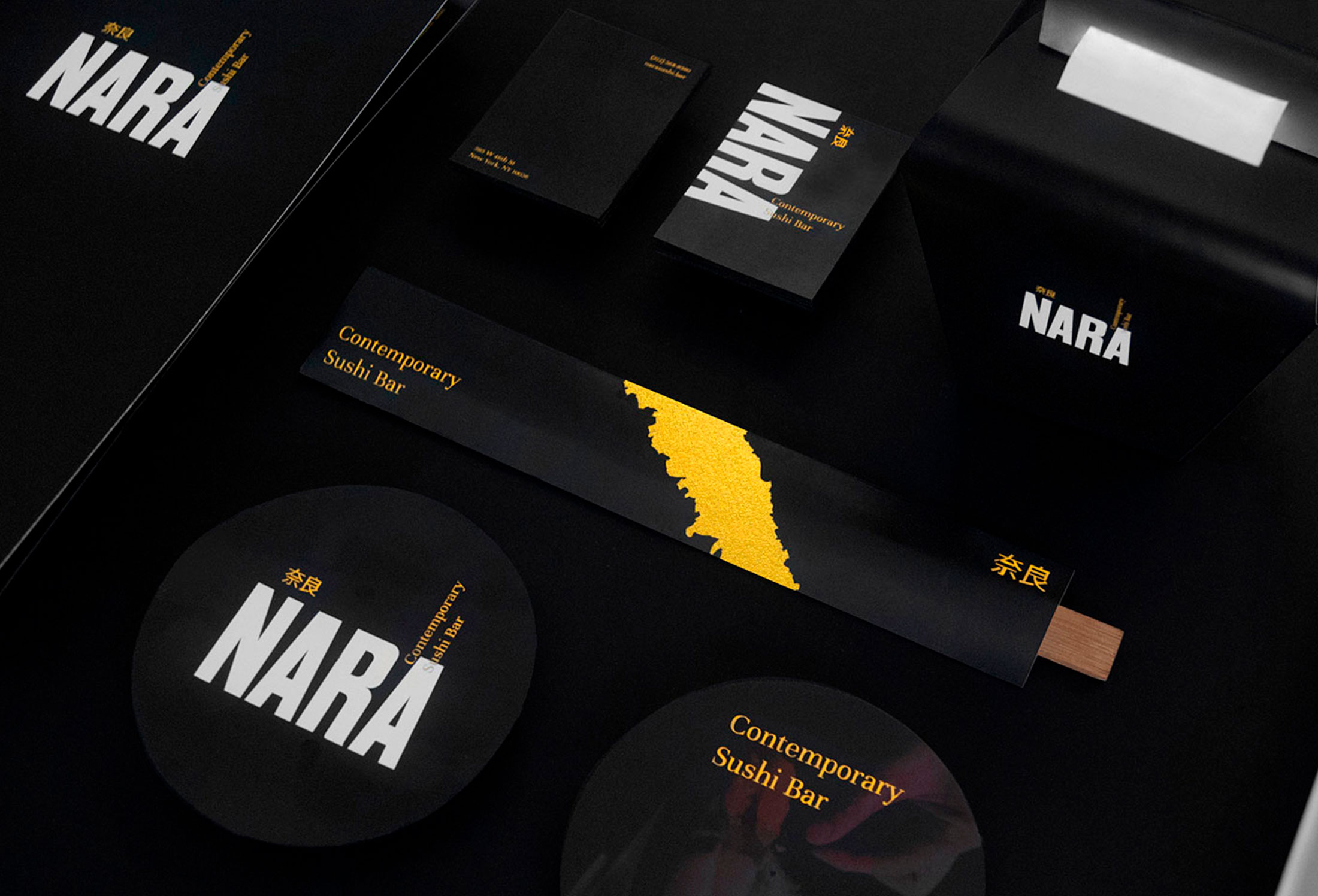
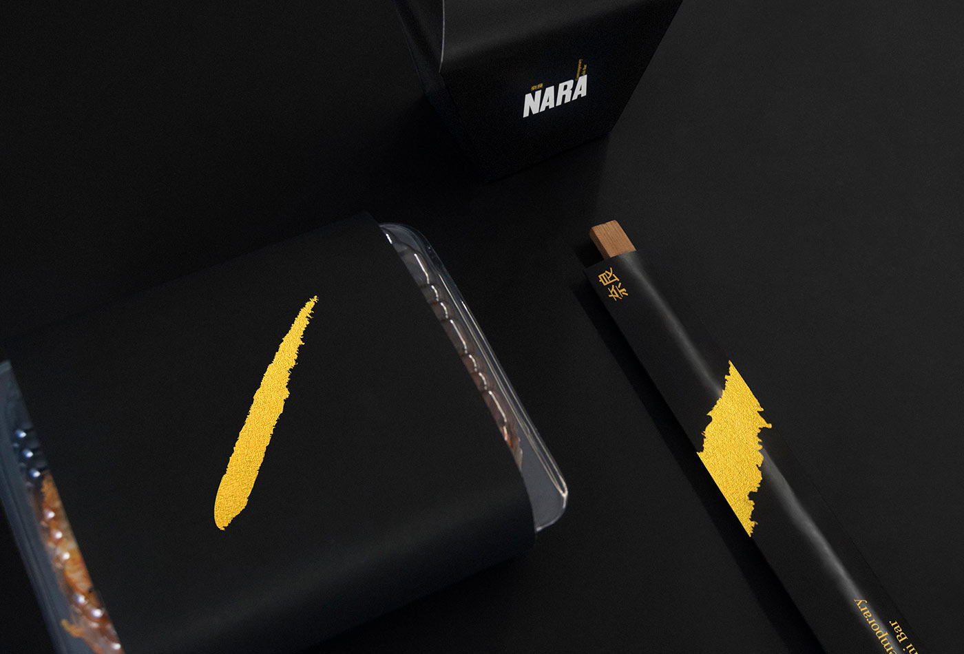
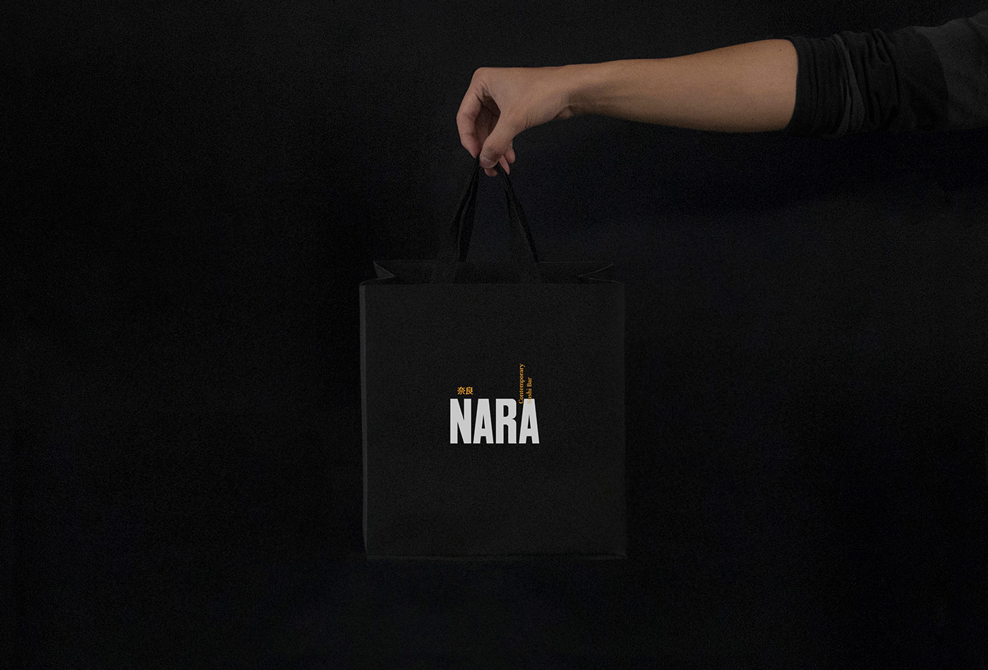
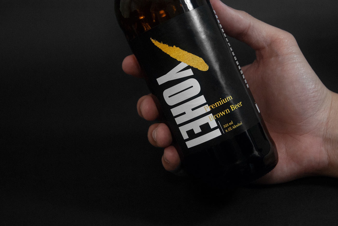
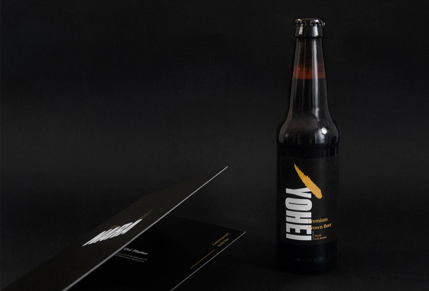
Nara is a Contemporary Sushi Bar, result of the combination between traditional Japanese recipes and the multicultural context of New York City. For this reason we took those ideas as main communication axes, creating a sober identity with Japanese characteristics but, with an international feeling.
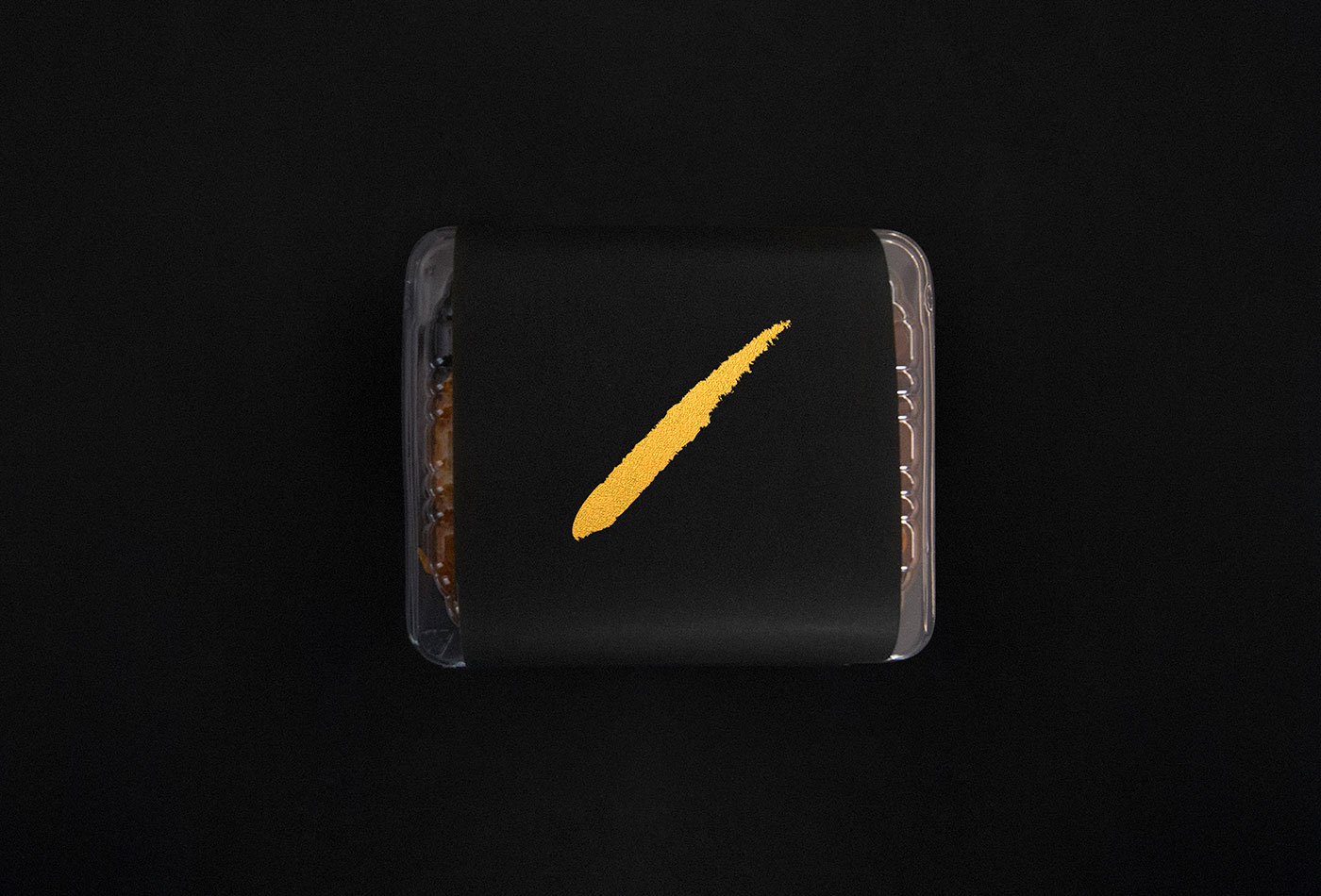
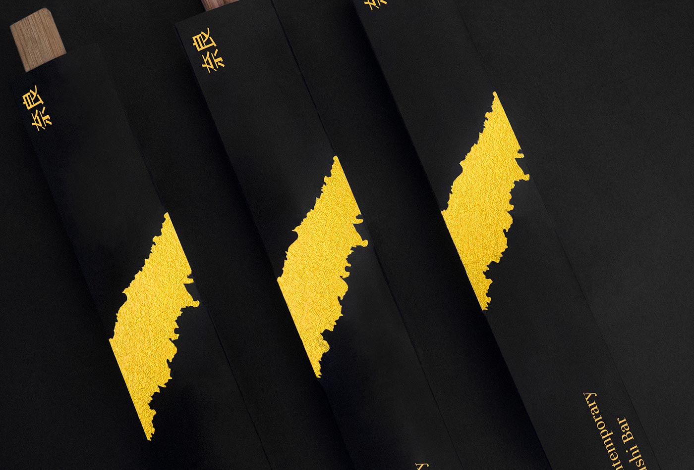
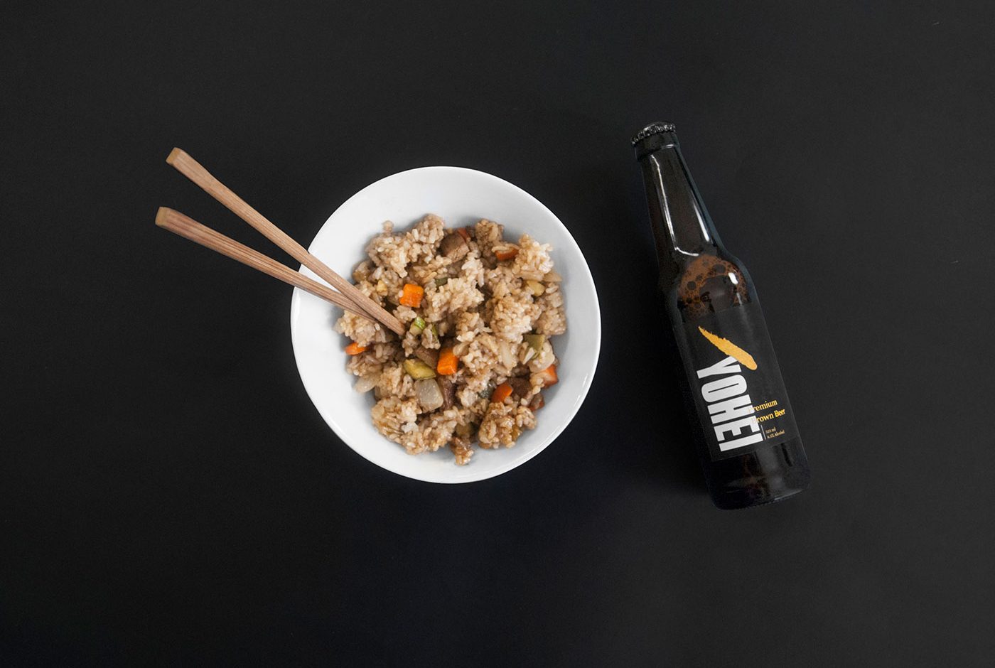
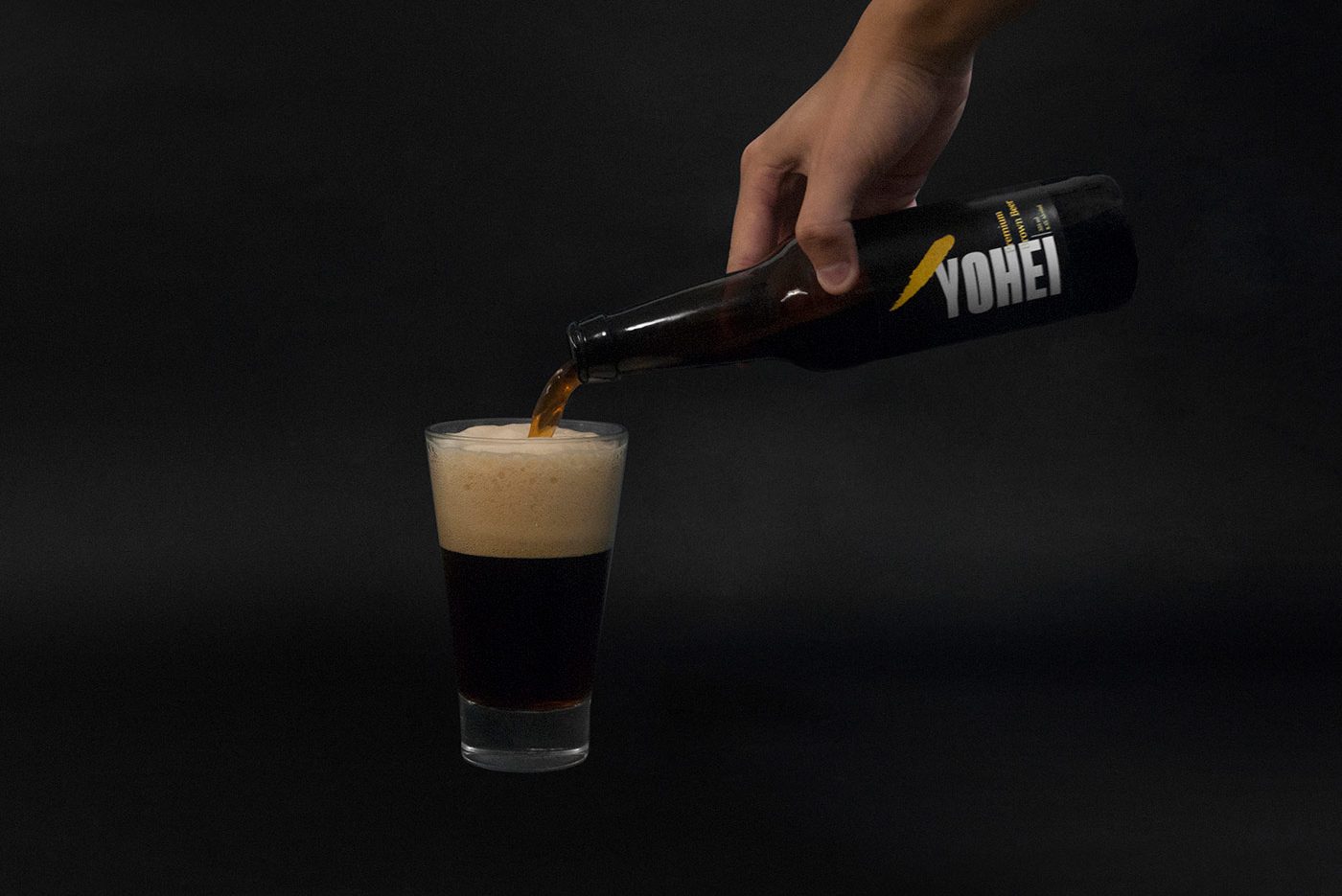
We designed a custom made font used in main logotype and sub-product’s logotypes (like its own beer “Yohei”). Additionally, a bold and recognizable golden brushstroke complements the identity to make it memorable.
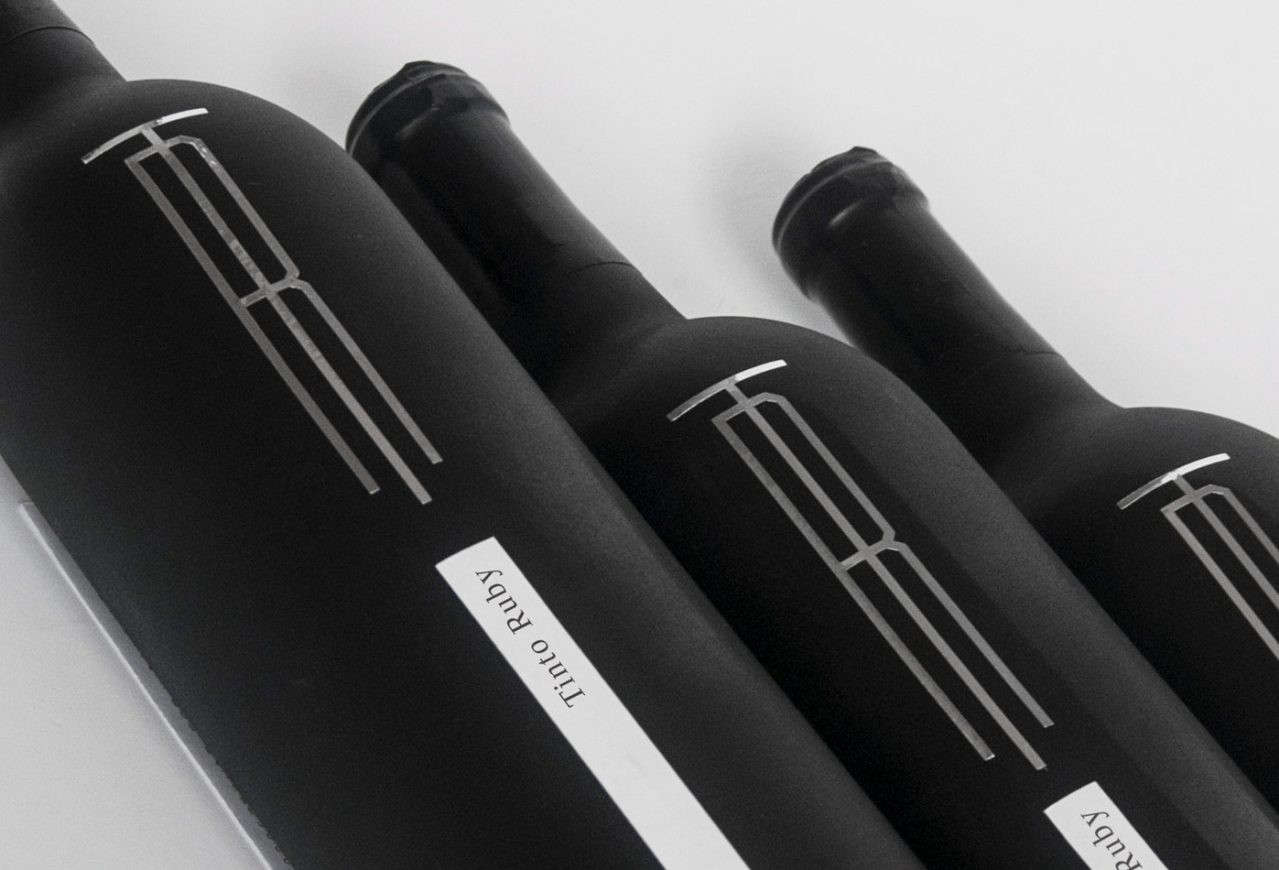
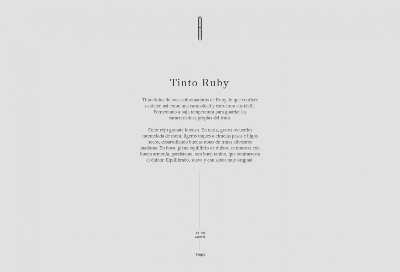
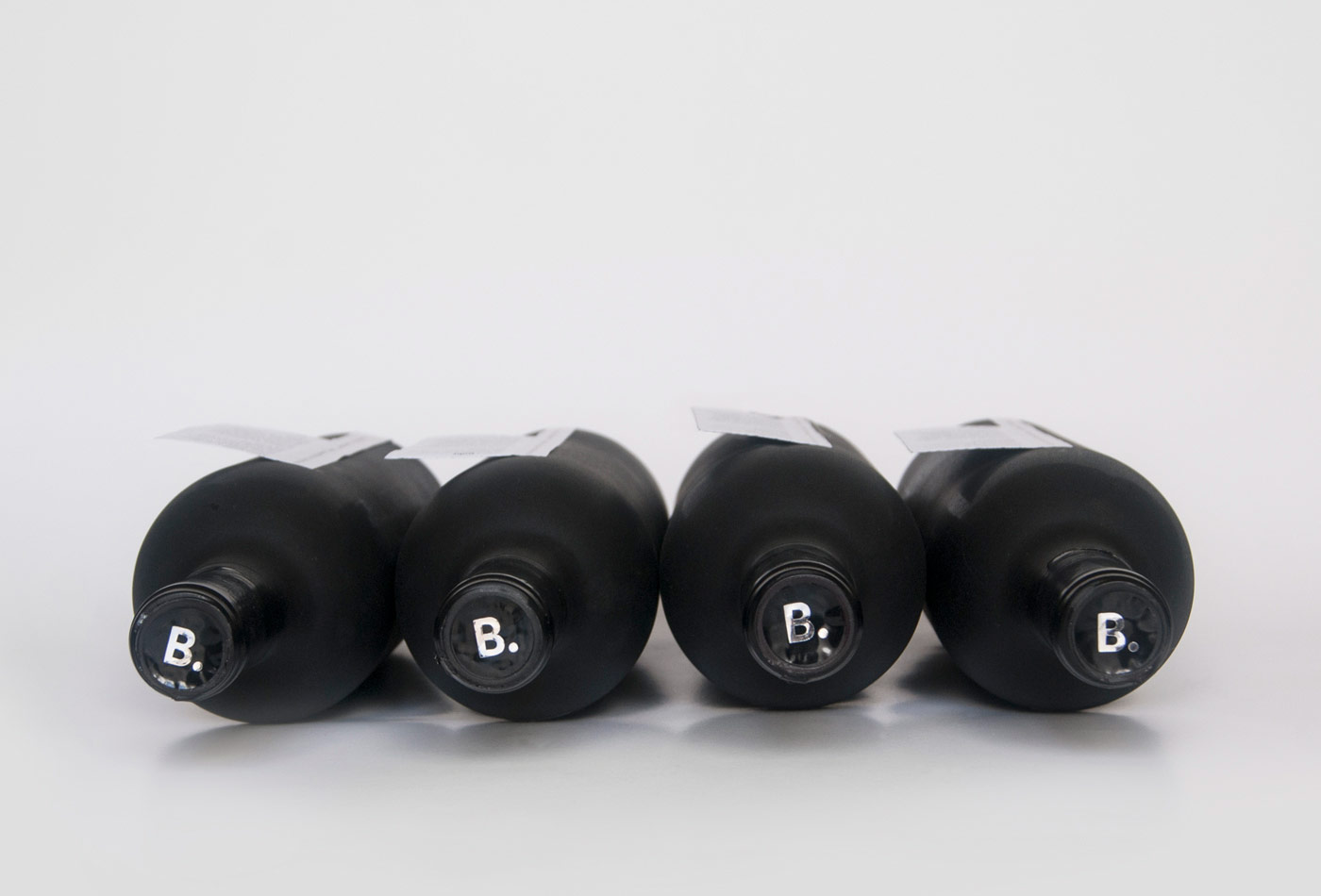
Tinto Ruby is a red wine made by La Redonda, in Queretaro, Mexico, and is definitely one of our favorite local wines. For this reason, we choose it to give as a present to our clients. But not only do we share it, but we add our own style on it by redesigning the bottle’s presentation, so each client can have a unique bottle, created with passion and love to celebrate a year full of work and adventures.
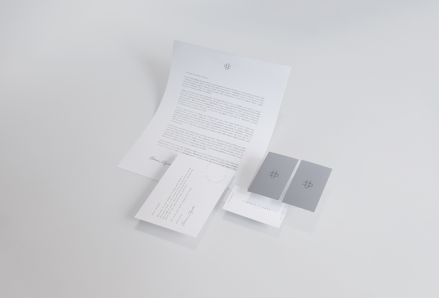
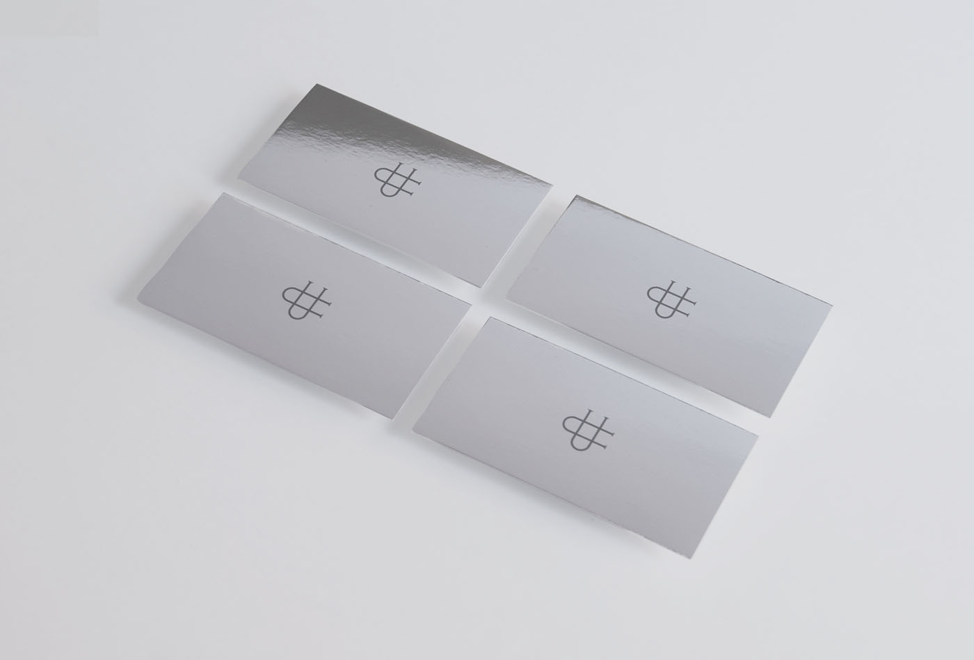
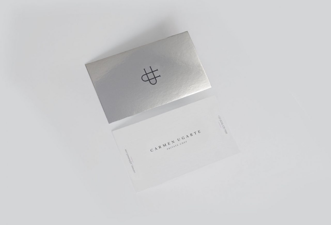
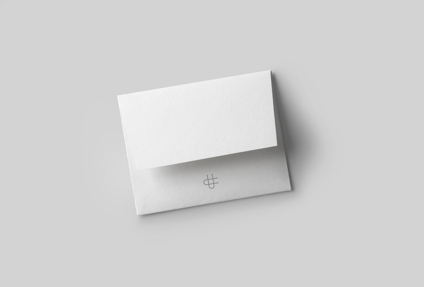
Carmen Ugarte is a Private Chef based in Los Cabos, Mexico, recognized by her personalized service and unique style, combining Asian and Italian techniques with Mexican spices and flavors, and matching her recipes or ingredients to the client’s requirements. Its premium service has enabled it to work with high-end customers who visit Los Cabos.
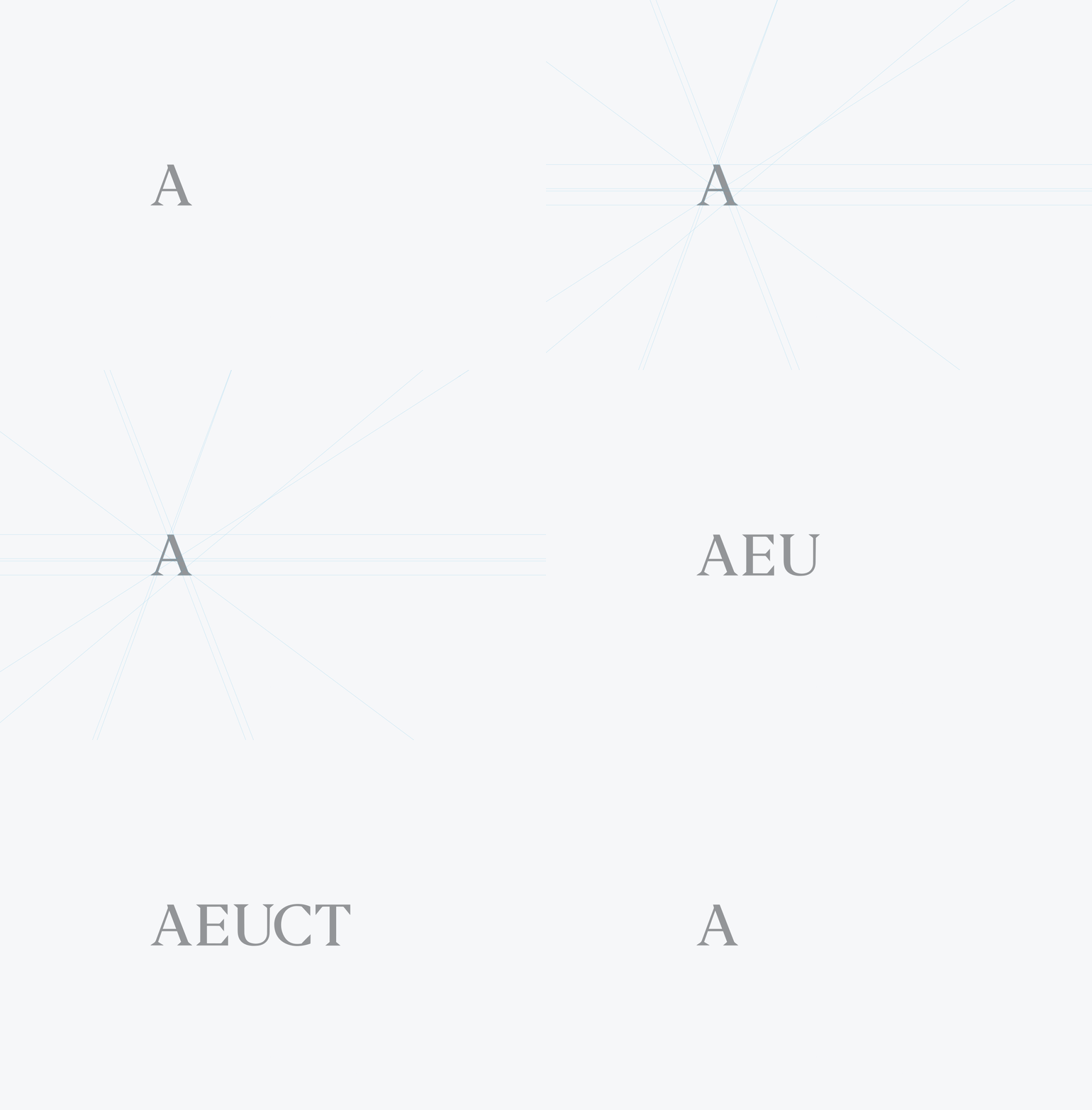
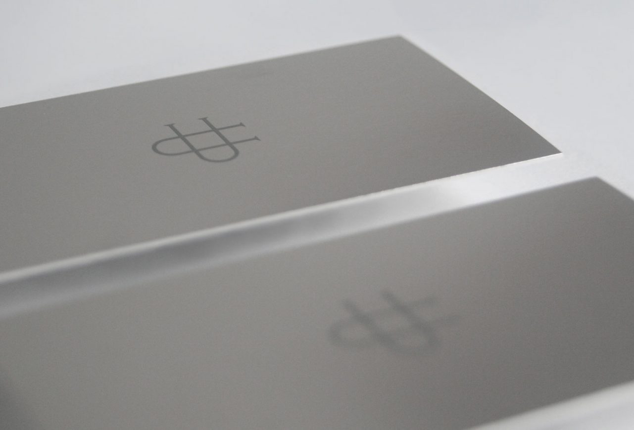
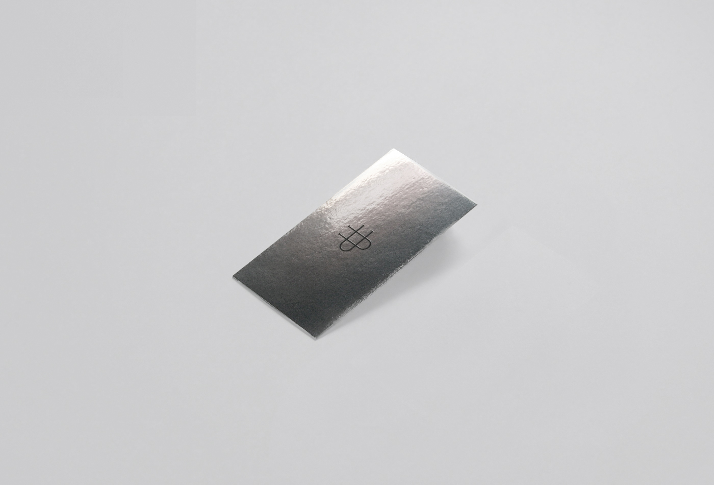
We created an elegant and exclusive identity, designing a monogram with her initials as the main identifier and an application with her full name in a custom made typography. The use of silver finishes frames the exclusivity of the services of the chef in each of its applications.