BRADA IS A GRAPHIC DESIGN STUDIO SPECIALIZED IN BRANDING. IF YOU WANT TO CONTACT US PLEASE FEEL FREE TO SEND US AN EMAIL TO INFO@BRADA.CO OR CHECK OUR CONTACT SECTION.
BRADA IS A GRAPHIC DESIGN STUDIO SPECIALIZED IN BRANDING. IF YOU WANT TO CONTACT US PLEASE FEEL FREE TO SEND US AN EMAIL TO INFO@BRADA.CO OR CHECK OUR CONTACT SECTION.
BRADA IS A GRAPHIC DESIGN STUDIO SPECIALIZED IN BRANDING. IF YOU WANT TO CONTACT US PLEASE FEEL FREE TO SEND US AN EMAIL TO INFO@BRADA.CO OR CHECK OUR CONTACT SECTION.
BRADA IS A GRAPHIC DESIGN STUDIO SPECIALIZED IN BRANDING. IF YOU WANT TO CONTACT US PLEASE FEEL FREE TO SEND US AN EMAIL TO INFO@BRADA.CO OR CHECK OUR CONTACT SECTION.
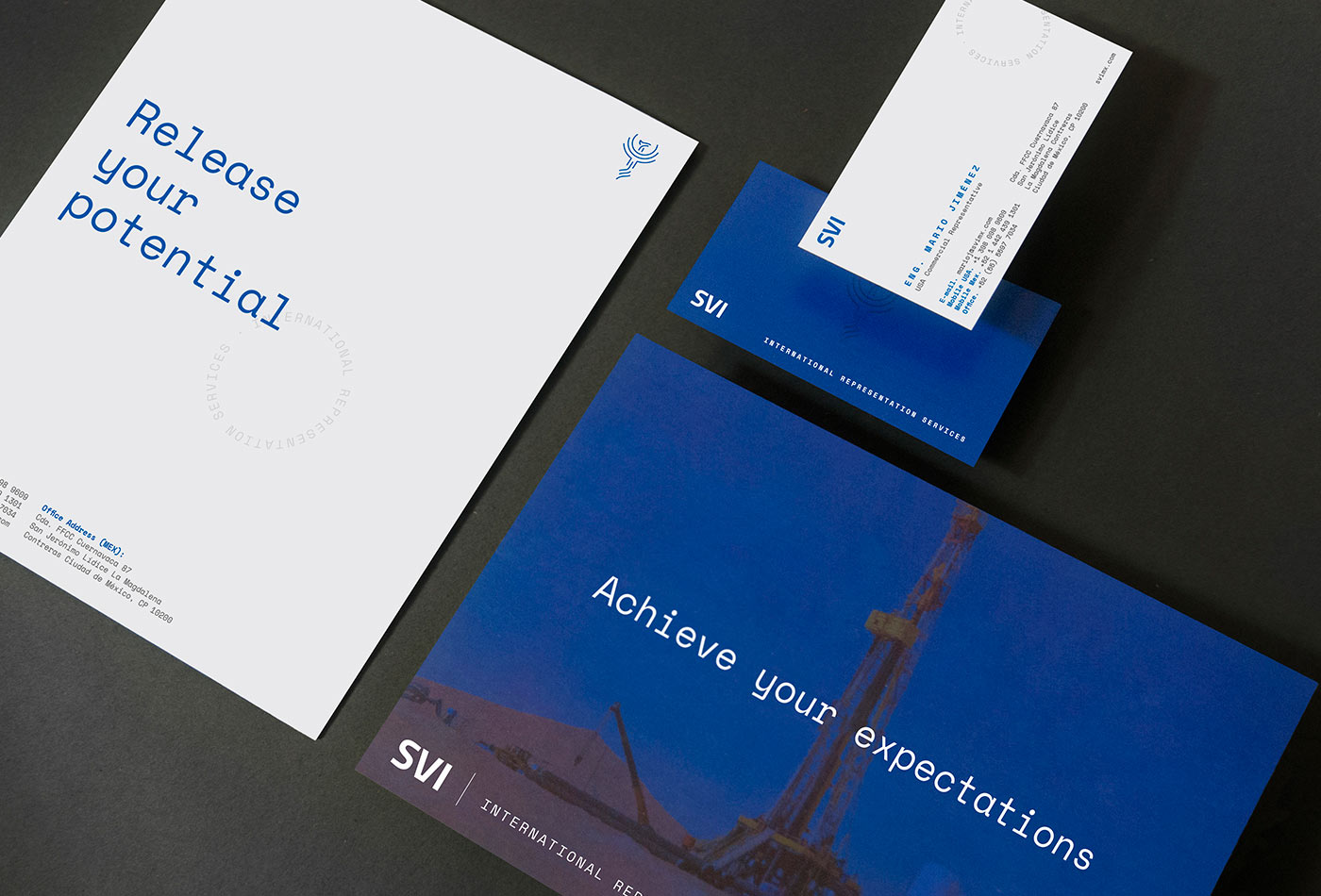
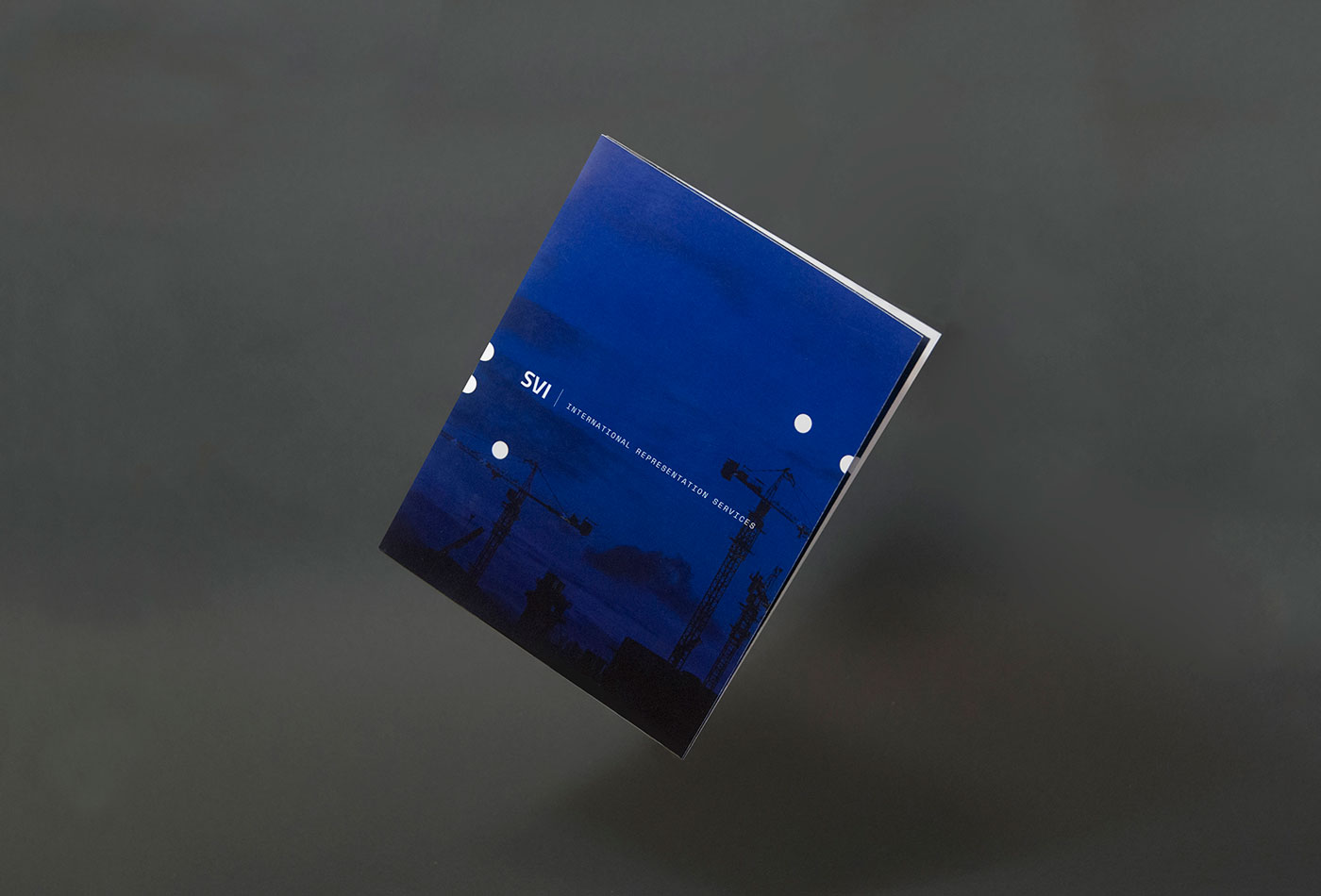
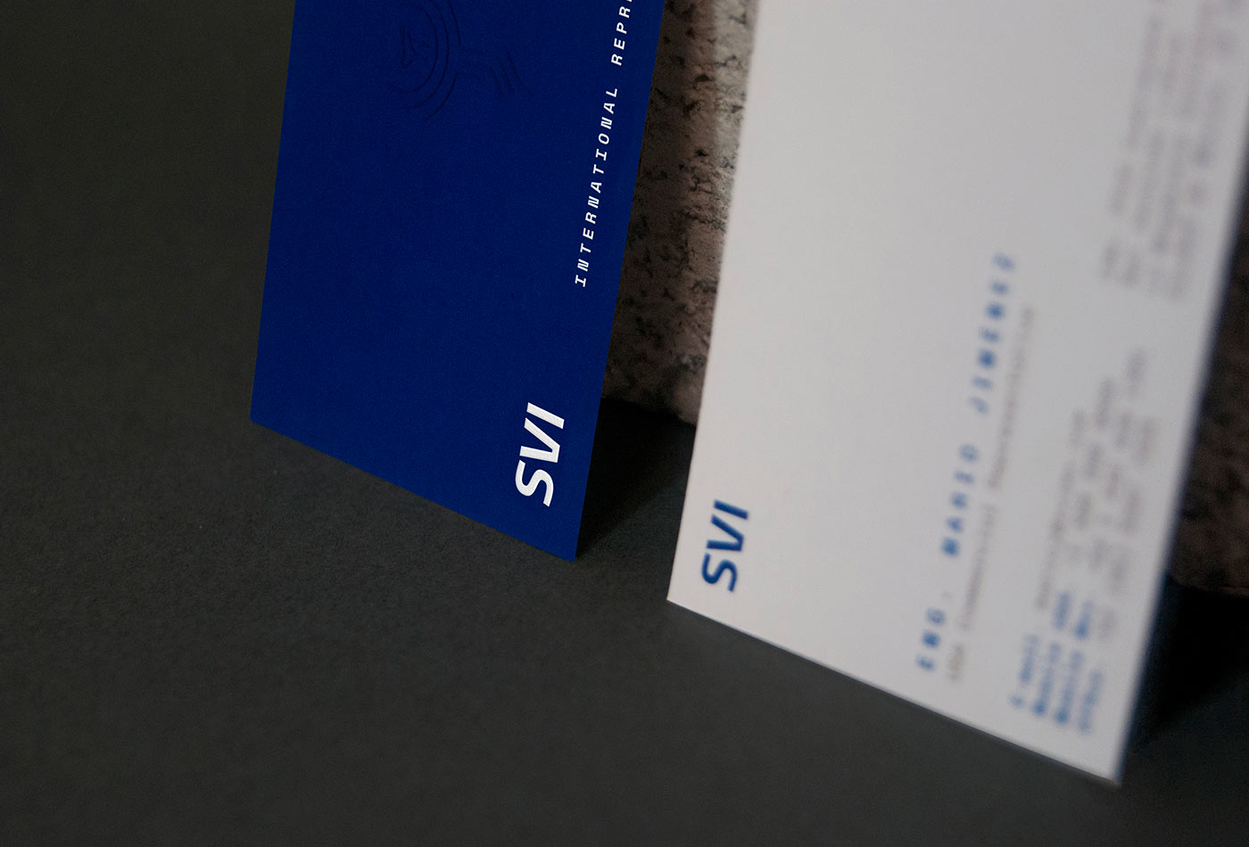
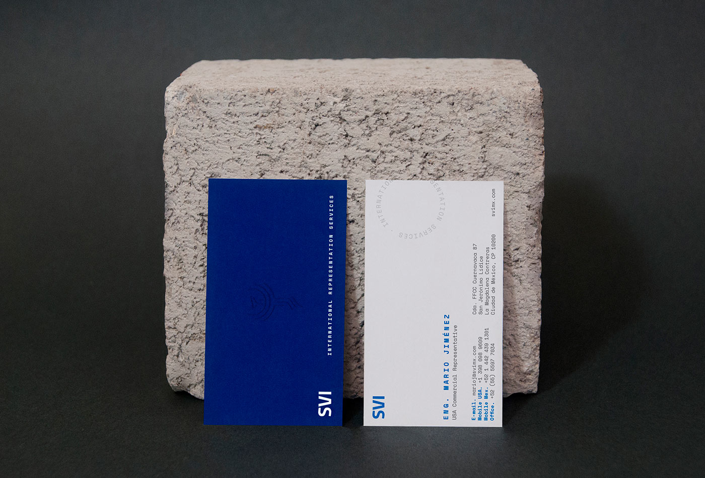
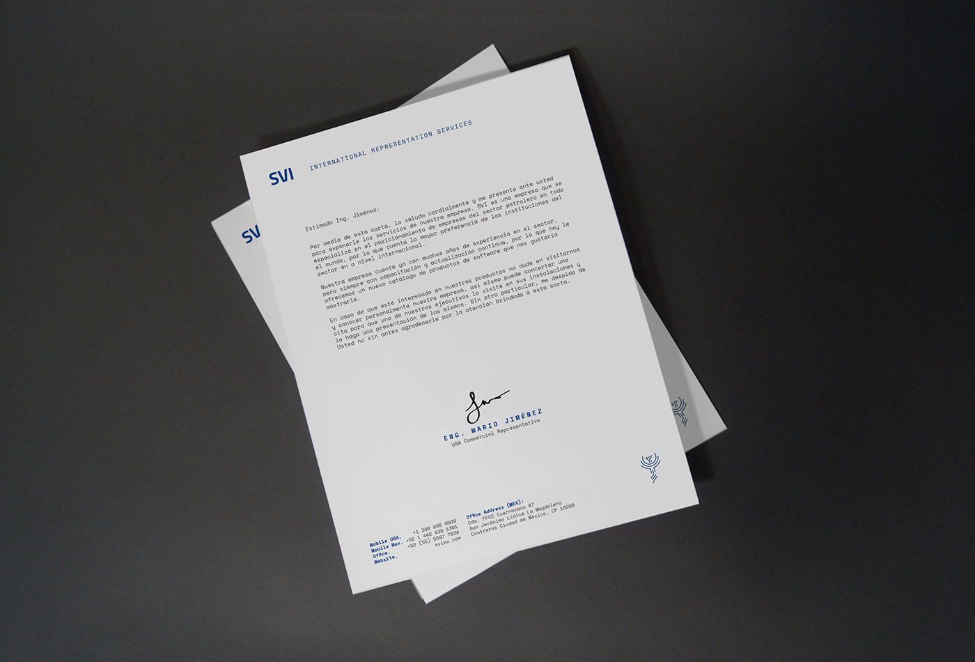
SVI is an independent inspection company, focused on supervision, testing and technical audits of international companies. With a deep knowing of the oil & gas processes, SVI has acquired through the years a deep knowledge of the main manufacturers in America and Worldwide.
For the identity we take 3 main axes: it’s an international company, with 20 years of experience and that the services they offer are completely technical. These points were our start point for the colors, typographic selection and graphic style in general.
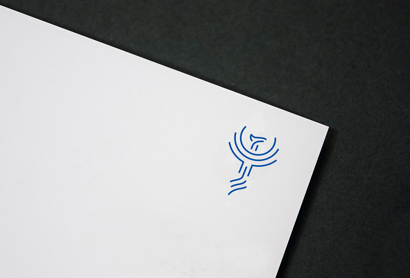
Finally, as a specific requirement, we created a phoenix symbol, which functions as a sort of stamp and complements the identity.
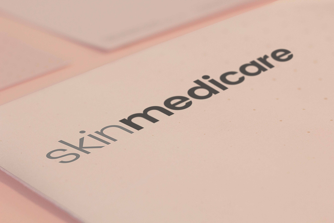
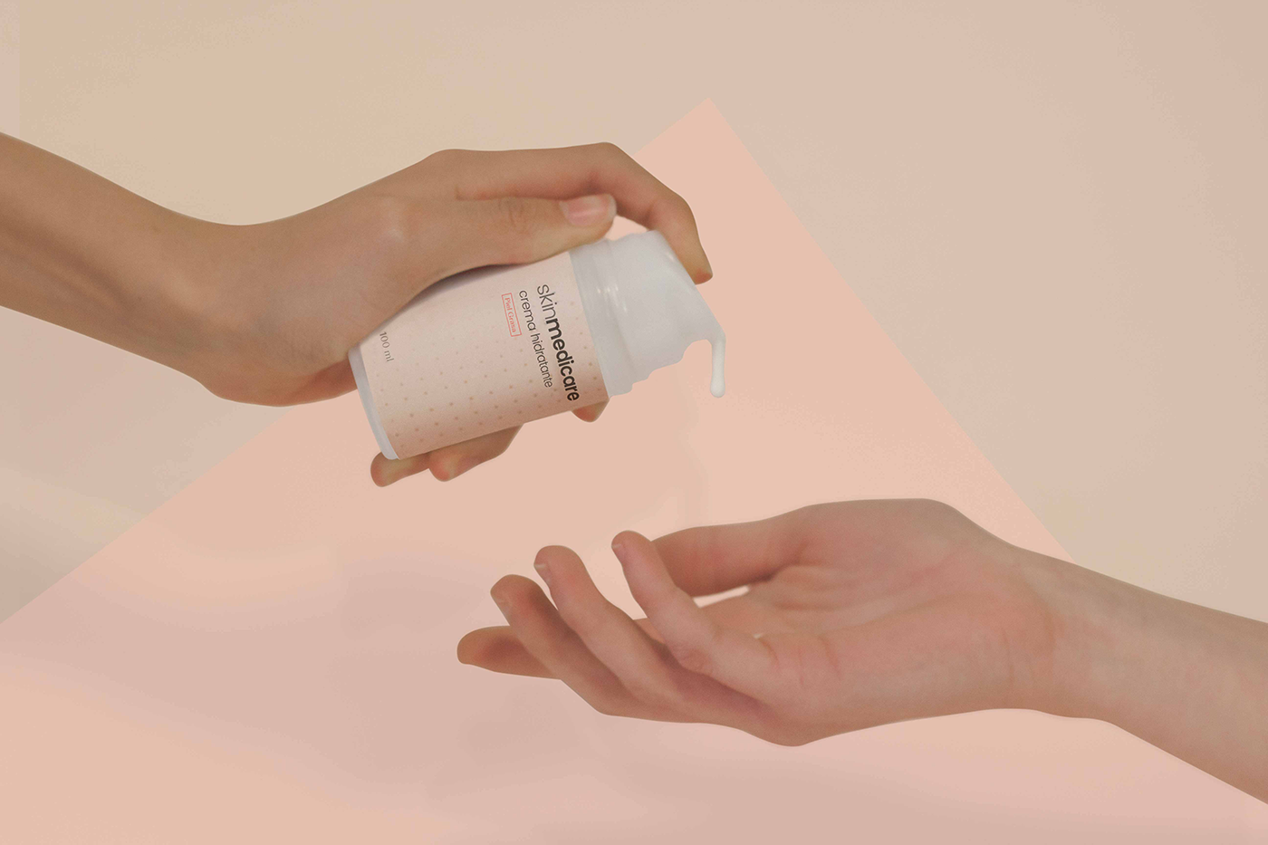
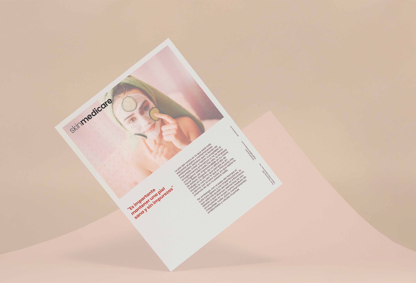
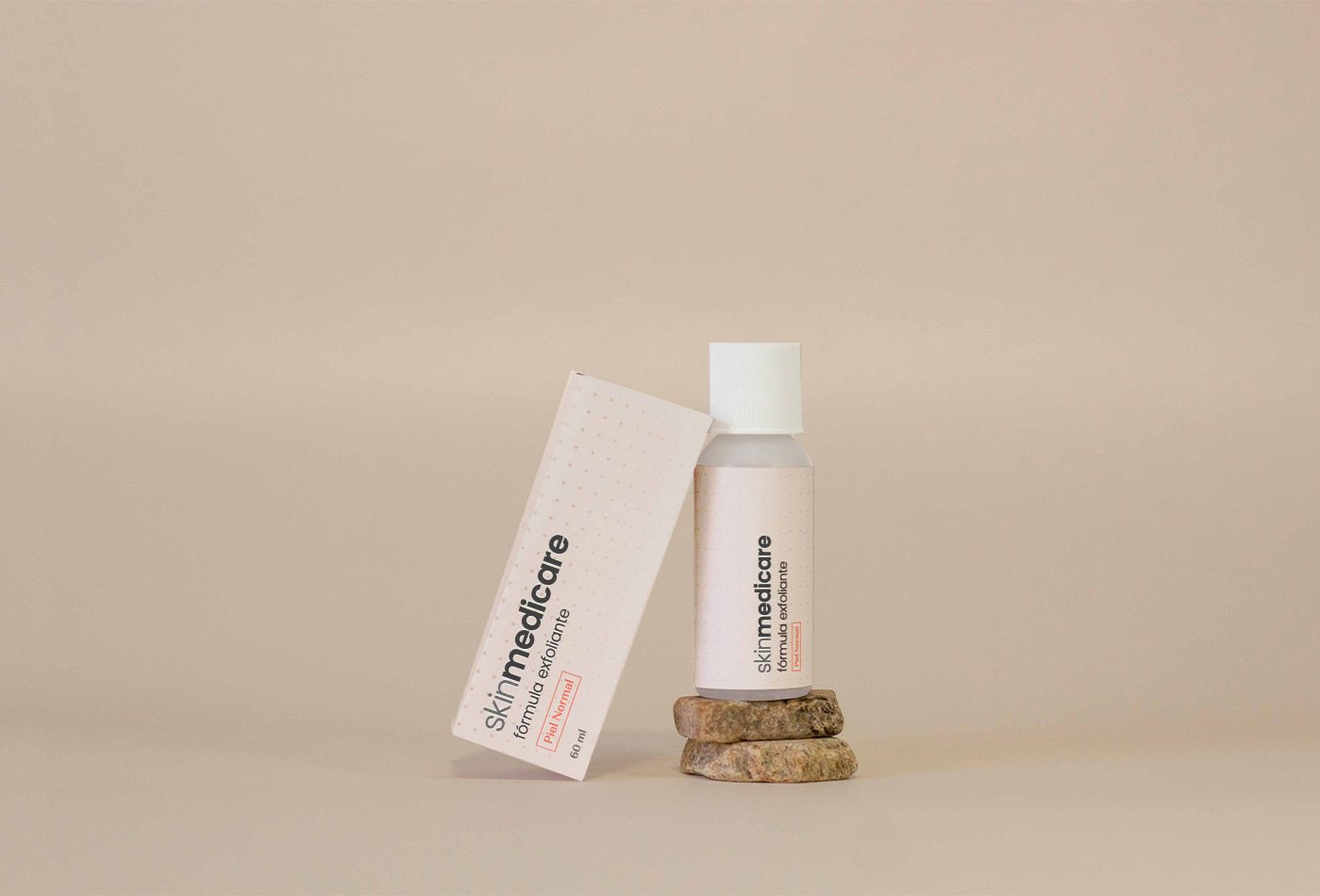
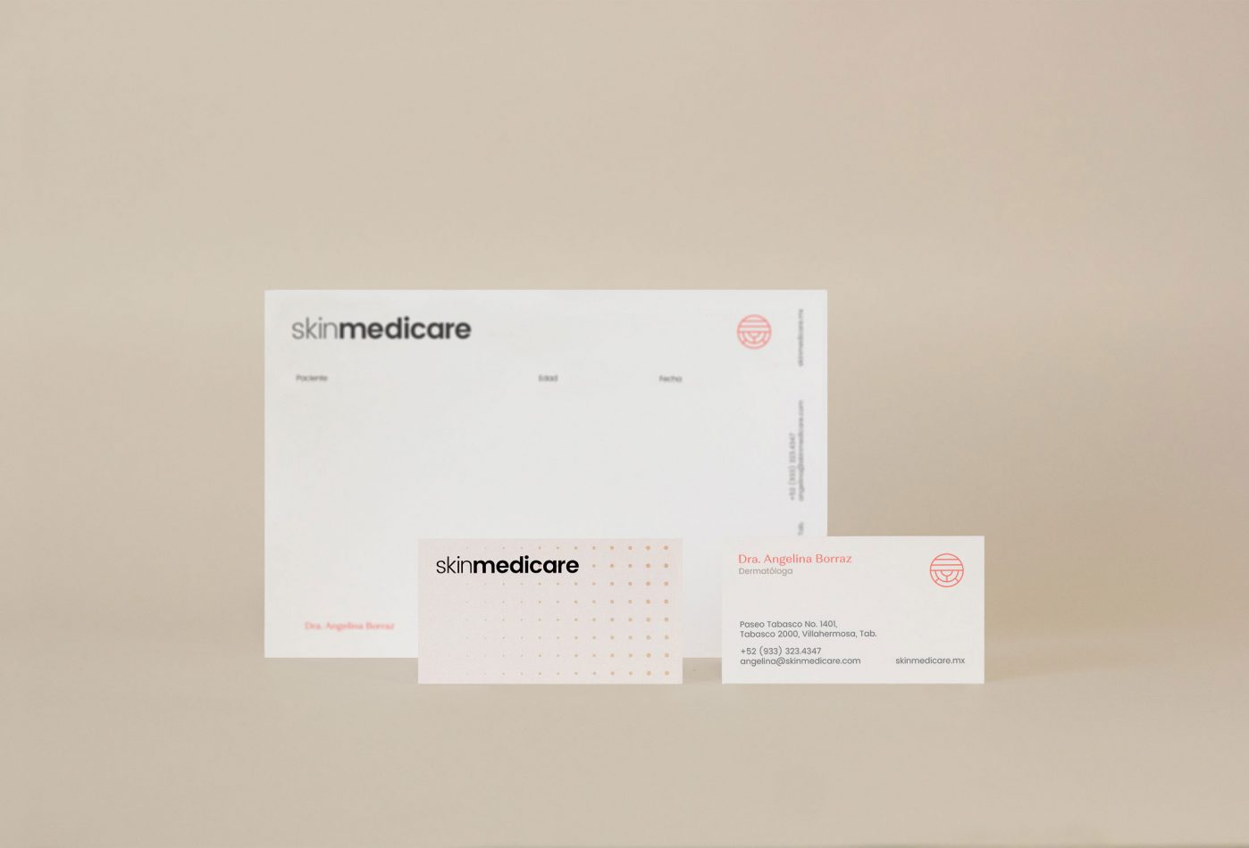
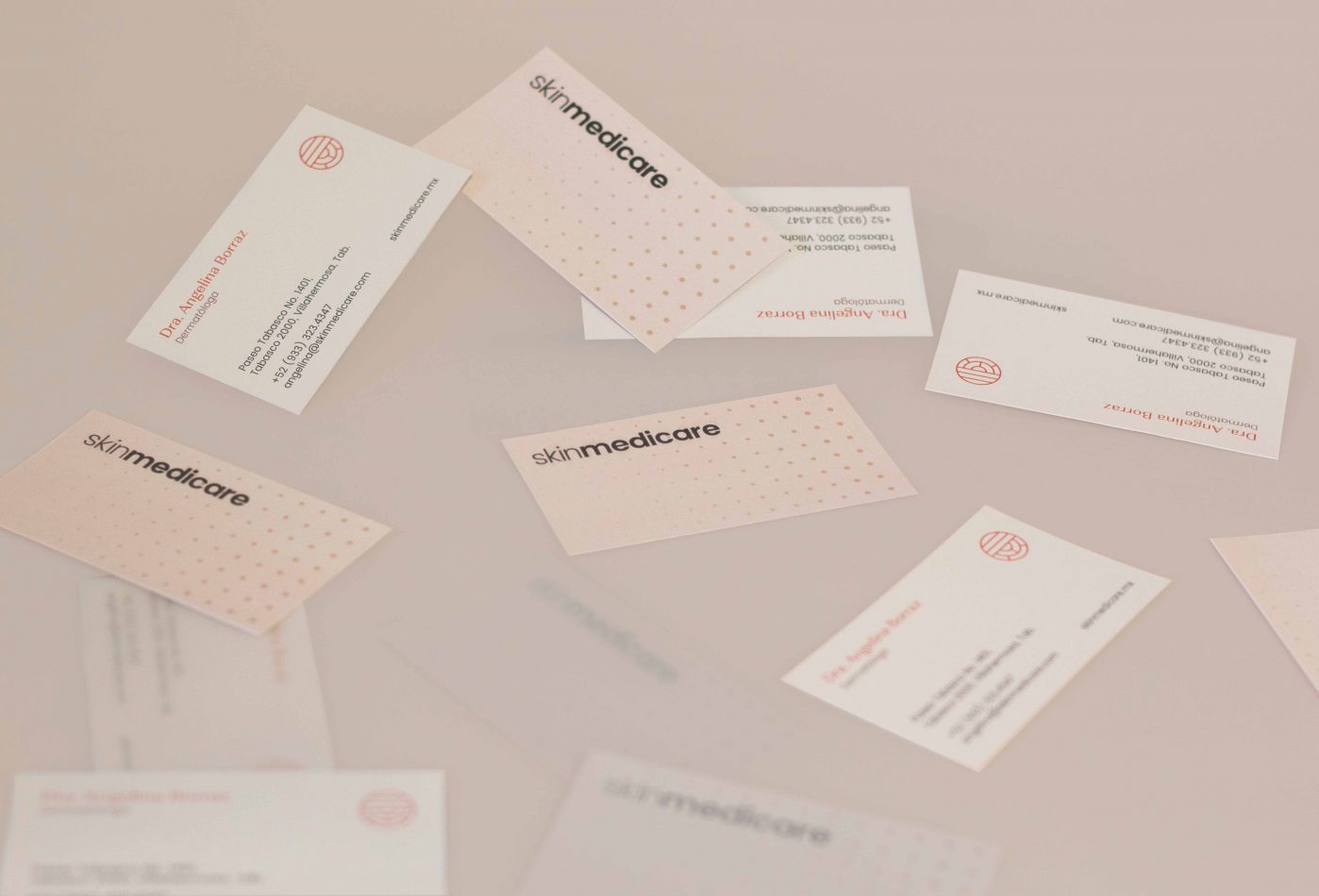
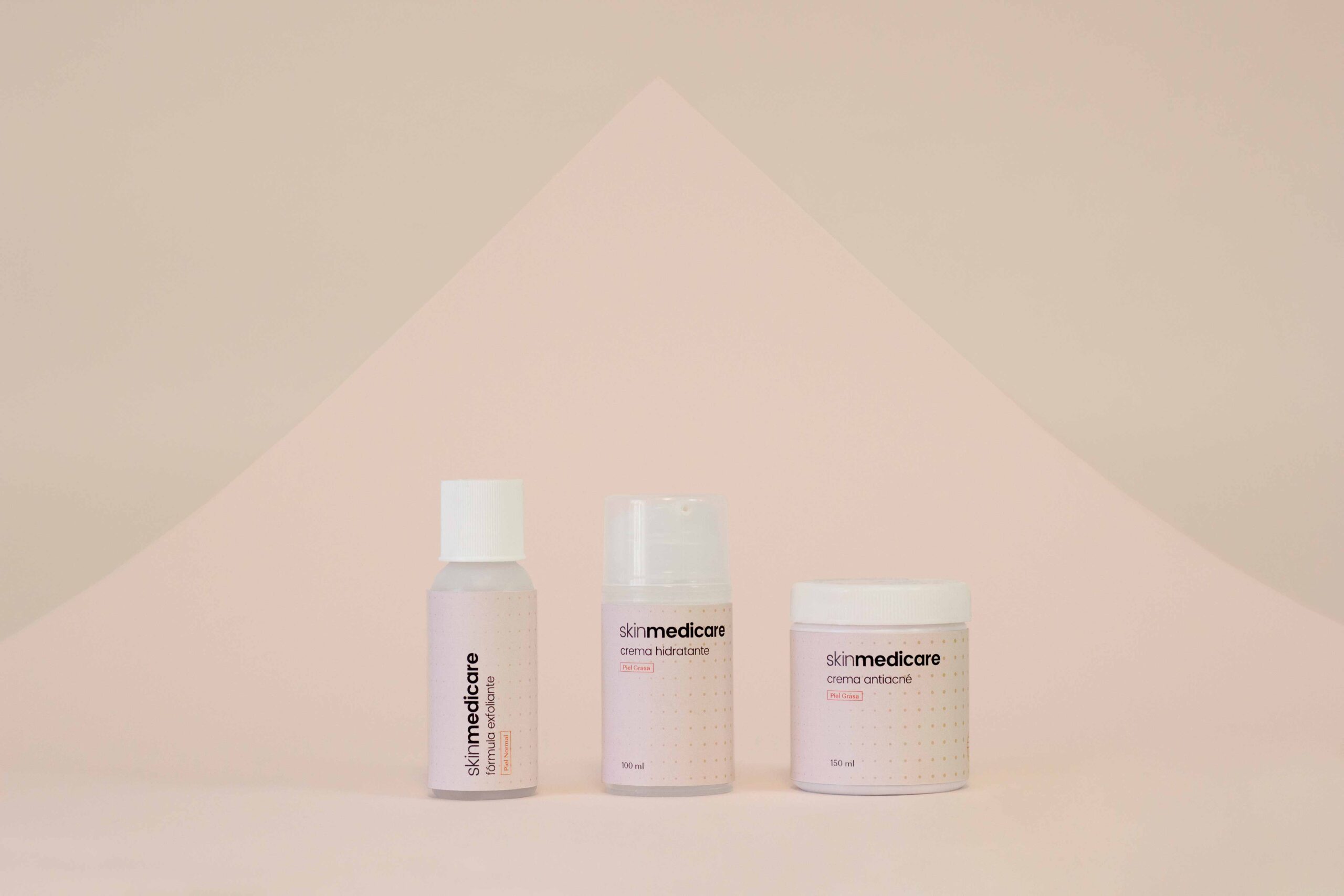
Skin Medicare is a specialized dermatological clinic in the city of Villahermosa, Tabasco, in southern Mexico. Our job was to build the brand’s visual identity. We used as reference the work object of the clinic: the skin.
First, an abstraction of the layers of the skin was created to use as an identifier, used as a complement to the main logo. In addition, we created a texture based on the skin pores, and this idea was applied to different visual elements used in the brand.
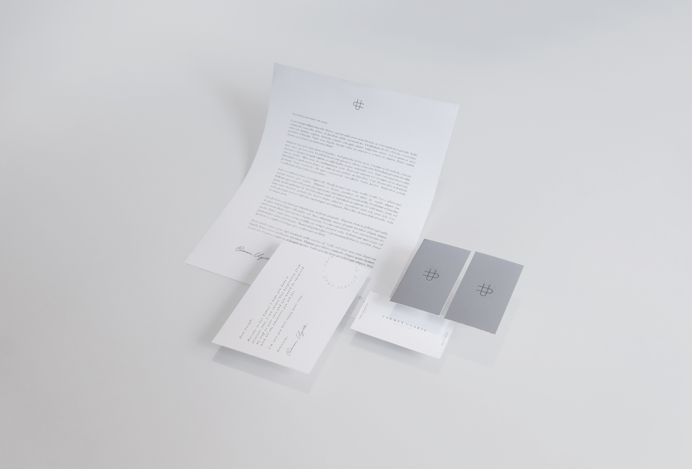
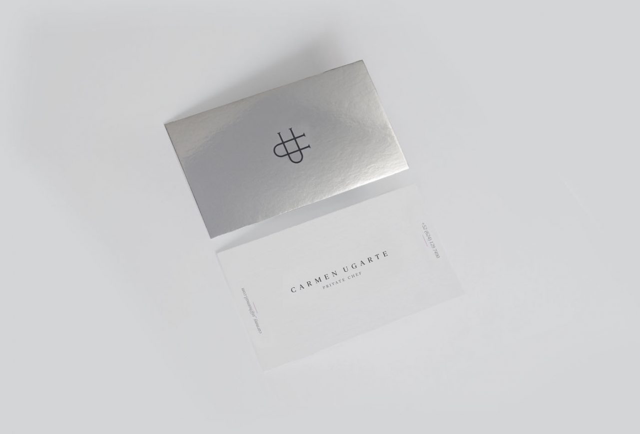
Carmen Ugarte is a Private Chef based in Los Cabos, Mexico, recognized by her personalized service and unique style, combining Asian and Italian techniques with Mexican spices and flavors, and matching her recipes or ingredients to the client’s requirements. Its premium service has enabled it to work with high-end customers who visit Los Cabos.
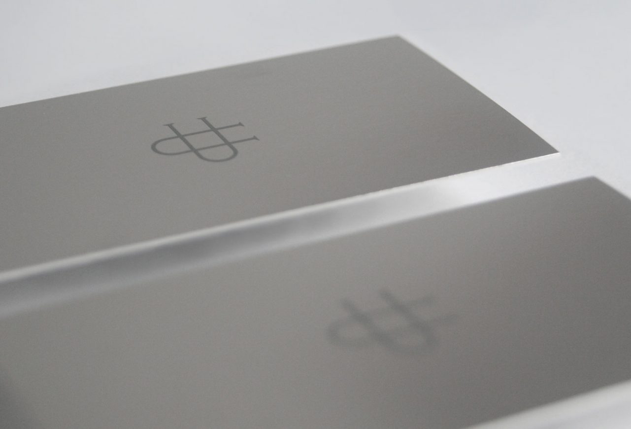
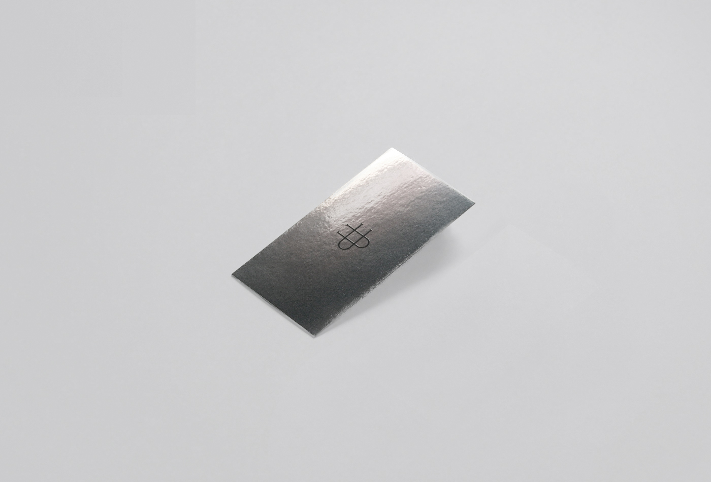
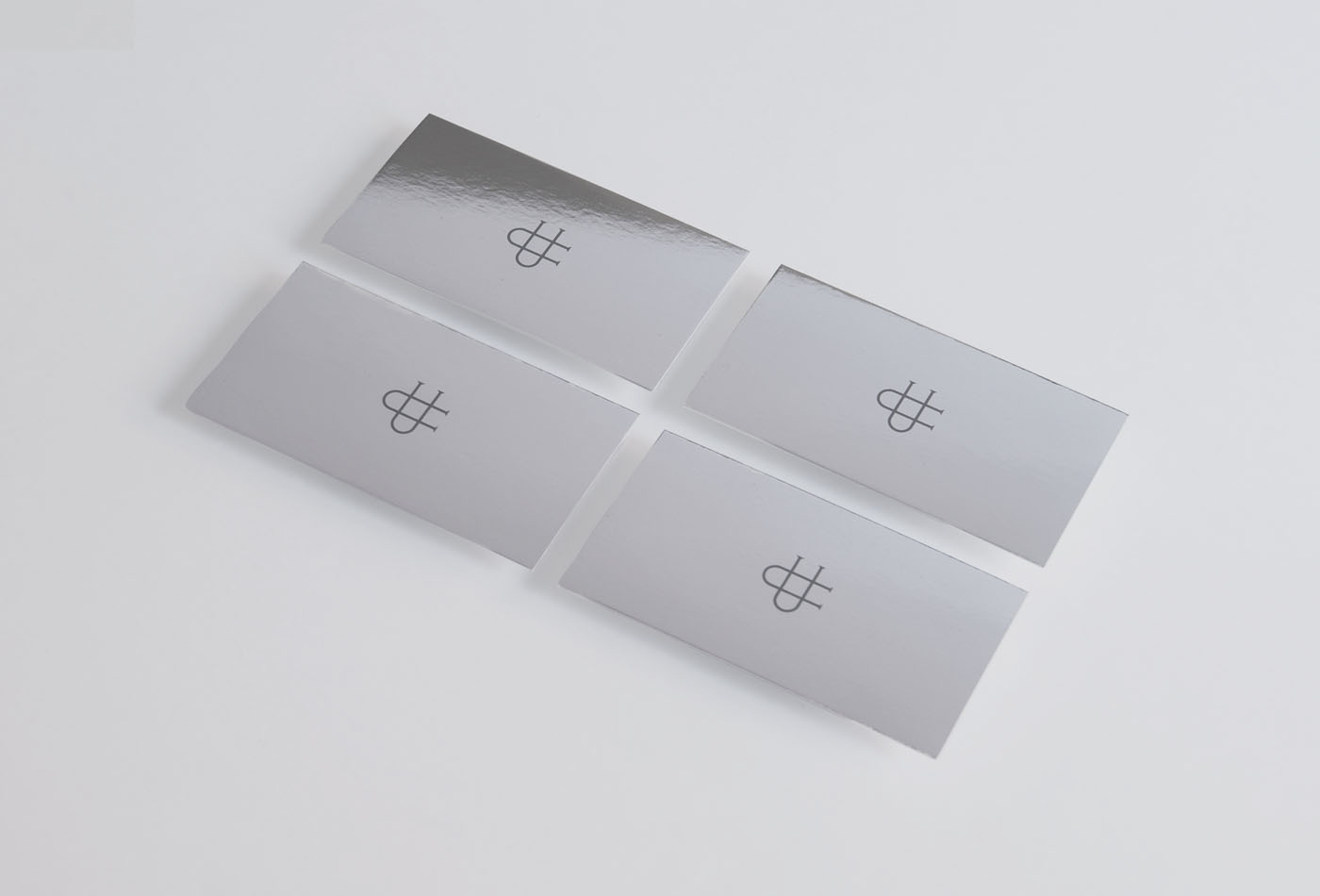
We created an elegant and exclusive identity, designing a monogram with her initials as the main identifier and an application with her full name in a custom made typography. The use of silver finishes frames the exclusivity of the services of the chef in each of its applications.
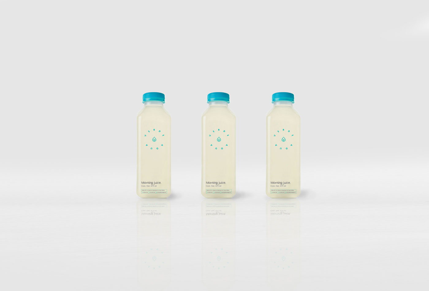
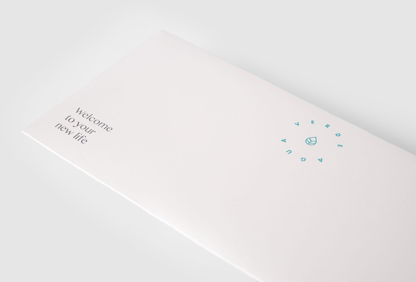
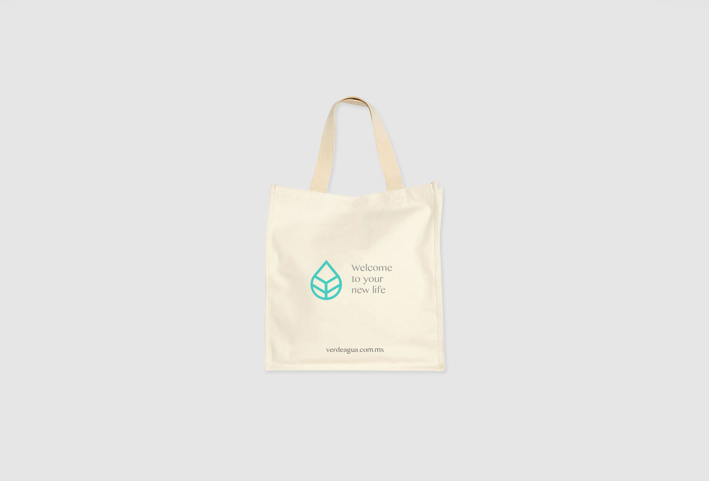
Verde Agua is a nutrition and coaching center focused in diabetes, based at Mexico City. It’s premise consist in getting back into a new life turning to basics, to the essential.
Therefore, the graphic identity is very simple: a clear logotype starting from health, nature and organic elements, complemented by a single color that refers to the name and is complemented with large spaces to convey the idea back to basics.
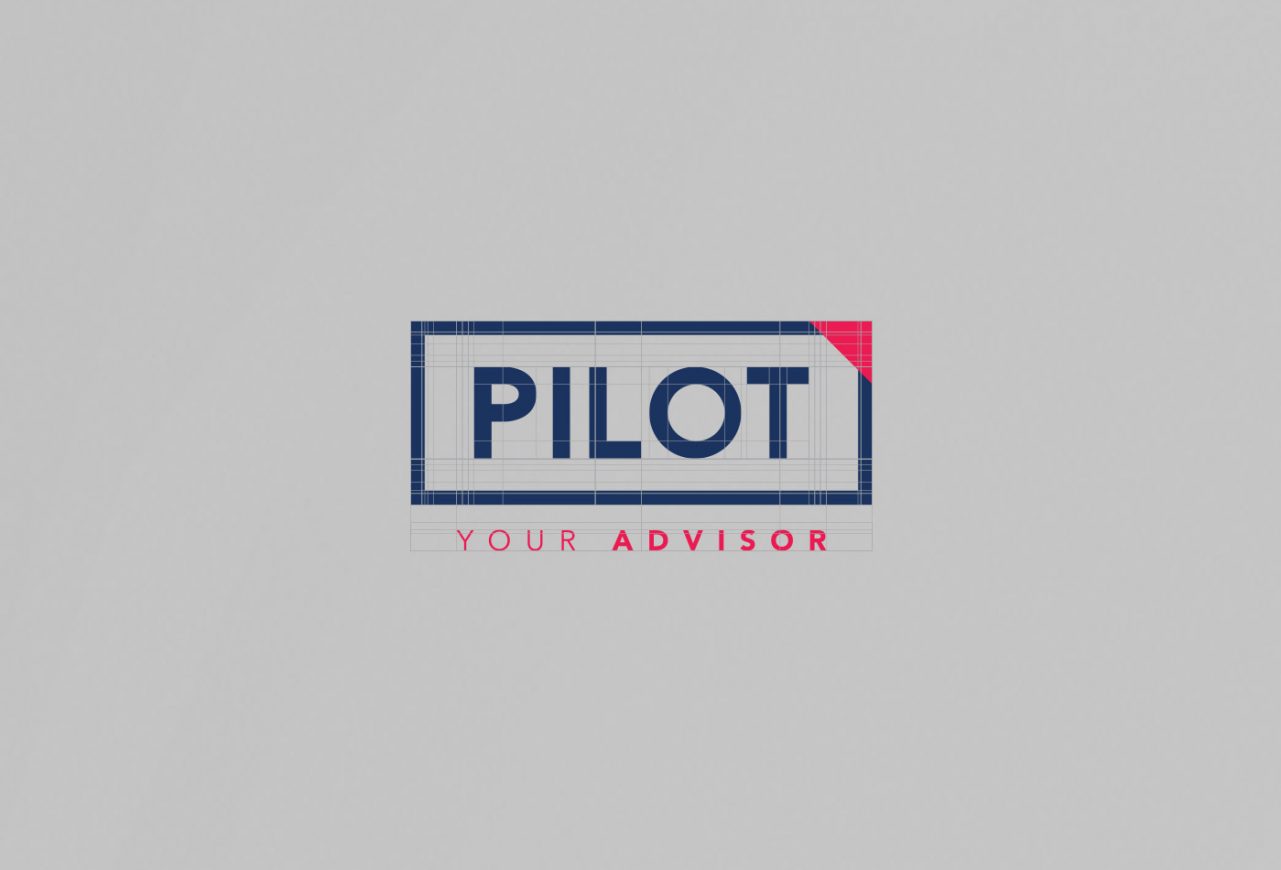
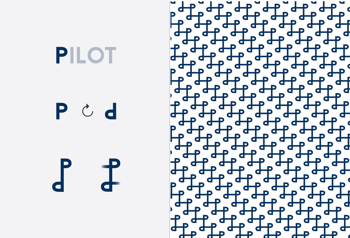
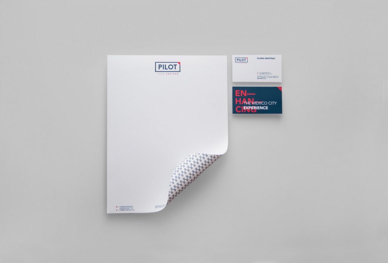
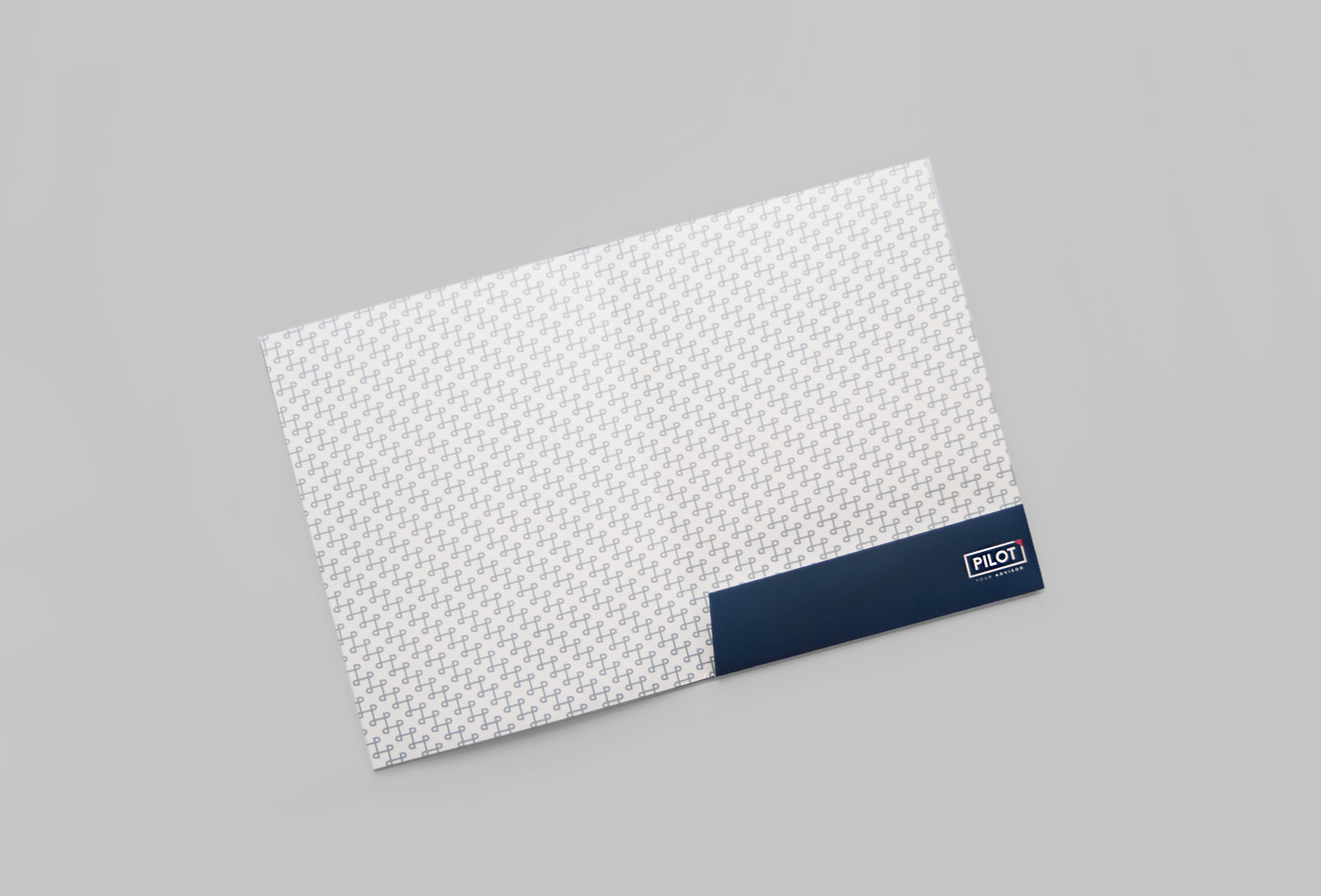
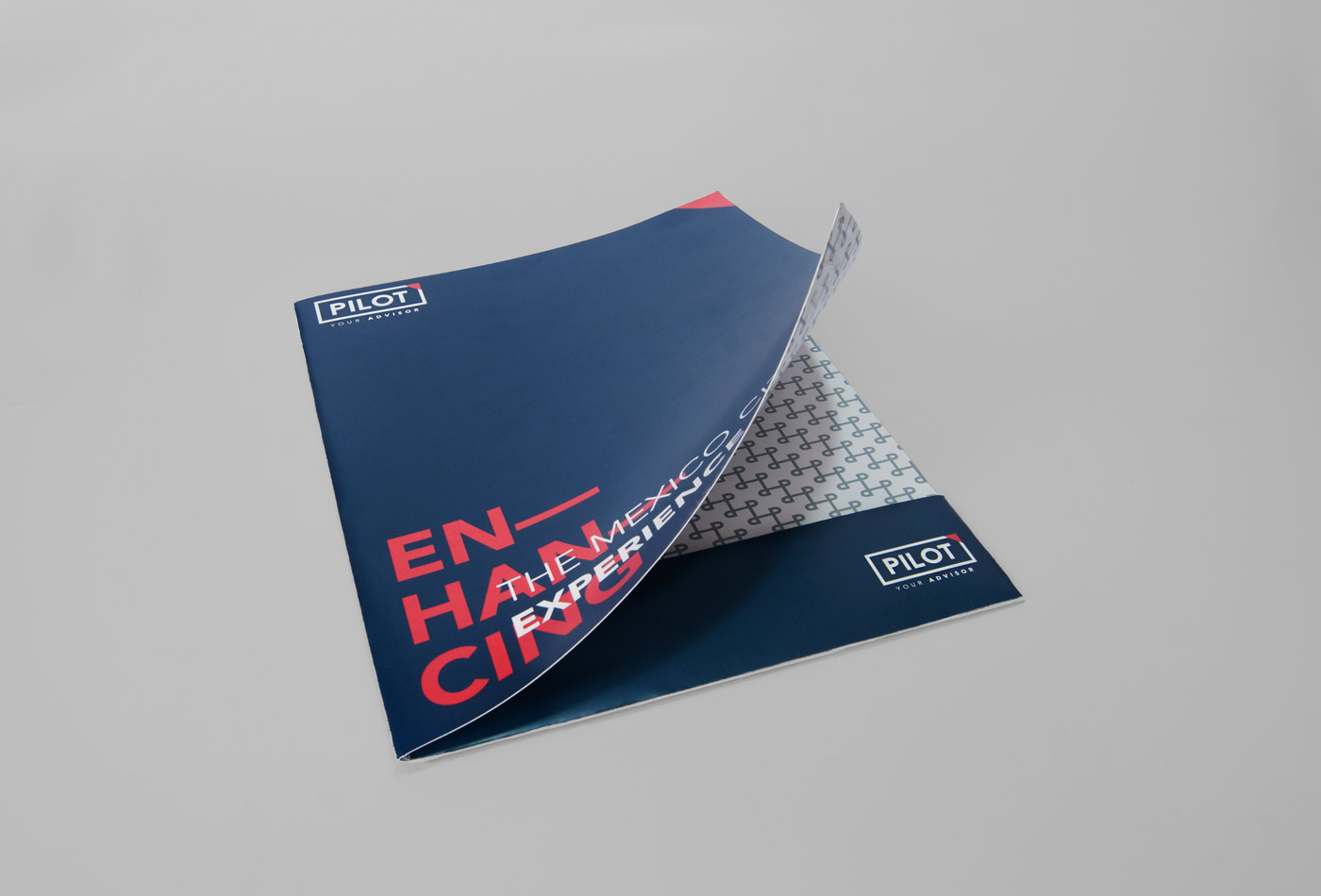
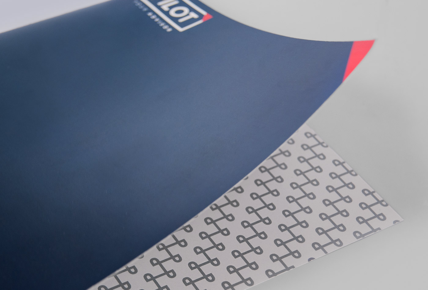
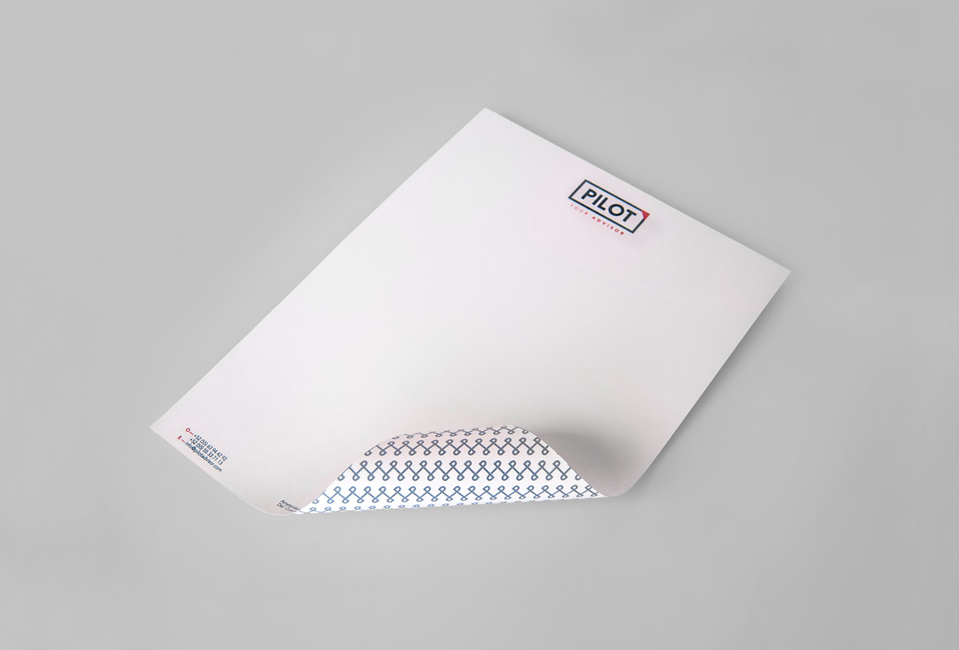
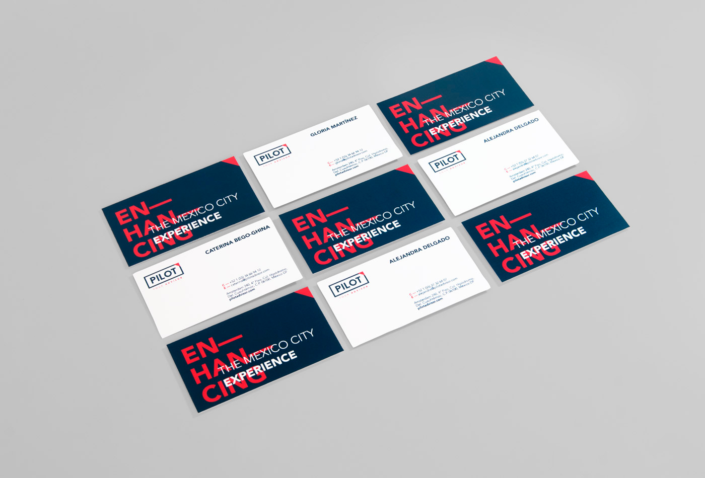
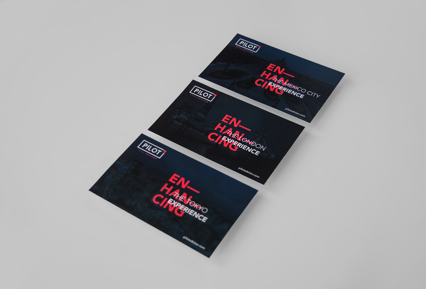
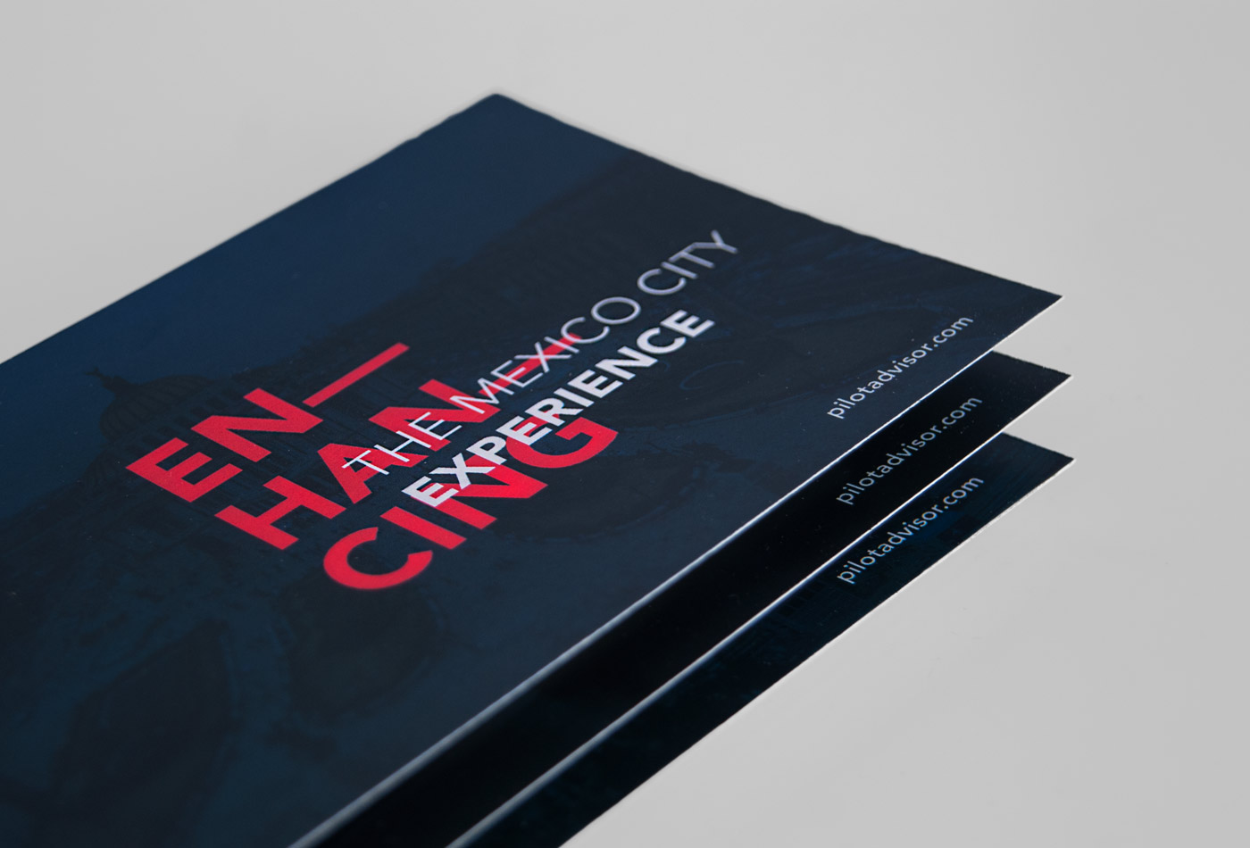
Pilot is a concierge company specializing in relocations in Mexico City. Their services range from dealing with real estate and school seeking, to planning tours and trips. They are experts in handling personal lifestyle of it’s customers.
Based on the above, the name is a simple analogy: one who guides or directs a course of actions for others. That’s Pilot; a simple word whose meaning conveys the real work of the company.
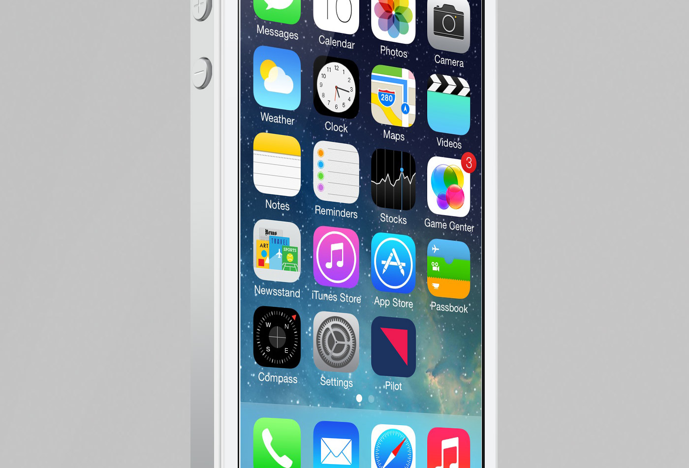
By this idea arises the universality of airspace, reflected in blue and accented with small details in pink. A rectangle provides the sense of security and this is complemented with a triangle pointing forward and upward to create a universal, strong and purposeful brand.